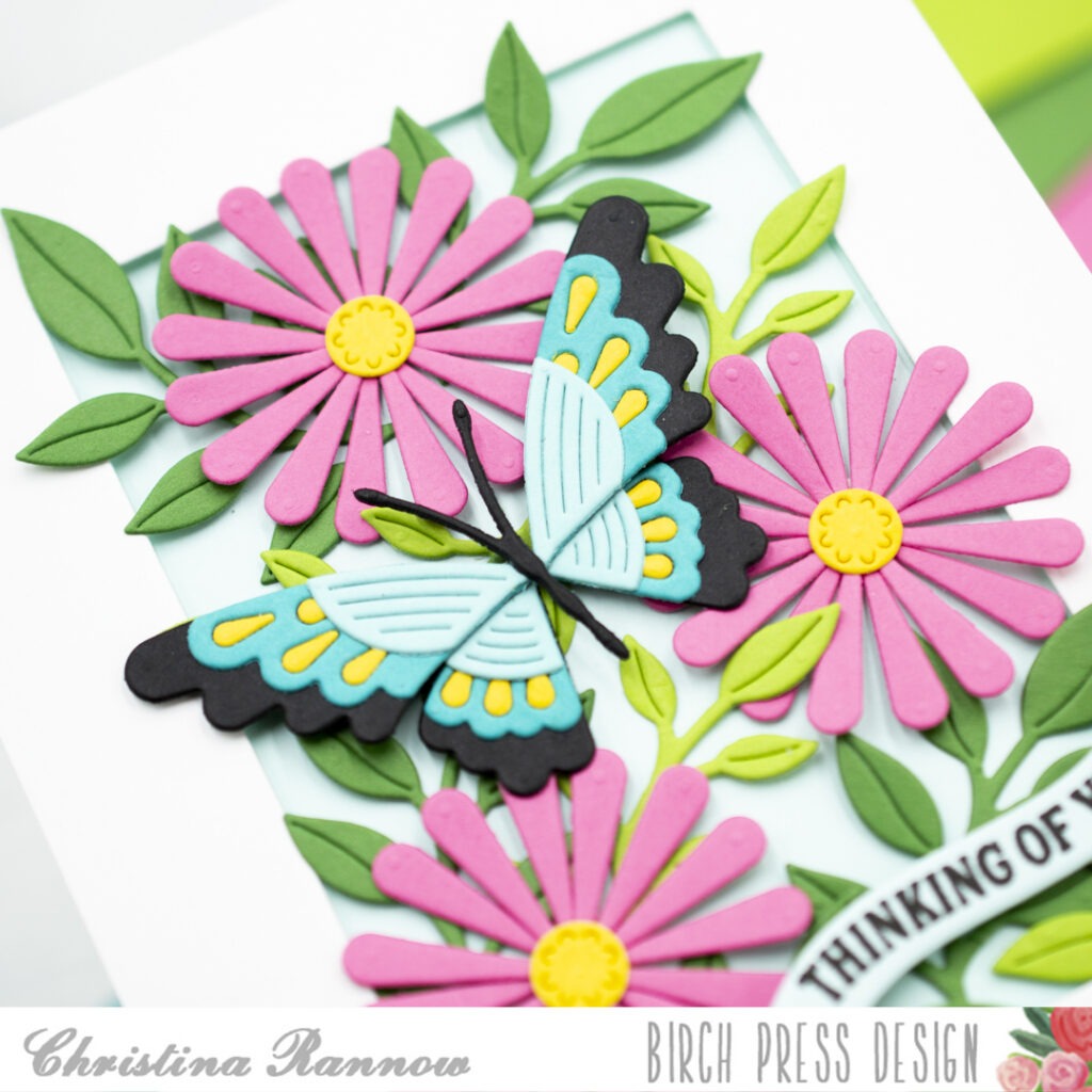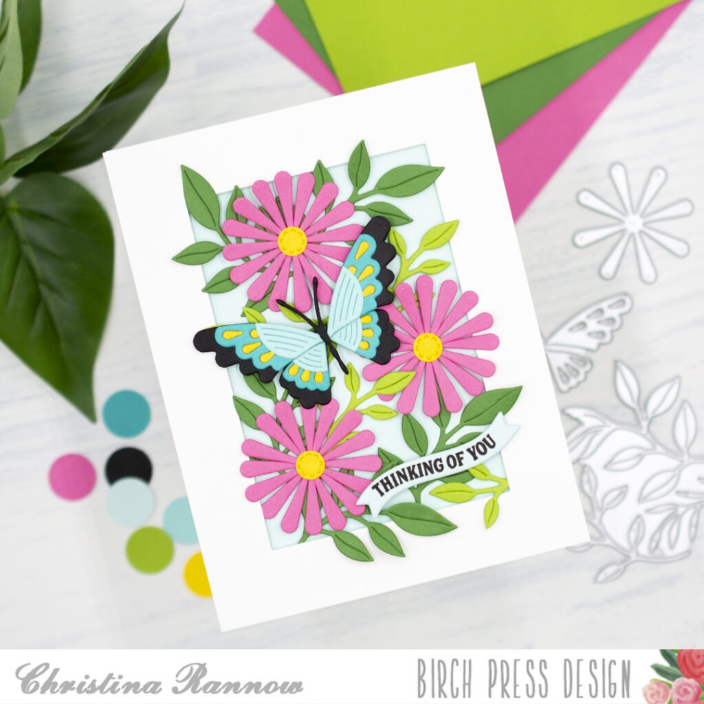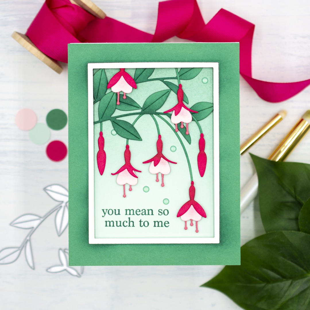
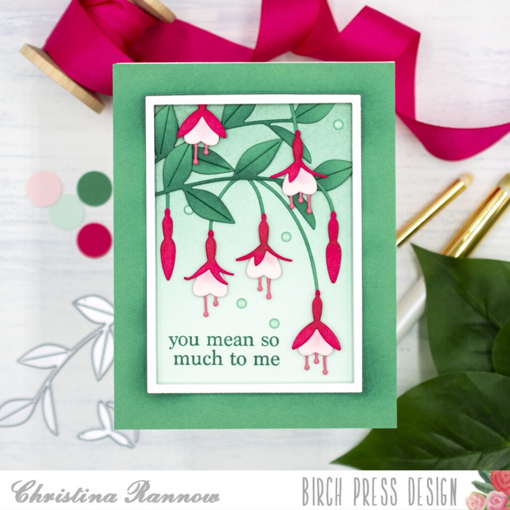
Hello! Christina here. Today I’m sharing a beautiful floral card featuring the new Block Print Fuchsia Spray dies. This set creates graceful, detailed blooms for an elegant card design full of depth and dimension. I paired the set with a simple sentiment and a basic frame to showcase the beauty of these fuchsia blooms. Let’s take a closer look at how this card came together.
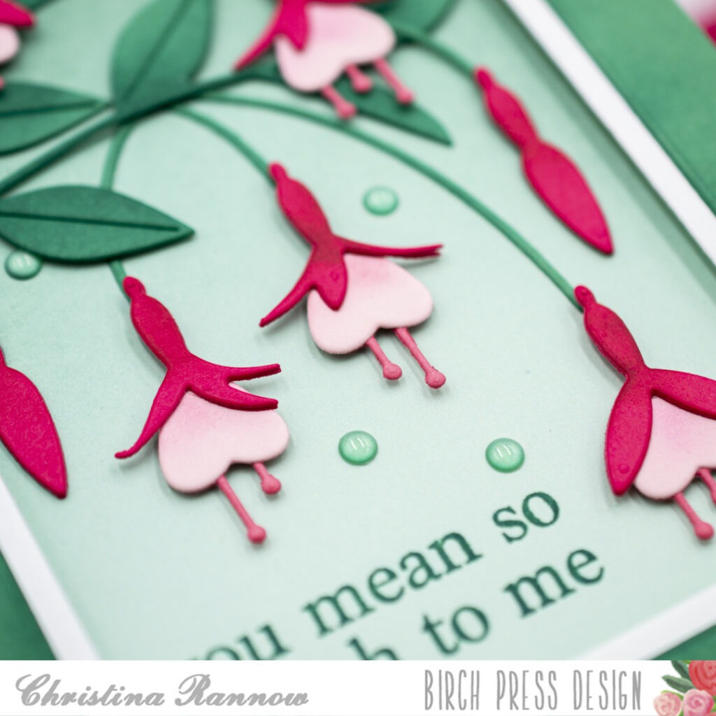
I started by die-cutting the fuchsia pieces from colored cardstock. I chose a trio of pinks for the blooms and a vibrant sea green for the leaves. Before layering and assembling the pieces, I added shading to each piece with a darker coordinating ink color using a small blending brush. After assembling them, I set them aside while I worked on the background panel.
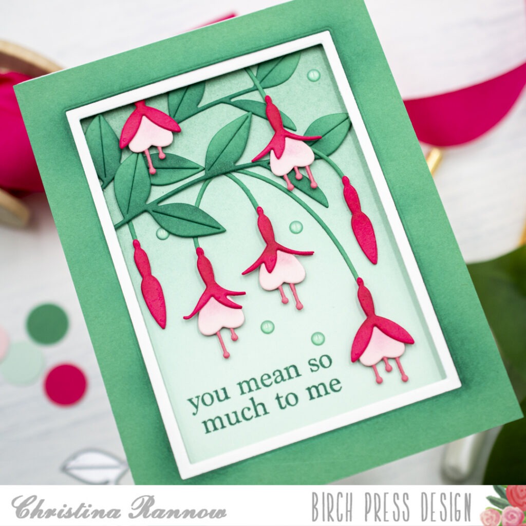
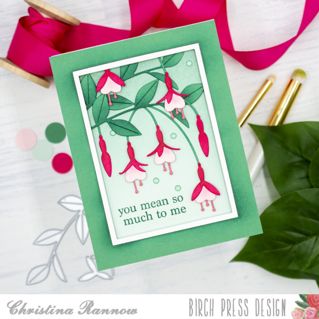
For the background panel, I started with a mint green A2-sized piece of cardstock. Then I blended in a darker sea green color on just the top half of the panel. Next, while leaving space for the sentiment, I played around with the arrangement of the fuchsia blooms and greenery until I liked the layout. Before securing the die-cuts to the background panel, I first stamped the sentiment with a coordinating green ink. Then I secured the die-cuts with either glue or, for added dimension, thin foam squares. I left the space around the perimeter of the background panel free of die-cuts so I could add a frame. I ended up having to trim just a couple of stems and the top of a bloom to accommodate the frame.
To create the look of a matted frame, I used two basic nesting rectangle dies. I die-cut the larger one from sea green cardstock and the smaller one from white cardstock. Before layering these together, I blended a darker coordinating ink color around the inside edge of the sea green frame. Then I popped up the layered frame on my card front using foam tape and attached everything to a top-fold card base. The finishing touch was to add a few translucent green embellishments.
Thank you for reading about my elegant card design featuring the graceful Block Print Fuchsia Spray die set. See you again soon!