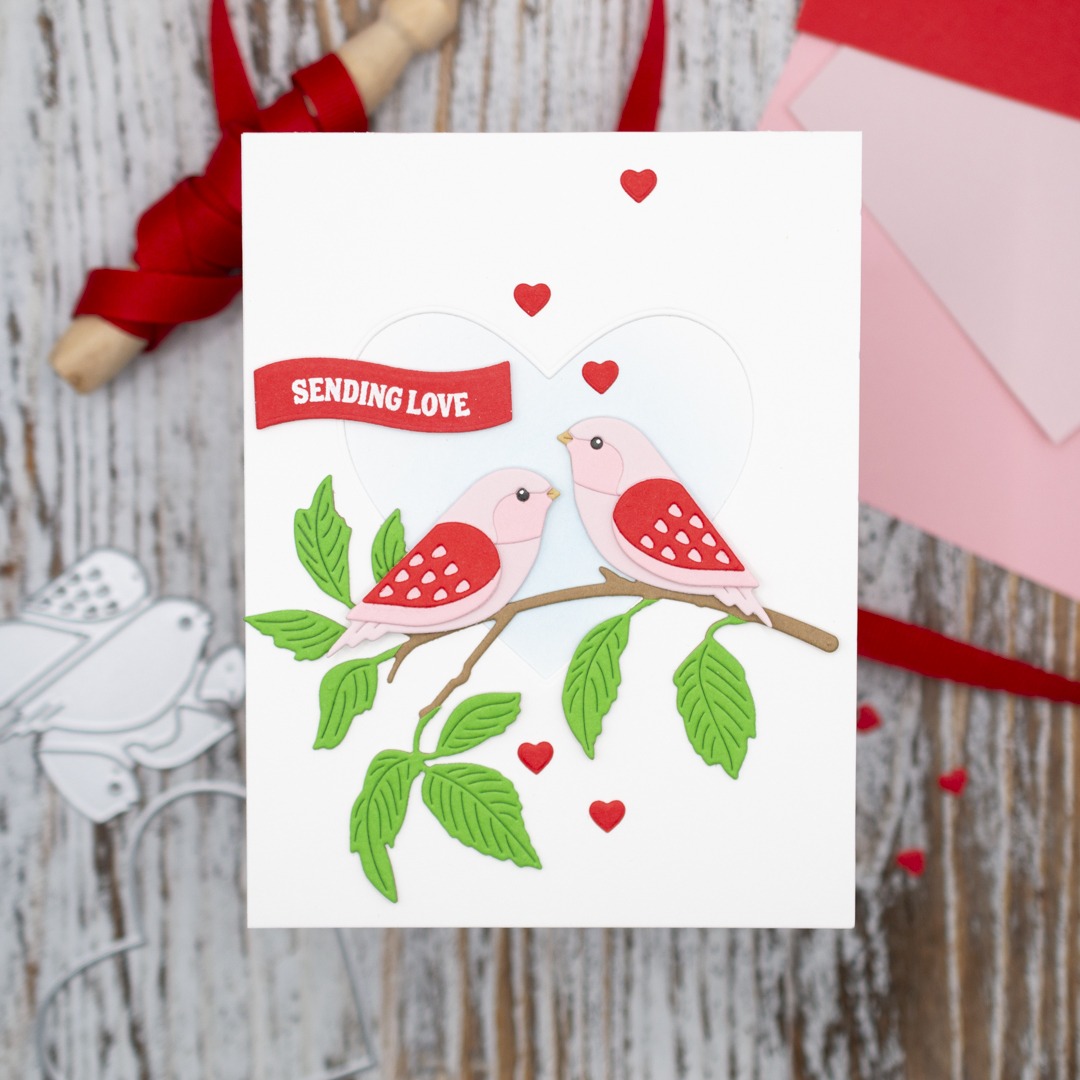
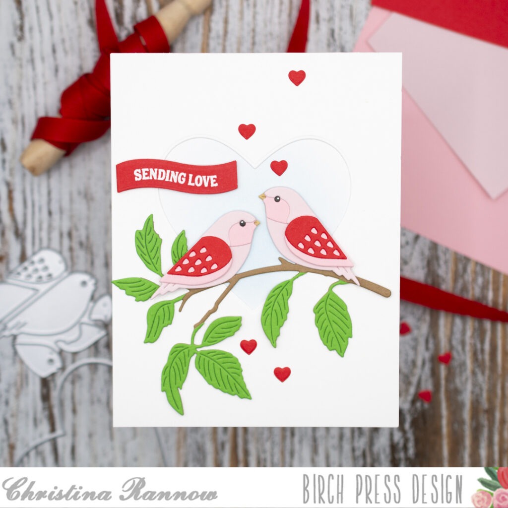
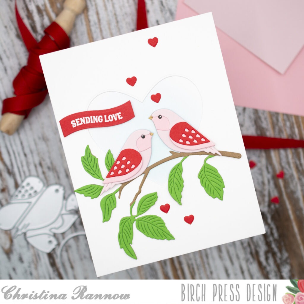
Hi friends! Christina here to share a charming Valentine’s-themed card featuring the sweetest pair of lovebirds. These cuties are part of the latest release and are from the Block Print Bird Duo die set, and since we are coming up on Valentine’s Day, I decided to make them pink and red lovebirds. I have them perched on a branch and framed by a simple heart die-cut from the background panel. Let’s take a look at how this lovely card design came together!
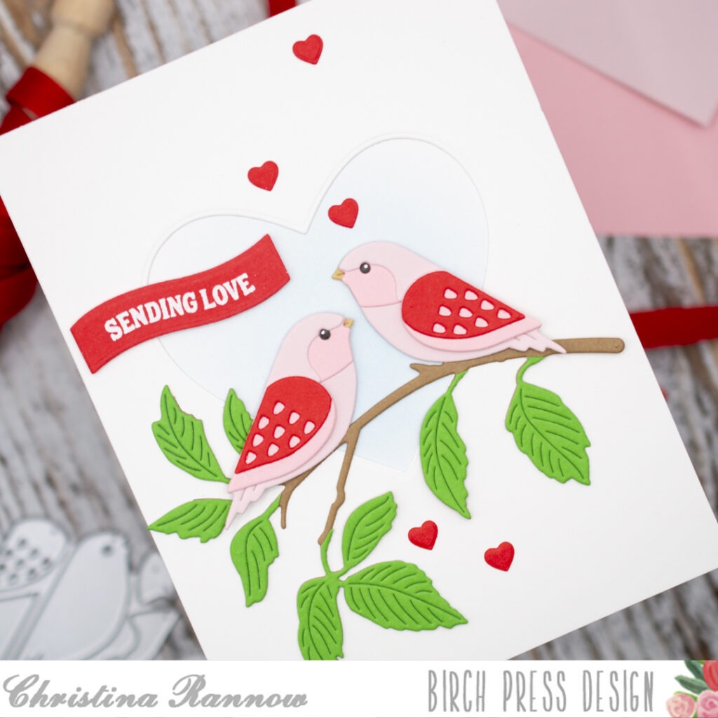
My first step was to die-cut the components for the sweet little birds. I used red and two shades of pink cardstock for the main body pieces and a khaki color for the beak. I assembled the birds using glue for most of the pieces but used thin foam squares for the wings. I die-cut the eyes twice from dark gray cardstock and stacked them for a little dimension before gluing them in place.
Next I die-cut the pieces for the Abundant Branch from green and brown cardstock and then assembled the branch using glue.
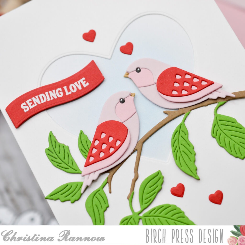
With most of the elements completed, I moved on to the background panel. I used the heart from the Block Print Garden Heart set to die-cut the shape from the center of a white A2 cardstock panel. Then I lightly inked the center of another A2 white cardstock panel with Tumbled Glass Distress Ink before layering the heart panel on top. This created a heart-shaped window for the lovebirds to be perched against.
My last steps were to bring everything together and add a sentiment. First, I attached the branch across the panel near the bottom of the heart. Then, using thin foam squares, I attached the bird duo so they were perched on top of the branch. Next, I heat-embossed a sentiment from the Poppy Stamps Sentimental Banners on red cardstock with white embossing powder and die-cut it using a small wavy banner die. I added the banner to my card front along with some small red heart die cuts that I got from the Poppy Stamps Hearts Shining Arch die set.
Thank you so much for checking out my Valentine’s Day card design with the sweetest pair of lovebirds that I created using the new Block Print Bird Duo die set. See you again soon!