
Hi friends! I hope your week is going well for you! Today I’m going to share how to find inspiration for your cards using a Color Mood Board!!! I have been using color mood boards for a few years now, and it never lets me down! It will take the most basic card and bring it to next level genius! Colors emit a powerful message, so I encourage you to use them whenever possible!
Below is the color mood board that I used for my card in this blog post. This was inspired by my fellow design team member Crystal Komara, who shared it on her social media. I instantly fell in love with the colors and decided to use it for today’s card! The color combinations are glorious for this time of year!
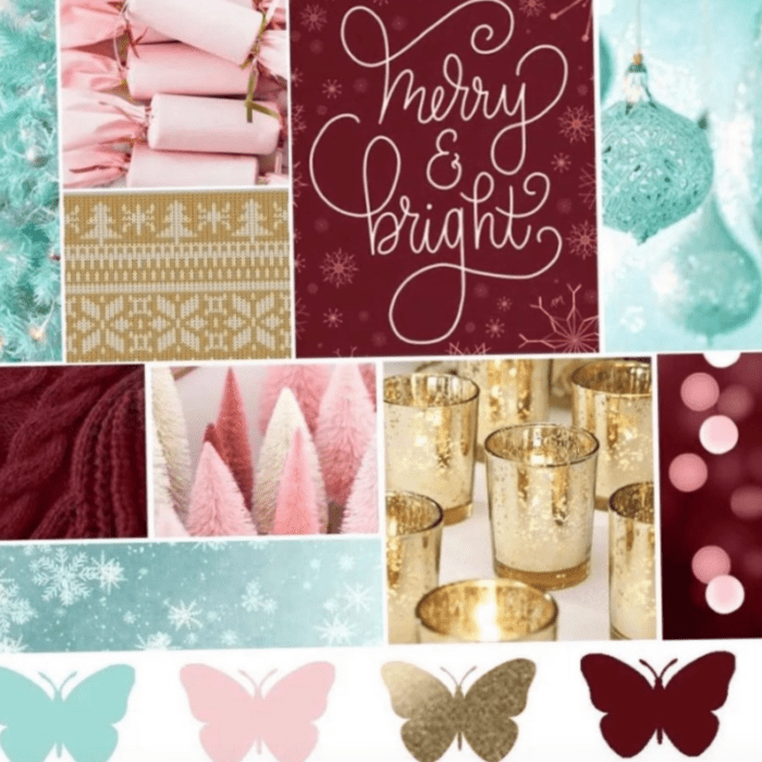
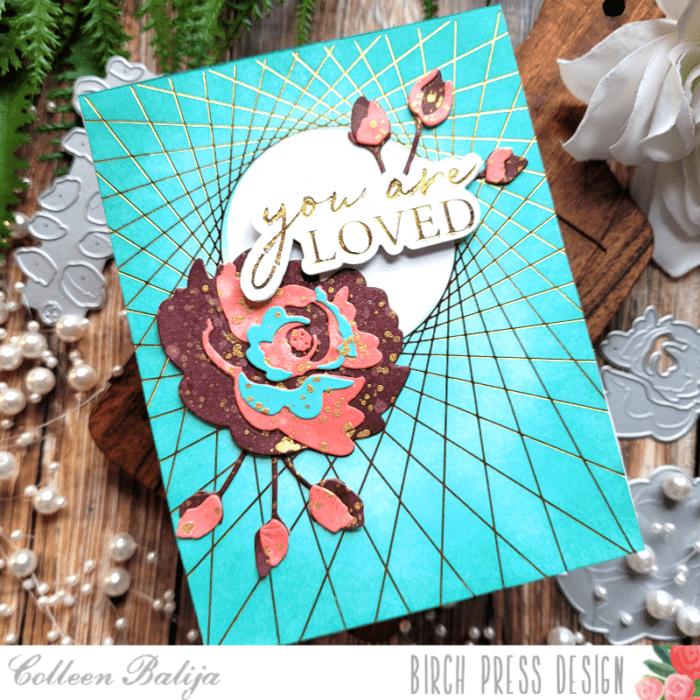
I started with String Art Frame Hot Foil plate in gold, channeling the gold in the color mood board. Then I added teal shading over the hot foil, again inspired by the color mood board. Already we’ve got 2 colors used!
Now it was time to work on the focal point! Using the NEW Morning Rose & Triple Buds Contour Layers die, I chose the burgundy, coral, and teal colors from the Color Mood Board to apply to my flowers and buds. This is a layered die set, so 3 colors were perfect!
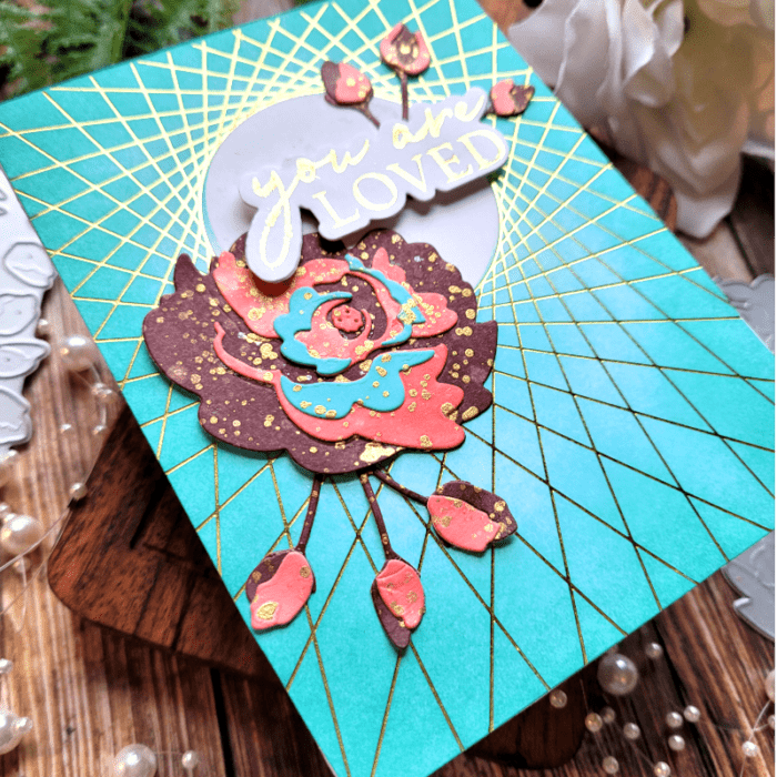
In the photo below, you can see the details in my flower and buds! Let me explain how I achieved this look.
I swiped burgundy and coral inks directly onto white cardstock. Then I sprayed the ink to lift up some of the ink with water. Next, I added gold paint splatters over both colors and allowed it to all to dry. Once it was dry, I die cut my floral layers and buds. The darkest burgundy color would be the 1st layer (the one furthest away from the eye), coral the 2nd layer, and teal the top layer. Then I adhered my layers together. I added a bit more of the gold splatter once everything was adhered together.
TIP: Birch Press Designs does an amazing job of helping you layer these contour dies! They emboss the image that needs to be layered next over the other image. All you have to do is line it up and adhere it! I love how easy it is to do!
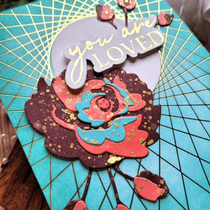
Next, it was time to put everything together on my card panel that I had created earlier.
You can see in the photo above that I left the inner circle of the background panel white. This will help draw the eye to the focal point and it leaves just a hint of white space. There is something about white space that grounds everything!
TIP: I “stage” everything before adhering it down, just to be sure that my design items are exactly where I want them! Once I have it where I want, then I begin to adhere everything using liquid glue. Liquid glue provides wiggle room to place the design item in the exact right spot!
I adhered the flower and one of the buds to the lower left corner of the white circle, and then added the NEW You Are Loved Noted Script hot foil plate to the upper right of the circle, tucking the 2nd bud behind the sentiment. For the You Are Loved Noted Script sentiment, it comes with a coordinating die cut, so I die cut it 3 times and adhered it together to give the sentiment some pop!
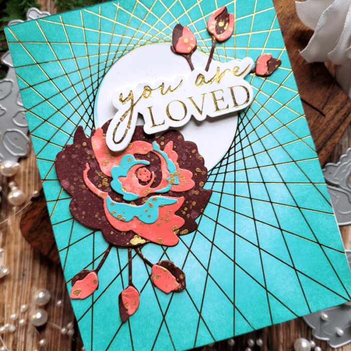
Here is one more look at the finished card. Notice how all the colors from the mood board were used? Color Mood Boards are made to work cohesively, so you won’t go wrong using one! You can find color mood boards just about anywhere – from social media (like Crystal’s) to googling it! One other source that shares a variety of mood boards is Sarah Renae Clark. You can find her on Instagram!
I’m so glad you joined me today! I hope that you found inspiration and use a color mood board to bring your cards to life!!!

Supplies


