
Hi friends! Today I want to talk about how to add texture to white space! I find it difficult to not fill my entire card up with design elements and color! But, when I make a card like this one today, I’m so glad that I allowed the white space to shine through! I forget how pretty a card with a white background can be!
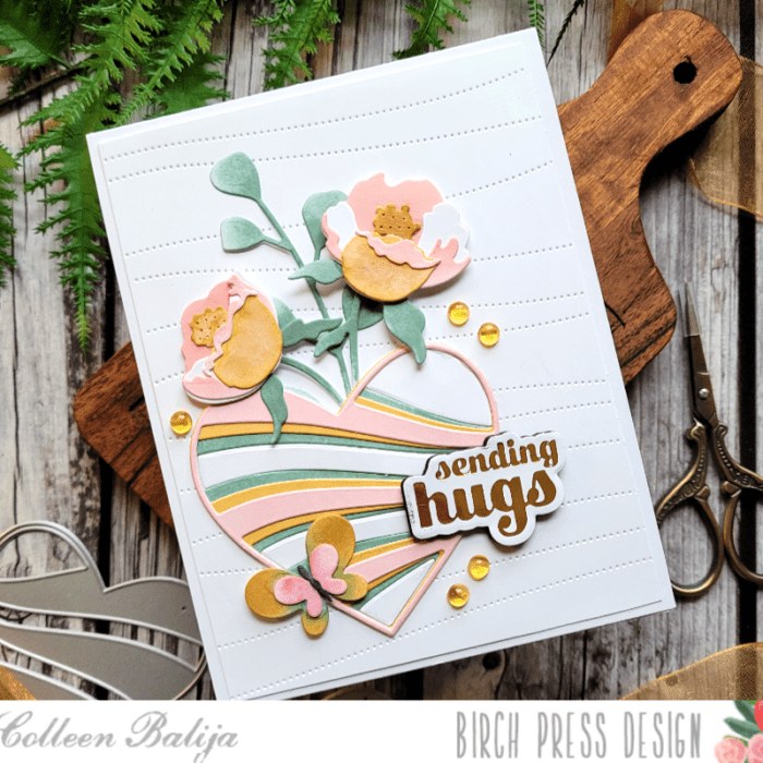
Adding texture to white space is easy to do with a die cut! Die cuts add texture without adding color. For my card, I die cut the Pinpoint Contour Plate onto an 80 lb 5.5×4.25 white card panel. Then I trimmed the panel down and adhered it over a 5.5×4.25 white card base so that the white card base peeked out behind the die cut card panel. Already we’ve got texture and dimension!
Next, I added my focal point to the white space using Banner Hearts layering dies. I die cut all 3 layers and then ink blended each layer in soft shades of pink, golden yellow, and green. I kept the colors soft so they blended with the white background. I also die cut Plate C in white and set the inside pieces aside for later.
I wanted to add some design elements around the heart to frame it. So, I die cut Prime Peony Duo Contour Layers, Eucalyptus Stem and Berries (just the leaves), and Simply butterfly Contour die and ink blended each layer using the same colors as the Banner Heart. I decided to place everything in the lower left corner of the card panel so that the white space would surround my focal point. I adhered the flowers first and then the heart next. I added the white pieces from Panel C in the heart so that the heart was a solid piece (I didn’t want the background card panel peeking through and competing with the heart). You can see the details in the photo below.
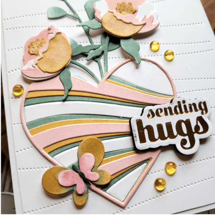
The final step was to add the sentiment and a few gold sequins. My sentiment is the Sending Hugs hot foil plate and die cut. I foiled it in gold and die cut it 3 times so that it would pop off the page a bit for dimension. The flowers are popped up on foam tape as well to add dimension.
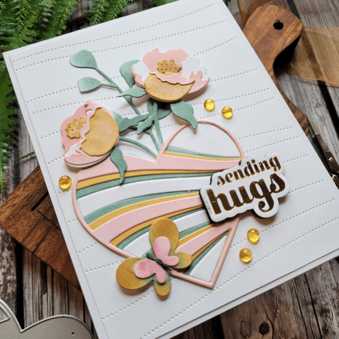
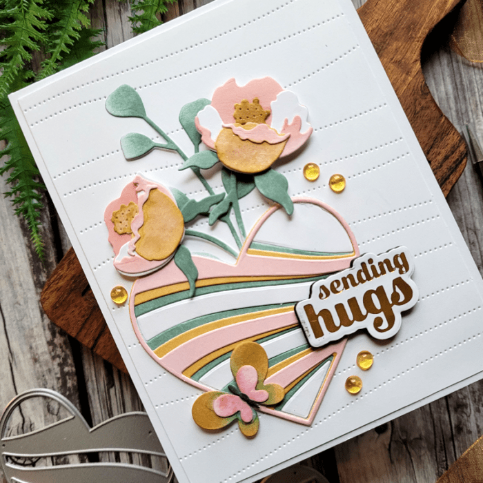
Let’s take one final look at the card below and see how the white space works for it. This card has a lot of white space in it, but the texture from the Pinpoint die plate adds interest and texture without adding color. The colors in my focal point are soft enough that they don’t steal the show from that beautiful white space. And the positioning of the design elements allowed the white space to surround the focal point nicely. What do you think?
I hope that you will play around with using white space to your advantage in your cards! The key thing is to know when to stop and allow enough of the white space to shine through! One thing that helps me is to pause a few times in the process to look at the card’s progress, and even take photos of it!

Supplies


