
Hi friends! Big hugs to you as the shelter in place continues! I hope you’re all safe and healthy and have all you need. Today I’m playing with the new Midnight Mandala stencil.

This technique is fun and easy and I hope you give it a try. All you need is a stencil, distress ink, glitter and glossy accents.

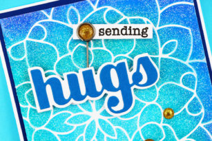
You can tape your stencil in place but if you want to treat yourself, invest in a can of Pixie Spray. It holds the stencil firmly in place and lifts off easily – no more tape and you’re hand’s free. I inked the stencil in ombre shades of blue distress ink.

I love the shine of glossy accents and the sparkle of glitter so I mixed them together and spread the mixture thinly and evenly over the inked stencil. When you’ve got complete coverage gently lift the stencil and wash it immediately with warm soapy water.

Just look at all that sparkle and shine!

I didn’t want to cover up these pretty shades of blue so I added a simple sentiment – the Big Hugs Sugar Script adhered with adhesive foam tape and a stamped “Sending” from the Memory Box Cherry Blossom Wreath tucked in a Tim Holtz Trinket Pin.

Easy right? I hope you’ll give this a try! You’ll love the raised texture that reminds me of embossing!

Supplies