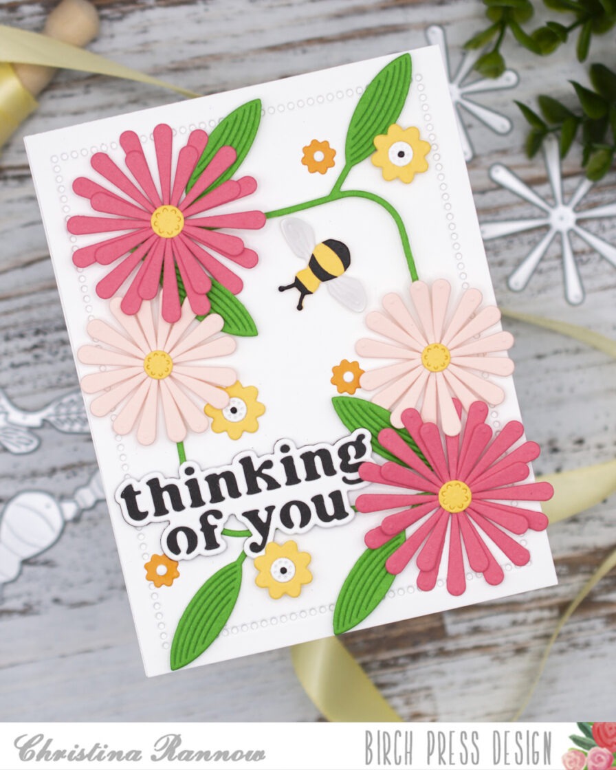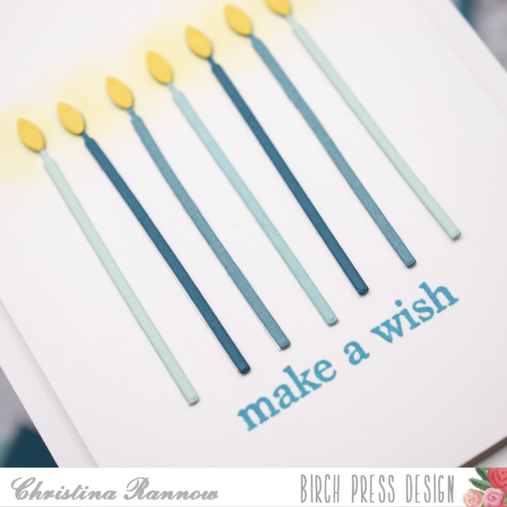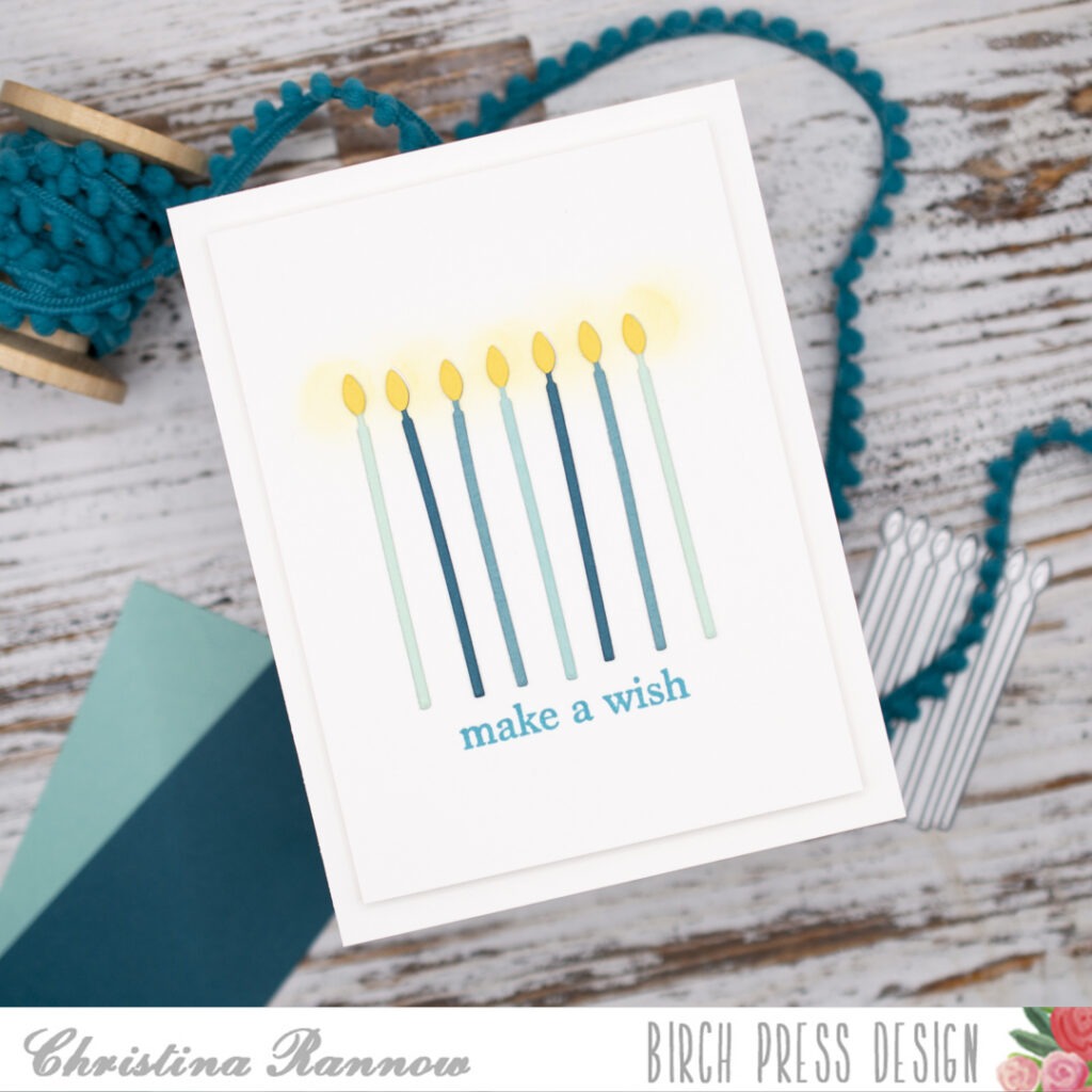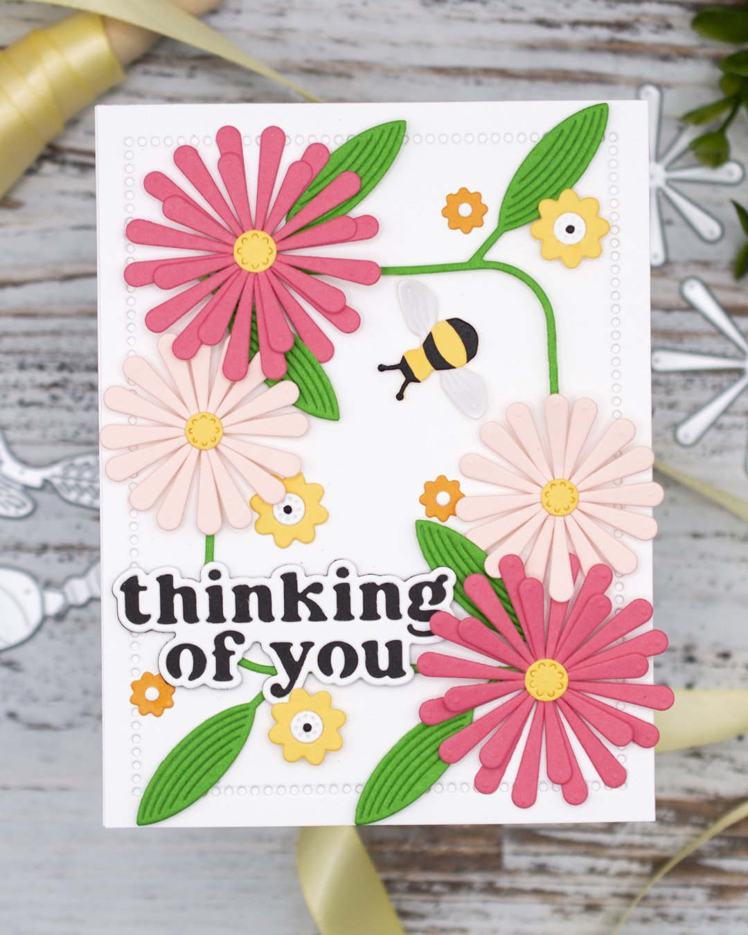
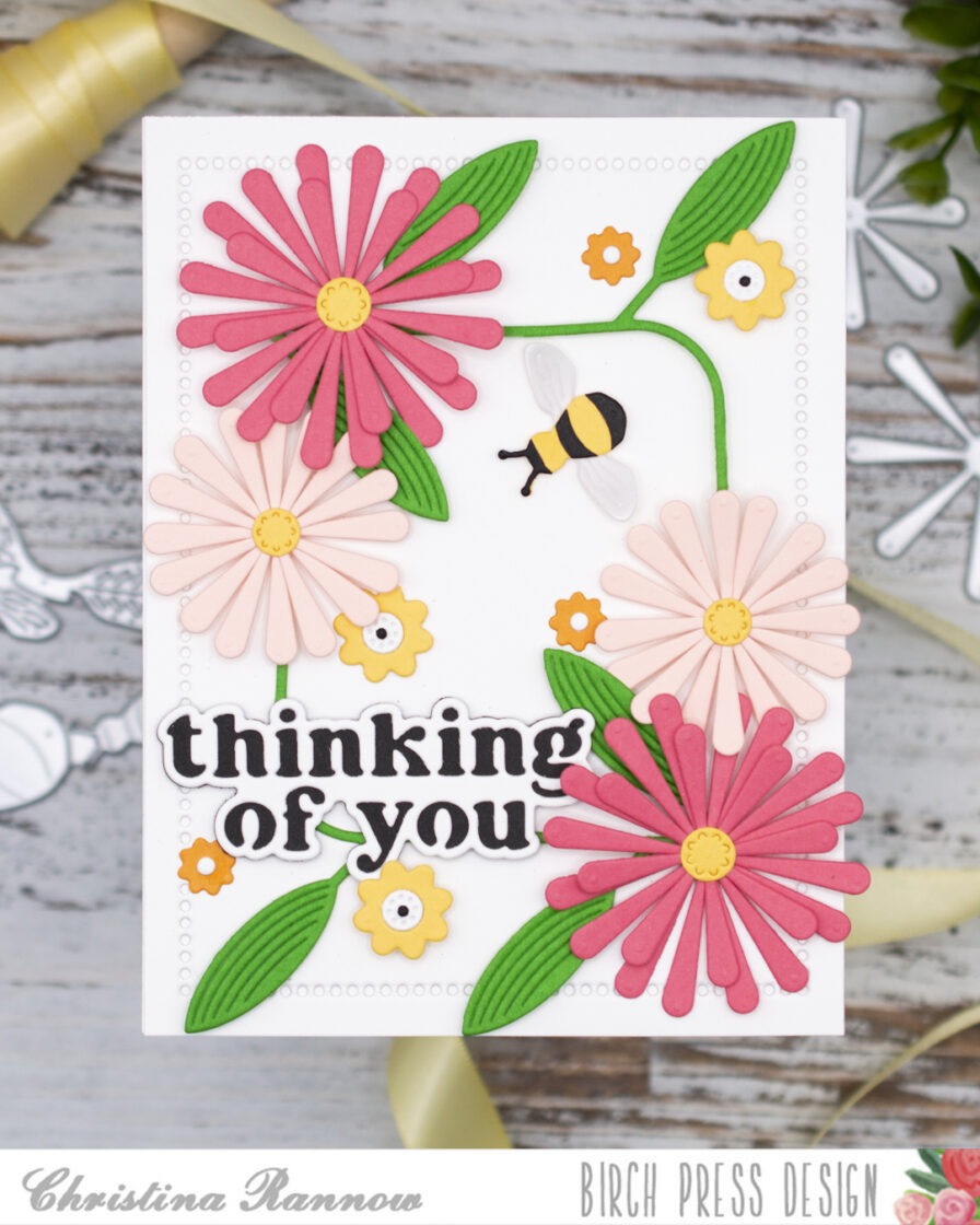
Hello, it’s Christina! Spring has sprung, and I have a bright and happy card to share with you featuring the new Block Print Daisy Flower craft dies. I love that you can layer up the daisy petals to get full, beautiful blooms with plenty of depth and dimension. I combined the daisies with some more new goodies, the Mod Branches and Thinking of You Vintage Sentiment craft dies. And to round out this bright and happy card design, I added a small Buzzing Bumblebee and a few smaller flowers to complement the daisies. Grab your favorite cardstock colors and we’ll get started!
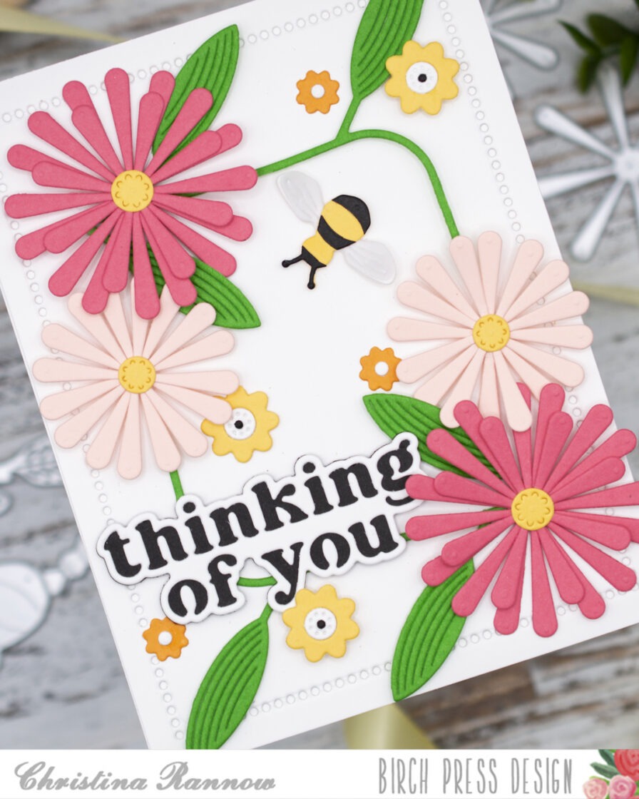
I started by die-cutting all the components for the different elements of my design and then assembled them, securing everything with glue. I chose a pale pink and a salmon-colored cardstock for the daisy petals and a buttery yellow and an orange for the smaller flowers. For the Mod Branches, I chose a bright cilantro green cardstock, and after die-cutting two of them, I snipped a few leaves and berries from the branches, leaving me with just a few leaves on each one to accent the daisies. I decided on black cardstock for the sentiment because it coordinated with the bumblebee, tying everything together.
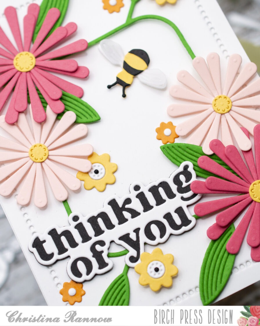
With all the die-cutting and assembling done, it was time to put everything together. I kept the background panel simple and used plain white cardstock that I die-cut to give it a dotted detail around the edges. Then I placed the Mod Branches on the panel so they formed a natural frame and added the big beautiful daisies to fill in the corners. I placed the sentiment along the bottom and then embellished my design with the smaller flowers, scattering them throughout, and the sweet bumblebee buzzing into the scene. The final step was to attach the card front to a side-fold card base.
Thank you so much for checking out my bright and happy card design featuring the new Block Print Daisy Flower craft dies! Happy crafting!