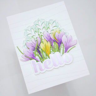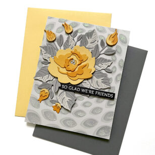
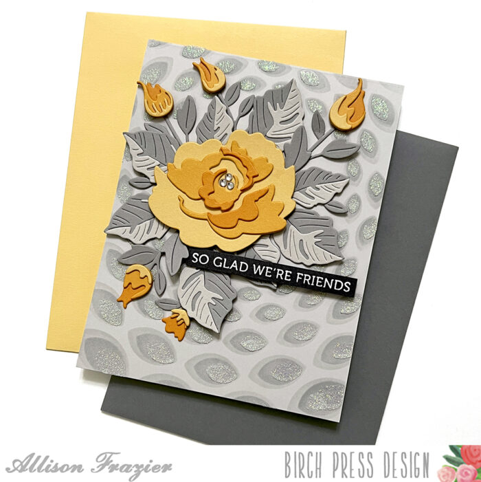
Hello, Birch Press friends! Today, I am sharing this beautiful muted card with a pop of sunshine yellow as the focal point. It’s like when the sun comes out after a dreary winter day! It features the new Morning Rose Contour Layers die and the Delicate Floral Buds Contour Layers die set. I also used the new Gilded Petalpoint Stencil Set.

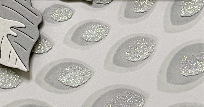
I started by stenciling the front of a light gray A2 card base. For the first stencil (with the largest openings), I used a light gray ink, just slightly darker than the card stock itself. For the second stencil, I used a medium shade of gray ink. And for the third stencil, I used clear Nuvo Glimmer Paste. I really love the tone on tone effect, but that Glimmer Paste really makes it special. This stencil actually matches up with the new Gilded Petalpoint Hot Foil Plate, but as you can see here, it looks great on its own, too!
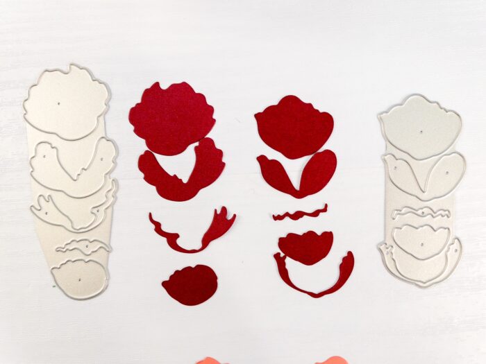
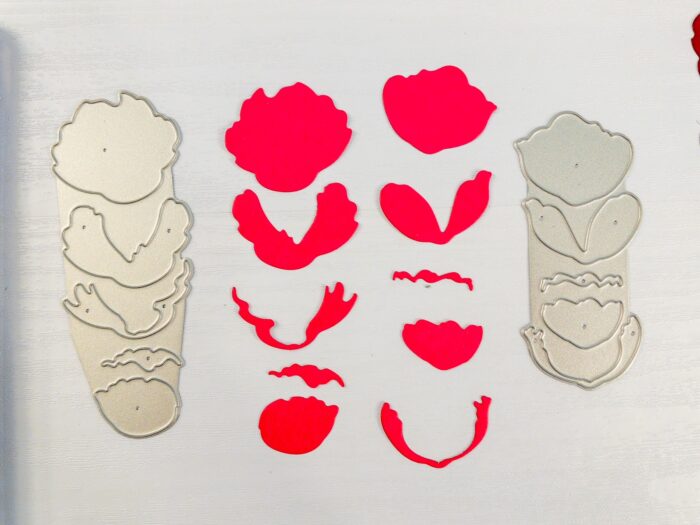
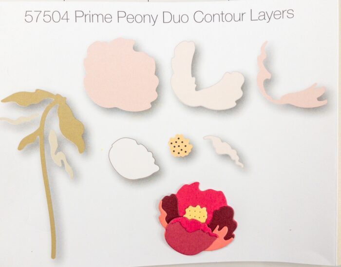
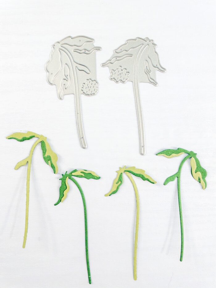
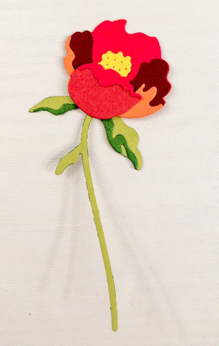
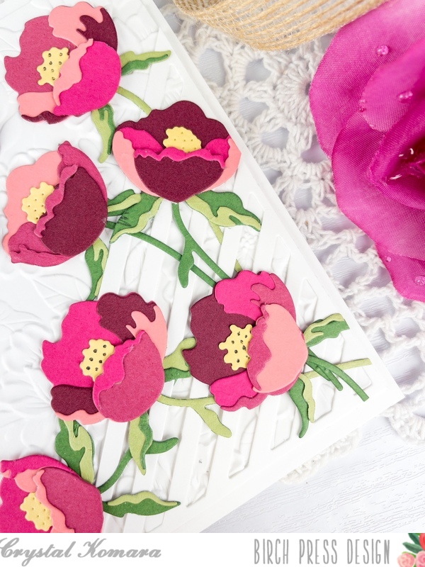
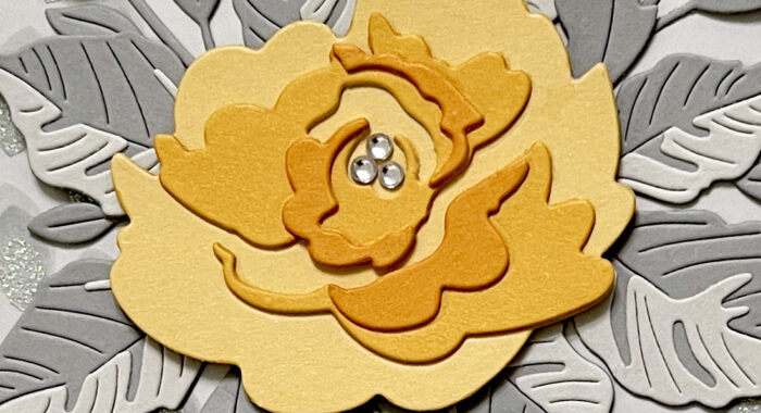
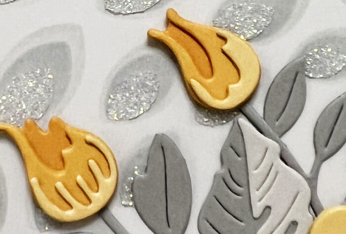
Next, I started making my die cuts. I used three shades of yellow card stock from the Memory Box “Sunny Orange” paper pack for the flowers. For the main flower, I cut two layers of each part of the flower so that I could stack them for dimension. I used two shades of gray for the leaves. By the way, the leaves come from the Tropical Hibiscus Contour Layers set. I love mixing florals and leaves from all of the different Contour Layers sets!
And speaking of mixing up florals, I used the Delicate Floral Buds for my little flowers, again making two layers of each part of the flower. The Morning Rose actually comes with the “Triple Buds” dies, but I just wanted to mix things up today. I cut the stems/leaves for the Delicate Floral Buds from the darker shade of gray paper.
Once I had all of my elements cut and the layers stacked, it was time to assemble the arrangement. This is probably the part that took the most time! Once I was happy with an arrangement, I started with the bottom by glueing the Delicate Buds first. Then I popped the main flower up on foam tape. This allowed me to then tuck the leaves in under that flower and still continue to make some last minute changes to the leaf arrangement. I finished the card by heat embossing a sentiment from the Lingo Thanks stamp set. I also added three fairy jewels to the center of the rose, just to tie in the shine from the stenciled background.
Thank you so much for joining us today. I hope this card inspires you and brings a smile to your face!
Wishing you a crafty day,
Allison

Supplies


Supplies