 Hello Everyone!
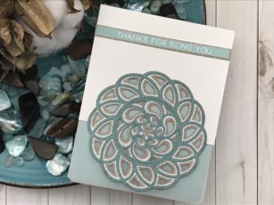
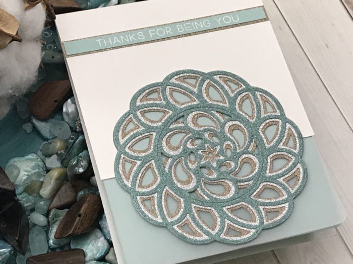
I am back with another project using the Splash layering die set! This die is just perfect for all occasions and I thought it was perfect for a thank you card.
To match the movement this die creates I just knew I had to have soft shades of shimmer papers from my stash. I used shades of pool, silver and beige for my design and the inside of my standard A2 (4 1/4 inch x 5 1/2 inch) size card.
I cut a 2 inch section from the front of my card base so my focal image would extend off the front of my card and adhered a piece of velum and pool card stock to the inside.
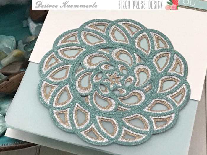
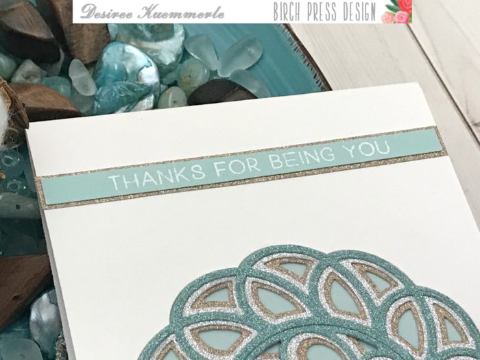
I used a simple sentiment from the Best Friend stamp set and heat embossed it in fine detail white powder. Framed it using my beige shimmer card stock and added to the top of my card.
If you want to see more details just click on the video below and see our project come together step by step!
I hope you enjoyed today’s project… Make sure you stay tuned for more wonderful projects coming soon! Have a great day and always remember… Be Creative!

Supplies


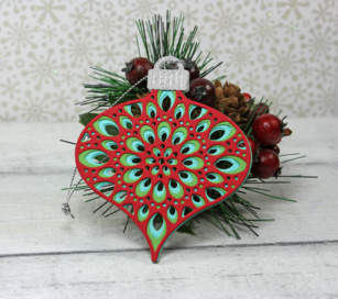
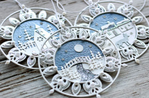
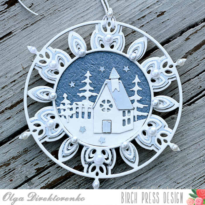
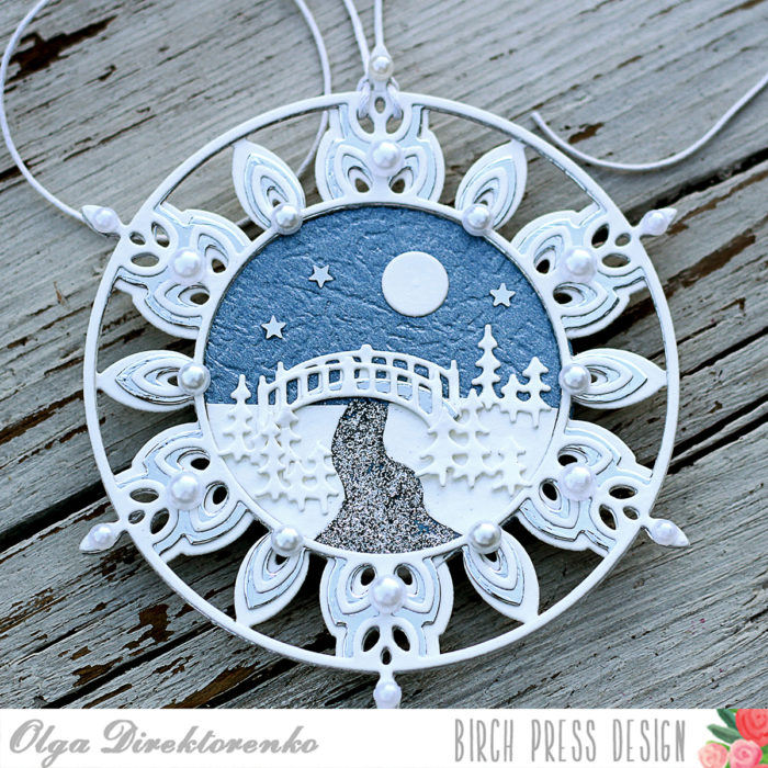
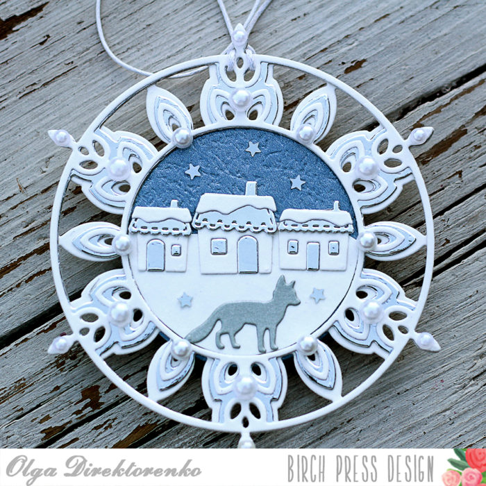
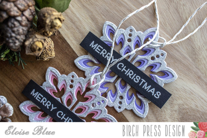
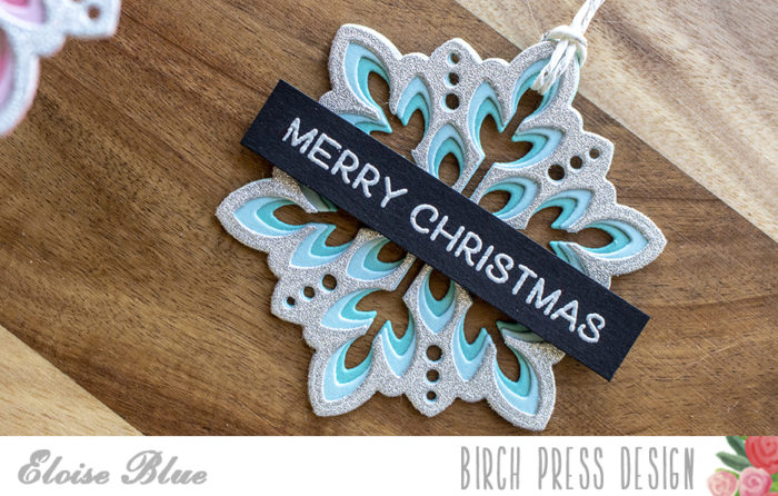
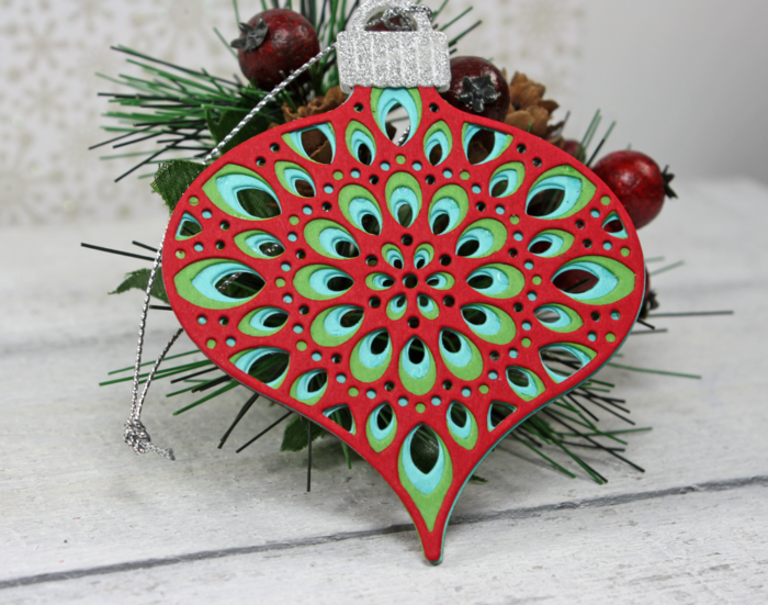 Thank you for coming by today for a little more Birch Press inspiration! Birch Press Design is participating in my
 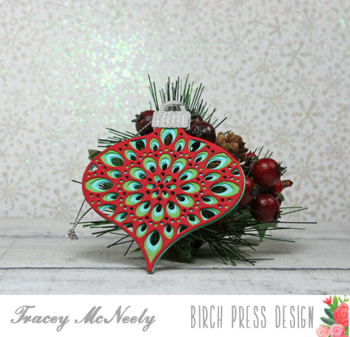 I have a short showing you how I created the ornament.
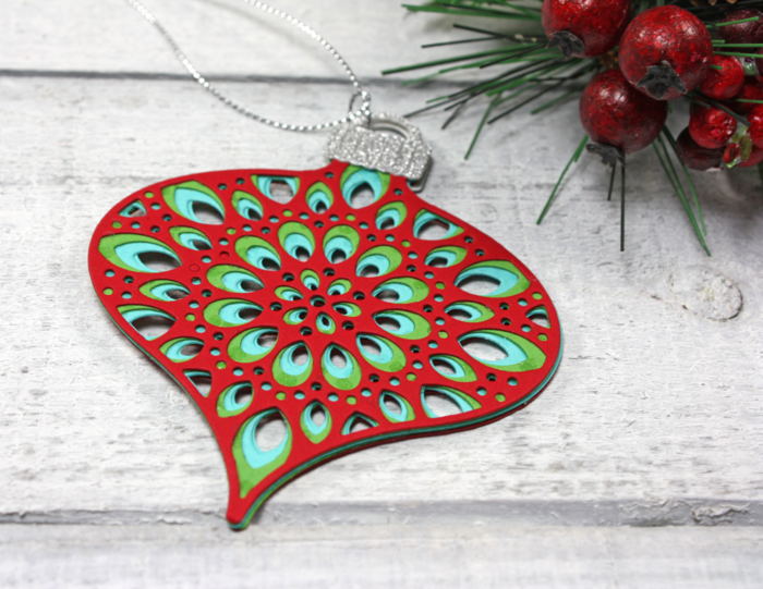 To make the double sided ornament you want to glue the back of one ornament to the back of the other ornament so that it mirrors the front and the back is identical to the front. Next the two ornament holders that were cut from silver sparkle paper were glued to the top of the ornament, both front and back making sure they lined up with one another. Again the beauty of using liquid adhesive.
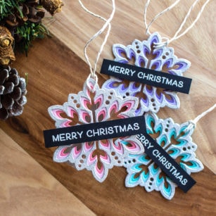
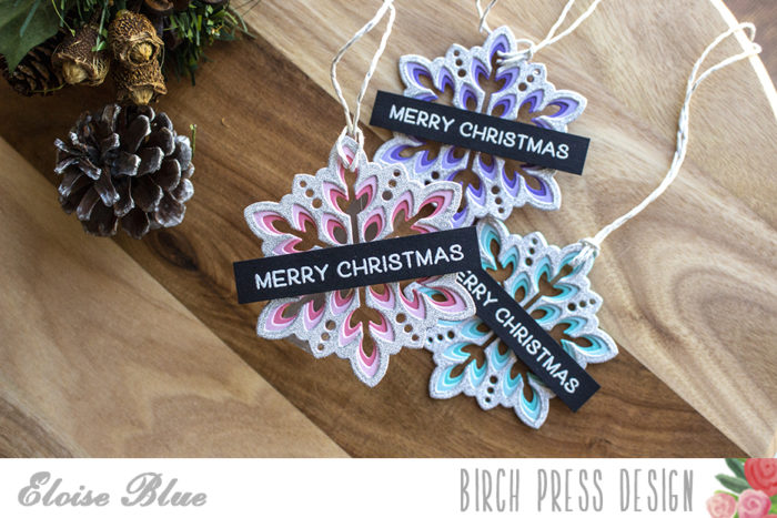
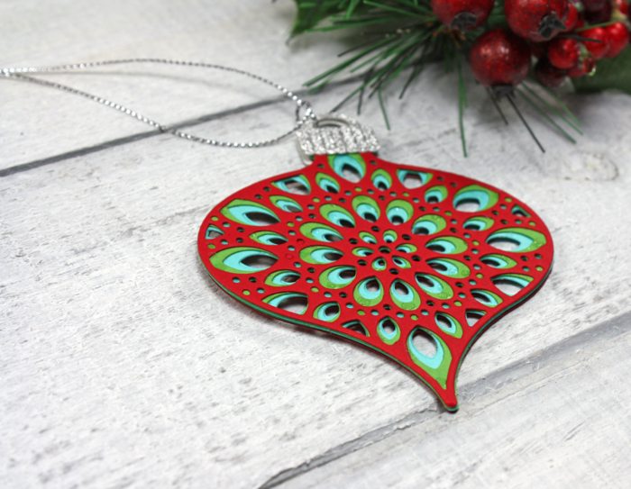 A few of the Birch Press Design team members have created tags for Day 7 of my
  Your double-sided Christmas tree tag can be taken off the parcel and added right to the tree. Thank you so much for stopping in today and creating with me today!


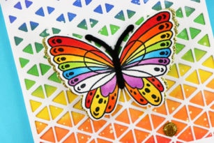

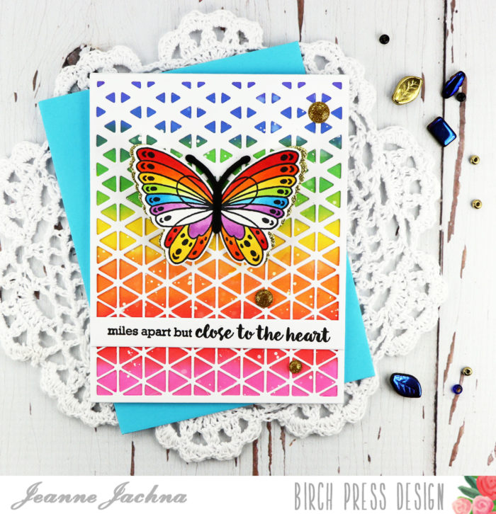
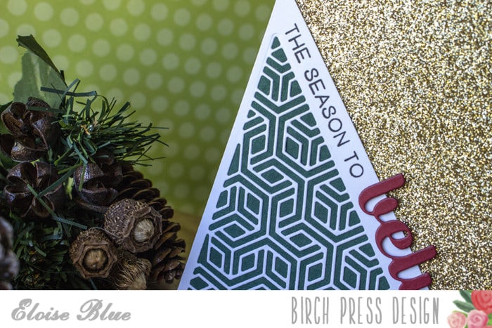
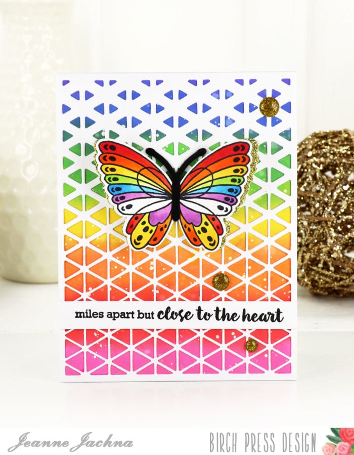
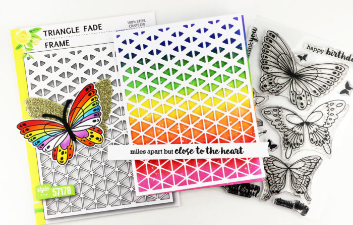 I topped the panel with the Triangle Fade Frame cut from white card stock. I love the fresh triangles and the gradient pattern.
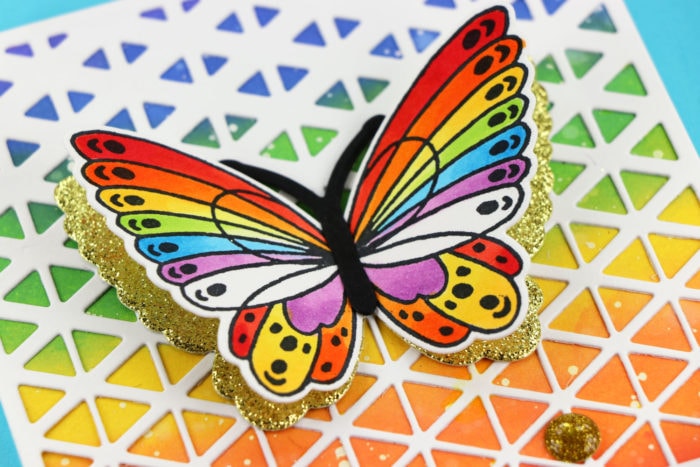
 Wishing you a bright beautiful day!
 Finished Size 4.25 x 5.5″


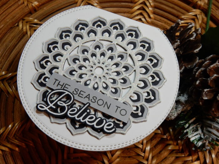
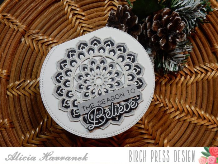


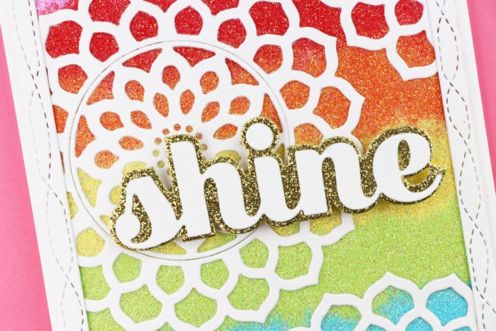
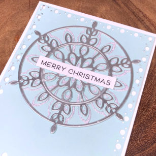
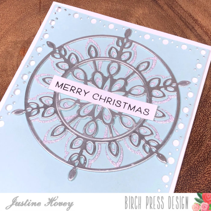
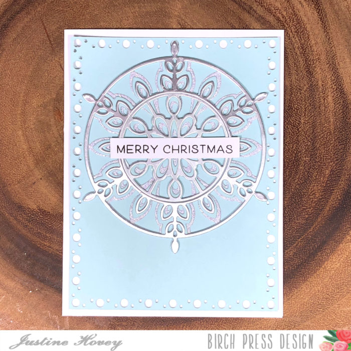
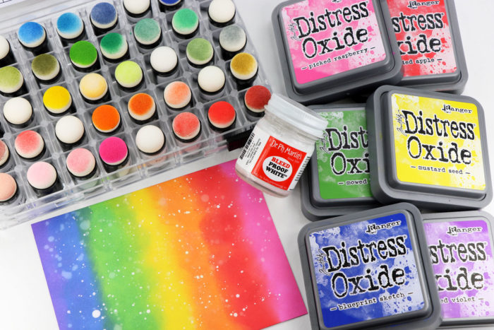
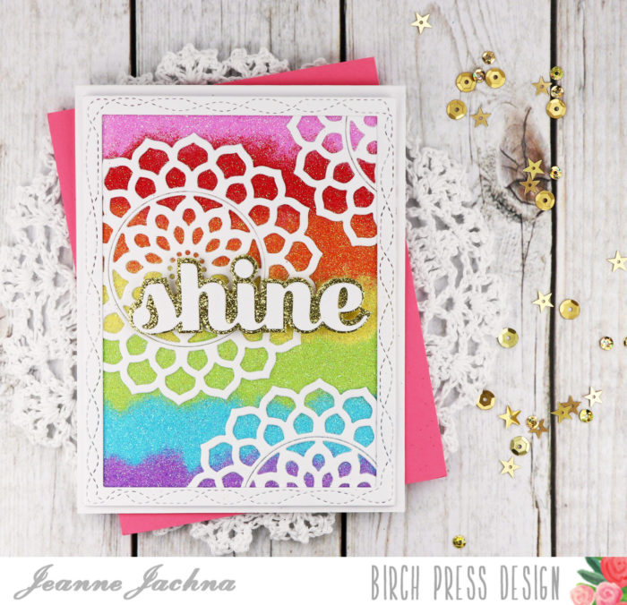 I wish you could see this beauty in person! It looks fussy but was really easy to make!
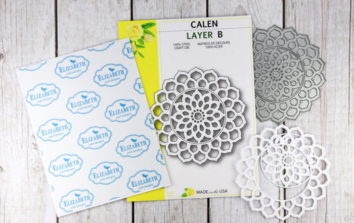 I started by covering a white card stock panel that was slightly smaller than my card base with double sided adhesive from Elizabeth Craft. Next I cut the Calen Layer B die several times and adhered them to the sticky card front.
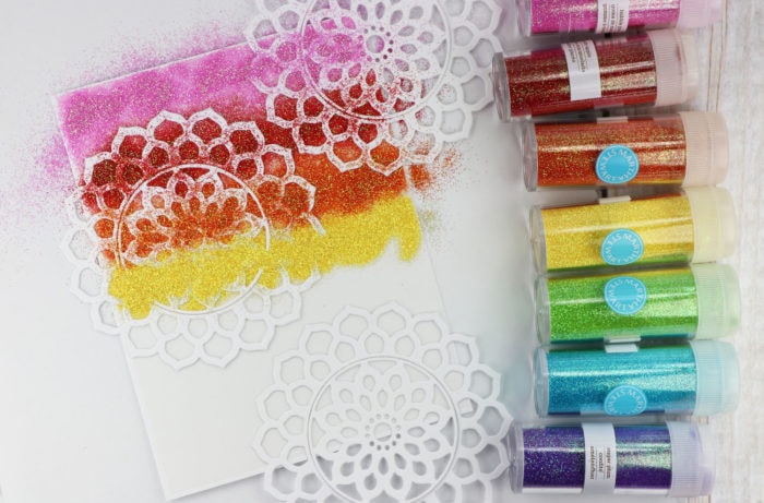
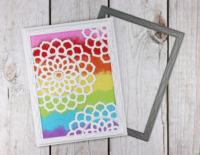 Next I trimmed off the Calen mandala die cuts that were hanging off the edges of the card stock panel and added a Wrapped Stitch Frame die to give the edges a clean finished look.
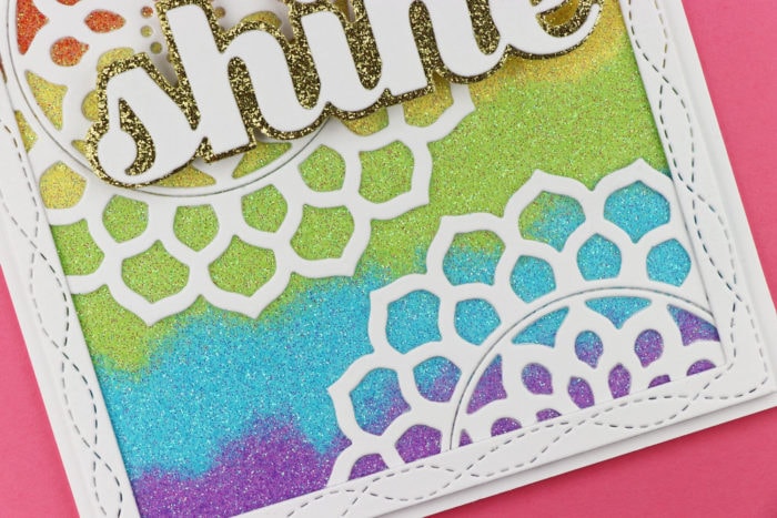 The blended glitter has a funky look that is so fun!
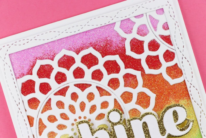 The finishing touch was the Shine Sugar Script sentiment. I cut the base from gold glitter paper and the detailed letters from white card stock.
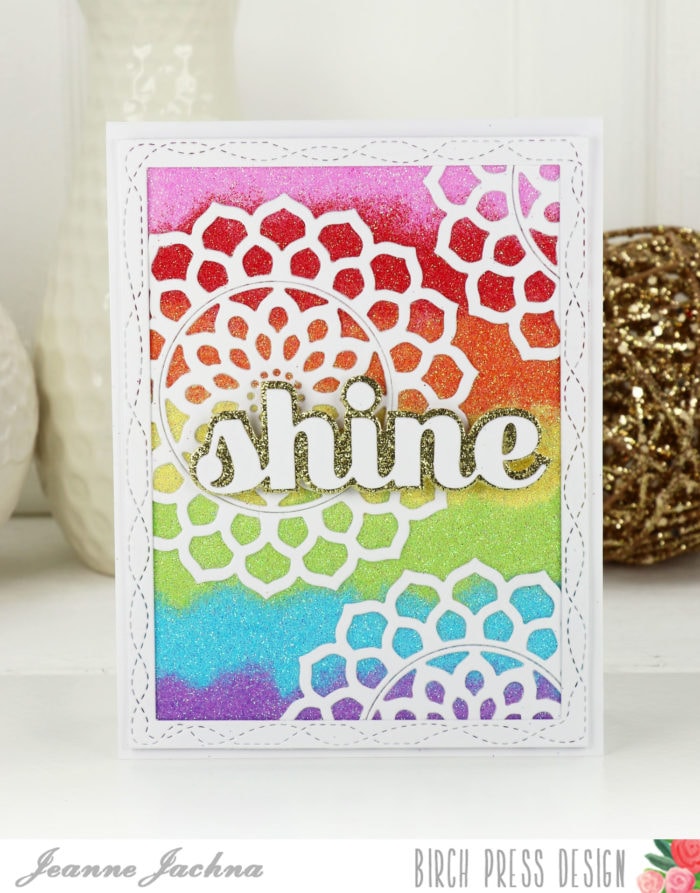 I’m sending this card to my daughter to remind her that she’s always a star to me! And what do stars do? They shine of course!