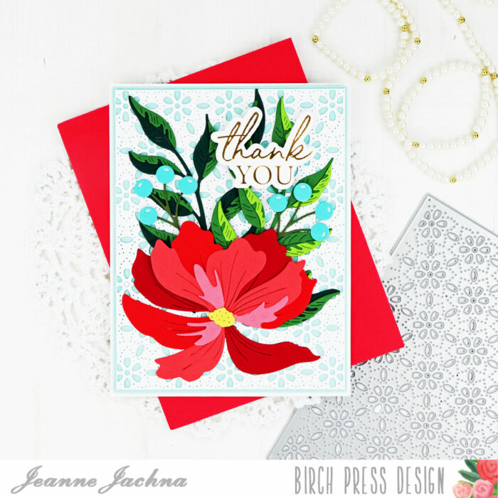
Author: birch press

  • How to Add Texture to White Space on Your Card | by Colleen Balija

    How to Add Texture to White Space on Your Card | by Colleen Balija

    Hi friends! Today I want to talk about how to add texture to white space! I find it difficult to not fill my entire card up with design elements and color! But, when I make a card like this one today, I’m so glad that I allowed the white space to shine through! I forget how pretty a card with a white background can be!

    Adding texture to white space is easy to do with a die cut! Die cuts add texture without adding color. For my card, I die cut the Pinpoint Contour Plate onto an 80 lb 5.5×4.25 white card panel. Then I trimmed the panel down and adhered it over a 5.5×4.25 white card base so that the white card base peeked out behind the die cut card panel. Already we’ve got texture and dimension!

    Next, I added my focal point to the white space using Banner Hearts layering dies. I die cut all 3 layers and then ink blended each layer in soft shades of pink, golden yellow, and green. I kept the colors soft so they blended with the white background. I also die cut Plate C in white and set the inside pieces aside for later.

    I wanted to add some design elements around the heart to frame it. So, I die cut Prime Peony Duo Contour Layers, Eucalyptus Stem and Berries (just the leaves), and Simply butterfly Contour die and ink blended each layer using the same colors as the Banner Heart. I decided to place everything in the lower left corner of the card panel so that the white space would surround my focal point. I adhered the flowers first and then the heart next. I added the white pieces from Panel C in the heart so that the heart was a solid piece (I didn’t want the background card panel peeking through and competing with the heart). You can see the details in the photo below.

    The final step was to add the sentiment and a few gold sequins. My sentiment is the Sending Hugs hot foil plate and die cut. I foiled it in gold and die cut it 3 times so that it would pop off the page a bit for dimension. The flowers are popped up on foam tape as well to add dimension.

    Let’s take one final look at the card below and see how the white space works for it. This card has a lot of white space in it, but the texture from the Pinpoint die plate adds interest and texture without adding color. The colors in my focal point are soft enough that they don’t steal the show from that beautiful white space. And the positioning of the design elements allowed the white space to surround the focal point nicely. What do you think?

    I hope that you will play around with using white space to your advantage in your cards! The key thing is to know when to stop and allow enough of the white space to shine through! One thing that helps me is to pause a few times in the process to look at the card’s progress, and even take photos of it!

    Supplies

  • Foil and More Foil | by Toni M Maddox

    Foil and More Foil | by Toni M Maddox

    Hello, Birch Press fans! Toni here with you today sharing a (hot) foil project that could be used for about any occasion: G/Valentines, friendship, encouragement, or just to say hello.

    This is my favorite type of card to make for my stash because I can just grab it and go, so to speak. I’m not sure I’ll be able to send this one away though!

    I started the card by hot foiling the Birch Press Design String Art Frame Hot Foil Plate with one of the new Spellbinders satin pastels hot foils. These are translucent so very subtle, especially on the foiled cardstock front.

    In this case I used the salmon color which coordinated perfectly with the Memory Box Vintage Pastel Mirror cardstock used for the Birch Press Design Morning Rose and Triple Buds.

    I cut out the Birch Press Design Fuddled Leaf from Memory Box Rainbow Reflections Rainbow Mirror cardstock. The Birch Press Design Sugar Script Big Hugs is cut from the pastel pad in a pearly color.

    I love the soft combination of colors, don’t you?

    I hope you enjoyed today’s card and have a great rest of your week!

    Supplies

  • Star Flower Thanks | by April Antonio

    Star Flower Thanks | by April Antonio

    Happy Friday Birch Press friends, and Happy New Year!

    It’s a new year so I figures it’s time to try some new things. Anyone struggle with a certain color? Have a complicated relationship with it? Well, that’s me and the color purple..no not the movie at all, the actual color. Me and purple just never seem to connect —- so, I decided to try it for today’s project.

    I grabbed the new Pinpoint Contour cover plate which I am personally in love with, and cut it out three times: twice from heavy weight cardstock, and once from the creamy purple found in the Rainbow Reflections Mirror Pad. (Flashes of Prince are dancing in my head!).

    As a lot of us in this post-holiday season, I have a lot of thank you cards to send to friends and family, so I thought I could make two cards today from one cover sheet. I took the coversheet I cut from the purple cardstock and chose a point about 3/4 down the sheet and cut right along one of the pinpoint perforations — which helped it cut very easily.

    I then lined these two halves up on top of my white cover sheets to exactly the spot where I had cut it. You’ll notice on one panel I have the purple at the top, and the other it’s on the bottom.

    Next, I saved some time by cutting the all of my flowers using the Star Flowers die from white cardstock, and assembled the flowers, making sure to leave the center (or the stamen) piece untouched for later.

    I also need a title and I really like using the chunky, Thanks Honey Script word and shadow die set. I cut this from white cardstock a few times, and then once from the creamy purple and once from the shiny, metallic purple that is in the same mirror pad.

    For my assembly, I placed the ‘thanks’ along the seam where the white and purple met, and arranged my flowers around this section. Lastly, I can’t resist some level of bling, so I used the Autumn Fairy Crystals to add centers to each flower.

    Thank you for joining me today! I hope you enjoyed this exercise in color exploration with me and that you are encouraged to carve some time from your weekend to get crafty!

    Supplies

    Supplies

  • Rainbow Adornment Dove | By Allison Frazier

    Rainbow Adornment Dove | By Allison Frazier

    Hello, Birch Press friends! Today, I am showing how you can stretch the use out of your products that are typically only thought of as winter or holiday products. My card features the beautiful Adornment Dove die set.

    I love the cutouts in the wing of the detail layer in the Adornment Dove set, and I thought it would be fun to color them instead of discard them. I could have die cut all different colors of paper, but it’s much easier (and less wasteful) to color with markers. I die cut the layer out of white card stock and left the cutouts intact. To make sure they didn’t come loose, I just taped them in place on the back with scotch tape. I then colored each cutout piece with a different color Copic marker. This does look messy, as the colors bleed onto the white border between each cutout, but that’s okay because it will get covered by a clean detailed layer.

    When I was finished coloring the separate cutouts, I glued that layer onto a solid background layer that I had die cut from white card stock. I then glued a clean white detailed layer over the colored layer. For the solid wing and tail feather cutouts, I colored these white pieces by blending some pink, yellow, and light blue markers. After glueing those pieces in place, I added a final detail layer that I die cut from a Champaign colored mirror card stock.

    For my card base, I took a dark teal panel of card stock, embossed it with Layer A of the now-retired Fiori Plate Layer Set, and then splattered it with a light gold paint. I mounted that onto the same color A2 card base. For the sentiment, I cut the Handwritten Thanks Outline die out of the same teal card stock and the detail Thanks die out of the Champaign card stock that I used for the dove. I adhered the sentiment and the dove to the card base. Notice how I purposefully did not glue all of the layers of the tail feathers together. This creates some really great dimension. To finish the card, I added a small jewel as an eye.

    I think this card design can be used all year round, don’t you? Thank you so much for joining us today. I hope this card inspires you and brings a smile to your face! 


    Supplies


    Supplies


  • Blended Banner Heart | By Seeka

    Blended Banner Heart | By Seeka

    Hello and welcome! Seeka here and today I’m sharing a clean and simple card featuring the Banner Heart Layer A die against a background made with the Pinpoint Contour Plate.

    I started off by using foam blending tools to blend Picked Raspberry, Abandoned Coral, and Carved Pumpkin Distress Oxide inks over a small panel of Bristol Smooth cardstock. I used the Banner Heart Layer A die to cut the panel and then used it three more times to cut white cardstock. I stacked and adhered the four outline layers together with the ink-blended die cut on top. Then, I inlaid the ink-blended fallout pieces and used clear tape on the back side of the heart to hold the pieces together.

    Next, I used the Pinpoint Contour Plate to die cut a piece of white cardstock. I trimmed the panel to about 3.75″ x 5″ and then glued the heart to it. To finish, I used foam tape to adhere the card front to light pink 4.25″ x 5.5″ card base and added a sentiment from my stash.

    Thank you so much for visiting!

    Supplies

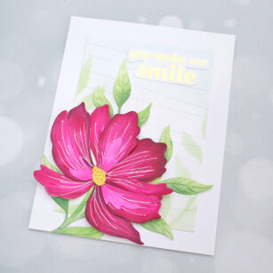
  • Morning Rose and Triple Buds Happy Birthday | By Natasha Vacca

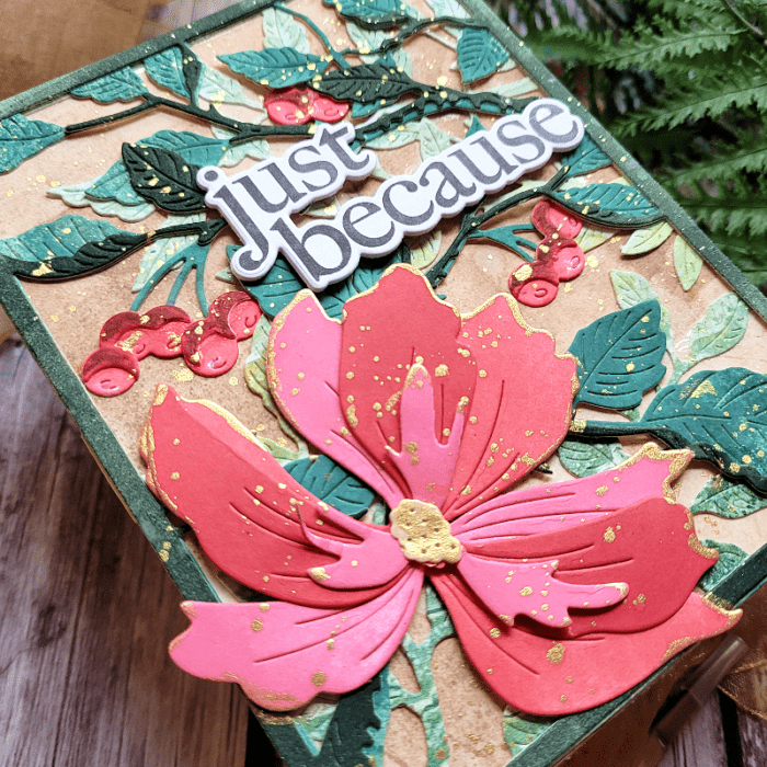
    Hello Birch Press friends I am excited to be back up on the blog today to share two of the gorgeous new die sets with you. I also paired these with a previous release as well! For today’s card I am using the gorgeous Morning Rose and Triple Buds Contour Layers die set. I had a lot of fun on today’s card, so let’s get started!

    I started by die cutting each layer of the rose. I chose 3 colors of pink card stock from the Berry Red paper pad collection from Memory Box. I die cut each layer using a different shade. I had a light, medium, and darker pink shade. I die cut 2 roses and 2 of the triple buds. Next I die cut 3 leaves from the Winsome Rose and Leaves Contour layers. For the leaves and the stems on the triple buds I used card stock from the Lush Green paper pad from Memory Box.

    Once all my flowers, stems, buds, and leaves were die cut I added ink blending to each layer. On the layers I used a combination of Distress Oxide inks and Dye Inks. I used a blending tool, as well a finger blending tool to add ink to the corners. I love the added texture and depth this provides to the flowers, leaves, stems, and buds.

    Next I adhered all the layers together using liquid glue. Once these images are die cut they are so easy to adhere together, the die provides outlines for you on where to glue the layers down. They are so easy to use. Once everything was adhered together I added a bit more ink to the edges of the flowers, leaves, and stems using the inks I shared above.

    Next I chose a background from my stash. I love creating gelli prints and found a background that had shades of pinks and greens, I thought this coordinated well with my images. I wanted to add a bit more texture to the background using the Pinpoint Contour Plate. I ran the gelli print and die through my die cutting machine. Next I trimmed the panel using my paper trimmer. I then added a few metallic gold splatters to the background for added texture. I dried these with my heat tool, then adhered the panel to an A2 card base.

    Next I placed the flowers, buds, stems and leaves onto the card front. I then adhered the images down using foam tape and liquid glue. To complete my card I chose a sentiment from my stash. I had a lot of fun with these 2 new products. Thanks so much for stopping by today! I will be back soon with more crafty inspiration!


    Supplies


  • Make Your Patterned Paper Shine

    Make Your Patterned Paper Shine

    Hello, Birch Press friends! This card has been in my head for awhile now, and I finally made it. I love plaid for the holidays, so I really wanted to incorporate some of this beautiful paper from the Christmas Jolly paper pad.

    I started by choosing which paper from the Christmas Jolly pad to use. I knew that I wanted to angle the paper on my card base, so I found a pattern that worked perfectly for that. I made sure to carefully trim it at the top so that it was even with the angled lines in the design. I then adhered it to a white A2 card base and added a thin strip of glossy black card stock to divide it from the white space.

    Next, I die cut the layers for the Meridian Ornament. I used white card stock for Layer C, black glossy card stock for Layer B, and Gold for Layer A. I also traced the shape of the ornament onto a piece of red card stock, fussy cut that out, and adhered it to the back of the ornament so that it showed through the cutouts in the white layer. I love how the gold layer enhances and pulls your eye to the thin, shiny lines of gold foil in the plaid paper.

    For the ornament topper, I used the die from Set A of the Radiant Ornament Layer Set. For the sentiment, I used the “joy” from the Find Joy and Outline set. The words are connected in this die set, but I simply cut them apart and made the “j” into a lower case j. I used a tiny round die from my stash for the “tittle” (dot) over the j. Don’t be afraid to alter your die cuts to fit your designs!

    To finish my card, I added some flat gold discs to the centers of the red floral design in the ornament and then added black gems on top of those. I also added some gold thread through the ornament topper.

    Thank you so much for joining us today. I hope this card inspires you and brings a smile to your face!

    Wishing you a crafty day,
    Allison


    Supplies


    Supplies


  • Merry Christmas Wreath | by Crystal Komara

    Hello crafty readers! There are only six days left until Christmas, so hopefully your last holiday card is in the mail by now! This is Design Team member Crystal Komara here with you today sharing the last of my Christmas card inspiration for 2022 using the Holly Wreath Plate Layering set.

    The base of this A2 sized card is made from 80 lb. Neenah Solar White Smooth cardstock.

    To create this card, you will need the following products from Birch Press Design:

    ~Holly Wreath Layering Plate

    ~Lush Green 6″ x 6″ paper pack

    ~Handwritten Merry Christmas and Outline die

    ~Twinkling Jewel Glitter Pad

    ~ Red Rhinestones (or clear ones and use your Copic markers to color them!)

    Now I had created a video showing how I made this card, but technology seems to hate me today and it’s floating somewhere in cyberspace that is not YouTube where I uploaded it! Arghhhhh!

    Thanks for visiting and have a wonderfully creative day! I wish you all the love, peace, joys and magic of the holiday season. May you carry that with you today and every day.

    Crystal

    Supplies

  • How to Use Color Mood Boards for Inspiration Part 2 | by Colleen Balija

    How to Use Color Mood Boards for Inspiration Part 2 | by Colleen Balija

    Hi friends,

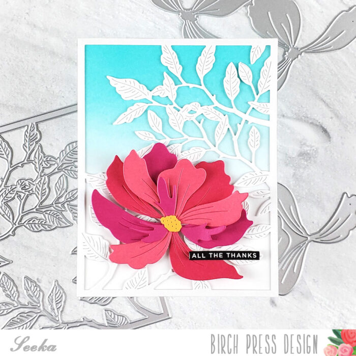
    I’m back with another post on how to use Color Mood Boards for inspiration!!! In my post earlier this month, I shared a mood board and card that was inspired by it. Today I’m going to share a completely different card using that same mood board! My hope is that you will see how inspiring it can be to create TONS of unique cards with just one color mood board! Here is my card below.

    And, here is that Color Mood Board in which I was inspired to create this card ealier this month! Again, I found this through DT Crystal Komara!

    The first step was to plan the layout of my card. I found a card on Instagram where I just fell in love with the layout and design elements, so I used that card as my starting point. Since I didn’t want to CASE the card, I used just the background design ideas from it.

    Next, I chose the Birch Press Designs dies I wanted to use for my card.

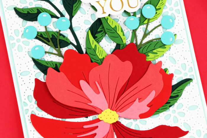
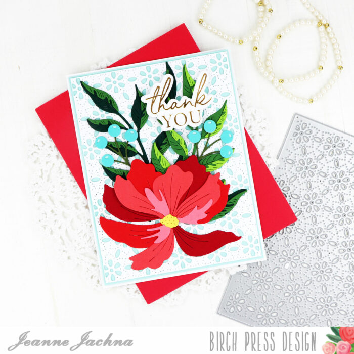
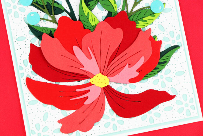
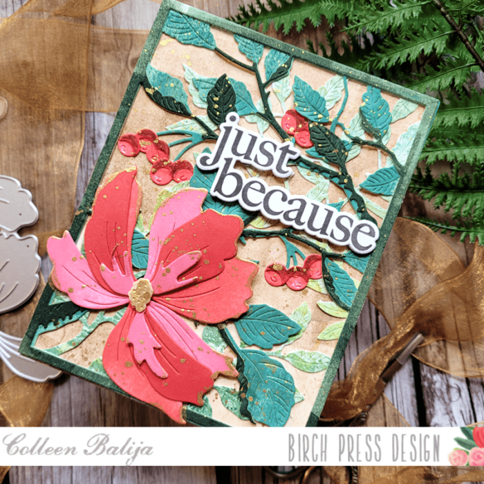
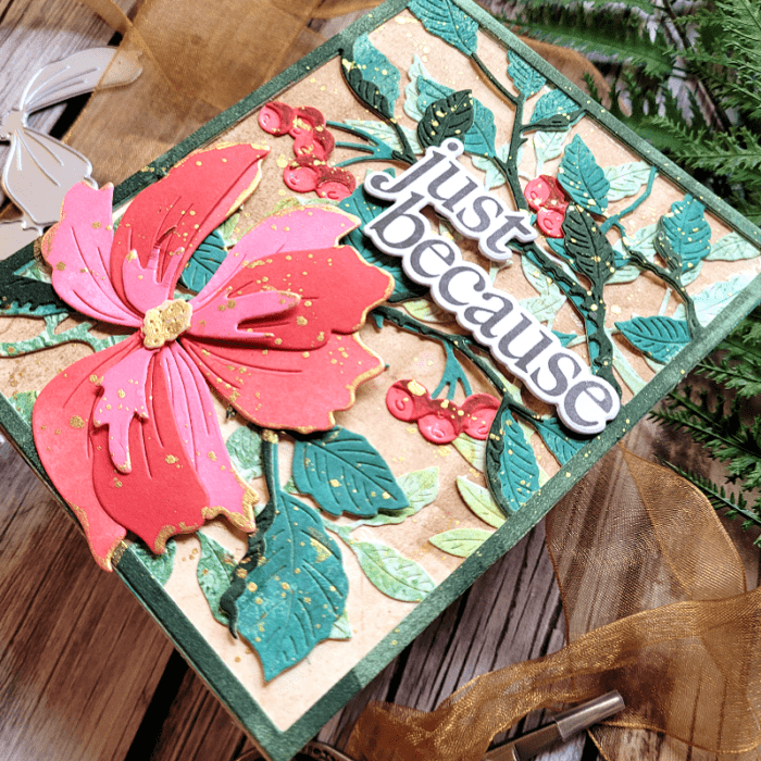
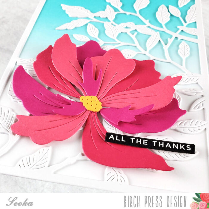
    Birch Press Designs just released a beautiful, layered floral called Morning Rose & Tripe Buds Contour Layers. In addition to this die, I used Wispy Blooms Contour Layers die to compliment the Morning Rose.

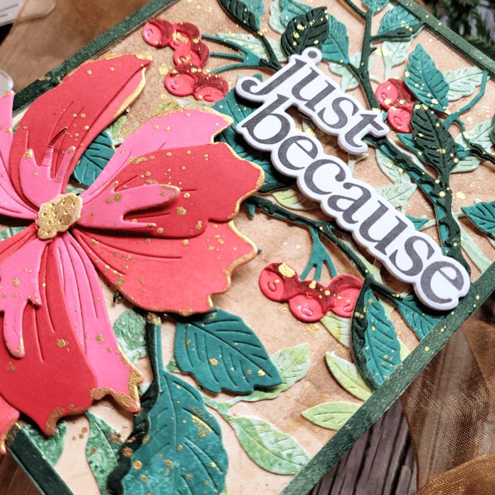
    Following the Color Mood Board, I used ink colors in similar shades and applied them directly to white cardstock. Then I splattered gold metallic ink and water over it to add interest. Once my card panel was fully dry, I die cut the layers of my flowers and buds and adhered it all together. All the flowers are coordinated with the same colors from the Color Mood Board for cohesiveness. I added more gold splatters to the flowers after they were die cut. You can see in the photo below how pretty the colors work together!

    The next step was to work on the background! I die cut the brand-new Pinpoint Contour die plate onto a 5.5×4.25 white card panel and adhered it to a white card base. This is a beautiful die that creates a design without die cutting it. It’s perfect for a background!

    Next, I trimmed 2 more card panels – one in white and a larger one in black. I inked up the white card panel using teal shades of ink, similar to the Color Mood Board. I went from lightest in the center to darkest on the outer part. To add interest, I used Layer A of Herbarium Layer Plates as a stencil and inked through it to create an abstract design over the teal ink! It was subtle enough to add interest without competing with the focal point! I also added gold splatters.

    I adhered the inked-up card panel to the larger black card panel, and then adhered both to the card base so that enough of the Pinpoint Contour die was peeking out from behind. You can see all that lovely detail in the photo above!

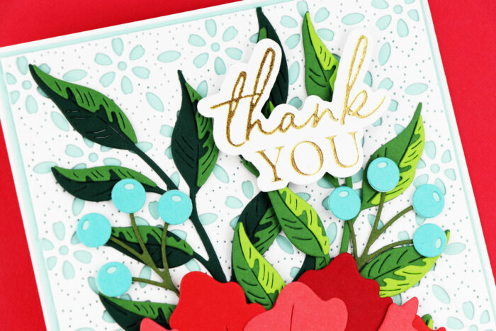
    Finally it was time to add my flowers over that beautiful card base! I “staged” everything exactly where I wanted it and then adhered it all down with liquid glue once I was satisfied with placement. The Morning Rose flower was popped up on foam tape. I finished with a gold foiled sentiment from You Are Loved.

    As a refresher, here is the card that I made from my last blog post, so that you can see how different that card is from today’s card!

    The colors are similar of course, but the layout and design elements are different! Color Mood Boards are coordinated for you so that the colors will work together nicely. That’s really important, as too much color can take away from the beauty and cohesiveness of a card! So, you can feel free to use all the colors on the mood board with whatever design elements you choose!

    You can find Color Mood Boards by googling them, by searching for them on Instagram, or by creating your own! I also frequently refer to color mood boards designed by Sarah Renae Clark, whom you can find on Instagram. She creates a multitude of mood boards for every season and every reason!

    Thanks for stopping by today!

    Supplies

  • You Have My Hearts | by Toni M Maddox

    You Have My Hearts | by Toni M Maddox

    Hello, Birch Press fans! Toni here with you today sharing a trio of sparkly Valentines using the new Banner Heart Layering Dies and You Are Loved Hot Foil Plate & Die.

    Let’s start with the last card I made which is my personal favorite. I love those pastels with the gold so so much!

    But, I actually started with the black and red card below. As you can see from the layers, you end up with perfectly useable diecut negatives which I absolutely could not let go to waste so the next thing you know I’m using those bits for more cards.

    The combinations of the glitter, mirror and regular cardstock are truly endless. Pair that up with using the hot foil negative and it just goes on and on.

    I hope you enjoyed today’s cards and have a great rest of your week!

    Supplies