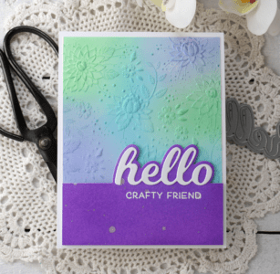
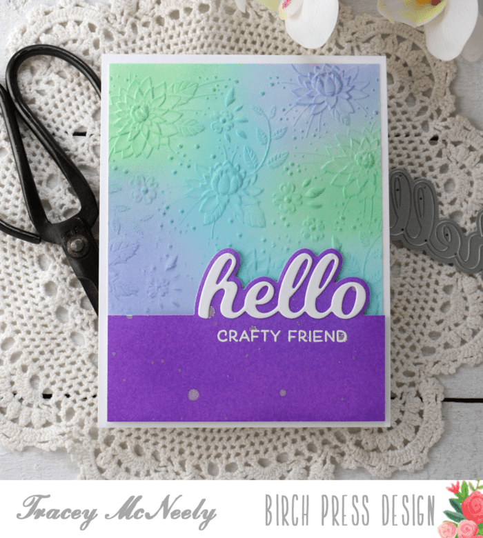
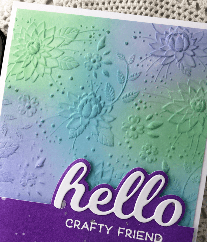
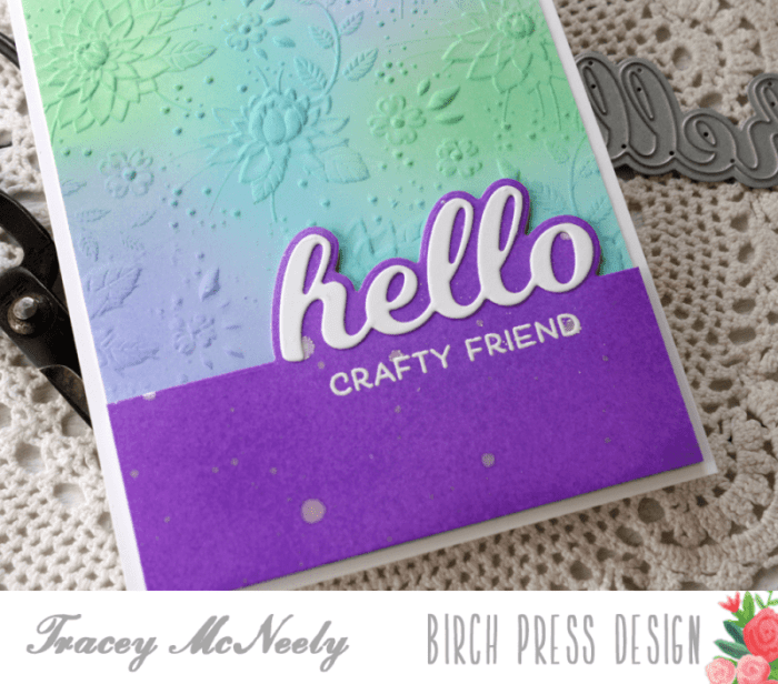
Hi there, it’s Tracey back this week with another post using fabulous Birch Press Design along with the fun 3D Embossing Folders from Memory Box Open Source.
I started off by embossing a piece of Bristol Smooth cardstock using the Memory Box Open Source Crysanthemum Fields Embossing Folder. I have never used these thick embossing folders before and I was a big perplexed as to what sandwich to use in my Gemini Jr. die cutting machine. Through a bit of Internet research and a bit of trial and error I found a sandwich that worked in both my Gemini Jr. and my Big Shot! These amazing 3D Embossing Folders work with the same sandwich! Today I used the panel embossed with the Gemini Jr. die cutting machine using this sandwich: 1. Bottom plate 2. Magnetic sheet 3. Embossing folder with paper inside (no top plate!)
I ran it through the machine and got a gorgeous embossed/debossed impression.
I chose to use the embossed side of the panel and used blending brushes to lightly add colour over the raised images. I set the panel aside while I worked on the other elements for my card. Using another piece of Bristol Smooth cardstock and I ink blended the Distress Oxide inks a little more heavily to create a solid panel to co-ordinate for the bottom of my card. I flicked some white gold pigment watercolor onto the bottom panel.
I trimmed the embossed panel down to 5 1/4″ x 4″ and then adhered it to a white card base using tape runner. Once the other ink blended panel was dry I used the Hello Topper die to cut across the top. Then I cut the word die ‘hello’ from white cardstock and added in into place with liquid glue.
The sentiment ‘crafty friend’ from the Just Because stamp set was white embossed direct to the panel underneath the word hello. The whole ink blended panel was trimmed down to 1 1/2″ high, not including the bump up for the word hello. I was added to the bottom of the card with with foam tape for dimension.
Thank you so much for stopping in today to craft along with me. I hope you are staying well and that I have inspired you to make something beautiful today.
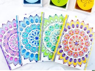
Hello crafty readers! This is Crystal here with you and today’s post is all about coloring the beautiful Thankful Mandala stamp set. If you love to color, then these cards will be perfect for you to try. And, well, if you don’t love to color so much then you can simply admire the beauty of someone else’s coloring!
I will be the first to admit that I have a love/hate relationship with coloring. There are times when I find it peaceful and soothing, yet there are also days when I find it can be simply dreadful! So, listen to how YOU feel. If you feel like coloring today, then go for it! If you’d rather sit back and eat a hot fudge sundae, you certainly won’t find me judging you! : )
For this yellow mandala I used Copic marker numbers V17, R27, Y02 and YR68.
For the green mandala I used Copic markers numbers YG06, G21, G05 and BG13.
For the purple mandala I used Copic markers number RV19, RV55, RV66, V9 and BV02.
Each of these cards begins the same way. I stamped the large Thankful Mandala on a 5 1/2″ x 3 1/4″ piece of Neenah Solar White Smooth cardstock in Memento Tuxedo black ink. Then I selected 3-4 colors of Copic markers in complimentary hues and color away. There is no rhyme or reason to my madness! In all honesty, each mandala took me about half an hour to color and then I adhered various colored rhinestones for added sparkle.
I found a complimentary colored cardstock base for each color and added two strips of die cut glitter paper down each side of the mandala.
For the blue mandala I used Copic marker numbers B02, B24, B52 and B12.
I hope you have enjoyed these cards and will maybe try coloring some too! Thanks for visiting and have a wonderfully creative day.
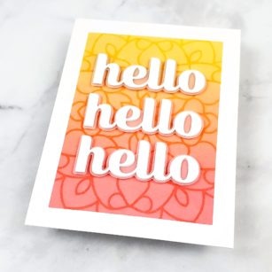
Hi there, Seeka here and today I’m sharing a card that combines an ink-blended background with a stenciled overlay.
I started with a 4.25″ x 5.5″ piece of Strathmore Bristol Smooth cardstock. Using Post-It tape, I masked off the borders and then used foam blending tools to blend Mustard Seed, Carved Pumpkin, and Abandoned Coral Distress Inks over the exposed area.
I let the panel dry for a few minutes and then removed the Post-It tape and replaced it with fresh tape. Next, I placed the Midnight Mandala stencil over the panel and used washi tape to hold it in place. Using a clean foam blending tool and tamping motion, I applied Hero Arts Unicorn white pigment ink over the stencil and onto the background. To keep my white ink pad pristine, I smooshed some ink onto my glass work surface and then picked it up from there with the blending tool.
I removed the stencil and the Post-it tape and set the panel aside to dry.
Next I used the Big Hello Sugar Script die set to die cut “hello” six times from white cardstock. I stacked two and adhered two layers together to end up with three sentiments. I adhered each to the shadow layer of the sentiment which I cut from vellum.
To assemble the card, I adhered the three hellos to the background with foam tape, and then adhered the card front to a card base.
This card has been created to hold a small gift. It’s a great way to present “a little something” extra inside a card such as a tea with a packet of honey, or a package of seeds, necklace, small pen, or notepad – anything that is about 1/4″ thick.
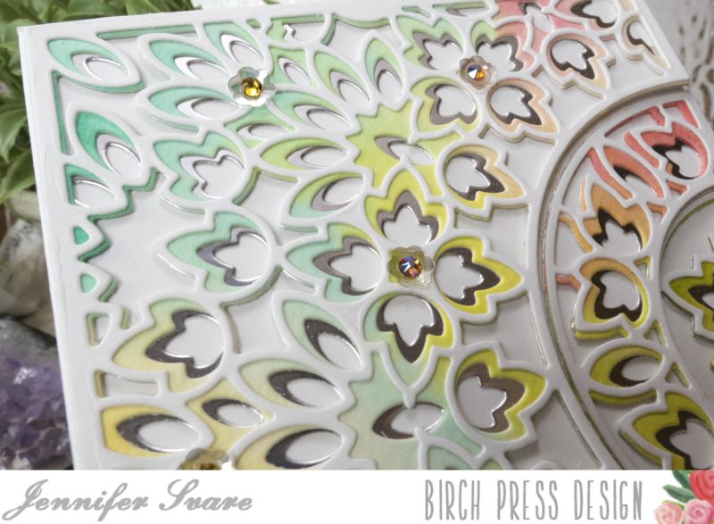
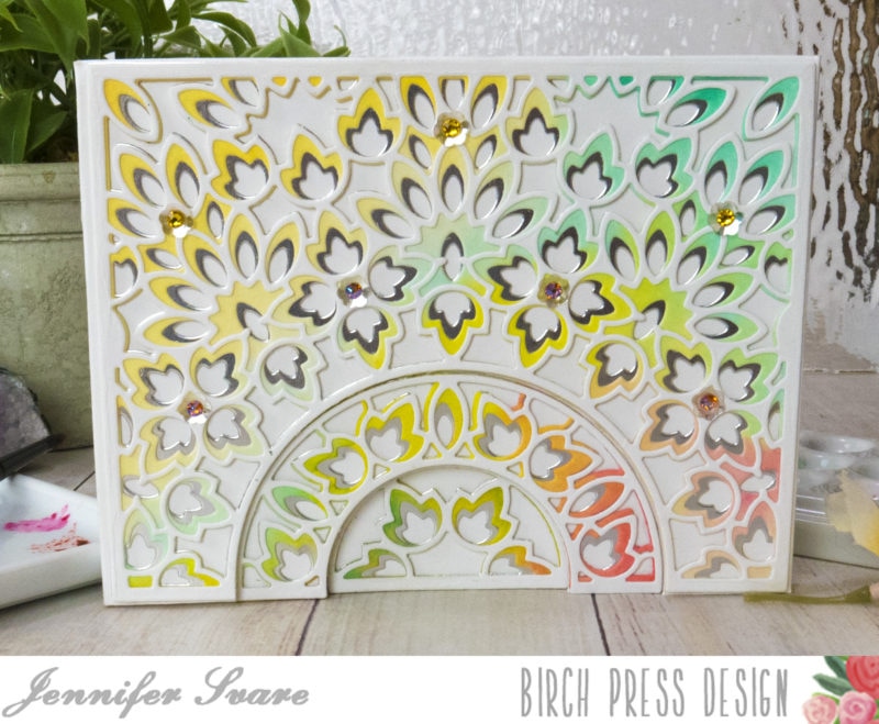
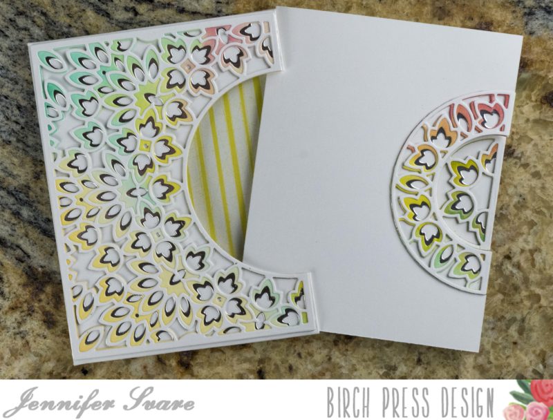
Today I’m going to show how each section of the gorgeous Enchantment Plate can be used to carry the design all the way from the outer sleeve to the inside of the card as it is opened by the recipient. Be sure to check out the video below to see this card in action. I’ve also prepared a written/photo tutorial below for those who prefer to read instructions.
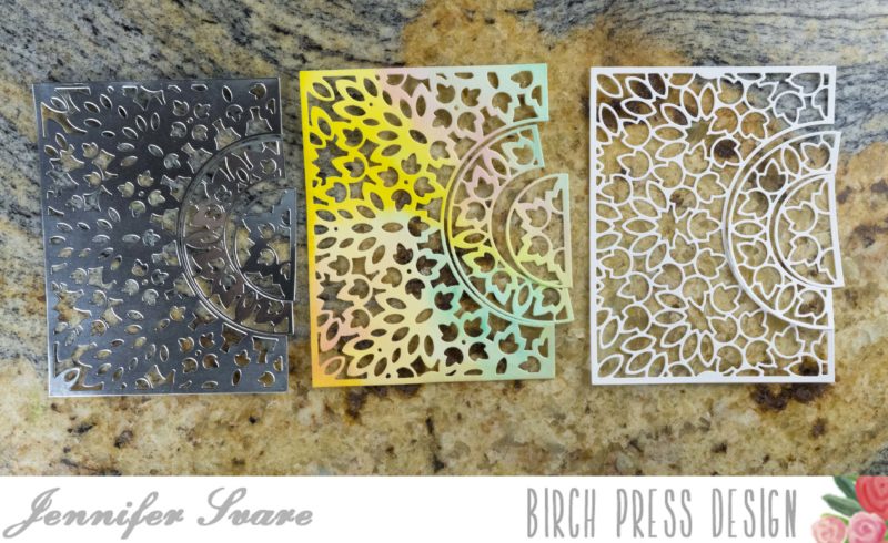
I used silver for the background, watercolor wash for the middle layer, and white for the top layer. The Enchantment Plate design looks good in any orientation.
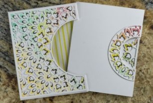
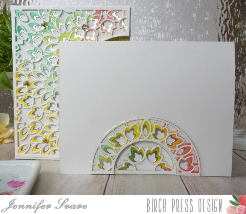
The main exterior of this card is actually a sleeve that holds an inner card. The design’s sections have been distributed between the outer sleeve, the inner notecard, and the inside of the notecard.
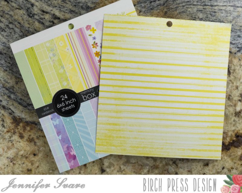
Here is a photo of what the sleeve looks like with no notecard inside. I love the patterned paper background made from Memory Box Springtime Bouquet – so pretty!
Here’s a link to a step-by-step video of how I made this card. For a photo and written tutorial, please scroll below the video. If you don’t see the video below, it can be viewed by clicking here. All products used are also linked below. Have a great day!
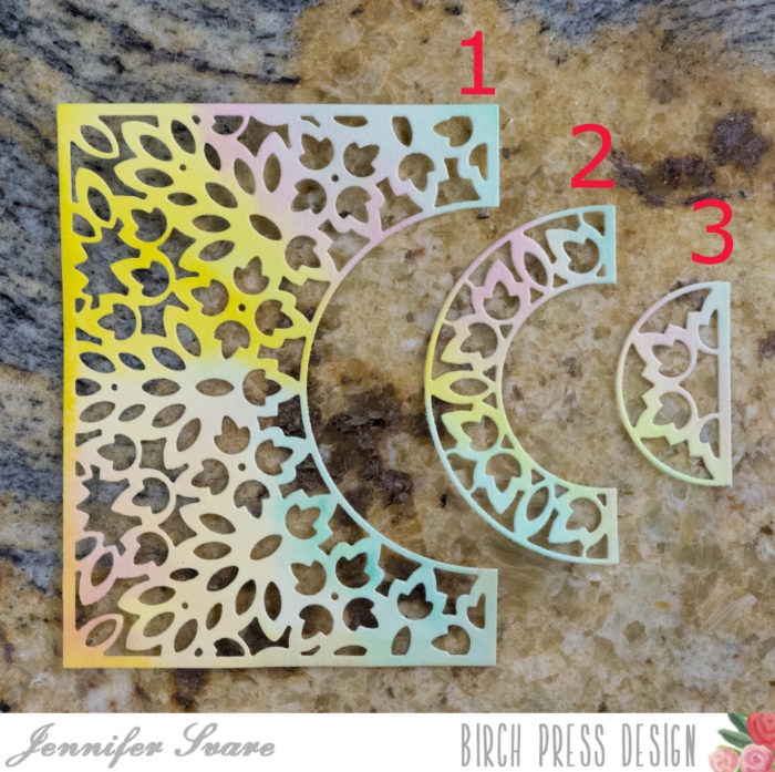
TUTORIAL: First off, each plate from this set die cuts 3 “sections.” This offers enormous possibilities with mixing colors.
Base layer is Silver, Middle Layer is Watercolored, Top Layer is White
As we go along, I’ll refer to each of these sections as outlined in the below photo: Section 1, Section 2, and Section 3.
When looking at this card straight-on, the entire design is visible.
When the recipient pulls it out of the sleeve, Sections 2 and 3 are attached to the notecard. When the notecard is opened, only the small section 3 shows, and still gives a nice design when the card is opened.
See the wonderful depth this creates between the card sleeve, the card, and the inside of the card when something bulky is inside?
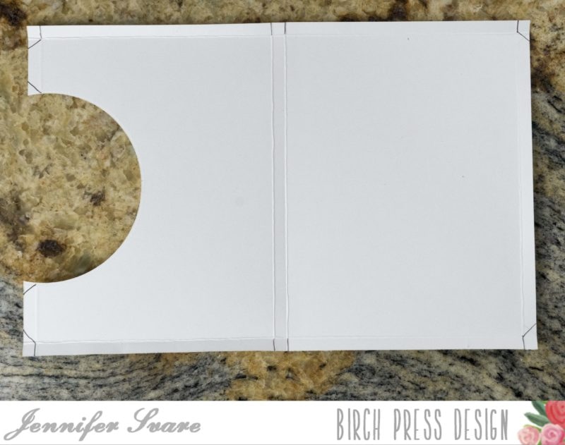
The sleeve and notecard are cut from two pieces of white card stock. The first measures 9-3/8″ x 6-1/8″. The second is a standard-sized A2 card base, which measures 8-1/2″ x 5-1/2″ (scored down the middle for a normal side-folding notecard).
As shown in the photo below, I needed a quick wash of color for the middle layer. I used the new watercolor paper (available here at Birch Press Design) which is a beautiful, thick, 140-lb. paper. It holds all the water needed to create beautifully blended backgrounds. I wasn’t too particular, and this took no time at all.
While the watercolor background dried, it was time to score the outer sleeve that will hold the notecard. Using the larger piece, I scored 1/4″ all the way around.
Once it was scored all the way around, with the longer edge against the top of the scoreboard, I needed to score right in between two of the grooves of my scoreboard, which isn’t possible. To get around this, I made a tick-mark at the non-scorable section between 4-1/2″ and 4-5/8″ as shown in the below photo:
Then I bumped the mark over to the next groove on the right so I could score it there. I then scored two spaces over (1/4″).
Once all the scoring was done, I laid the piece out so one of the short edges (6-1/8″ side) was on top. To make the space for the design of Section 2 to show through, I made a template from a spare Section 1 and placed it where it will be on the card. Once placed, I traced where the half-circle needed to be. (I used a circle die that happened to fit perfectly from a nested circle set in my stash. This could also be done by hand with scissors.) Notice below that the top of the template only goes to the scored line; not to the top of the card. The very top will be folded under for extra reinforcement, so that’s not going to count.
Time to do the same thing with the notecard. Since the notecard will open up to the smallest section of the Enchantment Plate, I included the base plus Section 2 of the plate. This served as my template to mark where the smaller half circle needed to be cut.
That was all that was needed for the notecard – easy! Now, getting back to the larger outer shell, I creased all folds and cut the flaps as shown below:
I then glued each flap of the outer sleeve to form a very skinny box. Notice how the flaps fold from the top toward the back so there are no glued edges showing?
As can be seen in the photo above, the top flap is glued to the base on the inside for extra strength of the top rim. Left alone, it is a visible seam when the card is removed from the sleeve. To hide this and also provide a pretty backing, I chose a piece of patterned paper from the Memory Box Springtime Bouquet 6 x 6 pad, cut it to just a hair under 4-1/4″ x 5-1/2″ and glued that down.
After gluing each of the layers together, I adhered them to where they needed to be on the sleeve, outside of the notecard, and inside of the notecard. This would be a great project to make several of to have on hand for those quick “need a little something to give” cards.
I hope you enjoy this project! It is a very simple way to give a wonderful gift. It’s fast, and it’s fun!
Hello Birch Press fans. Sometimes I really want to experiment with backgrounds and really get inky. Today I am using the Bold Stripes Stencil to make a colorful background.
I have chosen some lovely blue shades and brush blended atop Open Studio watercolor paper.
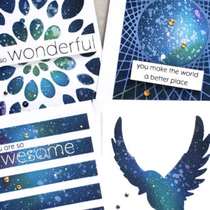
Good morning! Ardyth here with 4 cards using the same, fun technique: creating a galaxy sky through a stencil!
I started by adhering the most open layer of the Mandala Stencil set on a white card panel with temporary spray adhesive.
I blended random areas of bright colours – lemon yellow, lime green and bright fuschia through the stencil, leaving most of the panel white.
I blended a mid-blue ink over the whole panel, darker around the edges and lightening up toward the centre.
Then I blended navy blue ink over the whole panel, again, dark around the edges and lightening up toward the centre.
A little note about creating galaxy skies – they all look very ugly through the whole process, until the very, very end. Don’t worry if you’re not happy with it at this stage, just keep going!
I blended black ink through the stencil, this time just at the very edge of the panel. Then, leaving the stencil on, I spritzed water and lifted up some of the colour with a paper towel.
Then, I mixed some white acrylic paint with water and tapped it over the panel to create stars (this is the point where it starts to look good!)
As you can see, I couldn’t stop. And I didn’t just use stencils either!
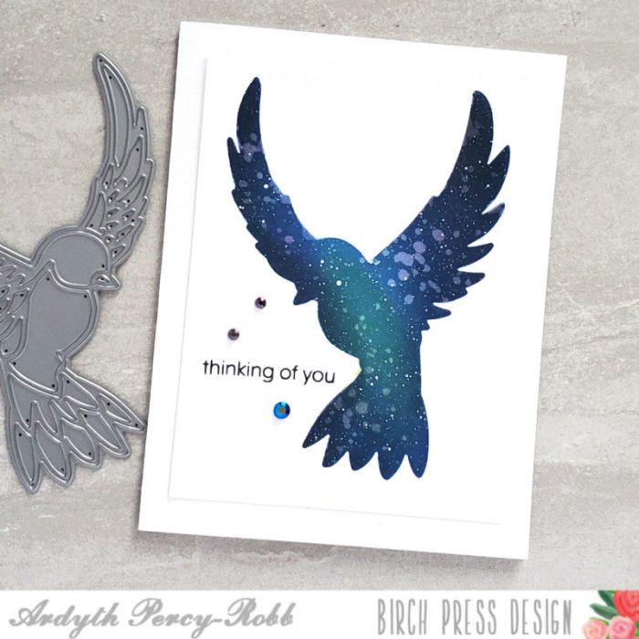
As well as the Mandala Stencil set, I used Bold Stripes Stencil, a home-made stencil created from a String Art Frame die cut, and the negative from the PoppyStamps Peaceful Dove die.
All my sentiments came from the You Are Awesome stamp set.
I hope you like these cards – there is a 1 minute video on our Instagram feed today showing the process in detail.
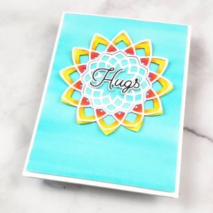
Hi there, Seeka here and today I’m sharing a sunny card using the Dazzler Layer die set.
First, I die cut Dazzer Layer C from white cardstock. Then I used three markers (Copic RV14, Y17, and Y15) to color the outer ring. I started with RV14, a pink, along the inside of the die cut and then added Y17, an orange-y yellow, next to it. This was very quick coloring with not a lot of attention to blending.
Then I added Y15, a yellow, around the outside edge.
Next, I used used the Dazzler Layer A die to cut another piece of white cardstock. I added a bit of glue around the inside of this die cut and adhered it over my Copic-colored piece, leaving the tips of each point un-glued, and curling them up a bit so that they stand up from the bottom die cut for a bit of dimension.
Then, I created a quick watercolor background using a Cool Aqua Karin Brushmarker Pro pen. I scribbled the pen over a piece of watercolor paper and then used a paintbrush and clean clear water to spread out the color, not blending out too smoothly and leaving a bit of color variation. I also added some white paint splatter using watered down white guache.
I trimmed my watercolor panel down to 4″ x 5.25″ and then adhered the my die cut piece to it. I also adhered the center die cut from Layer C (I love that each die layer results in two separate pieces!).
For the sentiment, I used the Best Friend stamp set and die cut the word “Hugs.” I die cut three more layers and then stacked and adhered all four layers together and then adhered the sentiment to the center of the star.
To finish, I used foam tape to adhere the card front to an A2-sized card base.
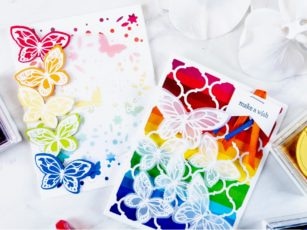
Hello readers! This is Crystal here with you today sharing some rainbow cards featuring the Lovely Butterflies stamp set. I’ve been creating a lot of rainbow themed cards lately, because I find them very cheerful and uplifting and I think we could all use more sunshine (and rainbows) in our lives right now!
The base of this first card was made using 80 lb. Neenah Solar White smooth cardstock. Using the Delfina Layering Plate A, I die cut the lattice background from white cardstock. I adhered a piece of rainbow paper behind the lattice using a Tombow dot runner before adhering both layers to the card base. I stamped the sentiment “Make a wish” in Memento Tuxedo black ink on a piece of scrap paper and notched the bottom end. I adhered thin pieces of orange, red and blue ribbon behind the sentiment and stapled it together. Yes, stapled! Why not?! It’s art!
I stamped a variety of butterflies from the Lovely Butterflies stamp set on vellum cardstock in Versamark ink and heat embossed them with white embossing powder. I die cut the butterflies using the coordinating Lovely Butterflies dies and adhered them to the card small pieces of 3M foam adhesive for added dimension.
To create the second card, I die cut the Butterfly Garden Layer Plate C from white cardstock. I adhered this over a piece of rainbow patterned paper. I stamped one butterfly on each of five different colored cardstocks (red, orange, yellow, green and blue) and heat embossed the butterflies with white embossing powder. I used the coordinating Lovely Butterflies dies to die cut the butterflies out.
I die cut a circle of vellum cardstock and stamped the sentiment in the middle of the circle in Versamark ink. I heat embossed the sentiment with white embossing powder and adhered it to the center of the card. I adhered the die cut butterflies down the left side of the card in a rainbow pattern. I adhered the butterflies to the card using small pieces of 3M foam adhesive.
I have created a YouTube video tutorial for you to watch and learn how both cards were created!
Thanks for visiting and have a wonderfully creative day!
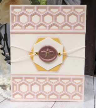
The bevel set is three layers, and I chose soft pinks and corals that sit on an ivory card base. I placed one on the top and one on the bottom of the card front.
I love how the layers stagger on the inner portion of the card for a unique, finished look.
For the center space, I used some nested hexagons from my stash to create a base for the wax seal. Ivory twine was run through a gold grommet, and secured to the backside with tape before attaching to the card base.
I brushed the bee with a gold leafing pen to match the grommets. That extra touch of gold pulled it all together.
I love the elegance of the honeycombs layered in soft colors, mixed with the wax seal. This card is great for any occasion!
Check out the video below for a detailed tutorial on how this card was made. Thank you for stopping by today, I hope you have a wonderful day!
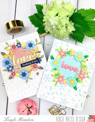
Hello, crafty friends! I am so happy to be here today sharing these two cards I made with Birch Press Designs’s Avalon Frame Layering Dies. I love using the pretty negative die cuts from my Birch Press layering dies in my cards, and these cards show how I used these pieces to make frames on my cards. I had so much fun making my first card that I had to make a second!
I started my card by die cutting all three layers from the Avalon Frame layering dies from white 110# cardstock. I saved all of the little negative dies off to the side and die cut a circle out of all three layers. I then started coloring my floral elements with alcohol markers, layering them to create different shapes and dimension (all of the elements used in each card’s frame were constructed from the pieces from the three layers; no extra pieces were used!) Once I had enough floral elements colored I arranged them around the perimeter of the circle.
To finish the card, I die cut a watercolored background to put inside the circle. I adhered the Love sentiment from Birch Press’s Love Honey Script die, and stamped the additional sentiment from Birch Press’s You Are Awesome stamp set onto navy cardstock. Some gold sequins finished up the card!
Onto the second card! This card was made the same way, just switching up the colors.
I used a summery color scheme to color my floral elements, and layered an aqua card base behind my 3 layering panels. I die cut the Love sentiment from Birch Press’s Love Sugar Script die and finished the card with some clear sequins.
I had so much fun creating these cards, and I hope you enjoyed them! I’ll be back soon with another card project… until then, happy creating!