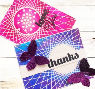
Hello Birch Press fans! Today I bring you two cards using the amazing String Art Frame Die.
I love the radiating lines. I have selected some wonderful sparkle colors to match the jewel tones in the glitter papers. I water brushed blended them for my background onto the watercolor paper that is now available in the shop.
I cut the String Art Frame in a light shade of the lovely delicate pastel glitter paper for both cards.
Some gorgeous purple glitter paper from the Twinking Jewel pad was perfection for the butterflies.
For the Love you card I die cut the heart sprinkles die directly onto the background and added the word dies.
The purple glitter papers, as well as all of the jewel paper pad colors are divine!
I am loving all of the newest release this Spring, and I hope you are enjoying it as well!
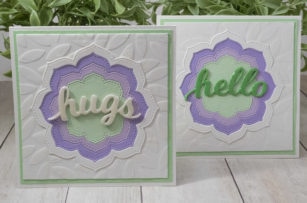
Hello! Today I’m excited to introduce the new Vivid Bloom Stitched Layer Set available now at Birch Press Design! So many wonderful things can be done with nested dies, and this set has 6 sizes to offer endless possibilities!
The video (linked below) shows how I created frames using the dies, and also put a subtle texture into the background using the Leafy Jumble stencil and transparent texture paste.
The new Hello and Hugs Honey Script dies each come with the letters and a background die. For today’s project, I used the letters without the background. Several were stacked on top of each other for extra depth to the letters. I went over it with a shimmer pen, topped off with glossy accents. I love, love, love this script!
Creating frames from nested dies is just one way to use them – really, the possibilities are endless and I can’t wait to share more ideas! Enjoy the video and have a great day!
Hello there, I hope you’re having a lovely day! Seeka here and I’m so very excited to share my first post on the Birch Press Design blog!
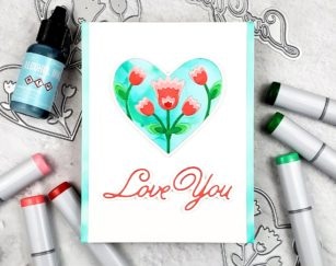
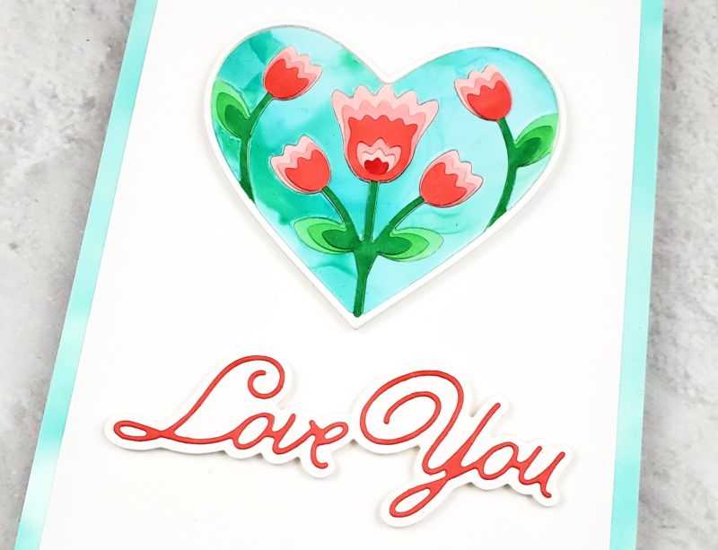
I started by die cutting the three layers of the Folk Art Heart Layer Die set out of white cardstock. Because I planned to color each heart, rather than letting all of the pieces fall out I left them in their negative space and backed each piece of cardstock with Post-it tape to hold everything in place.
Next, I used red and green Copic markers to quickly and loosely color the die cuts. The only place I took a bit of care was on the die cut with the darkest red tulips. On that die cut, I made sure not to color over the white frame of the heart, and ensured that the green stems didn’t blend into the red flowers.
Then, I moved on to the negative space around the tulips. I decided to use Aqua Ranger Alcohol Ink to create a blue sky with a bit of color variation. I added a few drops of alcohol ink to a small piece of Yupo paper, and then added a few drops of Blending Solution. When I’d covered a large enough area, and when the panel was dry, I used the die cut with the largest tulip (Layer C) to cut the piece of Yupo. Using the same Aqua alcohol ink, I also colored two narrow strips of Yupo.
I stacked and adhered the layers of the heart together and then pieced in the blue sky, backing the entire piece with paper tape to hold it all together.
Next, I used the Handwritten Love You and Outline die set to die cut white cardstock. I used the same technique of leaving the die cut in the negative space of my cardstock and backing it with Post-it tape to make it really easy to color with a red marker. Then I adhered the sentiment to the shadow layer.
To assemble the card, I adhered the blue strips of Yupo to the left and right edges of an A2-sized card base. Then I adhered a 4″ x 5.5″ inch piece of white cardstock in the center of the cardbase. To finish, I used foam tape to adhere the heart and the sentiment to card front.
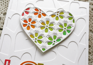
Hello my crafty friends! I hope you’re having a great day. There’s more new in the store and I’m excited to share a card made with the new String Art Frame.
I wish you could see this one in person! It’s a rainbow of sparkly color!
I started by adding double sided adhesive to a white card stock panel the same size as my card base. Then I removed the protective sheet and adhered the String Art Frame to the sticky panel.
Next I sprinkled colorful glitter over the open areas of the die cut where the double sided adhesive is exposed. I pressed the glitter into the panel with my finger tips, but you could burnish with a roller or a bone folder.
The colorful sparkly background is a feast for the eyes!
I added a simple sentiment using the Thanks Honey Script word die (that comes with a detailed and background die) and a stamped sentiment from the new You Are Awesome stamp set.
This sparkly technique will work well with lots of your die cuts. I sure hope you’ll give it a try!
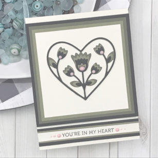
For today I am going to make a Valentine’s Day Card featuring the Folk Art Heart Layering Die!
Let’s start by cutting our layering dies in the cardstock colors you chose. Once they are cut I then grab the same colors and cut my squares using my paper trimmer. For these I start with a 4 ¼ inch square and decrease each cut by ¼ inch. I create four of these.
While we are getting everything ready, let’s add our sentiment, and for this project I chose a sentiment from the Lingo Thanks Stamp Set!
Using my liquid adhesive, I start layering all my pieces that have been cut!
I used a Standard A2 Size top folding card base (4 ¼ inch x 5 ½ inch) for my card and arranged my pieces.
Added a few drops for embellishment!
As always, I hope you enjoyed today’s project… and if you want to see more details just click on the video below and see how these projects come together step by step!
Make sure you stay tuned for more wonderful projects coming soon! Have a great day and always remember… Be Creative!
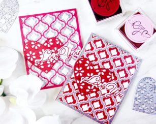
Hello readers! This is Crystal Komara, I am one of the new Design Team members with Birch Press Designs and I am honored and delighted to be here with you! I hope I can inspire you with my creations, and I hope I’ll also meet many new faces along the way. It’s kind of an exciting day for me as not only am I making my grand debut on the team, but I am sharing with you my very FIRST crafting video! I’m kind of a go-big-or-go-home girl! I poured a lot of hard work and time into the creation of this video and I’m quite proud of my first attempt, but I’ll let YOU be the true judge of my untrained videography and emcee skills!
For today’s Valentine inspired cards I have used the beautiful Delfina Layering dies, the all new Flora Heart dies and the Love You Outline dies. I chose to cut all three layers from the Delfina Layering Dies. Layer C (the bottom) was cut from a rose red cardstock, Layer B (the middle) was cut from a carnation pink cardstock and finally, Layer A (the top) was cut from silver glitter paper. I adhered all three layers together with a fine-tip liquid adhesive.
Please check out this step-by-step video detailing how I created every layer of this card:
I do hope you found this video helpful and I welcome your kind comments and constructive criticism (bonus points for niceness!) so that I can continue creating content in a way that’s most useful to you.
I created two custom ink blended panels from Bristol Smooth cardstock. The first was a 3″ square that will be the base layer for my layered Floral Heart and a second smaller rectangular panel will fit the Simple Love sentiment die. I blended the ink on both panels with distress oxide ink in rainbow order—picked raspberry, orange marmalade, moved law and peacock feather.
Once they were blended I flicked some clean water on to the panel and lifted some of the colour with paper towel. Once it was dry I cut the largest heart from the Perfect Hearts die set, it fits perfectly behind the Flora Heart Layers dies.
Each layer from the Flora Heart Layers die set was cut from heavyweight white cardstock and I used liquid adhesive the glue the layers together. To complete the heart I glued the layered heart to the rainbow base layer.
I cut layer A from the Cherish Plate die set also from white cardstock and glued it to the font of a white top folding card base. The Simple Love Die set comes in two pieces. I cut the larger of the two Dies from the second ink blended panel and then the detail layer from white cardstock. The smaller letters were glued to the sentiment with liquid adhesive.
I added the heart and the sentiment to the card base. Leaving the card like this allows you to customize the inside to say whatever you want for the occasion. Thanks so much for stopping by today and watch the video below for more details on how I put this card together.
Hello! With Valentine’s Day fast approaching, it might be time to make some fast, simple cards! Birch Press Design has you covered with this quick, easy Valentine. I am sending out many cards this year. It’s such a great time to tell close friends and family that I love them! With a large family, it was important to have a simple design. This is it!
I die cut the Cherish Layer A several times out of white and different glitter cardstocks. Check out the video below for tips on coloring glitter paper if you don’t have colors! I also used a dotted embossing folder to add some extra texture to the white layer.
The Simple Hearts, which are nested heart dies, were used to cut a large heart out of vellum, and a smaller one for the inside to match the band. The Handwritten Love You went on the top of all layers. Make sure to watch this short video for more detailed views of this card being made:
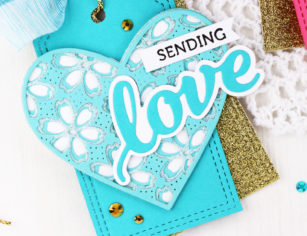
Hi crafty friends! It’s Jeanne here today and I’m sharing some pretty Valentine Gift tags to delight your favorite Valentines!
Tags are perfect for dressing up anything from a simple bag of home made chocolate chip cookies to something extra special for your sweetie!
I assembled several Flora Hearts in different shades of card stock. Each middle layer is cut with glitter paper from the new Memory Box Delicate Pastel Glitter 6″ pad.
The hearts are topped with Love die cut word sentiments and a stamped “sending” from the Lingo Thanks clear stamp set.
The hearts are layered over Poppystamps Double Stitched Tags cut from coordinating, and gold glitter card stock.
I think these hearts are gorgeous and plan to make another bunch that I will adhere to wood picks to top cupcakes!
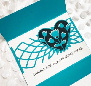
Hello Birch Press fans. Today I bring you a clean and simple gate fold card with a lovely, slightly more elaborate interior. I am so thrilled to be working with these gorgeous dies. If you are not already impressed with their lovely intricate dies, and impeccable craftmanship, I’m sure that it will not take very long with all of the design team creations coming your way soon.
The solid card stock base is cut at 8.25 x 4.25 and scored and folded starting from the left at 2.10 and again at 6.25 inches. The Hello Topper die is a perfect closure for the gate fold style type of card and was cut on white card stock and trimmed to 1 inch, then adhered to the bottom layer of the bottom fold. The Hello word die was cut in black and turquiose and adhered slightly offset against the white backing strip.
The lovely more layered inside was fitted with a white 4 x 5.5 panel. A solid 5.25 x 2.25 strip was center cut on the Dazzle A die and adhered 1.25 inches from the bottom of the white panel. Some portions of the Dazzle strip was trimmed to have uniform open spaces.
The sentiment from the Best Friend stamp set was centered .5 inches below the Dazzle strip.
The lovely heart was cut with the Folk Art Heart layer A in shimmer pastel blue glitter paper and the layer B in the solid turquoise. After adhering the solid layer to the glitter layer, both layers were adhered to black cardstock, hand cut, and affixed to the center of the Dazzle burst.
I am so smitten with this card and all of the creations I have made so far using Birch Press products. I can’t wait until you see the next release!