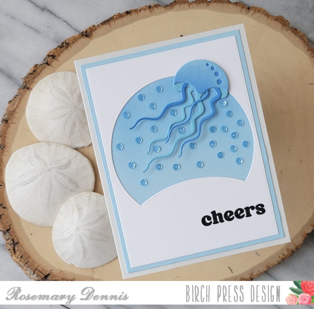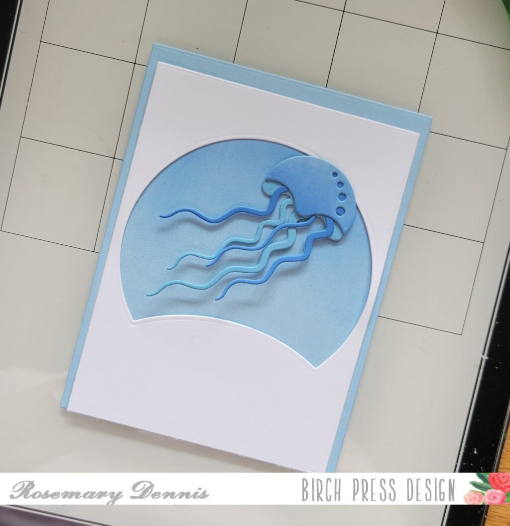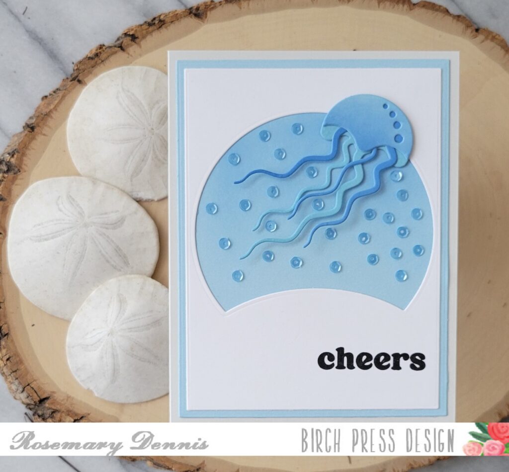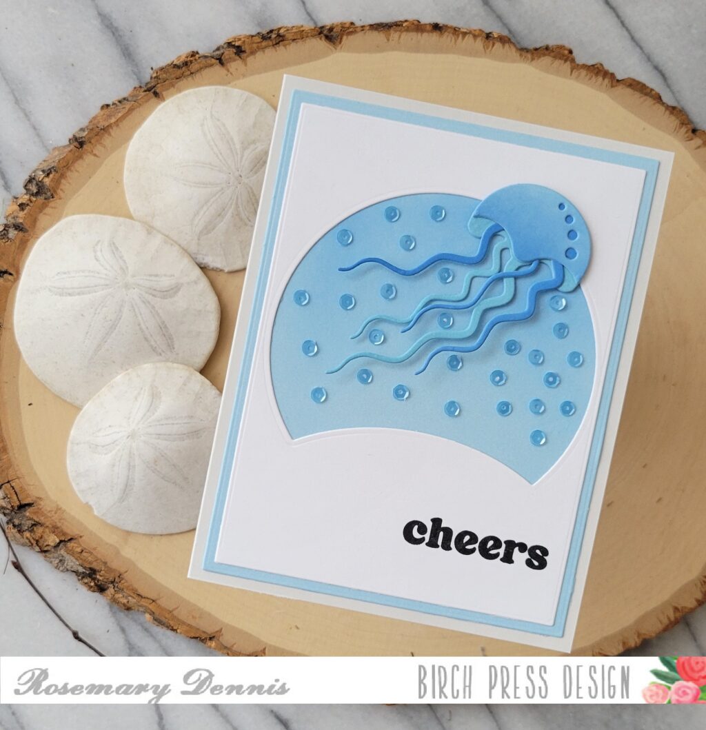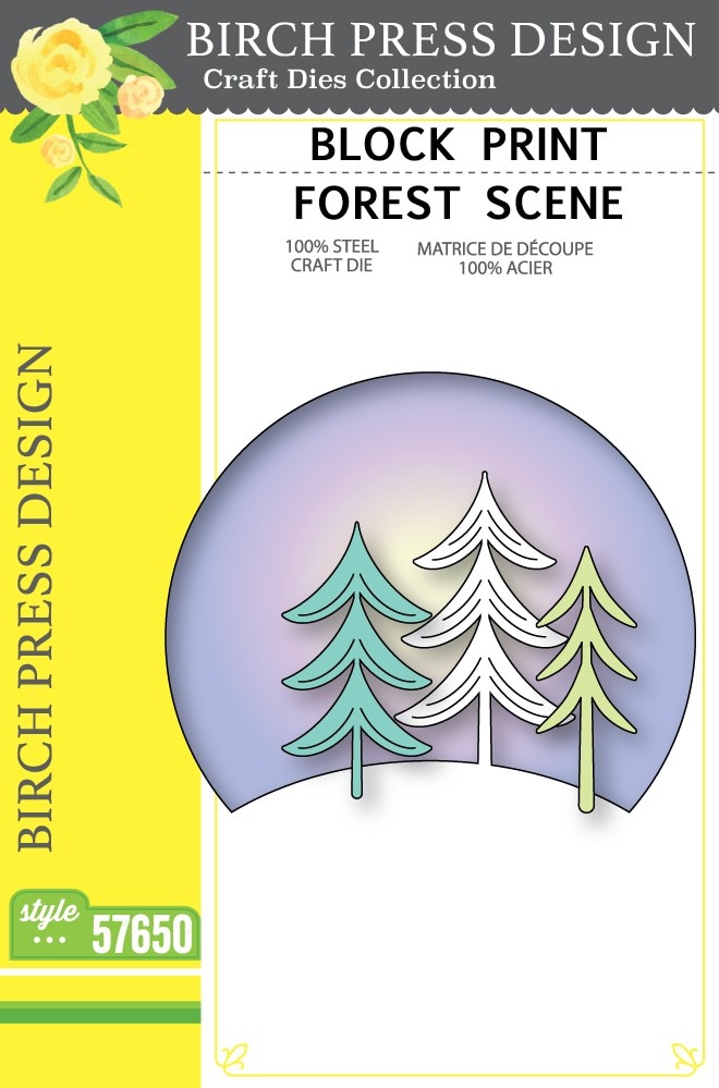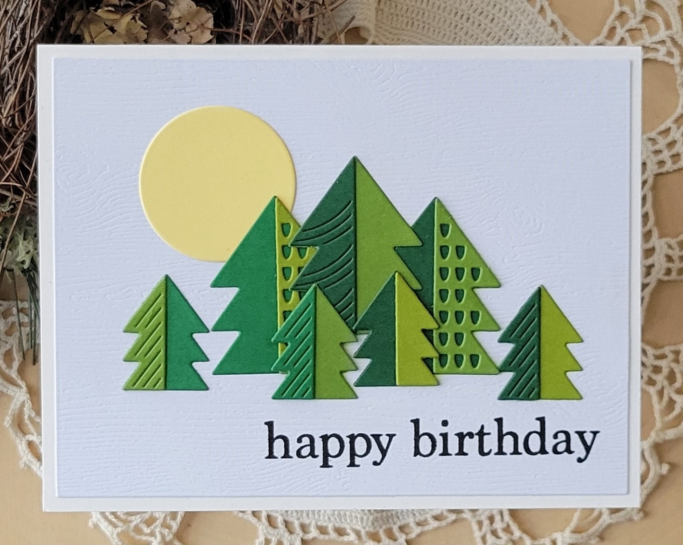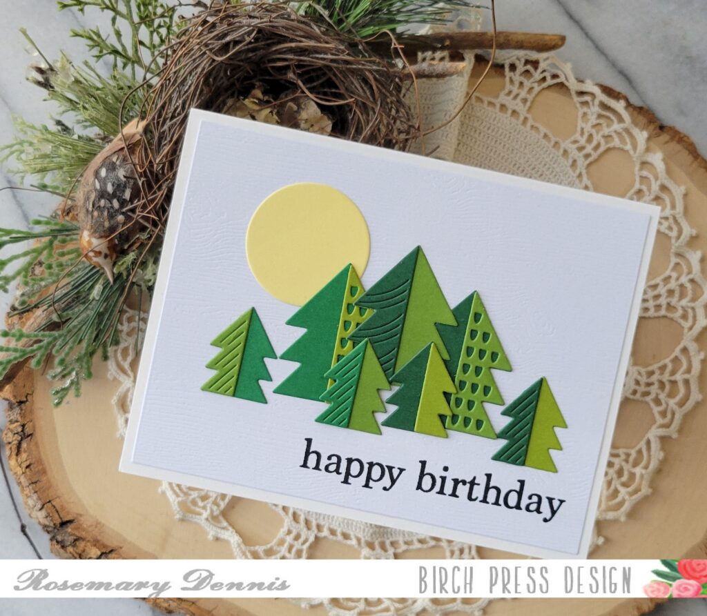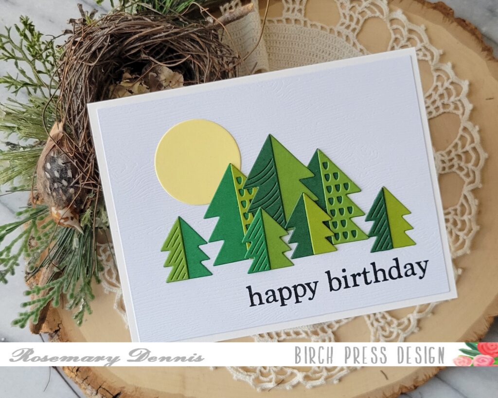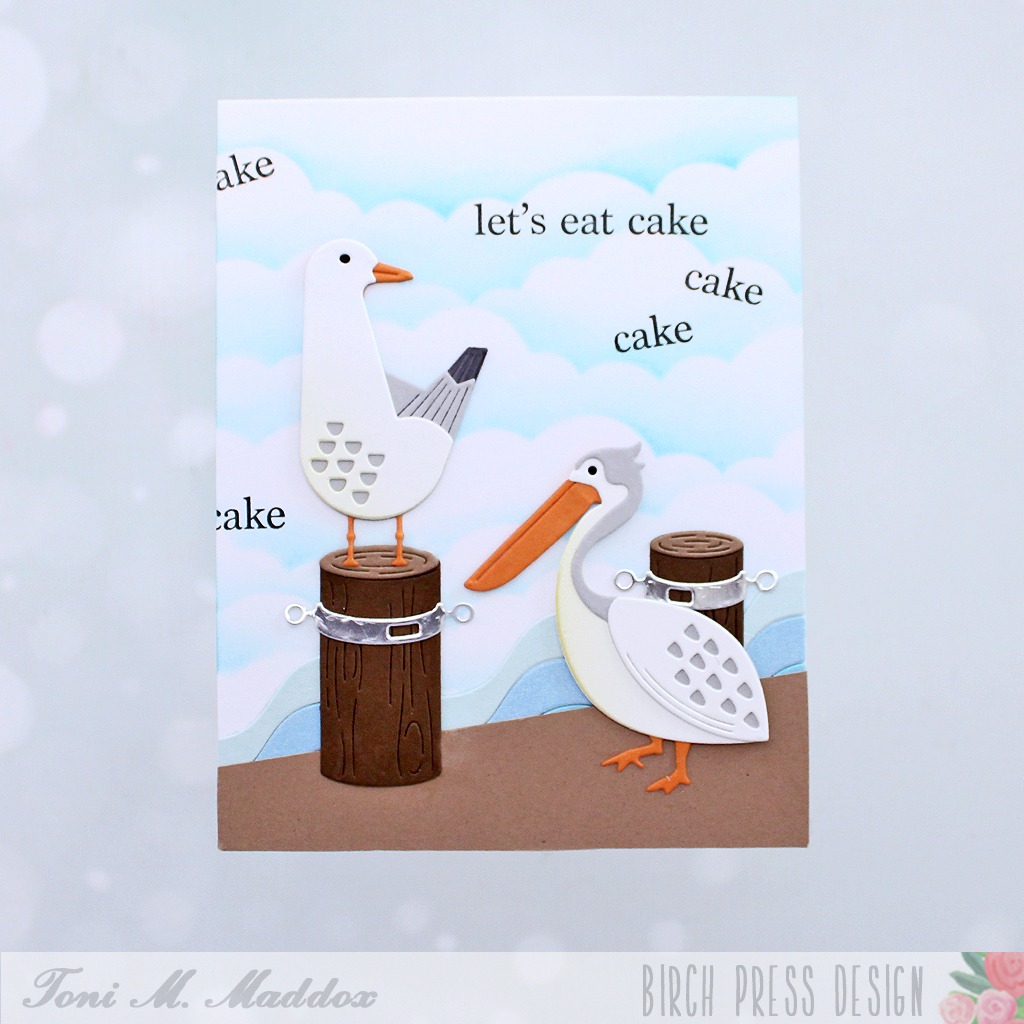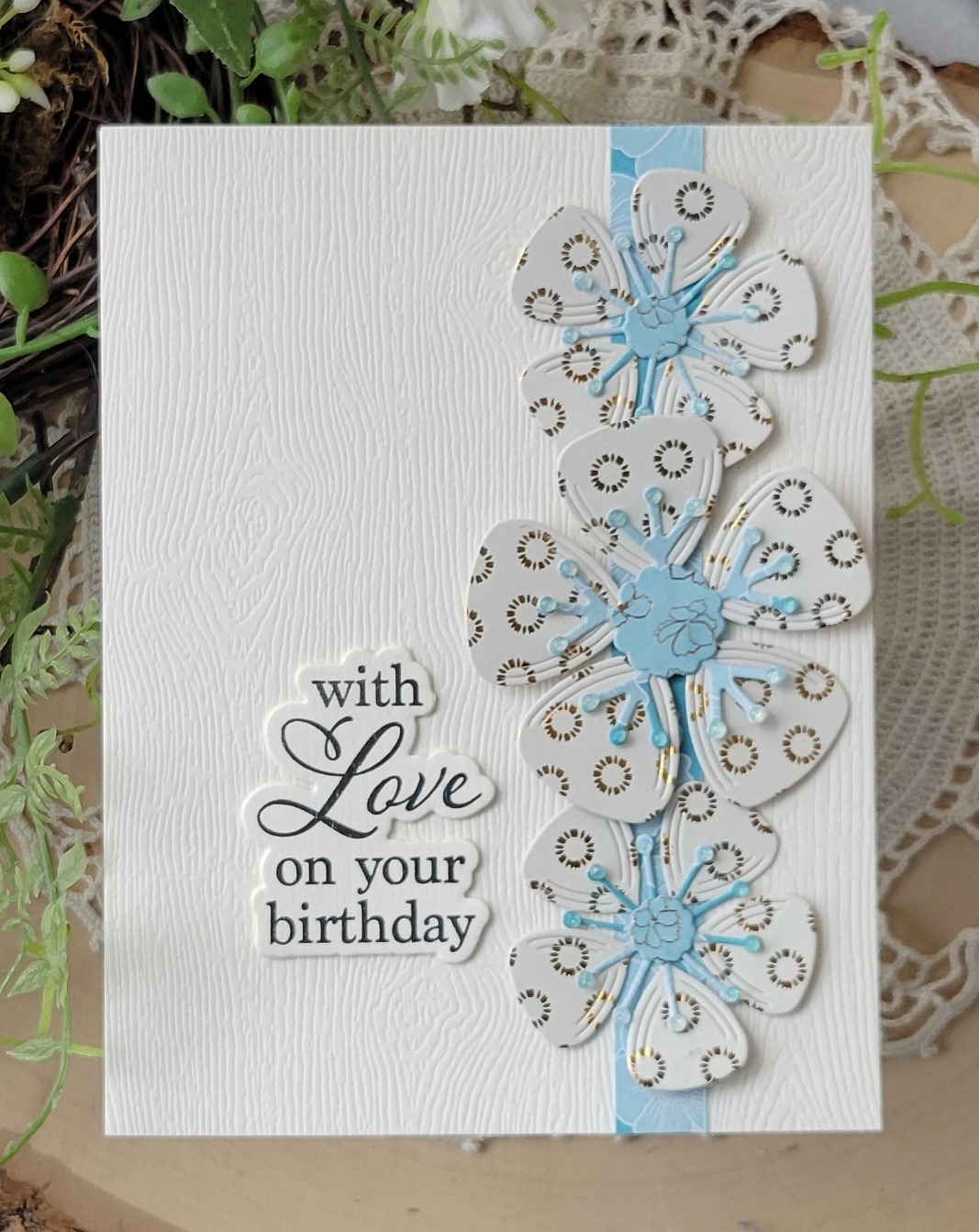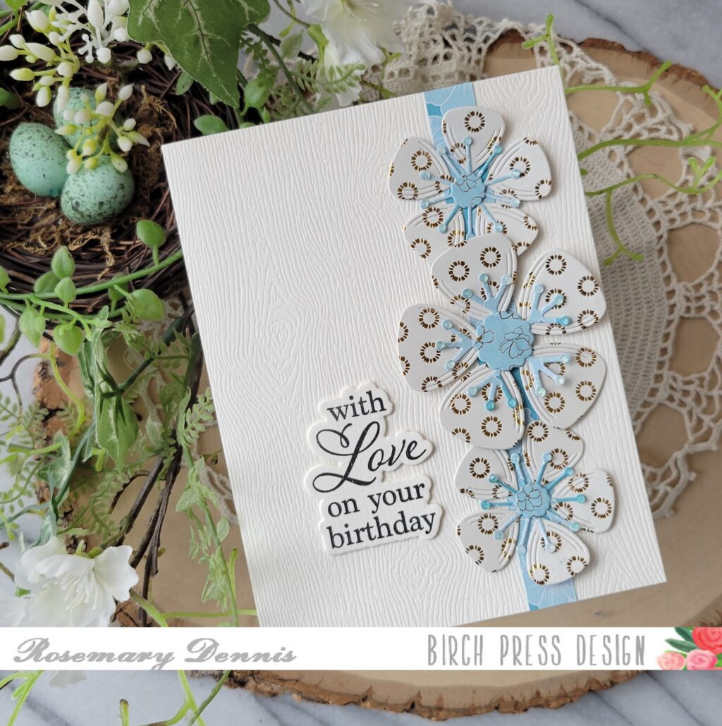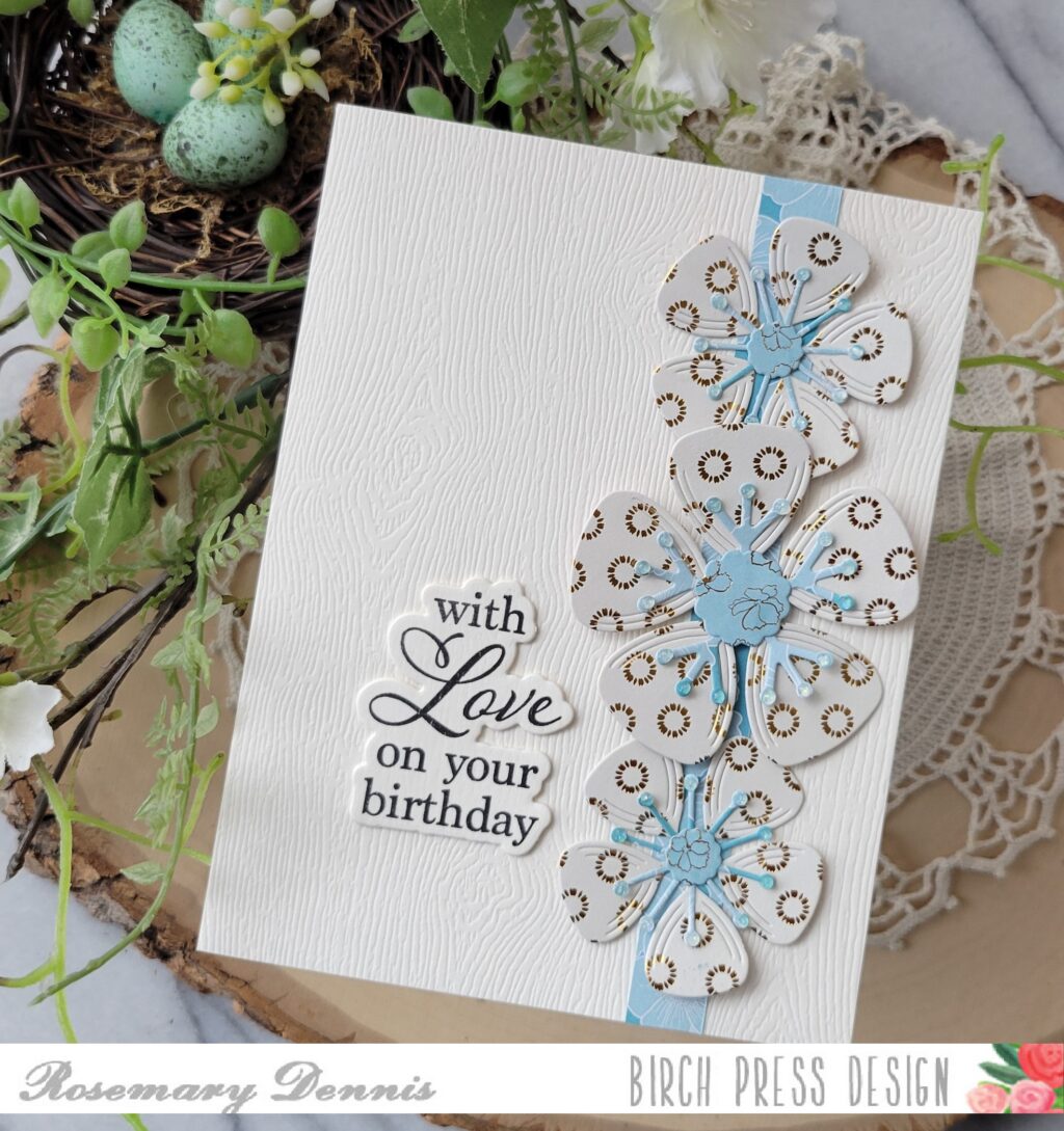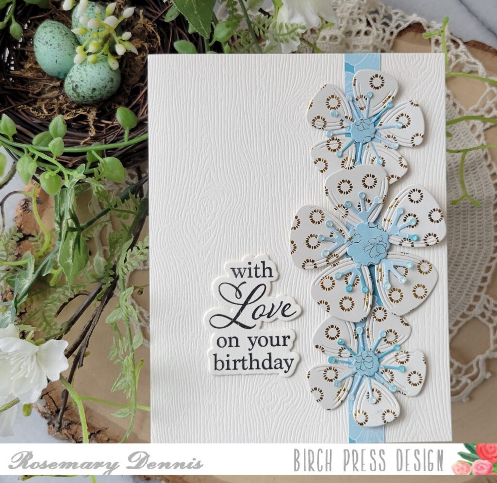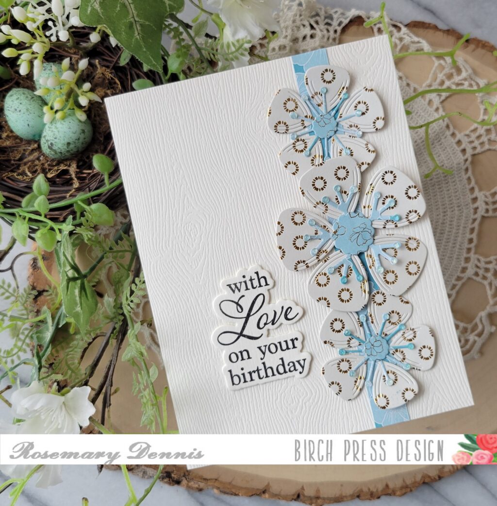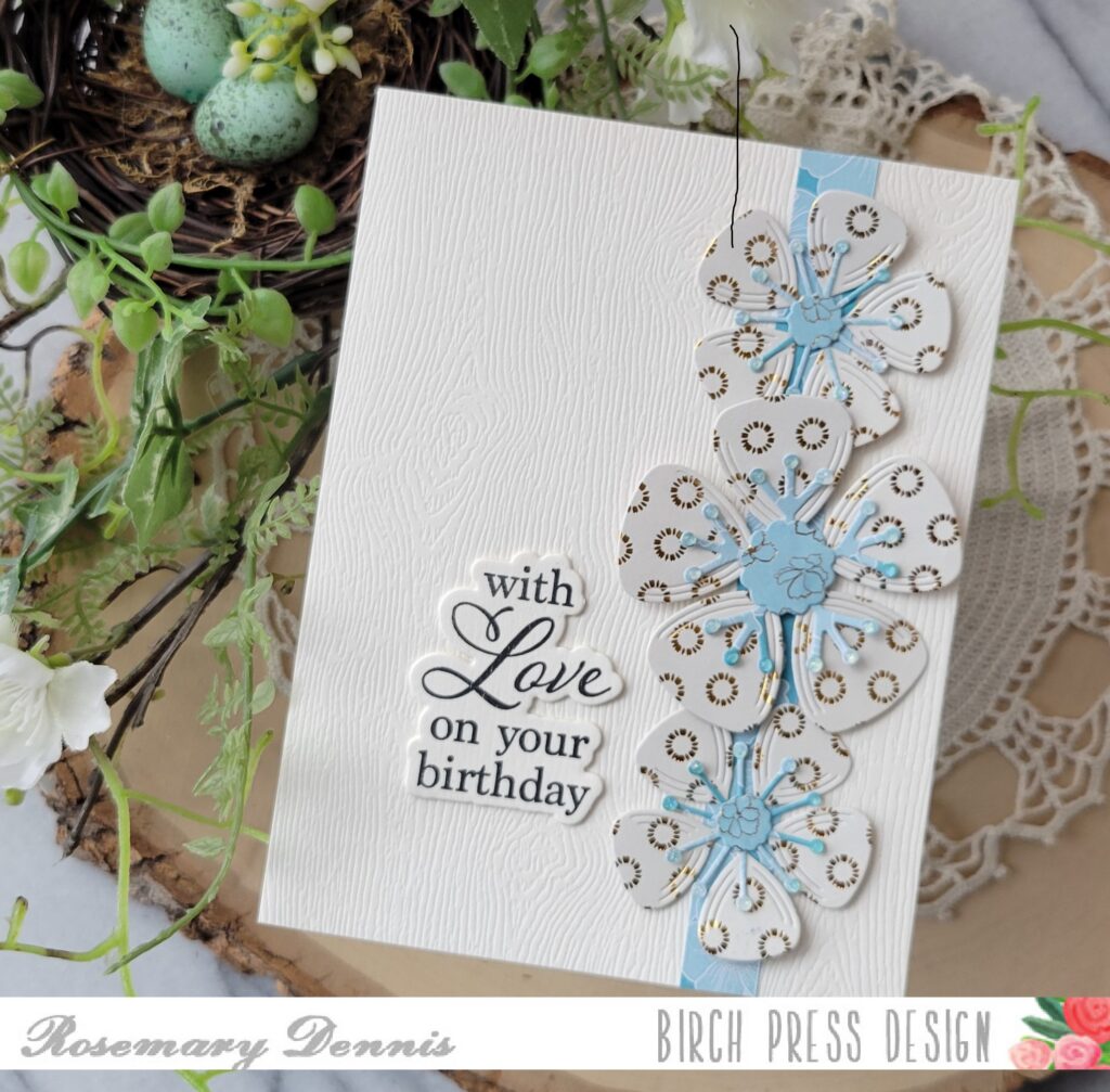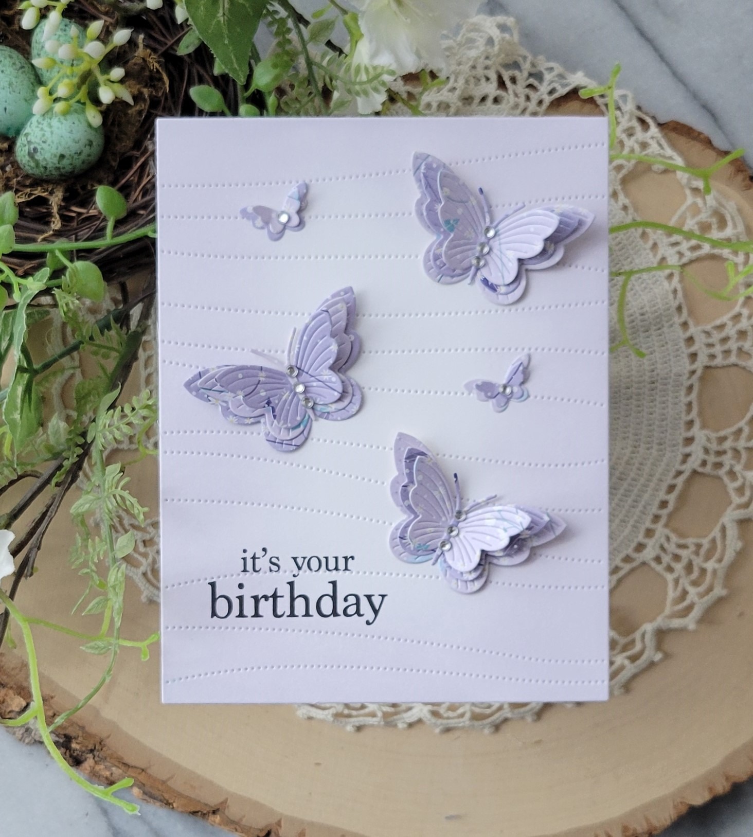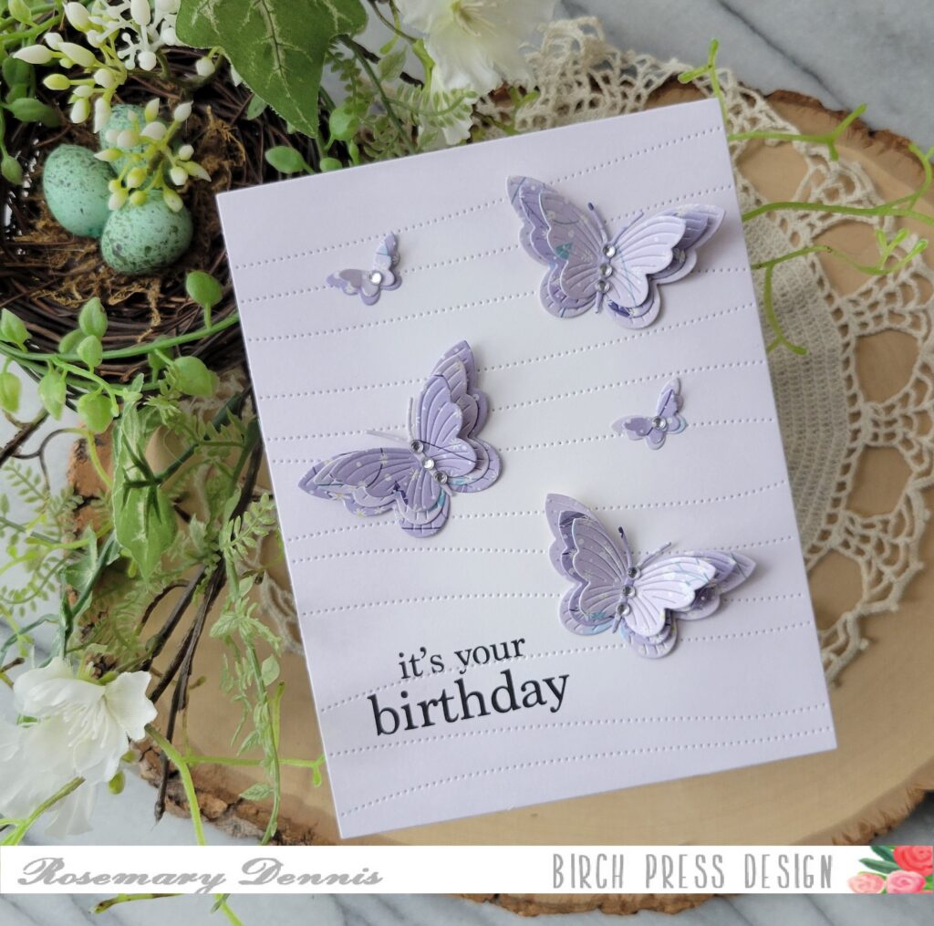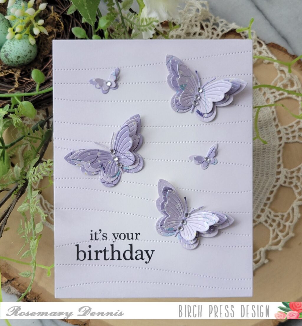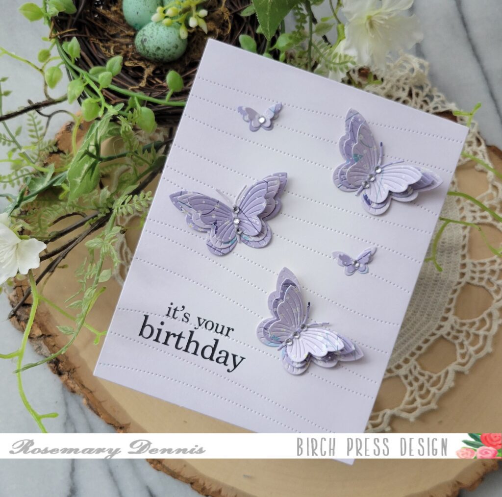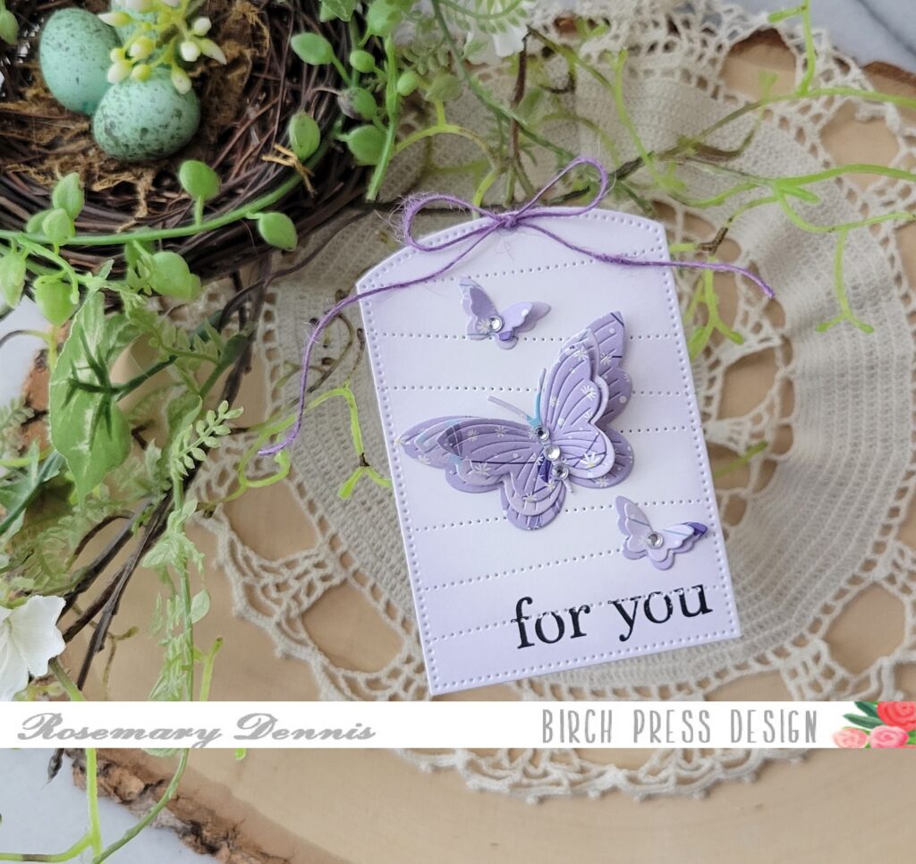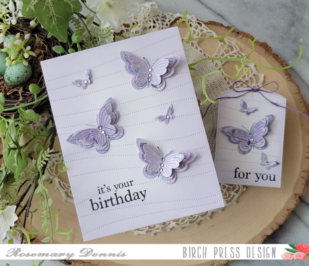
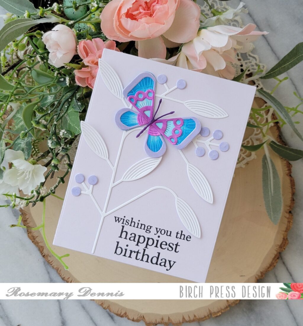
Hello friends! Rosemary here on the blog today with a sweet birthday card made with the new Block Print Deco Butterfly, Block Print Mod Branches and a sentiment from the Plain and Simple Birthday Greetings stamp set. Let’s take a look at what I made.
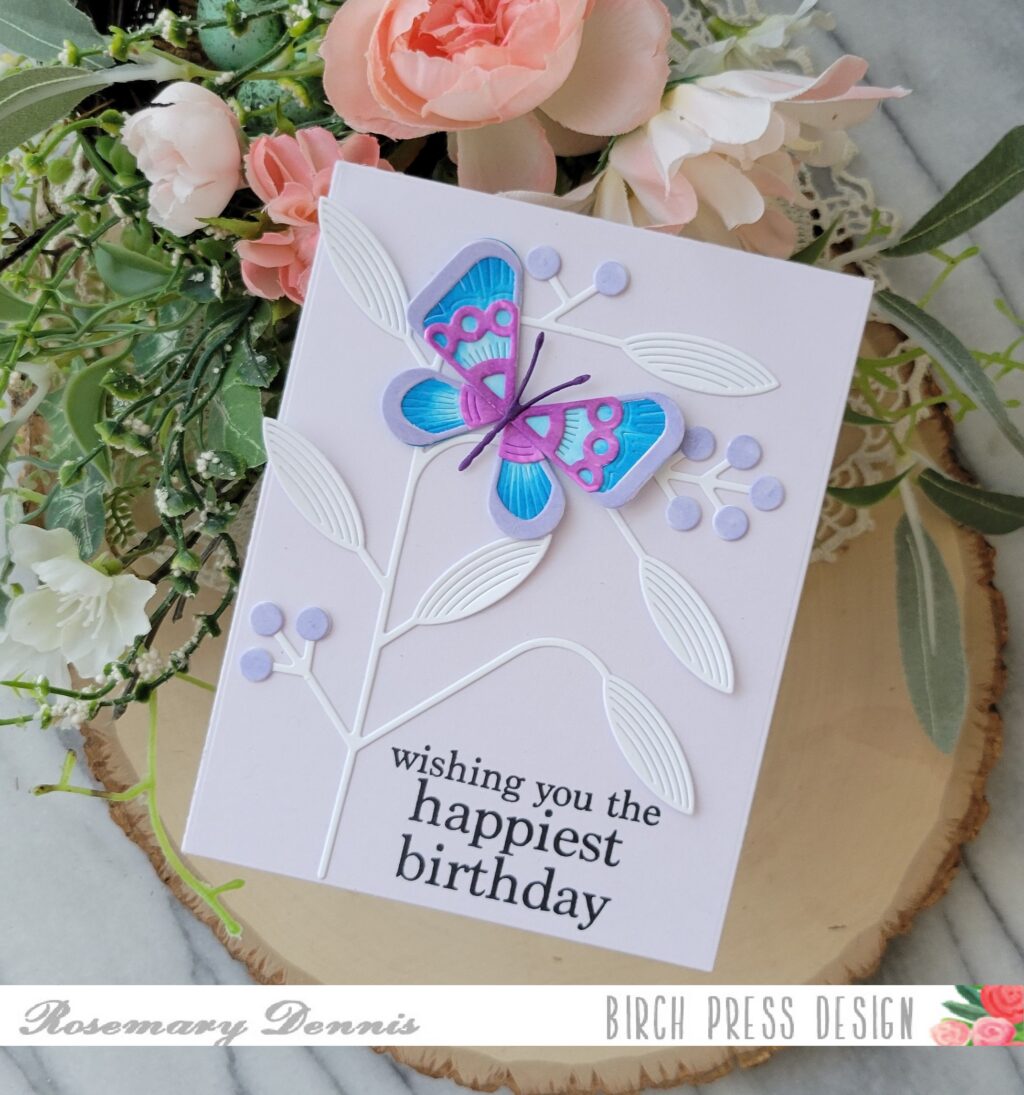
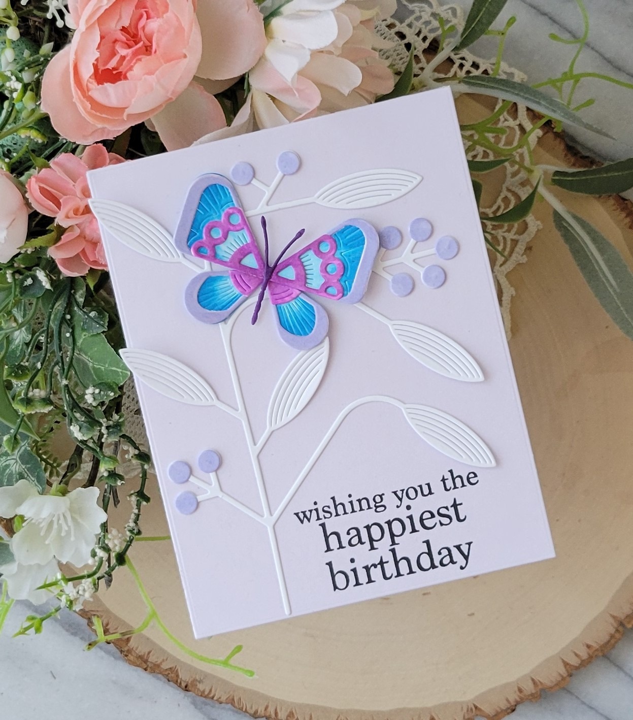
I started by die cutting all of the pieces of the butterfly and the mod branch from white cardstock. Then I decided to color the pieces using Copic markers. For this card I used a blue and purple color combo.
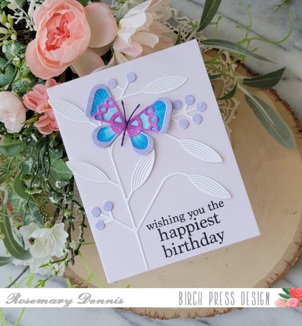
Once I had everything colored I let the pieces dry for a bit before assembling my butterfly with glue. I did use a dark gray marker to color the body.
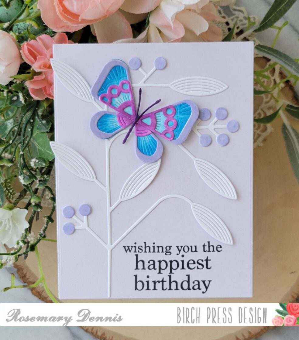
For the mod branch I decided to die cut the berries, as well, and then colored them with a light purple Copic marker. The berries were then attached to the branch with glue. I die cut a light purple cardstock with a rectangle die for the background.
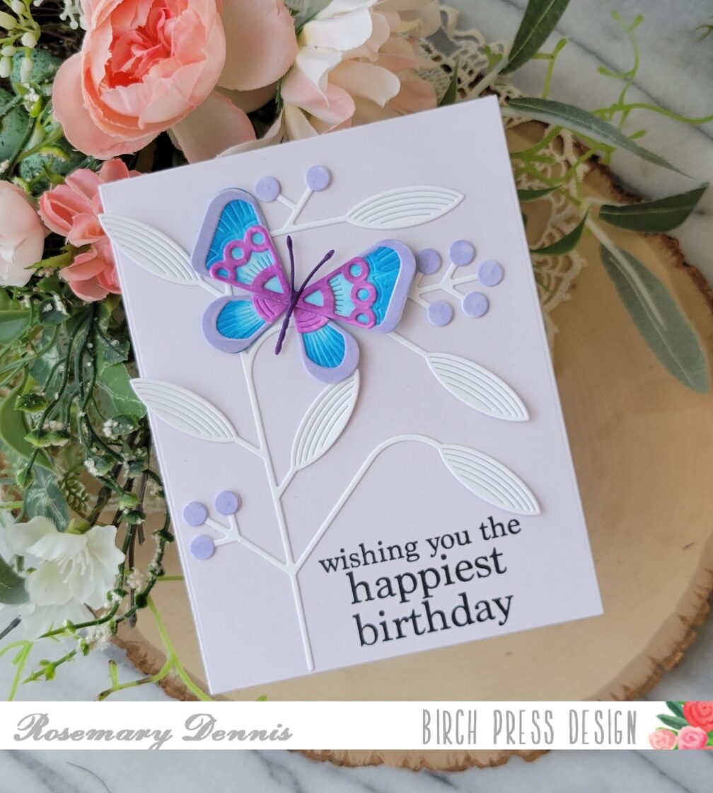
I don’t know if you do this or not, but it happens alot to me, but sometimes I get going on finishing a card and forget to stamp the sentiment before adding the images. That happened with this card. I added the mod branch using glue and then realized I needed to stamp the sentiment. Thankfully there was room for the sentiment and it stamped perfectly! The butterfly was added and the card was complete.
I hope you enjoyed today’s project. Thanks for stopping by the blog and have a wonderful day.