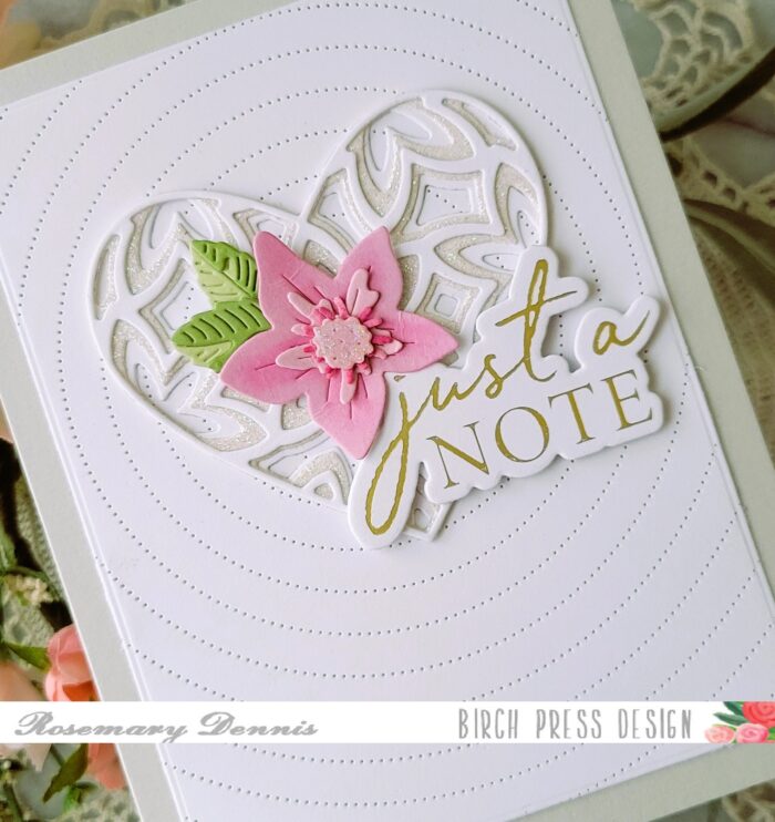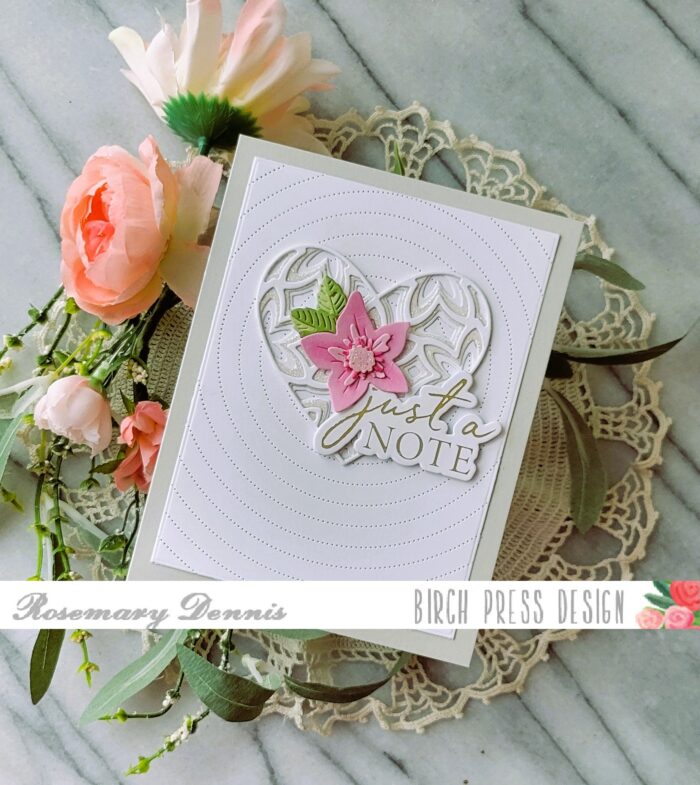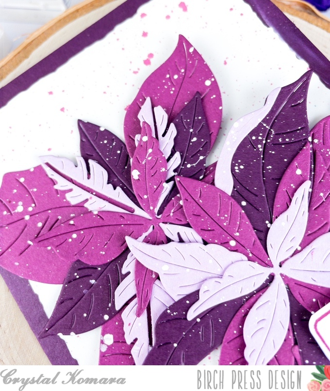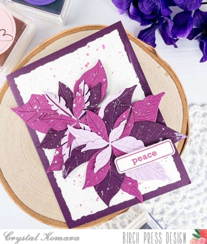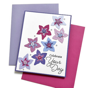
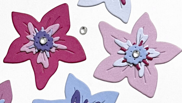
Hello, Birch Press friends. It’s always exciting when there are new products to play with, and that’s exactly what I’m doing today! I am featuring the new Gentle Flower and Leaves Contour Layers set. I love this sweet little flower, and I decided to make it the star of the show.
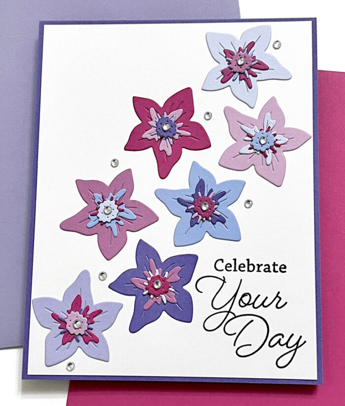
I first cut the flower die out of eight different colors of card stock. The die cuts all of the layers of the flower, so I was able to mix and match all of the layers and colors to come up with the various flowers that you see. I only used seven of the flowers on my card, since odd numbers work better for design.
The fun thing about this flower is that you don’t have to use all of the layers. It even looks sweet with nothing on it at all! I just had fun mixing all the colors up, so I wanted to use all of the layers.
I knew I wanted to arrange my flowers on the diagonal, so I found a sentiment that would tuck perfectly in the lower corner. The sentiment comes from the Friends and Family Stamp Set. I stamped it with black pigment ink onto my white card panel and then glued the panel to a dark purple A2 card base.
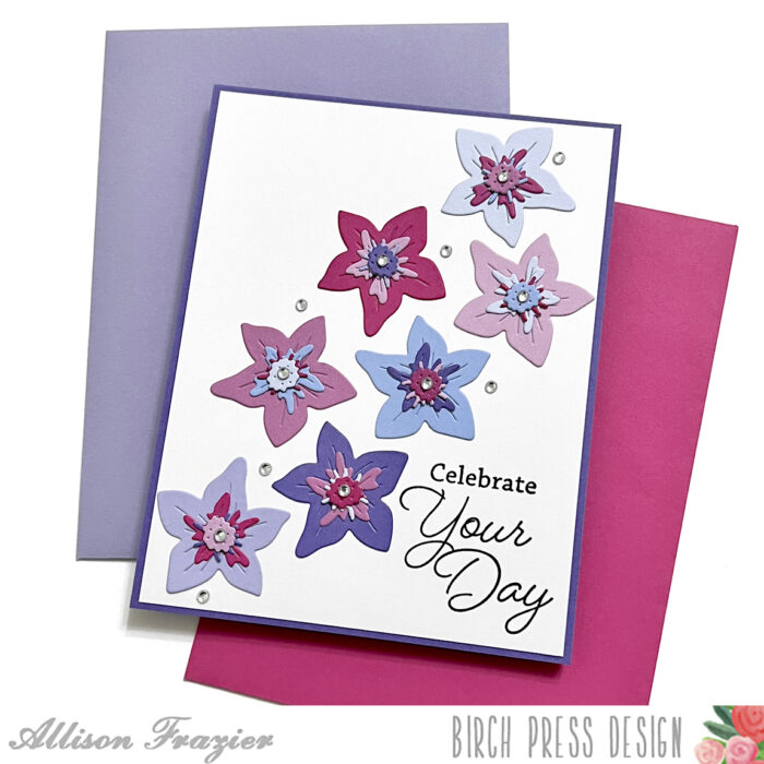
After glueing my flowers to the card base, I added some clear fairy jewels, both to the centers of the flowers and around the flowers. And that is it for my card today. I hope it brings a smile to your face. Thank you so much for joining us today.

Supplies


Supplies