
Hi friends,
What colors do you generally resort to for your holiday cards? I like to venture out and try new colors and textures for my holiday cards, so today I want to share my idea on a bold and shimmery card that is unique for the holiday!!!
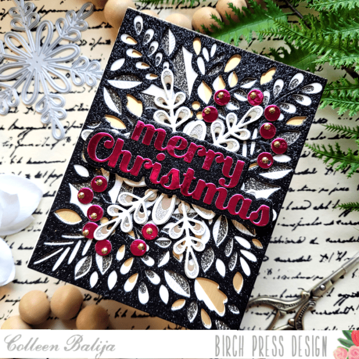
For my card I’m using Birch Press Designs Herbarium Layering Plates, Merry Christmas Sugar Script & Outline die, Crochet Snowflake layering die, Eucalyptus Stem & Berries Contour Layering die, and Memory Box Majestic Hues and Rainbow Reflections paper pads.

First step was to choose my color combinations. You can get inspired to find new colors by searching color mood boards or google popular colors, you can take inspiration from another card maker, or just choose your own colors! Try and limit your colors to no more than 3-4.
Once my colors were decided upon, the next step was to choose the texture I wanted to add. Texture is a great detail to add to your card and it can come in many forms! I decided on a combination of mirrored paper and glitter paper. Glitter paper has a different texture than the smooth finish of mirrored cardstock, so I thought the combination of both was perfect!

Next, I chose the design elements for my card (stamps, dies, embellishments). For me, it’s important to choose the color and texture first, as that makes it easier for me to choose the perfect stamps and dies!
Once I had my plan in place and everything gathered around me, I was ready to put the card together. I started with the background using the Herbarium Layering Plates. This is a GORGEOUS and detailed layering die! Each layer was die cut in black glitter, white glitter, and mirrored gold paper from the Memory Box Majestic Hues and Rainbow Reflections 6×6 paper pads. The mirrored gold was actually the 5.5×4.25 card base as well so it served a dual purpose! I set my finished background aside and worked on the focal point – the sentiment.

I die cut the Merry Christmas Sugar Script and Outline in magenta and glitter black cardstock. Since the sentiment is the focal point, I chose a color that would stand out from the background! After I finished the sentiment, I decided that I wanted more magenta on the card to even the colors out a bit more, so I die cut the Eucalyptus Stem & Berries Contour Layers in the same 2 colors as the sentiment.

I wanted another layer to be added between the background and the sentiment so that the sentiment would stand out from the busy background. I die cut the Crochet Snowflake layered die in shades of silver, gold and white glitter and mirrored cardstock and adhered it over the background. I stayed with the same color scheme for the snowflake with the exception of black.
Next, I tucked the Eucalyptus Stem & Berries behind the Crochet Snowflake and then added the sentiment, which was popped up on foam tape to help it stand out even more. Every little bit helps! I finished with a few gold sequins over the berries!
If you look at the finished card below, you can see a nice flow of color and texture! The eye is drawn right to the sentiment, and that’s what you want! You can get away with as much busyness as my card has when you limit your colors and textures!

Next time you work on your holiday cards, no matter what the holiday you’re celebrating, search the Color Mood boards or google popular winter colors to get ideas on unique combos that you can use for your cards. You won’t regret it and your recipients will be delighted to get such a beautiful and unique holiday card from you! I’m so glad you joined me today!

Supplies


