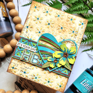
Hi friends! I’m back for Part 2 of How to Use Color Mood Boards for Inspiration! If you haven’t watched my previous post, be sure to visit that one as well for more inspiration! I love to use mood boards for color, texture, and design layout for my cards. Everything is done for you, so all that’s left is for you to choose what inspires you and make your card! Here is the mood board that inspired today’s card:
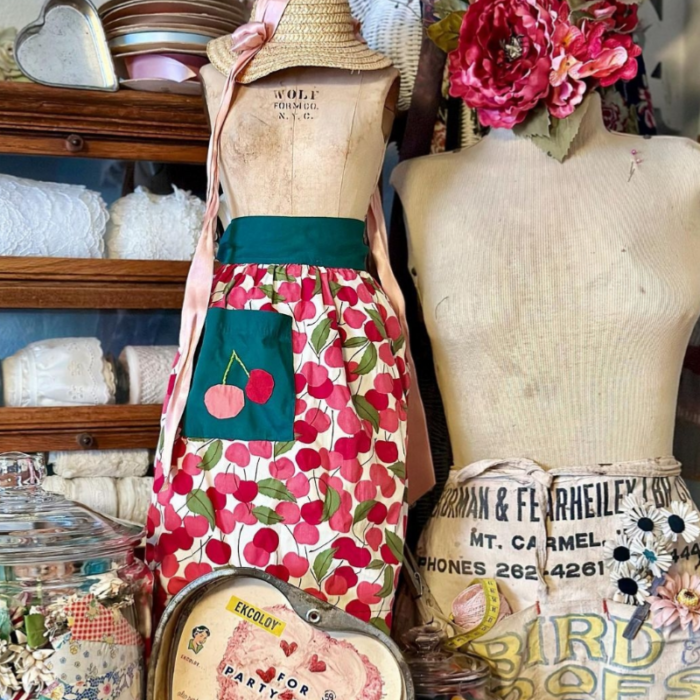
This mood board seemed old fashioned and rustic to me. I loved the hunter green from the apron, the yellow, brown, and blue from the words (lower right corner), the striking black words right above it, and the distressed shades beige from the manikin. The textures that I loved were from the manikin, the straw hat, and the large heart below the cherry apron. I wanted my card to be rustic and include a heart, flowers, and a mixed media touch with lots and lots of texture!
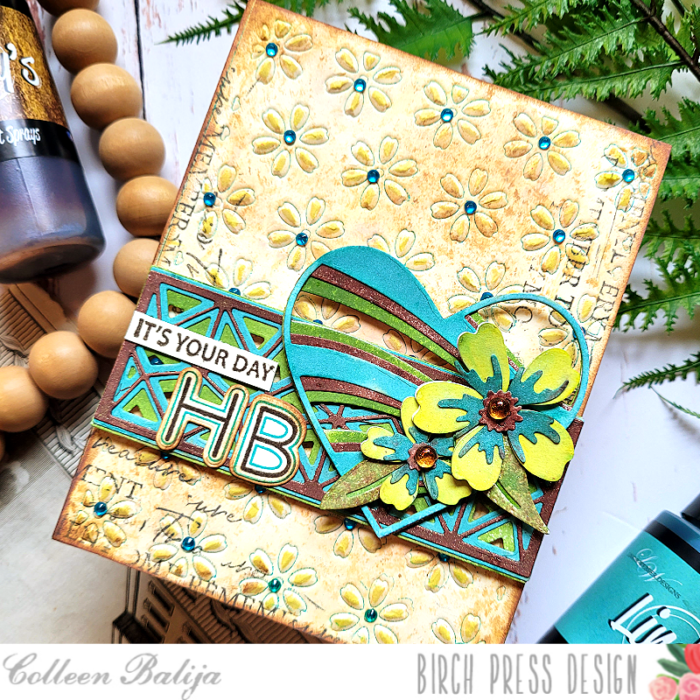
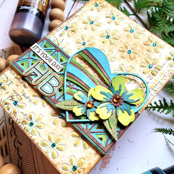
Step one was to create a textured background based on my observations of the mood board. You can see in the photo below all of the subtle, effective detail to my background. Let’s talk about how I achieved this look!
First, I duplicated the various shades of beige on the manikin using 3 shades of brown distress inks and then ink schmooshing onto watercolor cardstock. I placed the inks onto a glass media matt, sprayed with water, and then dipped the watercolor paper onto the ink. I kept repeating this process until I got the desired result. It helps to start with the lightest color of ink and heat each layer before adding the next layer. This creates a distressed look similar to the wood and manikin in the mood board.
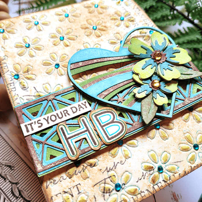
Next, I applied a dark teal shade of ink onto Flora Die Plate Layer B and then placed my inked-up card panel over the die plate and embossed it with my die cut machine (embossing techniques vary by machine – see the instructions for your machine on how to emboss with dies). The emboss technique creates an impression of the die onto your card panel without cutting all the way through it. When I removed the die plate, I was left with an embossed image of flowers edged with the teal ink! Then I went back over the raised image with a bright yellow ink to give the flower petals a pop of color! I adhered the card panel to a white 5.5×4.25 card base and added blue Fairy Jewels over each flower for added interest.
Next step was to work on the flowers and add even more texture! In the photo below, you can see the color and texture with the Banner Hearts die, Mini Splendor Bevel Plates, and Phlox Blooms & Leaves dies.
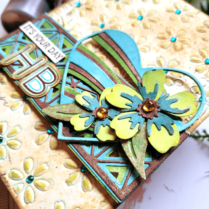
I die cut all of the above mentioned elements onto white cardstock. Then, I sprayed each of them using my Lindy’s sprays. Lindy’s sprays have subtle color variances and a bit of shine to them, so I knew they would be perfect for this mixed media project! After everything dried, I adhered the layers together. I placed the Mini Splendor Bevel Plates die over the card base about 2/3 of the way down. Then I placed the Banner Hearts die over it and to the right. I placed the 2 Phlox flowers and leaves over the lower part of the heart and finished with a “HB” (Happy Birthday) sentiment from Mod Alphabet stamp and die set. I chose that set because it reminded me of the bold yellow and blue words on the apron! Then I added “It’s Your Day” from Kind Hearts stamp to complete the sentiment.
I love to find unique elements from color mood boards to use on my cards, and I generally get lots of comments about it! I think that’s because the mood boards really inspire me to get playful! See if you can find some unique color mood boards that inspire you to jazz up your cards! You can even use mine! Be sure to let your creative juices flow on the layout and design of your card! Thanks for stopping by today!
Supplies


