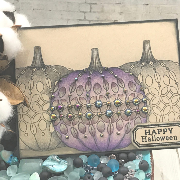
I am here today coloring a pumpkin… of course in a non-traditional way…
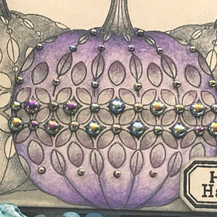
When we think of pumpkins we first think of orange, today we will see purple!
Today’s project is featuring the Pumpkin Lacework Stamp Set and you can decide which coloring medium you want to use for your image. I chose my colored pencils…
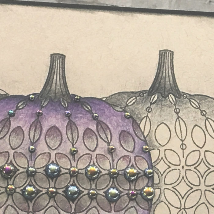
I started by stamping and masking my card stock to show the pumpkin image three times across my card stock. The pumpkin in the from will be our focal image while the other two will be pushed to the background simply by using grays and blacks for the coloring…
I used tones of purple, reds and grays across this image…
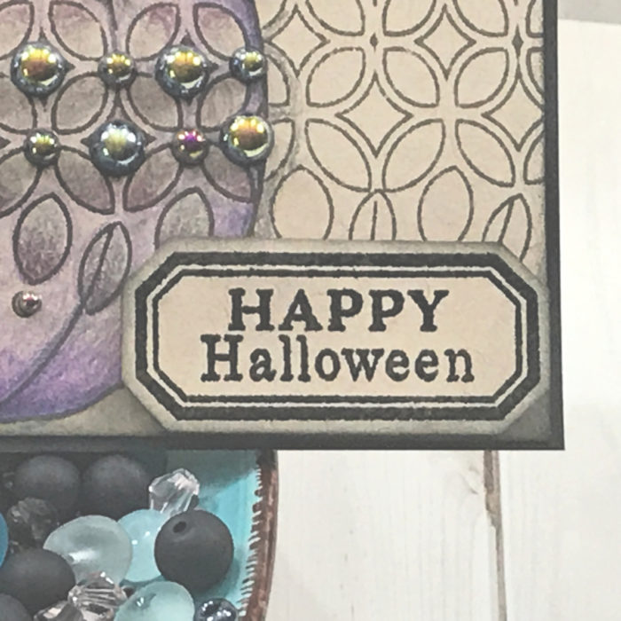
By simple adding black iridescent pearls puts this pumpkin to the next level, close to elegant!
Our sentiment is simply… Happy Halloween!
As always, I hope you enjoyed today’s project… and if you want to see more details just click on the video below and see how these projects come together step by step!
Make sure you stay tuned for more wonderful projects coming soon! Have a great day and always remember… Be Creative!
Hi friends! Thanks for stopping by! I hope you’re having a great day ! If you’re feeling cooped up I encourage you to take a ride in the car. The leaves are changing colors and they’re absolutely gorgeous!
We took a recent visit to a local farm stand and it was a real lift for the soul! It wasn’t crowded and the assortment of harvest bounty on display was amazing!
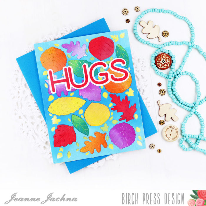
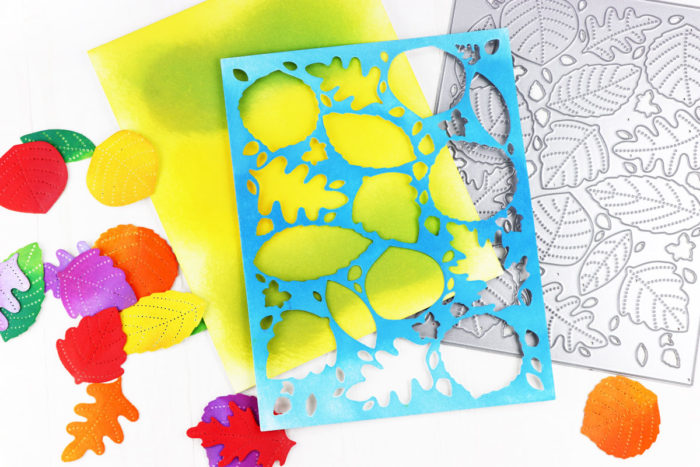
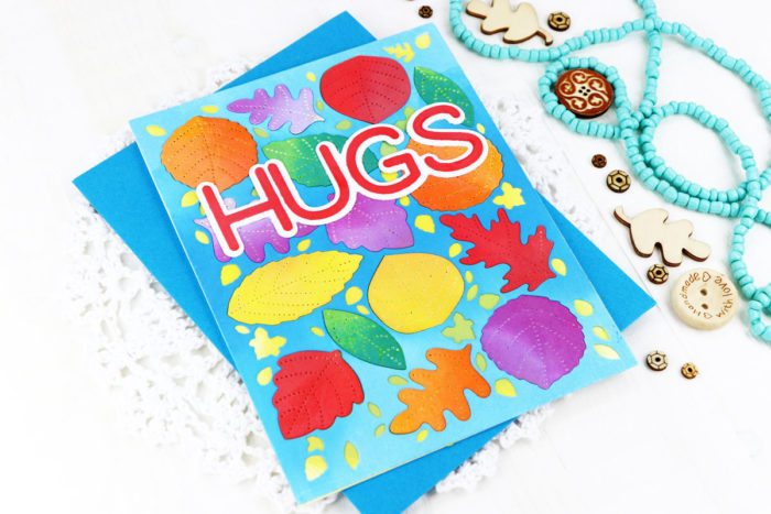
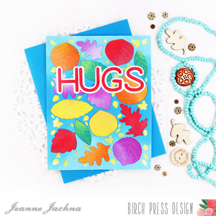
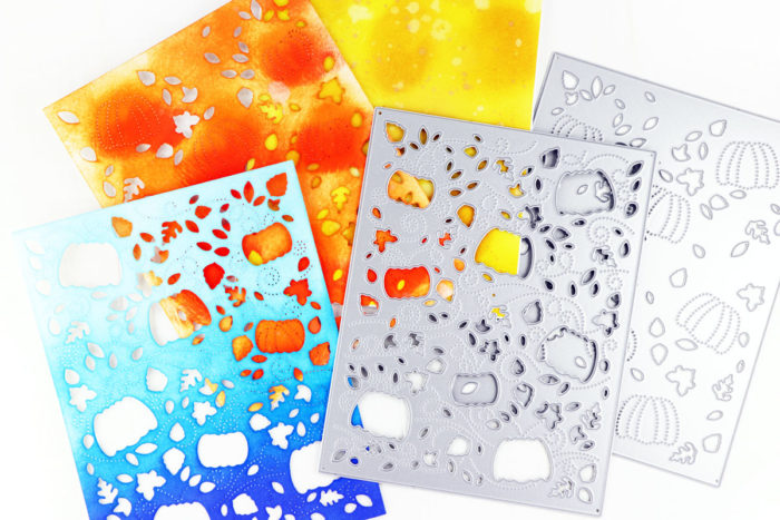
My card today was made with the B layer of the Autumn Breeze layered die set.
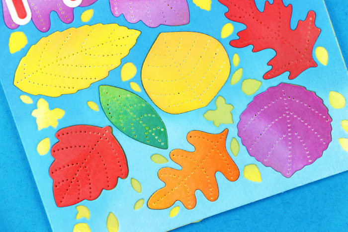
Everything you see is inked with Distress Oxide Ink. My card base is shades of yellow and green, topped with the die cut panel in shades of blues, and the leaves are everything in between!
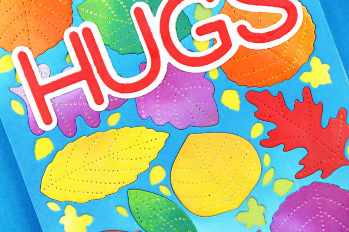
I love this die set and it’s absolutely worth every penny because it’s so versatile! If you look close you’ll see the pierced detail design on each of the die cut leaves. This die produces a large assortment of gorgeous detailed leaves.
I couldn’t cover this pretty panel so I added a simple sentiment using the Jumbo Lingo Hugs die cut. This too was inked with Distress Oxide Ink in Barn Door.
Enjoy the rainbow of color and beauty that only Autumn can bring!
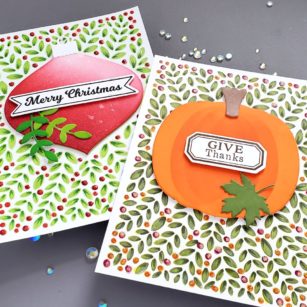
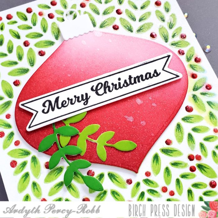
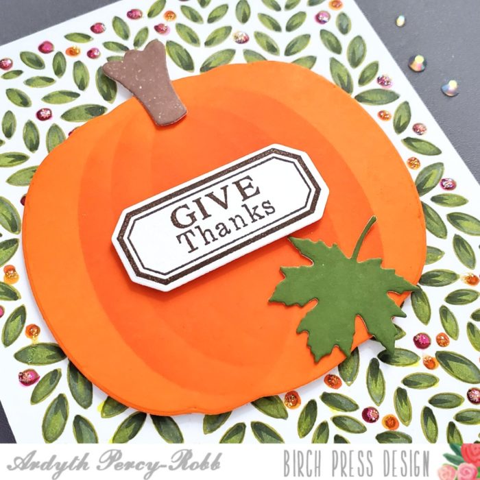
Good morning! Ardyth here with an easy way to get more from the gorgeous leafy background in the Christmas Ornament and Labels stamp set.
First, I stamped the background with green ink and did some no-line colouring with alcohol markers. I die cut an ornament and blended it with red ink, leaving a lighter area on the top right as a highlight. I popped it up on the card right over the ornament outline that is part of the stamped background.
I stamped one of the banner sentiments and cut it out, and popped it up over two of the branches, cut with the die included with the set. I added Nuvo Clear Crystal Drops to my red berries.
Then, I did it all again! This time, I chose a darker, warmer green colour for my leaves, and orange and pink for my berries.
I covered the stamped ornament outline with a die cut pumpkin from the Pumpkin Lacework stamp set. I blended orange ink over it, using the edge of the negative portion of my die cut, to give some dimension.
I stamped one of the included sentiments, cut it out and popped it up on the pumpkin, along with the stem and a maple leaf.
I hope you’re inspired to look at your stamps and dies to see how you can change them up and get more from them!
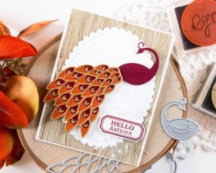
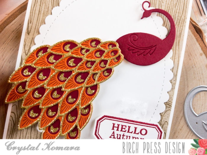
Happy Thursday readers! This is Crystal here with you today. I know that you have been seeing lots of beautiful Christmas inspiration here on the Birch Press Design blog recently, but admittedly I’m kind of a Grinch, so I don’t “do” Christmas until December 1! : ) I will stretch out fall (MY favorite season) for as long as I possibly can. Today’s card is a great example, because I’m not even sure that “fall peacock’s” are a thing, but I’m starting the movement. (I’m also side-Googling if any other peacock colors exist other than the blue-green hues we traditionally see). . . And if not, they do now!
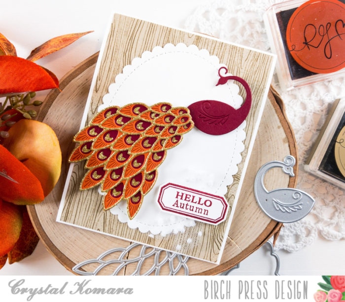
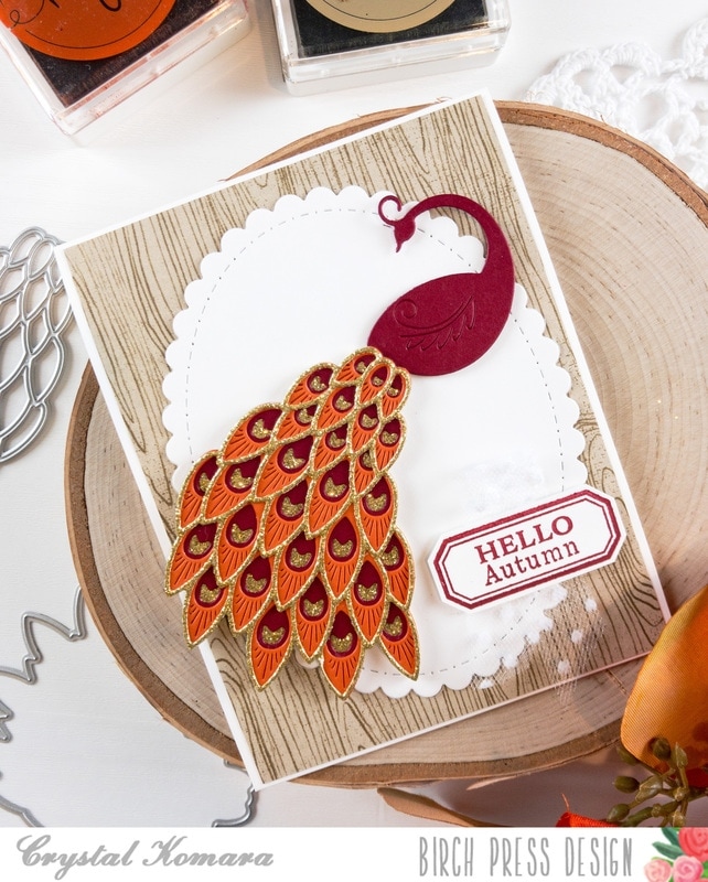
The base of this A2 sized card is made from 80 lb. Neenah White Solar Smooth cardstock. This is my go-to white cardstock that I use for everything from card bases, die cutting, stamping and Copic coloring. The first 5 1/4″ x 4″ mat is a piece of miscellaneous woodgrain foil paper. I die cut a large white oval from white cardstock and adhered it to the center of the card using a Tombow Permanent Dot Runner.
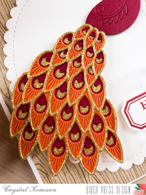
Using the Regal Peacock Layering dies, I die cut the bottom layer (Layer D) from gold glitter cardstock. I die cut Layer C from cherry cardstock. I die cut Layer B from rust cardstock and finally Layer A was also cut from gold glitter cardstock. I also cut the body of the peacock from cherry cardstock.
I adhered all four layers of the Regal Peacock together using LineCo ph bookbinding glue. This glue is my preferred liquid glue and holds glitter paper together much better than a dot runner. I adhered the completed peacock to the center of the oval using foam adhesive for added dimension. Lastly, I stamped the sentiment on white cardstock (using the Christmas Ornament Labels stamp set) in cherry ink and die cut it using the coordinating die. I adhered the sentiment to the lower right side of the card using foam adhesive.
Hopefully I’ve convinced you that with a little imagination, peacocks can look beautiful in any color – even if it’s not “real.”
Thanks for visiting and have a wonderfully creative day!
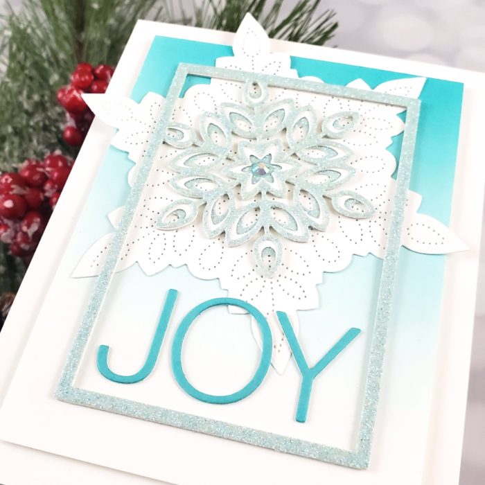
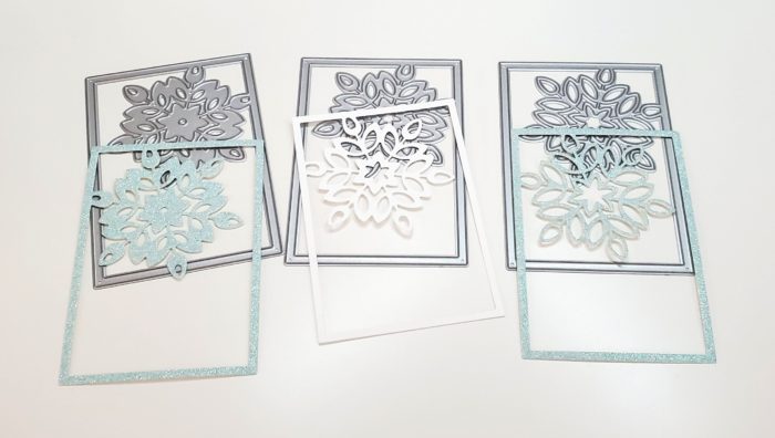
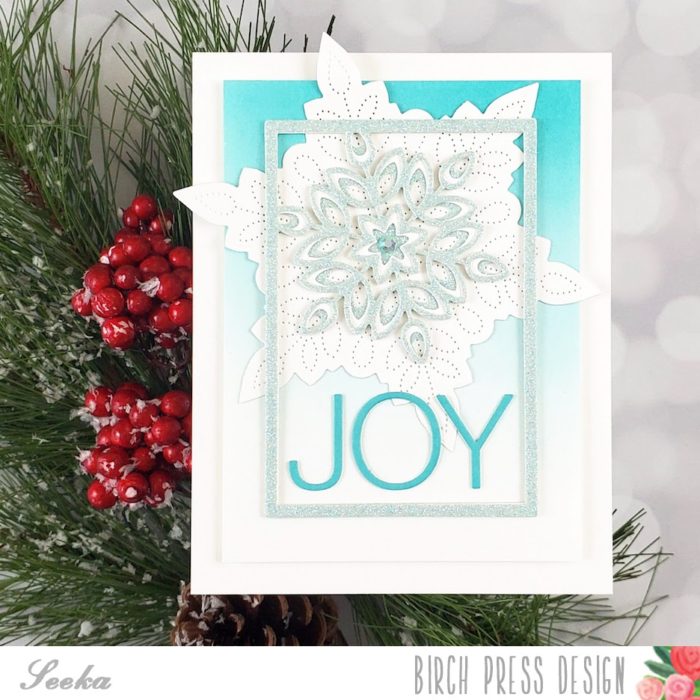
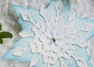
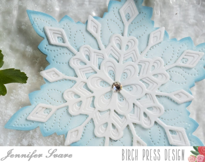
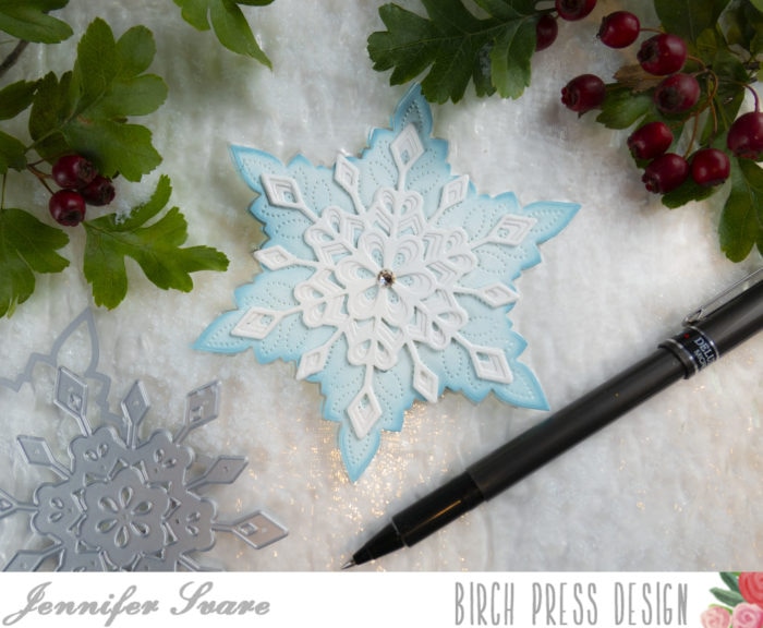
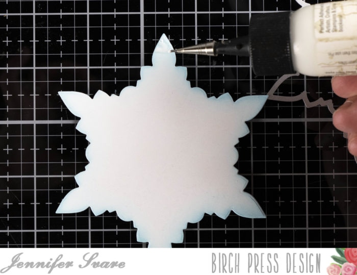
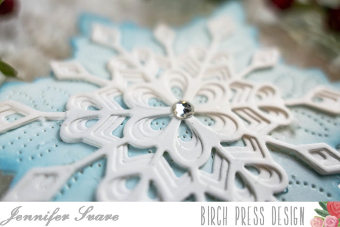
Hello, crafty friends, Seeka here and today I’m sharing a sparkly monochrome card featuring the new Pinpoint Snowflake die and the Mini Snowflake Frame Layer dies.
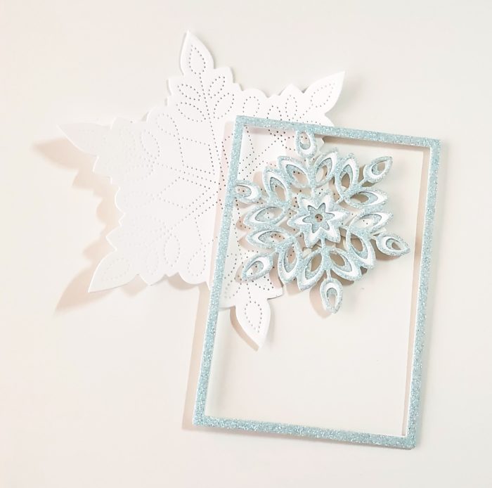
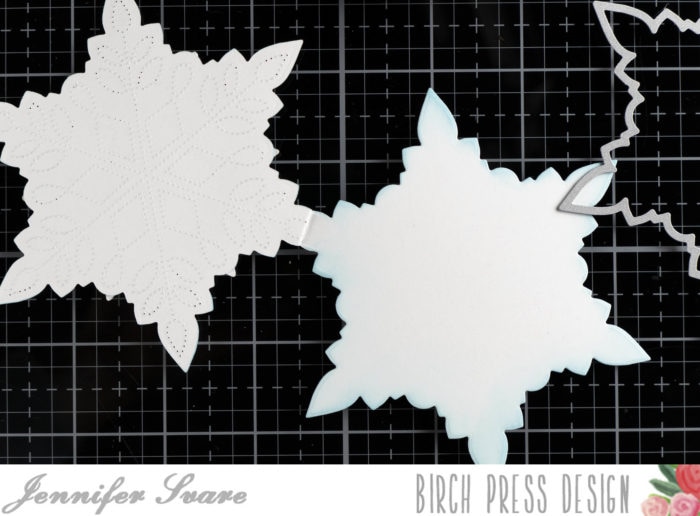
I began by die-cutting the three layers of the frame. The top and bottom layers are cut from shimmering cardstock from the Delicate Pastel Glitter Pad by Memory Box and the middle layer is cut from white cardstock.
I adhered the layers together and then die cut the Pinpoint Snowflake out of white cardstock.
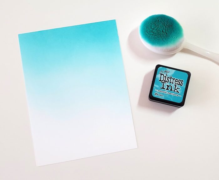
Next, I used a blending brush to blend Peacock Feathers Distress Ink onto an 4.25″ x 5.5″ inch panel of white cardstock. Then I trimmed the panel down to approximately 3 5/8″ x 4 7/8″.
For the sentiment, I used the Simple Joy die to cut a piece of aqua cardstock.
To assemble the card, I adhered the snowflake frame to the pinpoint snowflake and then adhered the combined piece to the ink-blended background. I adhered the sentiment letters and then used foam tape to adhere the card front to an A2-sized card base, and then adhered a small jewel to the center of the snowflake as a finishing touch.
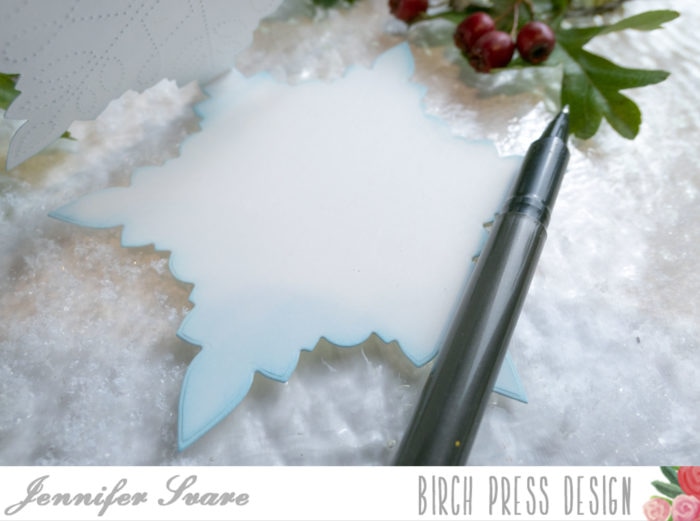
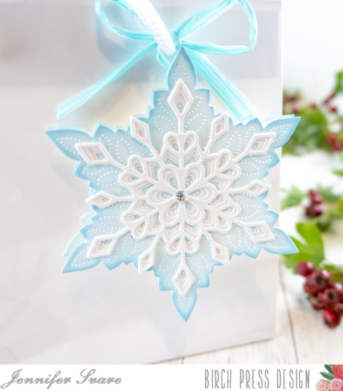
Hello! Today I’ve combined the new Frosty Flake layers along with the Pinpoint Snowflake used as a background to create a mini card or gift tag. The gorgeous layers were white-on-white, with a soft dusting of blue distress oxide gradient on the bottom layer.
I call it a “mini card” because it’s smaller than a standard A2 size, but it’s not tiny. It’s perfect for a small card or tag. See the reference to the pen above. This would still fit nicely in an A2 envelope when used as a card.
I love how the Pinpoint Snowflake comes with an outer shape die as well as the pinpoint interior plate. This allows a lot of versatility with the design. I die cut two of the basic shapes (above), and glued the very tip of the flakes together. This gives me a shaped card that has no embossed pinpoints on the interior for writing. The outside was embossed with the pinpoint plate for a beautiful background. The interior also has a soft gradient of blue sponged on as well.
The photo above shows it being used as a gift tag on a plain white gift bag. So pretty and I love how the light shines through the pinpoints. The top layers are made from all layers of the Frosty Flake die set. Paired with the pinpoint background, it’s simple, but yet has so much beautiful detail. To use it as a tag, I simply tied ribbon through the inside. No gluing or holes needed and it stays perfectly secure!
These could be done in so many different colors, and given as a gift tag or card set. Snowflakes last all winter, not just the holidays! What about thank you cards in January? Or a Happy New Year greeting written inside?
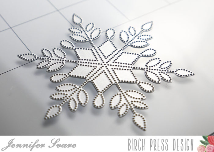
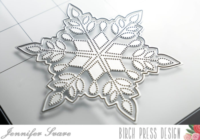
The above photo shows the pinpoint die from the Pinpoint Snowflake set. This can be used alone for many different background effects. I used this for the exterior background of my card.
The outline die cuts around the edge, leaving a nice border around the pinpoint design. I die cut one as shown above, and one using just the outline die, as shown below:
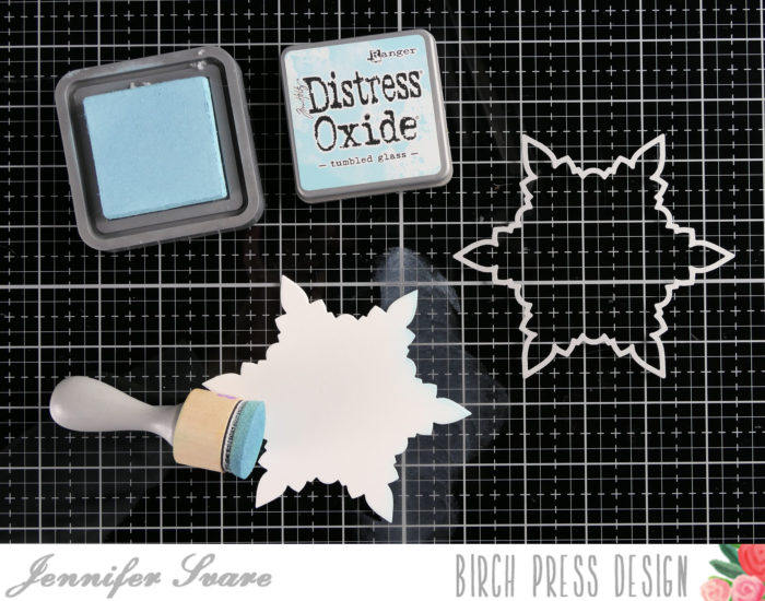
For both the top and bottom, I went around the edges with Tumbled Glass Distress Oxide ink, following through to a soft gradient on the inside of the snowflake.
Once the inside had shading done, I applied glue to the top portion of the snowflake and glued the front and back together to form the card. This creates an area that the card can bend and be opened. Because I glued approximately 1/2″ down, the card is not fragile when opened.
Layers A, B, and C of the Frosted Flake set were glued together, and then glued over top of the pinpoint layer on the front. A crystal was added to the center. This was a fast, easy project with a big “wow” factor! So pretty. I hope you have a great day!
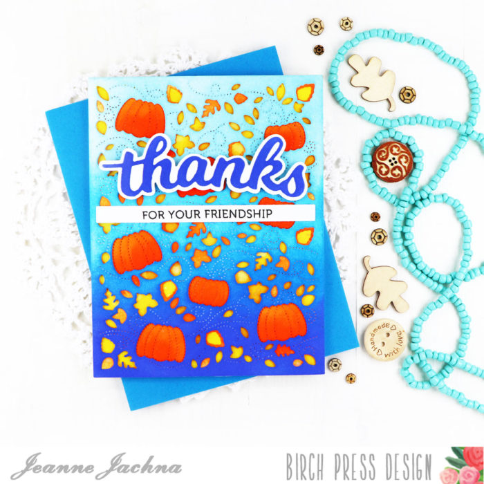
Hi friends! I hope you’re having a great day! Fall is in the air and I’m enjoying the crisp cool nights and seeing the leaves turn color!
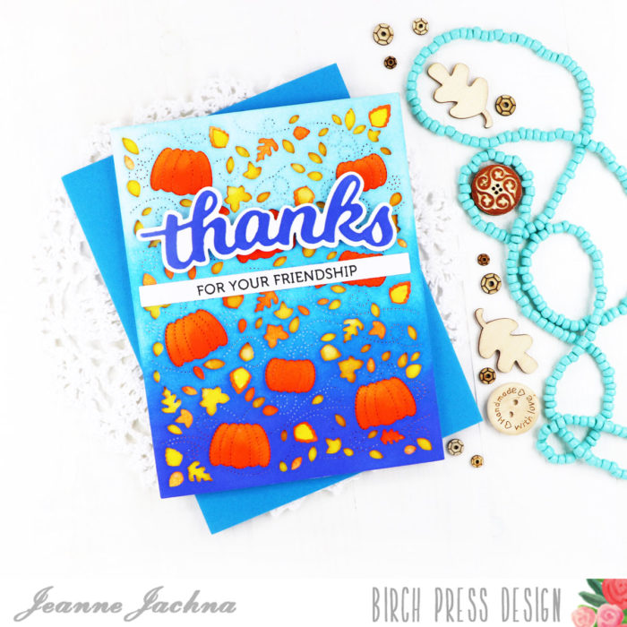
Birch Press Design is known for it’s innovative layered die sets, and honestly I think they keep getting better and better.
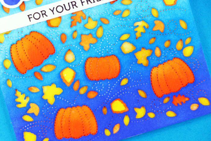
The sets are really versatile and more detailed. I used only two of the three dies in the set and covered the panels with distress ink before stacking them. I love the contrast of blue and orange. The yellow panel you see is the card base.
I really wanted you to get a close look at the detail on these panels. All three of the panels in the set have a beautiful pierced design. You can see the swirls on the blue cover panel that inspire the name of the set “Autumn Breeze”.
I inked the Thanks Honey Script die with Blueprint Sketch Distress ink to match the ink on the cover panel. The stamped sentiment is from the Lingo Thanks stamp set.
Autumn always gets me thinking of Thanksgiving – and I start counting my blessings. I just want you to know that I am ever so grateful for your friendship now and always. Hugs to you for always making me smile!
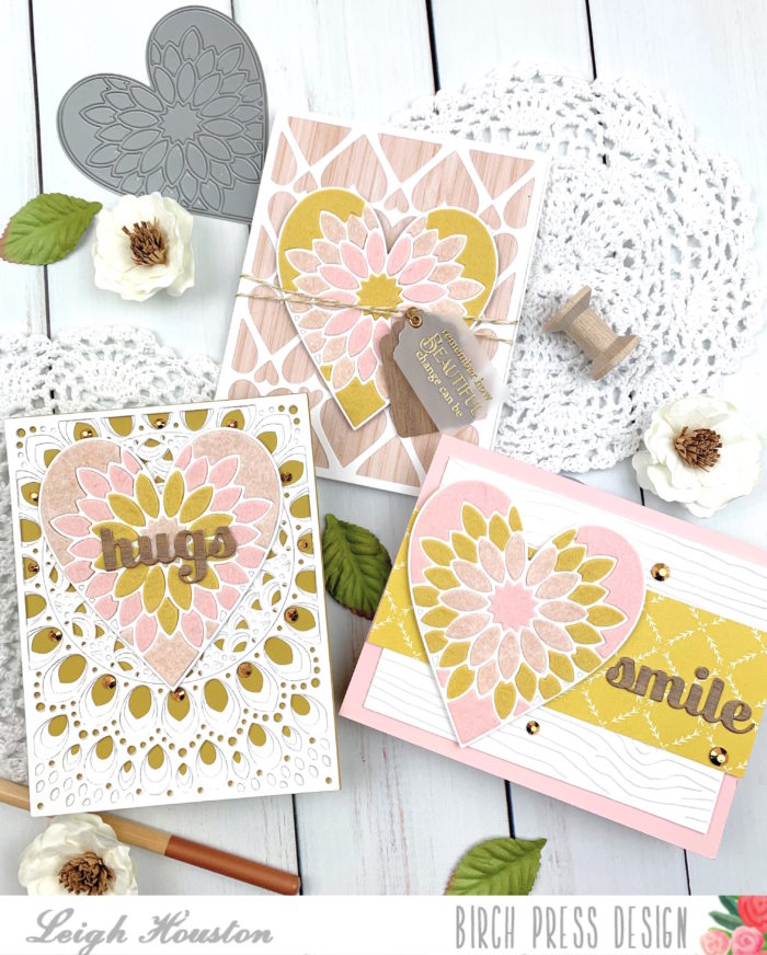
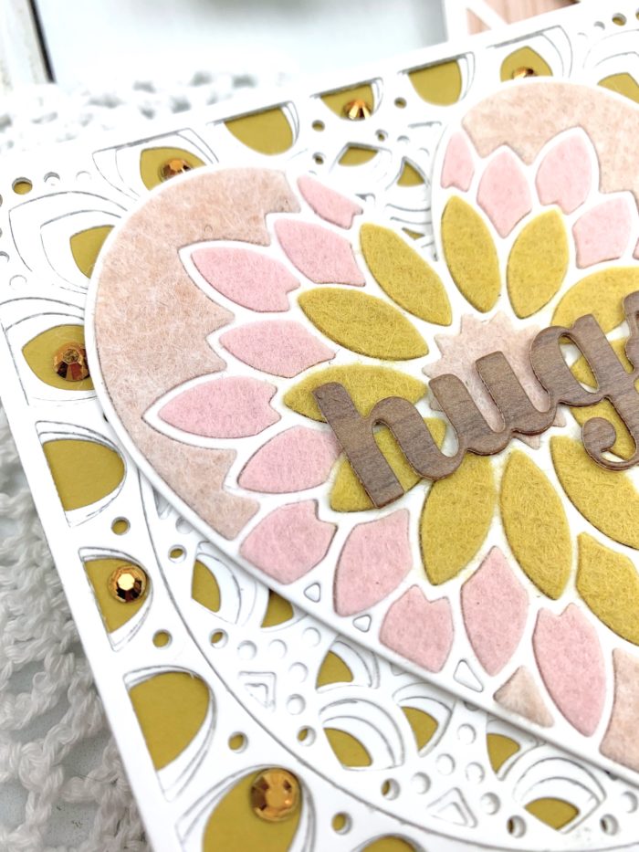
Hello, friends! I am so excited to be sharing these cards made with Birch Press Designs’s Dahlia Heart Layering Die set. Keep reading to see how easy it was to create these die cut cards with felt!
Over the past months where we’ve been spending more time at home than normal, my daughter has re-discovered her crafty side and the joy of making and giving handmade gifts. She is into all things boho, and I was inspired by her favorite color palette in making this trio of cards made with wool felt so she could give these cards to her friends.
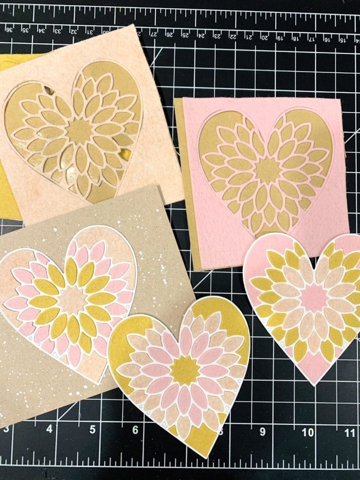
I started my cards by selecting three shades of wool felt in pink, peach and yellow (I recommend using a good quality wool felt for this). I adhered a sheet of double-sided adhesive to the back of each piece, and ran them through my die cut machine with Birch Press Designs’s Dahlia Heart Layer A die. I ran each piece through twice to make sure I got a nice clean cut through my felt (a precision base plate is also helpful when die cutting wool felt). I then die cut the same shape out of heavy 110# white cardstock three times and adhered each one to a base. After that, I took individual pieces of felt and inlaid them into the cardstock bases. This went quicker than you’d think (about the length of one bad TV show LOL), and how great is it that you get three different hearts out of this one process? Not to mention that the soft texture of the die cuts lends such a unique and special touch to the cards.
After finishing my die cut inlay, I wanted to create three distinctive card designs to showcase these soft and pretty hearts. For the first, I adhered a strip of coordinating patterned paper to white woodgrain-embossed cardstock and attached the heart to the left of the panel. I cut my sentiment from Birch Press’s Smile Sugar Script die from woodgrain patterned paper and added a few gold gems to finish the card.
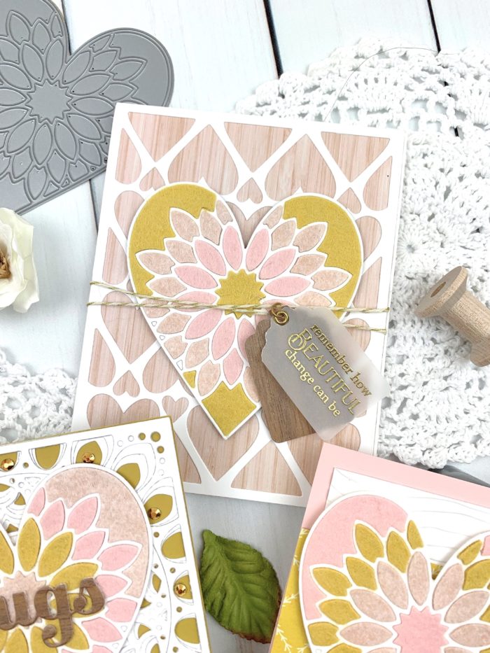
For my second card, I cut a white panel from Birch Press’s Amour Layer A die and adhered it to a base I cut from woodgrain paper. I adhered my card on top, wrapping it with twine for some more texture. I stamped my sentiment from Poppystamps’s Greeting Basics stamp set onto vellum, embossing it in gold and cutting it out in a tag shape (and cutting out an identical tag shape from dark woodgrain cardstock as a base). I hung the tags from the twine to finish the card.
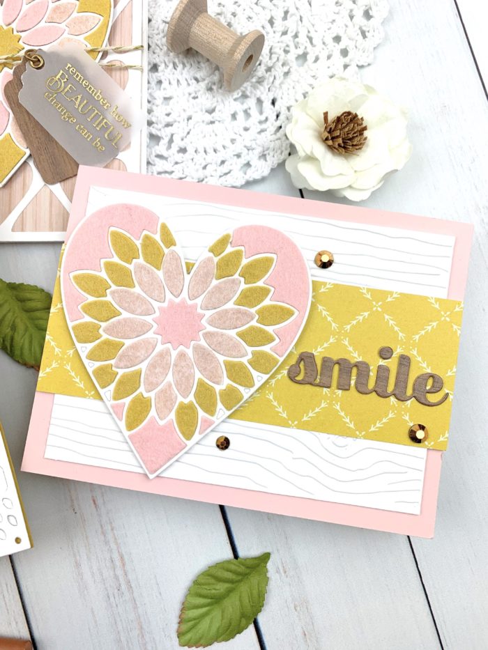
For my third card, I die cut all three layers from Birch Press’s Grace Layering Die set and adhered them to a deep yellow card base. I then simply adhered the heart, die cut my sentiment from the Hugs Sugar Script die, and added some gems for a little added sparkle.
I can’t tell you how much fun I had making these cards! They have already been confiscated by my daughter to give to her friends, and I can’t wait to try this technique with more dies. I hope this inspired you to try some felt in your die cut designs. Thanks so much for stopping by today, and I’ll see you again soon with more Birch Press Designs projects!
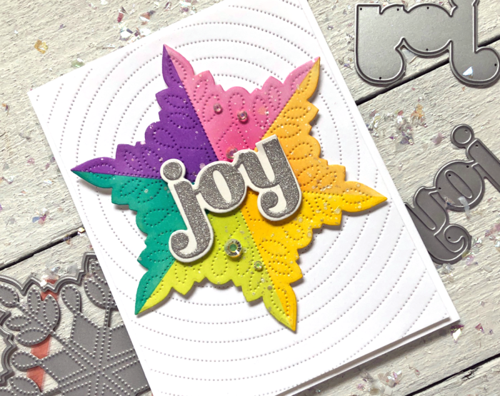
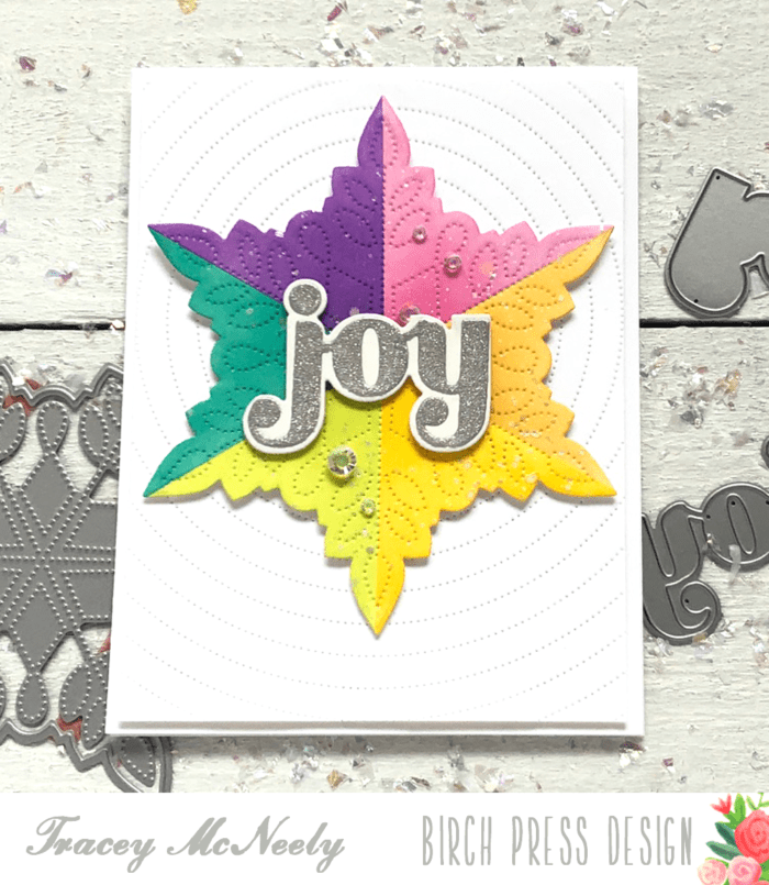
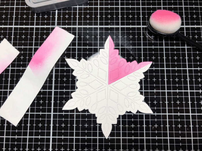
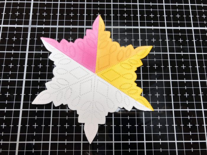
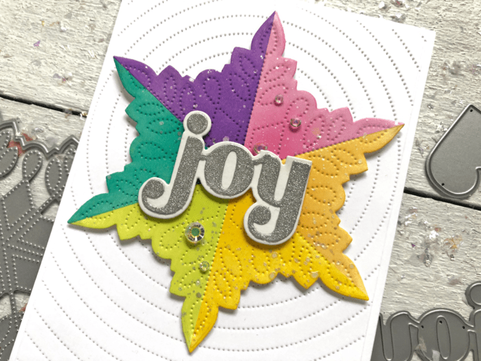
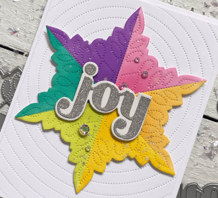
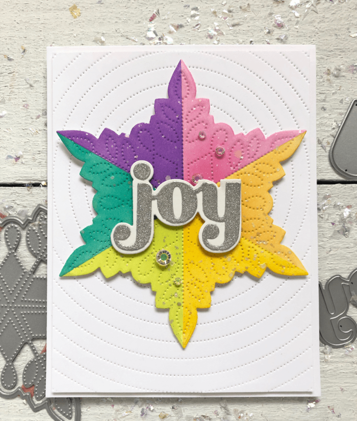
Hi there crafty friends, its Tracey here today with a tutorial on how I created this pretty rainbow snowflake using the newly released Pinpoint Snowflake die.
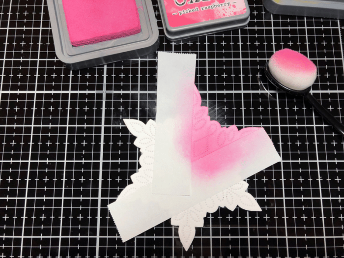
I divided up the snowflake into 6 equal parts. Using Post-it Tape for masking along the straight pierced lines I ink blended each section with a different colour of Distress Oxide ink.
After I ink blended the first section using Pink Raspberry and then I removed the tape to reveal a crisp line.
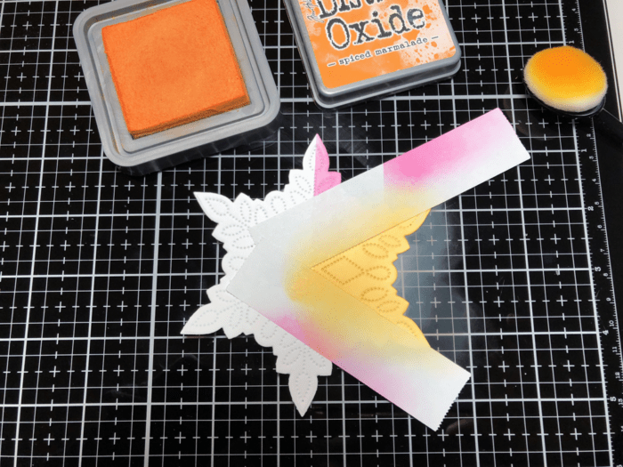
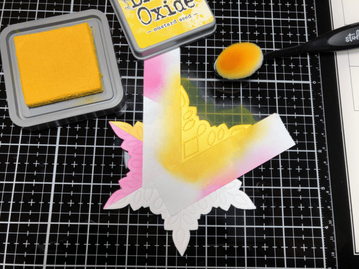
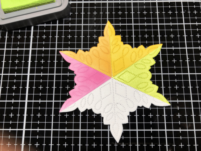
I moved the tape to cover the section I just blended and masked off the second section. I ink blended the next section with Spiced Marmelade using the same Post-it tape. Removed the tape and set up for the next section using the same Post-it tape once again.
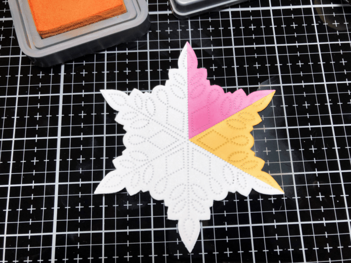
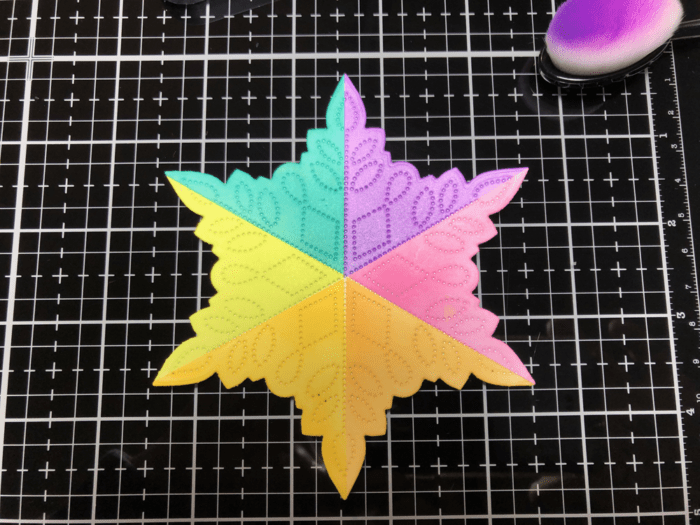
I continued around the snowflake for the remaining three sections–Twisted Citron, Peacock Feathers and Wilted Violet. I used new Post-it tape for the last three sections so there was minimal contamination of colours.
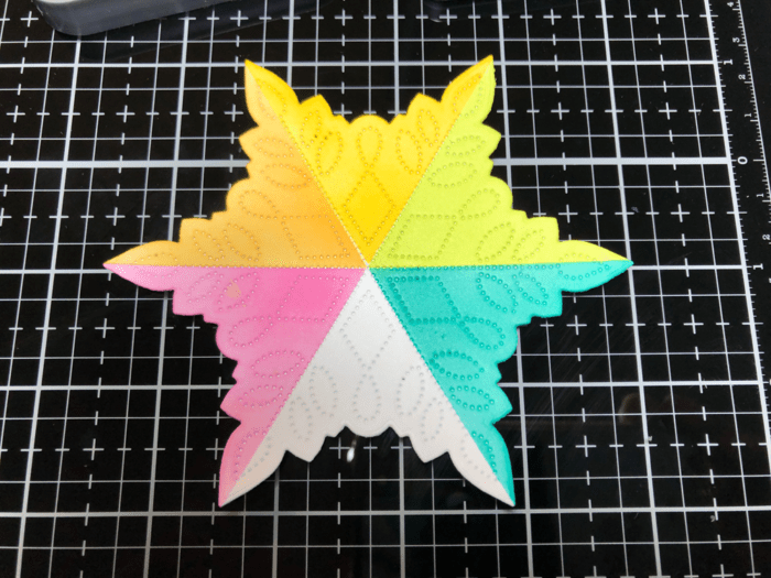
Ooops took this next photo from the wrong angle!
To make this snowflake into a card I die cut the Pinpoint Radial Plate from white cardstock. I trimmed it down to 5 1/4″ x 4″. Taking an 1/8″ of of each side so the centre of the radial is still in the centre. I finished by adhering the snowflake to the radial panel over the card base with foam tape.
For the sentiment I used the Big Joy Sugar Script dies. The word was cut with silver sparkle cardstock and the shadow cut from white. They were glued together and then adhered to the centre of the snowflake with foam tape once again.
To finish it off I tucked a few sparkling crystals around the sentiment.
Thanks so much for stopping in today I hope you give this technique a try. You can mask off and ink blend any shape or cover die that you have. It’s addictive, I promise. See you next time!
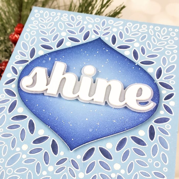
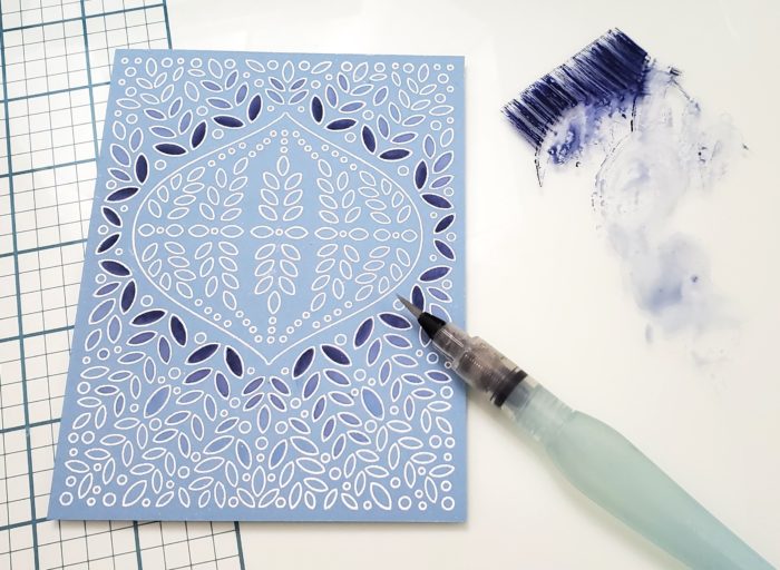
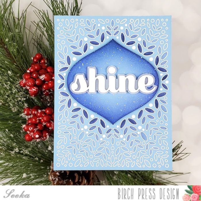
Hello! Seeka here and today I have a monochrome card featuring the Christmas Ornament and Labels stamp set. Lately I’ve been leaning towards aquas and blues for the holidays, but you could easily use any color of the rainbow!
I started by using white embossing powder to heat emboss the background onto a piece of periwinkle cardstock. Next, I smooshed a bit of Blueprint Sketch Distress Oxide ink onto my work surface and used a water brush pen to paint in some of the leave shapes. I used concentrated dark color closest to the ornament, and then diluted the pigment with water to paint increasingly lighter blue as I moved out to the edges of the card.
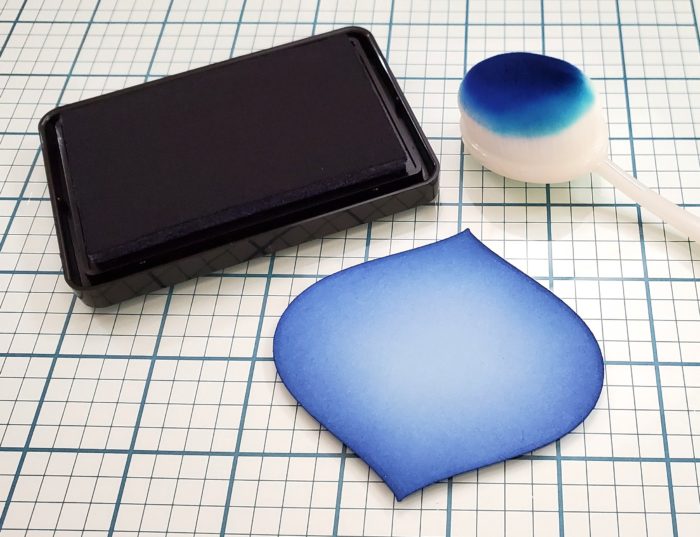
Next, I used the coordinating ornament die to cut another piece of the same color cardstock. Using a blending brush, I blended blue dye ink onto the edges of the ornament to create a bit of depth and color variation.
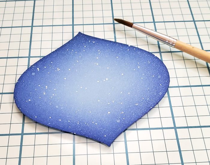
I spritzed the ornament with Hero Arts White Iridescent Shimmer spray, and then used a paint brush to flick a bit of white gouache over the ornmanent.
Next, I used the Big Shine Sugar Script dies to cut the word shine three times from white cardstock. I stacked and adhered the three layers together, and then adhered that piece to the shadow layer, which I cut out of vellum.
To assemble the card, I adhered the ornament to the background with foam tape, and then used more foam tape to adhere the sentiment. Then I adhered the card front to an A2-sized card base. As a finishing touch, I used added a few drops of Nuvo Chalk Stick Vintage Drops to some of the open circles in the pattern.