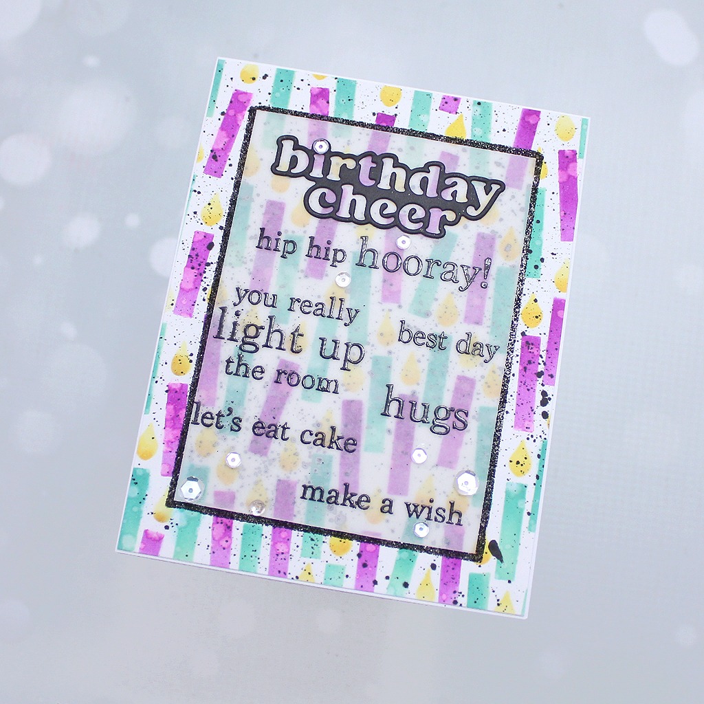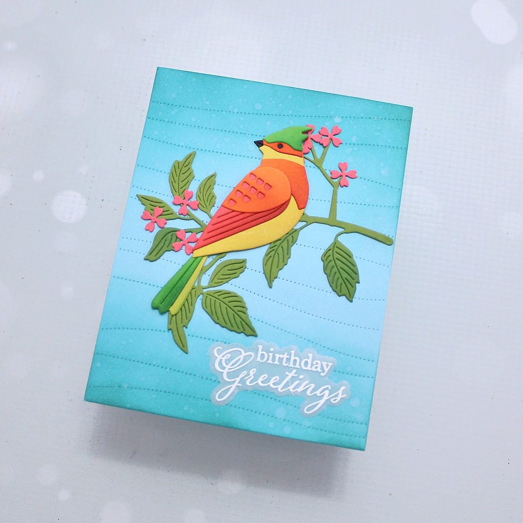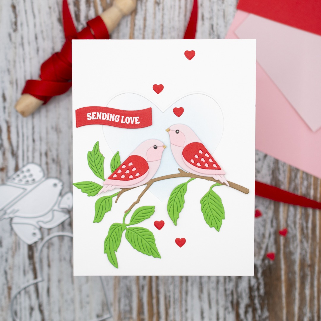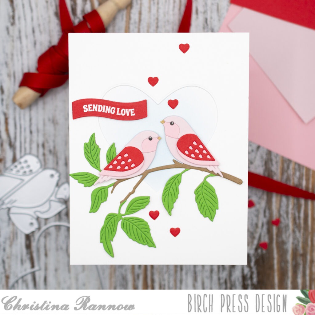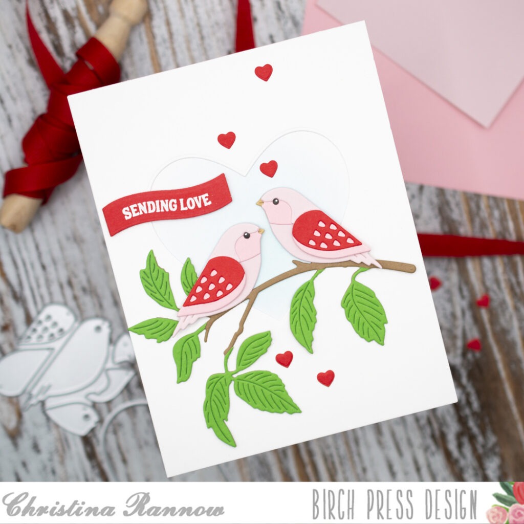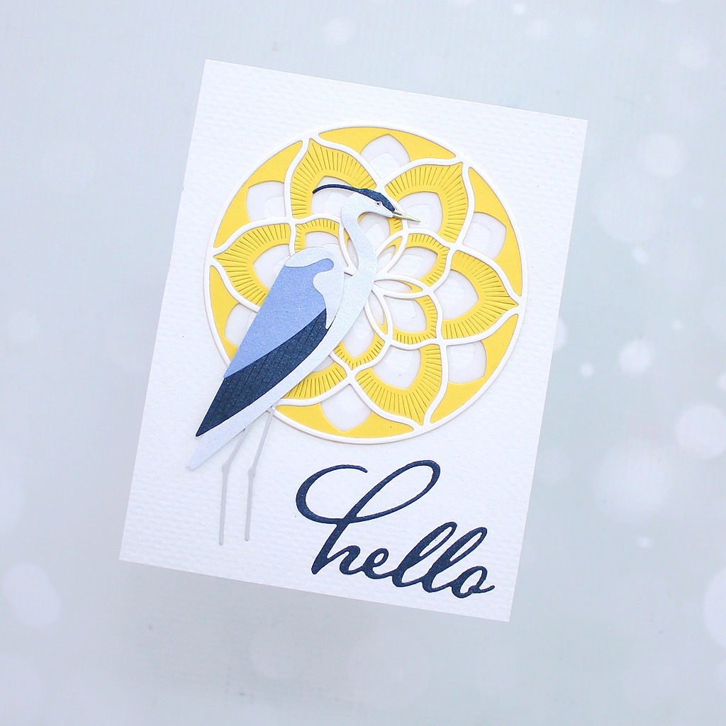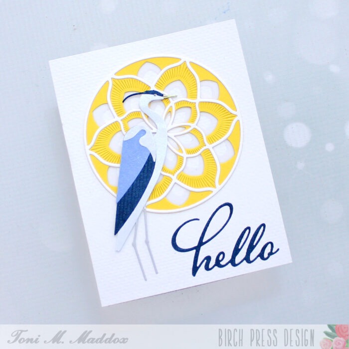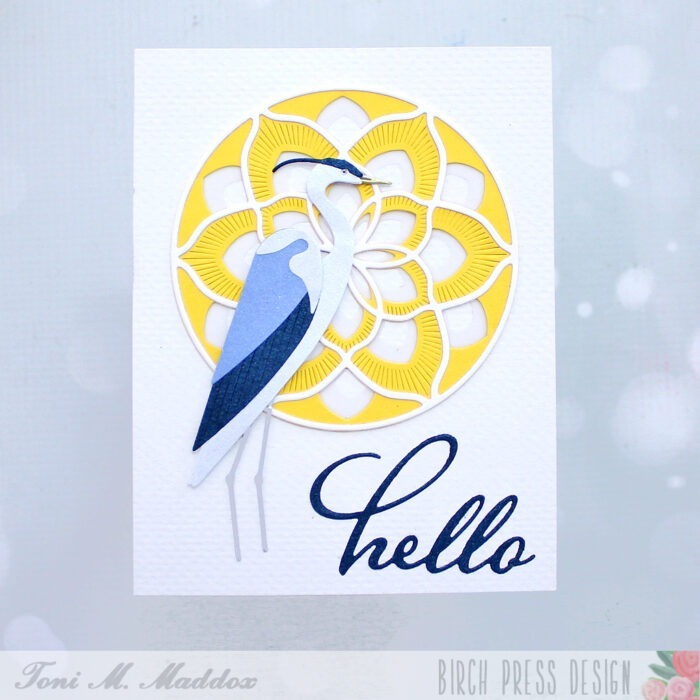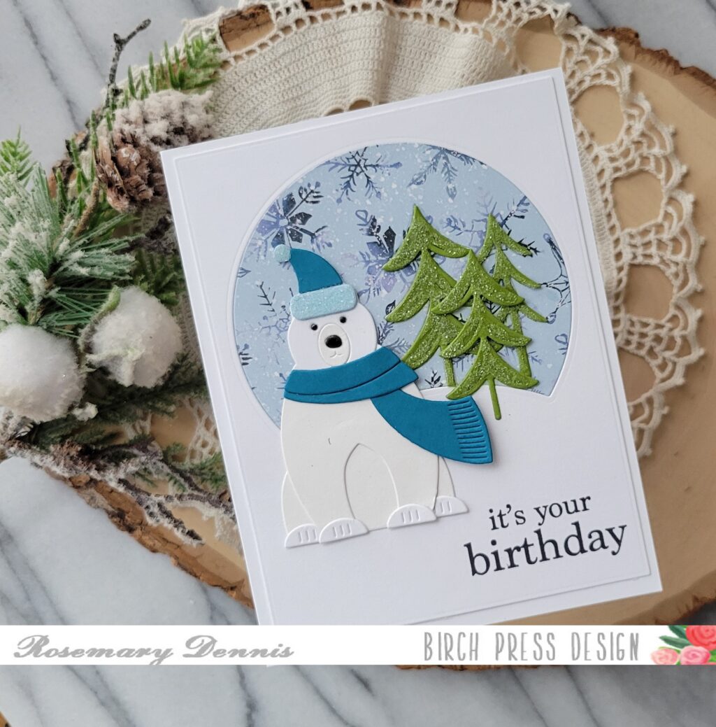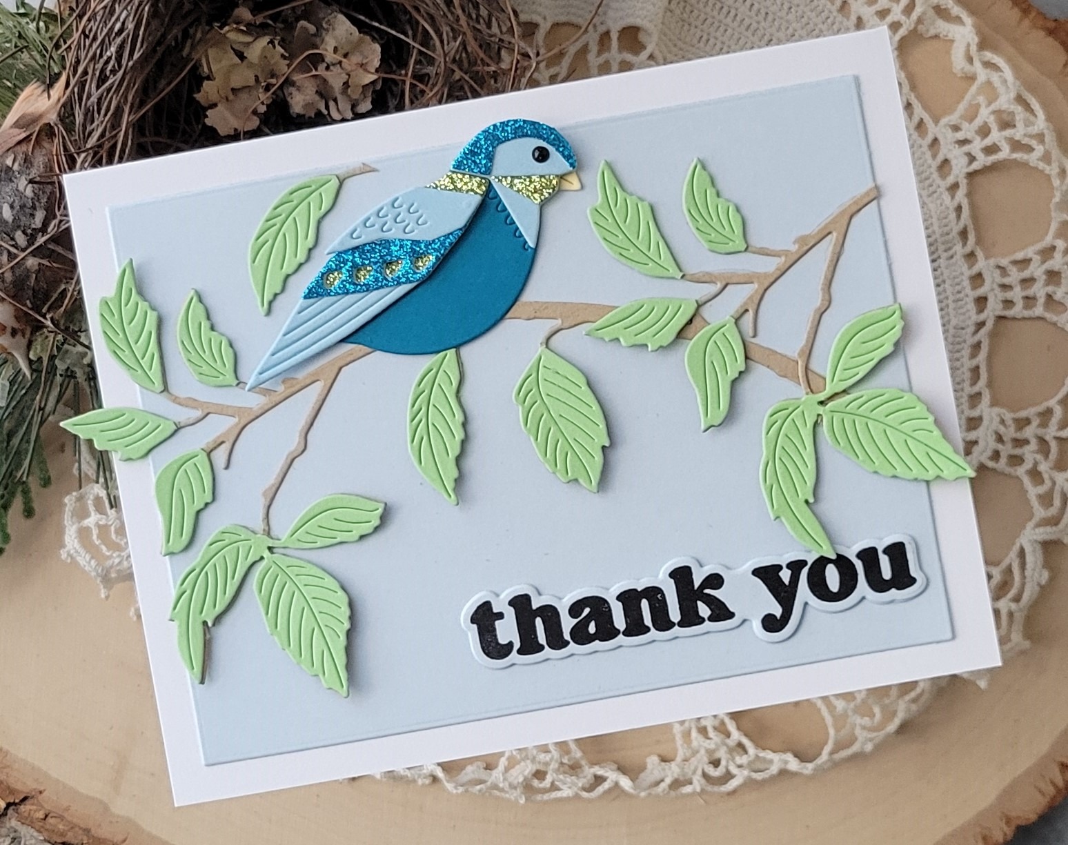
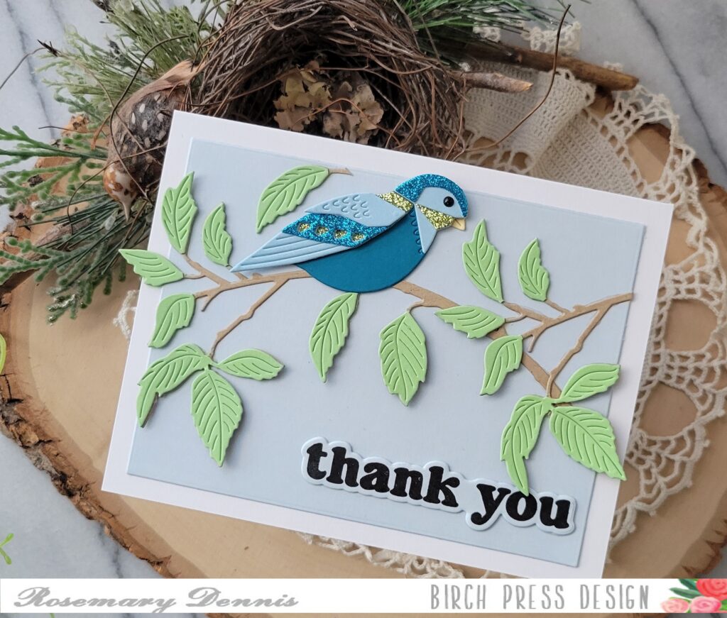
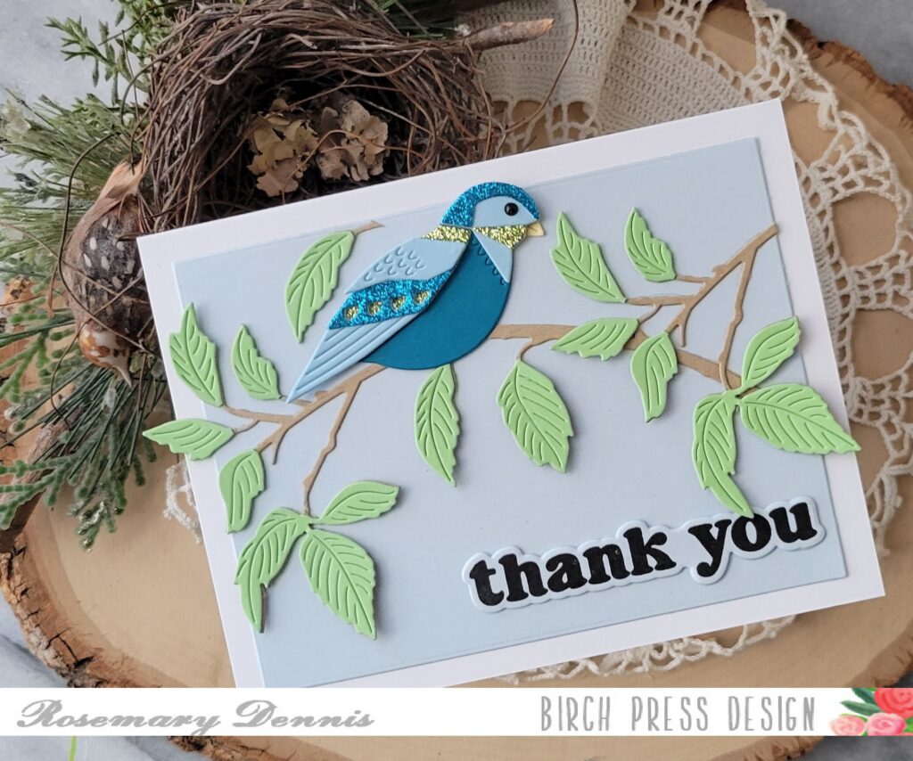
Hello everyone! Rosemary here on the blog today with a thank you card featuring the new Block Print Festive Bird die set, as well as two older products. Let’s have a look at what I created.
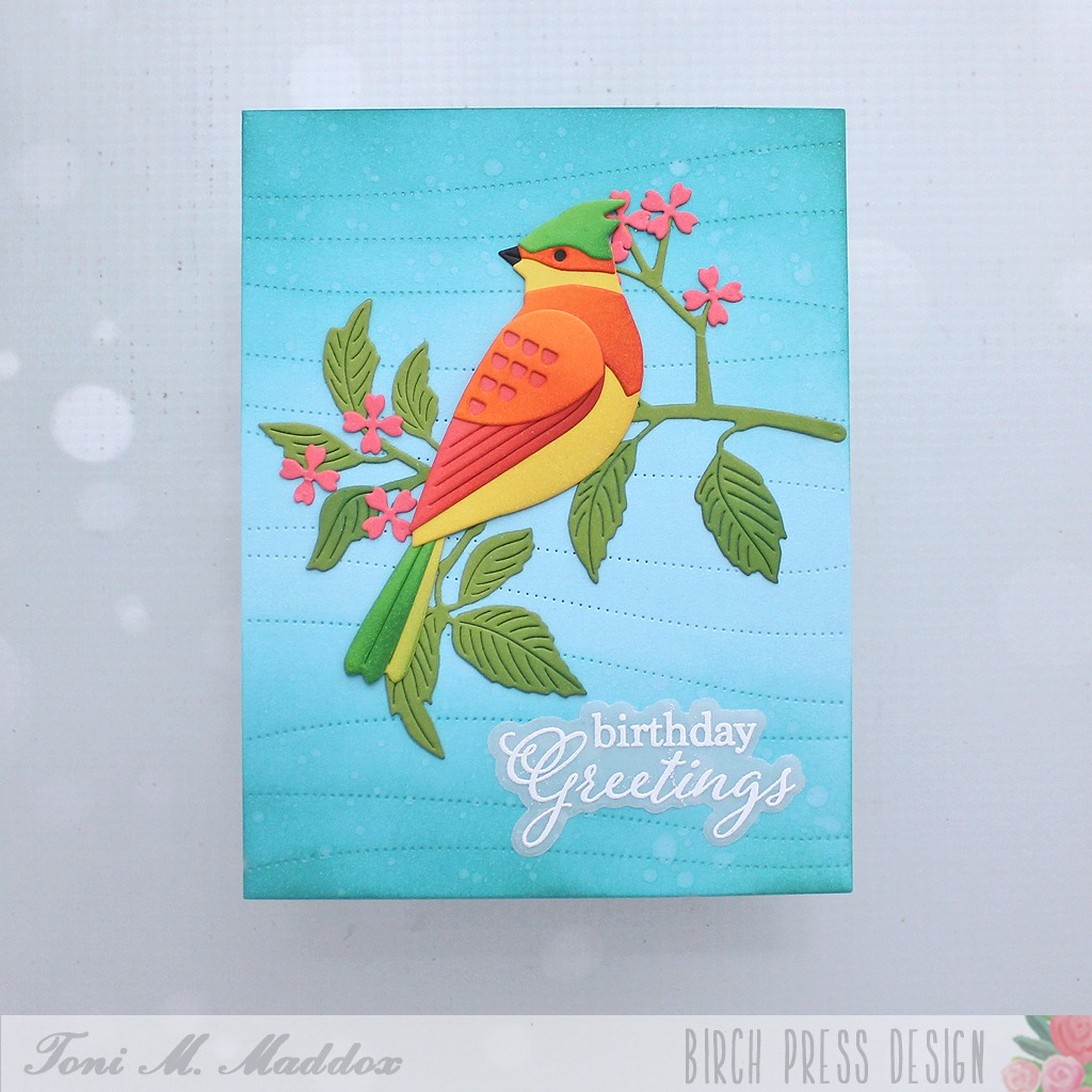
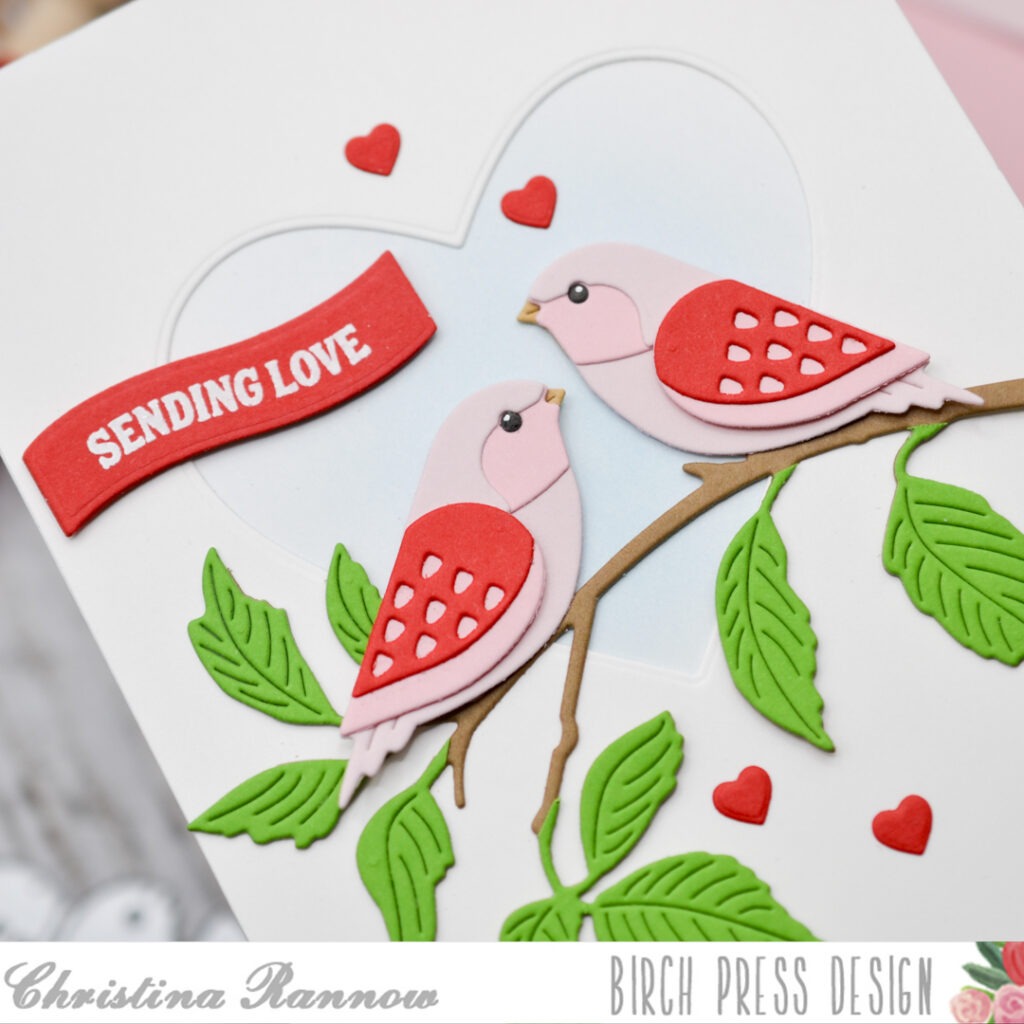
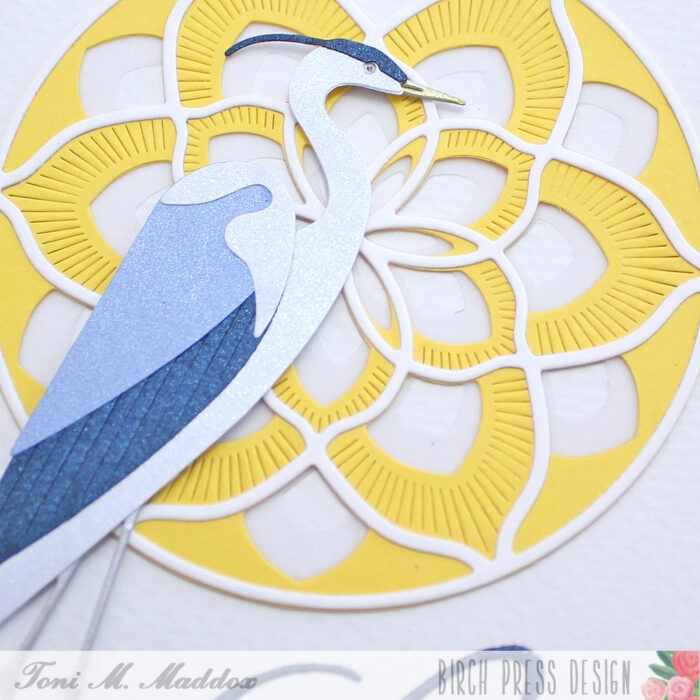
One of the things I like about the packaging for all of the Birch Press Design products is that it shares an image of the finished design in color. This provides you with a great jumping off point for creating your own little bird. I have done that in the past, but this time I decided to use colored cardstock and glitter cardstock to create my little bird. I kept my color scheme fairly simple.
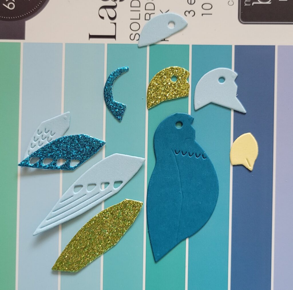
You can see all the pieces of my bird laid out above. I used cardstock from the Memory Box Lagoon 6×6 pad, as well as glitter cardstock from my stash and a tiny piece of yellow cardstock for the beak.
I did want to mention that before I started making color choices for my little bird I did die cut all the pieces from a scrap of cardstock so I could make sure I knew how all the pieces fit together.
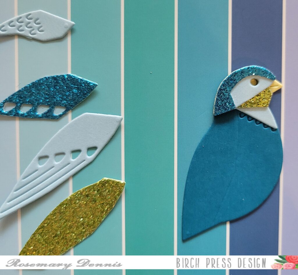
I used liquid adhesive to adhere my bird together. Once I had the bird finished I set it aside to figure out the rest of my card. Originally I was going to have the bird perched on a large die cut sentiment, but nothing was working. So, I decided to go through all my BPD dies and came across the Abundant Branch die. Perfect for my little bird to perch on!
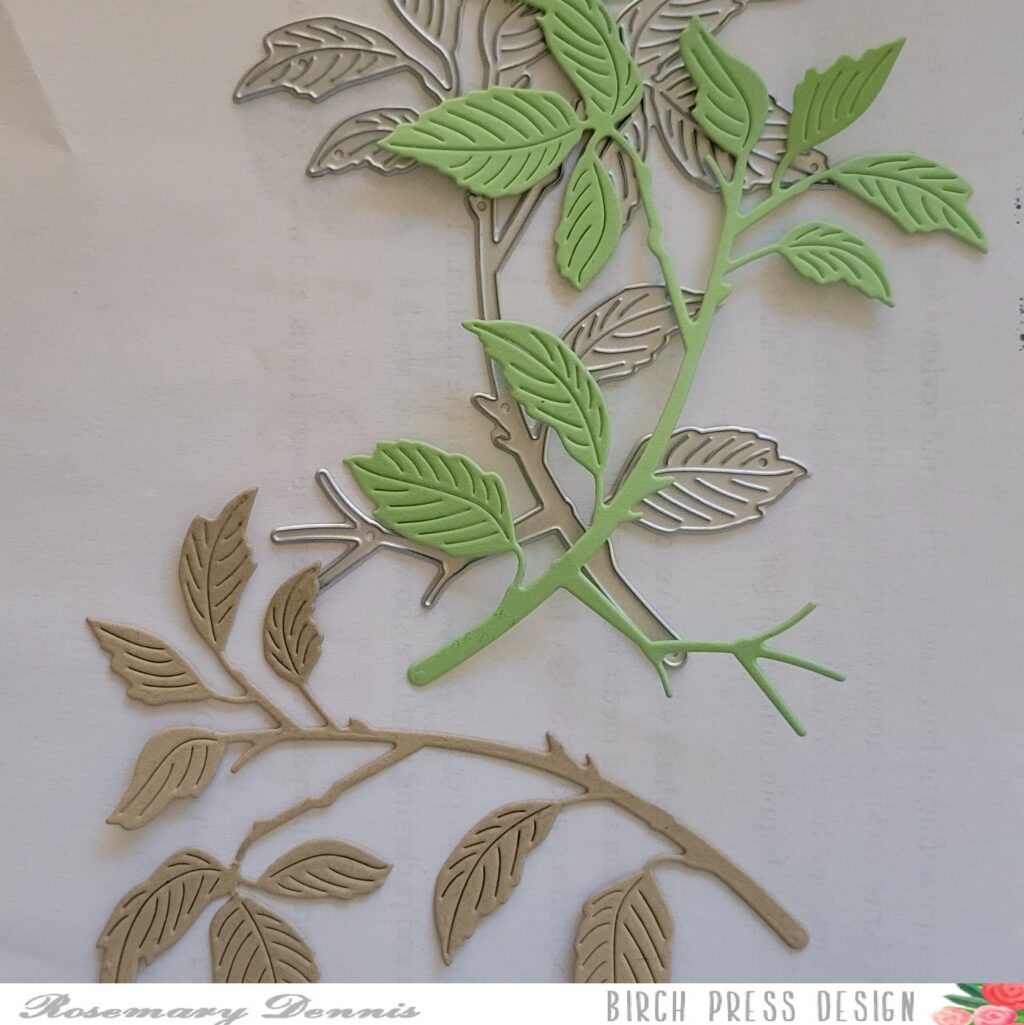
I die cut the branch from kraft cardstock and then from green cardstock. I trimmed the leaves off the green branch and adhered them with liquid glue to the kraft cardstock branch. I did that a second time and then trimmed apart that branch to I could position the pieces as you see. Then adhered my little bird on the branch.
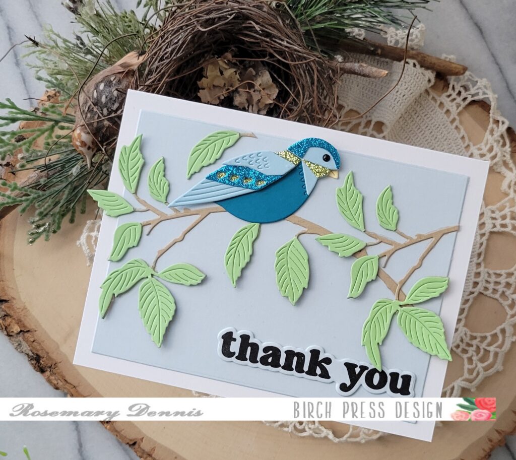
The sentiment is from the Vintage Everyday Greetings stamp set and was stamped on the same light blue cardstock I used for the background. I die cut it, a second layer, adhered them together with liquid adhesive and added it to my card front.
I hope you enjoyed today’s project. Thanks for stopping by and have a lovely day!