Category: Uncategorized

  • DIY Custom Colored Card Stock AND GIVEAWAY | Ashlea Cornell

    DIY Custom Colored Card Stock AND GIVEAWAY | Ashlea Cornell

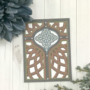
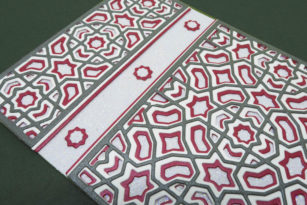
    Hello again everyone! Ashlea here and I’m thrilled to be back with some tips using one of the newest die sets available from Birch Press. The Epiphany Layer set reminded me so much of the holidays, specifically a wreath, so I wanted to bring in festive colors that would help remind others of that as well! To do this, I customized my colors for each layer by creating my own colored card stock. I used Catherine Pooler inks for this and used a “pad to paper” technique that I’ve used here before, but it’s so useful that I thought it warranted another mentioned.

    To create the wreath part of the image, I used Lime Rickey on white card stock for Layer A, Grass Skirt on white card stock for Layer B, and finally Spruce on white card stock for layer C. I love the dimension these colors give to my “wreath” and that they work so well to get the point of the wreath across.

    For the center of the wreath I thought I’d bring in the reds to complete my holiday palette. I used Samba for Layer A, Polished for Layer B, and Peppermint Scrub for Layer C. Again the choice to darken the tones on the descending layers gives a great deal of shadow and depth to the collections of die cuts.

    As you can see from the die in the photo above, there is even one more piece to the die that I have omitted for this card but saved for another time. I love these types of cover dies that can be used together or separately to create so many looks and types of designs for cards.

    I hope that you’ve enjoyed learning a bit about how I created this look using the new Epiphany Layer set!

    GIVEAWAY ALERT!! We are celebrating the new release at Birch Press Design, and are giving away the Epiphany Layer A die that I used on today’s card! For your chance to win leave a comment for me on today’s post. I love to read your comments.

    2) For a second chance to win one for YOU and a FRIEND, follow us on Instagram @birchpressdesign Like the Instagram post for this card and TAG YOUR FRIENDS. One tag per comment please–the more friends you tag, the more chances you have to win. Both you are your friend must follow @birchpressdesign to be eligible to win. One comment will be selected and you and your friend will both receive this stamp set.

    You must comment by midnight EST August 23. Winners will be announced August 26.

  • Pearlized Lotus Surprise + Giveaway Info!by Jennifer Svare

    Pearlized Lotus Surprise + Giveaway Info!
    by Jennifer Svare

    Hello! I’m back with some more Lotus Flower fun to share! Today, I’ve made a bunch of cards using different techniques using mostly Layer A from the set. For these first two cards, I did use inner die cuts from Layer B as well.

    This die set has sparked so much creativity, and I have really enjoyed using supplies I haven’t used in a long time. The cards above have a Pearlized Paint stripe in the background. I used the Finetec Mica Pearlescent Watercolor set. The textured background is the Handmade Ivory Pebble paper also available here at Birch Press. When the light hits them, they glow with beautiful colors, as in the photo below.

    I made this card *slightly* larger than standard size A2 so I could fit in a white border along the base with room around the die, but still fits in the A2 envelope.

    I had very limited amounts of the pebbled paper in my stash, so for my next card, I painted a pearlescent ivory background, and embossed a pattern to create texture.

    I tried some more layouts using only Layer A from the set, below. I am amazed at how many looks can be created using only ONE die!

    For my first card using only Layer A from the Lotus Flower set, I die cut it from masking paper. I then painted the interior of the flower with the golden pearlescent paint. It is such a subtle elegance! All of these cards can be seen in action in the video.

    The other cards were made using inlay techniques, mixed with different pearlescent areas of focus. The first card is strictly a petal inlay, with no borders. The middle card used leftover embossed paper with layer A to outline the negative space of the petals. The third card is simply the outline, but it has been painted with the pearlescent paints so when the light hits it, it is so gorgeous!

    I’m using Layer A for most of the cards shown above, because I wanted to share ideas for the die that one lucky winner is going to WIN! Here are the details:

    GIVEAWAY ALERT!! We are celebrating the new release at Birch Press Design, and are giving away this LOTUS LAYER A die! Want a chance to win? Here’s what you need to do to enter:
    1) To enter the blog giveaway, just comment on this post. Which card do you like best? Can’t wait to read your comments!

    2) For a second chance to win one for YOU and YOUR FRIEND, follow us on Instagram @birchpressdesign Like this Instagram post and TAG A FRIEND. 1 tag per comment, more tags the more chances you have to win. One comment will be selected and you and your friend will both receive this die. 

    You must comment by midnight USEST August 23. Winners will be announced August 26. GOOD LUCK!

    Thanks for stopping by today! See these cards in action below:


    Supplies


  • Color Block Congratsby Jennifer Svare

    Color Block Congrats
    by Jennifer Svare

    Hello! I’m so glad you’ve stopped by the blog today. I’ve made a card using the Maxwell Layer A, along with the Calligraphy Pop Congrats.

    This card is so much fun to make, and so simple! I die cut three layers of the Maxwell out of a slightly metallic silver cardstock so that the frame would have some extra dimension against the colored squares.

    In addition to cutting out of silver, I also cut one each of a krafty green, yellow, beige, and a couple shades of blues. These colors were cut so that I could inlay each square with a color square that fit perfectly.

    The Congrats was cut out of a copper metallic cardstock, and the shadow was out of the gray.

    So many different color combinations could be used. Light pastels with a bright silver could even work for congrats on the baby! Fun to make – I hope you enjoyed!

    Have a great day, and I’ll see you again soon!


    Supplies


  • Big Thanks!by Jennifer Svare

    Big Thanks!
    by Jennifer Svare

    Hello! Thank you so much for stopping by! Today I’ve made a thank you card using the gorgeous Pink Folia handmade paper available right here at Birchpress Design, along with the stunning Calen layers A and B.

    For the Calen layers, I used two shades of brown for the base layer, and a gold vellum for the top layer. I love the extra details in Layer A that seem to float above the design. So pretty!

    For the top and bottom borders, I chose the darker pink. To bring it all together, the Big Thanks Sugar Script is cut using white, with the lighter pink background.

    Check out the video below for more info on how this card was made! Have a great day, and I’ll see you again soon!


    Supplies


  • Using Die Cuts as a Stencil Guide for Negatives with Ashlea Cornell

    Using Die Cuts as a Stencil Guide for Negatives with Ashlea Cornell

    Hello there, everyone! It’s Ashlea back with you today with this fun card using the Amour Arch layer set in a way you may have not thought of before. But before we get into that, let’s just address this sentiment. I love a good pun and this one was just a sitting duck while I was putting this card together. A “boo”, of course, is a loved one or a significant other and putting that together with “rainbow” to create the new word “rainboo” is definitely one of my proudest moments of the day. For this I used the Lingo Alphabet dies which made creating my own sentiment a breeze.

    Moving right along, let’s get into the images. I started by cutting out each layer from the same piece of card stock. Because they’re curved it made it easier to fit them all onto one. I took the hearts that each layer cut out and put them into their own little piles of layer A hearts, layer B hearts, and layer C hearts just to be sure to not mix them up. This will become important in just a moment.

    I started to pull the image together by choosing my Copic colors. I chose R29, YR16, Y08, YG08, B29, V17 and V06 for my ROYGBIV rainbow. Obviously, there are only 3 layers here, so I improvised and created ombre hearts by blending red, orange and yellow onto the layer A hears, green and blue on layer B, and my two purple colors on layer C hearts. This ensured all colors of the rainbow were used and represented. TO assemble these hearts onto my card front, I used the arch cut out of the Amour Arch layer A and placed it over a 4″ x 5 1/4″ near the bottom. I made sure that it was evenly centered on the lower half of my card front, and then used the openings as a guide and stencil for where to adhere my layer A hearts. I placed a very small bit of glue into each open heart and then placed a heart into each opening. Once I removed my arch stencil, I was left with an arch of beautifully colored rainbow. hearts

    I then used glue to adhere layer B hearts so that the bottom of the heart matched up with the bottom of layer A hearts and repeated this method with layer C hearts. To create a bit more of a true rainbow, I colored six of the smaller hearts that each layer cuts in rainbow colors and adhered them between each heart, approximately where they are positioned on the die.

    Finally, I created my sentiment which I explained earlier in the post, and arched it a bit over the hearts. I hope that I’ve inspired you to create outside of the box with your layering dies! Thank you so much for stopping by today, I’ll see you again very soon!

  • Quick & Easy Alcohol Ink Rainbow Card | Ashlea Cornell

    Quick & Easy Alcohol Ink Rainbow Card | Ashlea Cornell

    Hello all! Ashlea here, and I’m back again playing with more alcohol inks because I just can’t get enough lately. This time I’m creating a very simple card featuring rainbow alcohol ink art. Before we get into the basics, check out this video from my YouTube channel:

    To begin, I chose my alcohol ink colors: Cranberry, Sweet Orange, Sunshine Yellow, Lettuce, and Purple Twilight. I thought these best represented rainbow colors and would work well next to each other. My favorite AI technique is a drop of ink, a drop of blending solution, and small puffs onto the solution with my air puffer (camera lens cleaner).

    For the sentiment, I used the Big Lingo Type Wow in black and white to contrast the colors of the inks. Before I adhered the die cuts, I trimmed the card front down to 4″ x 5 1/4″ and adhered it with foam tape to an A2 sized card base. I then adhered the middle “wow” so that I could evenly space the top and bottom words.

    To finish it off, I used the sentiment “You Mean The World To Me” from the Thanks Lingo stamp set and adhered that to the center die cut.

    I hope that you’ve enjoyed learning a little about how I created this quick and simple alcohol ink card today! Thank you so much for stopping by. I’ll see you very soon!

  • Simple Alcohol Ink Mother’s Day Card | by Ashlea Cornell

    Simple Alcohol Ink Mother’s Day Card | by Ashlea Cornell

    Well, hello there everyone! It’s Ashlea, and I’m back today with a very quick and simple DIY Mother’s Day card using Alcohol Inks and, of course, some Birch Press Designs stamps and dies! Check out my video below showing how I created this eye catching Mother’s Day card.

    My technique for Alcohol Ink art is a simple one; a drop of ink, a drop of blending solution right over that, and then blow some air with my air puffer while rotating my Alcohol Ink card stock. It’s great for a nice feathery look with lots of movement. I then add some blending solution splatters which helps to add texture and some more movement to the piece, but be sure to have a designated paint brush for these splatters! The blending solution will cause the bristles to become rough and course.

    One of my favorite die sets from Birch Press isn’t a layered one at all. It’s the Alpha Lingo letter dies, and I love them because they’re legible and small enough to create whatever sentiment/word without worrying it won’t fit. I chose to cut mine from a gold metallic card stock and add the same cuts from white card stock just off center behind them to create a shadow. This shadow technique draws the eye a bit more and makes it easier to read. To really drive this home, I added a small strip of vellum underneath the die cut word. Finally, I added the sentiment “So Glad We’re Friends” underneath the word and adhered it all to an A2 sized card base.

    I hope you’ve enjoyed learning a bit about how I created this card! Be sure to check out the video for the entire supply list as well as more tips for alcohol ink art! Thank you for stopping by and I’ll see you again soon!

  • Mother’s Day Weekend Sale

    Mother’s Day Weekend Sale

    On Mother’s Day we celebrate all the special women in our lives especially Mom! And crafty Mom’s are the best! Treat yourself or someone special in your life with 20% off your entire purchase this weekend (May 10-12) with sale code CRAFT20

  • Grateful for You Tri-Fold Window Card | by Jennifer Svare

    Grateful for You Tri-Fold Window Card | by Jennifer Svare


    Hello! Thanks so much for stopping by! Today I’ll be sharing a “Grateful for You” card that I made for a friend who has given me lots of great advice and direction over the years.

    The compass from Let Your Dreams Set Sail stamp and die set was perfect for this type of thank you along with the Waves Plate Layer A.

    This is a tri-fold card, so the oval from the front peeks through to the compass on the second layer of the card. I sketched a quick line with a watercolor marker, and filled in with water for just a touch of color. I’ll show the details in the video below.

    Once opened, the “Grateful to have you in my life” sentiment is seen under the compass. The font size and line thickness makes for gorgeous embossing. This is embossed out of gold.

    Open the flap once more to reveal the last sentiment and room for writing. The “Thanks for always being there” script came from the Sending Love stamp set, and I thought both sentiments went together nicely for a complete message.

    Are you looking for Father’s Day card ideas? This would also make a great card for any dads on the list. I love how the sentiments are very versatile, and can be used to thank anyone who has given advice or direction. It’s a great one to have on hand!

    Check out the video below, and you can watch me make this card. Have a great day! I can’t wait to see you again soon!


    Supplies


  • Layering Wonders | by Justine Hovey

    Layering Wonders | by Justine Hovey

    I love layering! I wouldn’t be a part of the Birch Press team if I didn’t. In today’s video, I am looking at all sorts of layering – stamps, dies and stencils and it is so much fun to create these intricate designs.

    I used the stencils from the Shining Mandala Stamps and Stencils to create this super fun background in a variety of shades of pink. I topped it off with the Friend die and added a small stamp underneath which is embossed in white on black cardstock.

    These two cards, I tried something I’ve never done before and I used all the pieces from my die cut – the pieces that were intended to be cut out as well as all those little pieces that fall out. I arranged them with the help of the frames. I can’t even tell which card I love more!

    The card above is made with all the pieces that I would normally have thrown in the garbage. I didn’t use every single layer but enough of them to get enough contrast.

    This is what the card looks like by layering the standard dies. You can see all those holes where I got the pieces from for the previous card.


    Supplies