
Hi there, it’s Tracey here today with a super glittery card and video using the String Art Frame die along with some other products from the recent Spring release.

For full start to finish instructions see the video below.
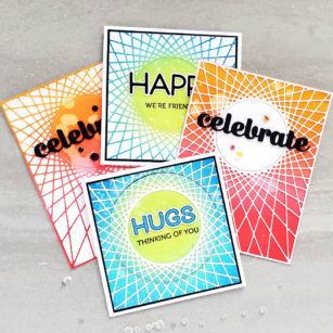
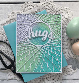
To create my background I started off by ink blending a panel of Bristol Smooth cardstock using three shades of Distress Oxide Inks–Cracked Pistachio, Peacock Feathers and Shaded Lilac. I used the Ring Tile Stencil to stencil over the panel using Nuvo Glimmer Paste in Moonstone.

Once the stenciled design was dry I adhered it to the front of my card base with tape runner. The String Art Frame die was cut from heavyweight white cardstock and then glued it to the glitter stenciled, blended ink panel with liquid glue.
TIP: Try dotting liquid glue around the outter edges and on any connection points when working with an intricate die cut for good coverage.

The Honey Script Hugs word dies were cut with vellum for the base and white cardstock for the word and glued together also with liquid glue. It was adhered over the circle in the centre of the String Art Frame by adding a bit of glue to the left and right edges of the word.

To add a sentiment on the inside of the card, I cut of panel of white cardstock to 5″ x 3 3/4″. Then I stamped ‘spread kindness this Easter’ using the Blooming Spring clear stamp set and attached the panel inside the card.

The glittered stenciling with the die cuts on top add so much dimension and depth to the finished card.

Thank you so much for stopping in and creating with me today. Wishing you and your family a Happy Easter and hope that we will all be able to celebrate once again with the people we love.

Supplies