Hello, there! It’s Ashlea and I’m thrilled to be back again sharing some inspiration with you. I don’t know about you, but I have recently be re-obsessed with alcohol inks. They’re so fun to play with and I love the looks I get when playing around with different colors. I always end up with tons of alcohol ink panels and try to brainstorm ways that I can use them on my cards and projects. I’ve shared a few ideas in this video on my Youtube channel. Check it out here:
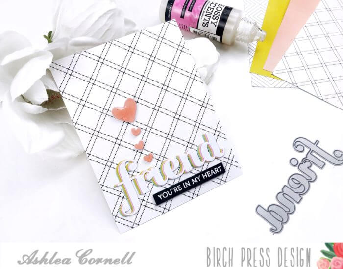
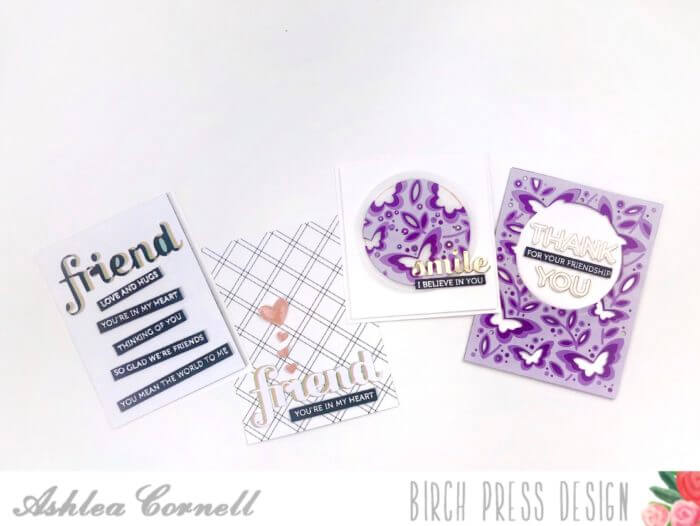
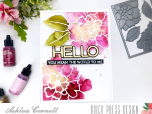
For my first card in the video I used alcohol ink on a die cut piece of card stock. I used the Peony Blooms layer A die and created a floral texture with the alcohol ink by using my darkest color (Cranberry)in the center of the flower shadows, then the lighter color (Pink Sherbet) and using my “air puffer” while rotating the card stock. This technique gives a great feathery texture that lends itself really well to alcohol inks, in my opinion.

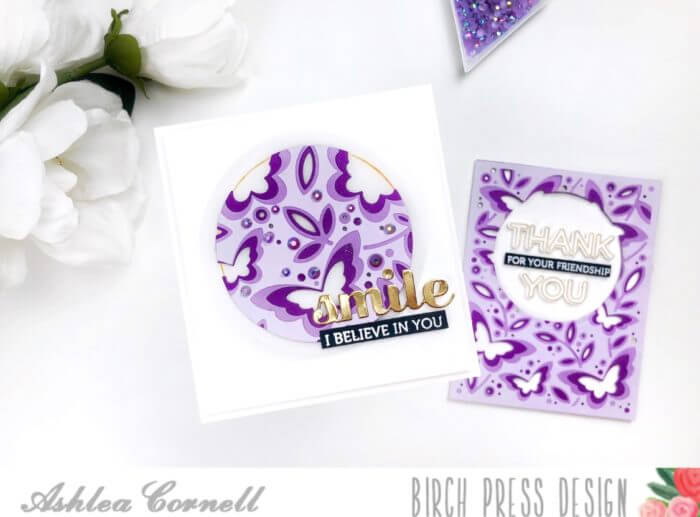
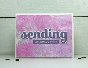
For my next couple of cards, I used pre-made alcohol ink panels and used word dies on one of them while I used the other as a card front. In this first one I cut out both the shadow die portion of the Big Friend Sugar Script die and the word die. I used these inversely with white card stock cut outs of the opposite dies (white shadow die for alcohol ink word cut out and white card stock word cut out for the alcohol ink shadow cut out) and created clean and simple cards with them using also the Aurora dies.

And finally, my alcohol ink card front consisted of a pretty clean and simple alcohol ink art panel using just the color Eggplant and the gold mixative. I trimmed the card stock down to 3 3/4″ by 5″ and paired it with the inside dies of the Aurora layers A and B. For my sentiment I used the “smile” die and the “so glad we’re friends” sentiment from the Lingo Thanks clear stamp set.

Thanks so much for stopping by today! I hope that you’ve gotten some ideas on how you can use those alcohol ink panels that you’ve created! I’ll see you again very soon!
Supplies