Category: Colleen Balija

  • A Springtime Thank You | by Colleen Balija

    A Springtime Thank You | by Colleen Balija

    Hi friends! I’m here on the blog today sharing a pretty monochromatic Springtime Thank You card using several of the February new release products! This new release is amazing with hot foil plates and lovely spring foliage die cuts!
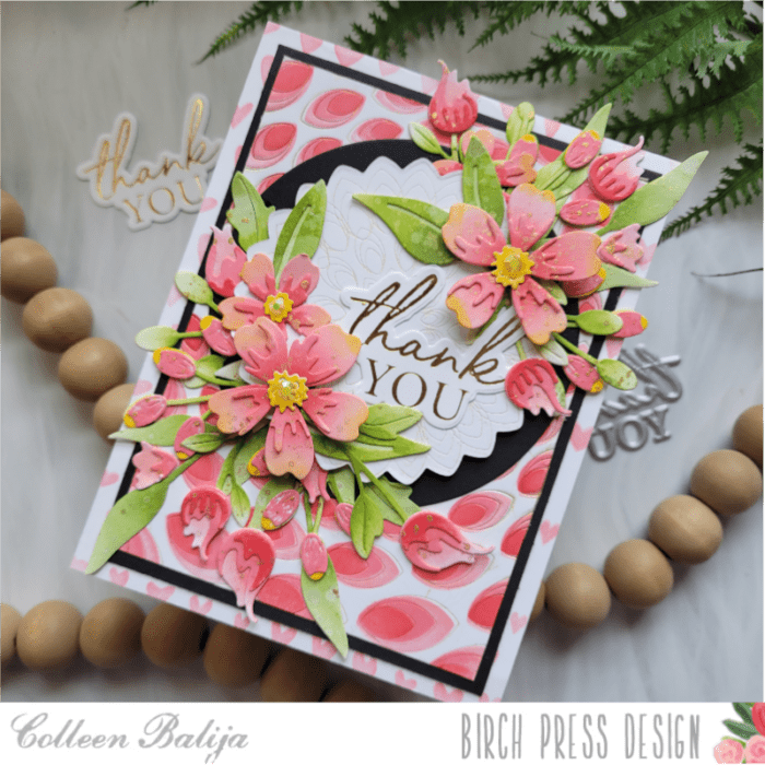
    For this monochromatic Springtime Thank You card, I created a background using Gilded Petalpoint hot foil plate and die set as well as the coordinating 3-layer stencil. I dry embossed the Petalpoint image onto white cardstock to create an impression, and then ink blended the layers using shades of coral – pink inks and the stencil. I trimmed the image down and placed it over a slightly larger black card panel. Then I placed both over a white 5.5×4.25 card base that was stenciled with some hearts that I had on hand. I just wanted a tiny piece of color to peek out from the white card base. The black card panel adds a level of contrasting interest that helps the card pop.

    Next, I die cut and dry embossed the center scalloped-shape circle from the Gilded Petalpoint hot foil plate. For a bit of interest, I added gold ink directly onto the die plate before die cutting it, so you can see gold embedded in the impression! This is another option to hot foiling! I also die cut a black circle slightly larger than the scalloped circle. I adhered the black circle to the card panel, but not the white scalloped one. You’ll see why in a bit!
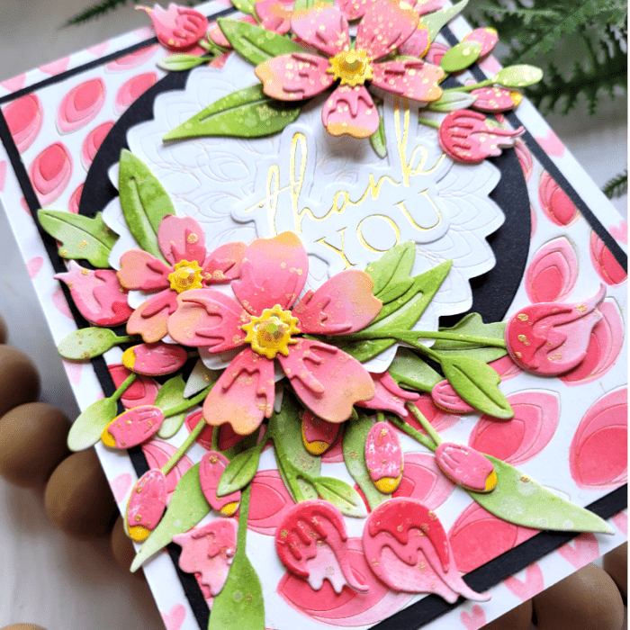
    Now it was time to work on the flowers, and there are plenty of them on this card! I love a good spring floral bouquet! And I wanted to use as many of the floral pieces from the new release as I could so you can see how well they play together! Also, this is a busy card, so going with a monochromatic look (one color family) really helps all the elements come together.

    I did some bit time die cutting of several flowers on white cardstock using Phlox Blooms and Leaves Contour Layers, Sylvan Berries and Leaves contour Layers, and Delicate Floral Buds Contour Layers. Then I ink blended each piece in the same coral-pink shades that are on the background panel. I sprayed the inked flowers and leaves with water and then splattered gold metallic watercolor over everything. I love how a simple technique like this can add so much detail and interest. It takes your ink blending to a new level! Can you see the details in the photo above?
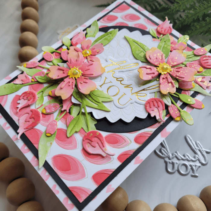
    When the flowers and leaves were colored and dried, I placed them around the scalloped circle. Now, as I mentioned earlier, I didn’t adhere the scalloped circle down because I wanted to tuck a few pieces behind it. This clever little trick adds depth and dimension but without the need for foam tape!

    I adhered the pieces that were tucked behind the scalloped circle first, next I adhered the circle with foam tape, then I placed the remaining flowers that were on top of the circle. I used foam tape on two of the flowers for even more dimension. Then I went back in and added a few more floral details until I was satisfied with my floral arrangement. I feel like a florist!!! I finished with a few sequins on the flowers for extra shine! Every little detail matters!

    The last step was to hot foil the Thank You Noted script hot foil plate and die cut it. I tucked the sentiment between the flowers.
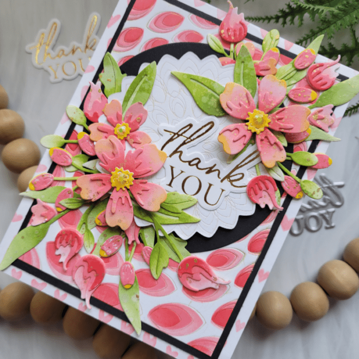
    I had so much fun with the flowers and that stunning Gilded Pinpoint plate. I hope that I was able to show you how well the flowers work together and also the various ways that you can use the hot foil plates beyond just hot foiling! Thanks for stopping by today!

     

    Supplies
     

  • Banner Heart Hugs | by Colleen Balija

    Banner Heart Hugs | by Colleen Balija

    Hi friends,

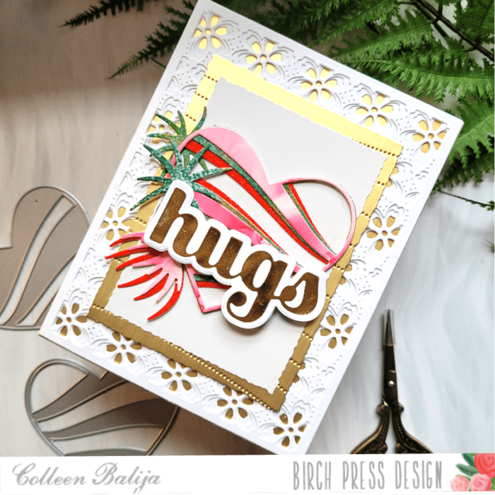
    I’m back today to share a fun and endearing card for someone who may need a hug during Valentine’s Day (or any day). This card is cheerful but comforting!

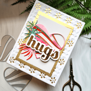
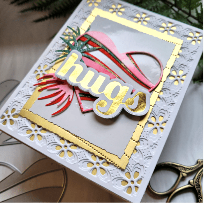
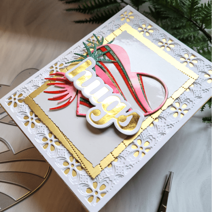
    I started by creating a card base of white and gold using Flora Plate Layering dies. The bottom layer is a gold card base. Then I added a gold layer over it that is slightly smaller and was embossed using the new Pinpoint Contour Plate die. This cover plate is perfect to add texture and interest! I added a mirrored white card panel over the gold. I used my handy Deckled Paper Trimmer to cut the layers, adding a bit more detail to the card base. I am all about the details! I set the background aside and worked on the Banner Heart.

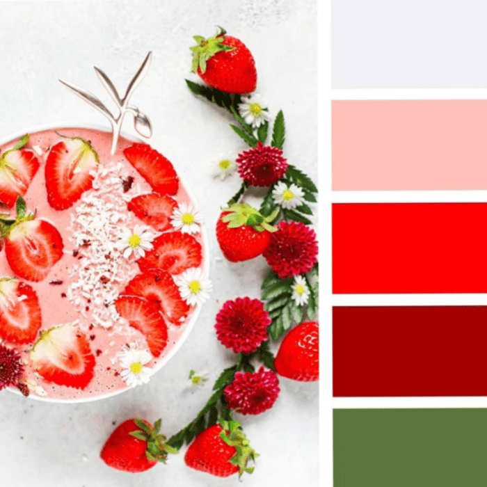
    I chose the colors for my heart using a color mood board. I love to use color mood boards because the colors are coordinated for you, so all you have to do is put them together! Here is the mood board that I used for my heart.

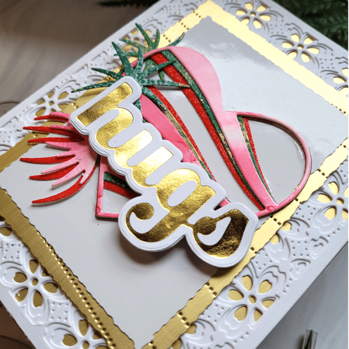
    Feel free to use this if you feel so inspired to do so! Anyway, getting back to my card, I found Memory Box glitter paper and a few other pieces of colored cardstock in shades of pink, red, and green, similar to the color mood board. I die cut all 3 layers of the Banner Heart using those colors and adhered the layers together, going from darkest to lightest in color. Hint: I used a variety of color card panels to add detailed interest to the heart, such as an alcohol base card panel, a gelli plate card panel, and a glitter card panel. Can you see the detail in the photo below? It makes a big difference!

    Once my heart was finished, I staged it over my background that I had made earlier, and decided it needed something more! That’s where the flowers and Hugs sentiment come in to play!

    I had foiled the Hugs Sugar Script sentiment awhile back (I like to do mass foiling so that it’s ready when I need it), so I grabbed that foiled sentiment and placed it over the heart. Then I die cut Wispy Blooms Contour Layers using the same card panels from my heart and tucked those behind the heart and sentiment.

    I tucked everything to the left of the sentiment because I wanted the heart to clearly show up on the card. The Hugs sentiment was propped up using foam tape.

    What I love about this card is that the only source of color comes from the heart and flowers. Everything else is neutral, which helps the focal point pop even more! And I love all the tiny details in this card that come together beautifully!

    Thanks for stopping by today!

    Supplies

  • How to Add Texture to White Space on Your Card | by Colleen Balija

    How to Add Texture to White Space on Your Card | by Colleen Balija

    Hi friends! Today I want to talk about how to add texture to white space! I find it difficult to not fill my entire card up with design elements and color! But, when I make a card like this one today, I’m so glad that I allowed the white space to shine through! I forget how pretty a card with a white background can be!

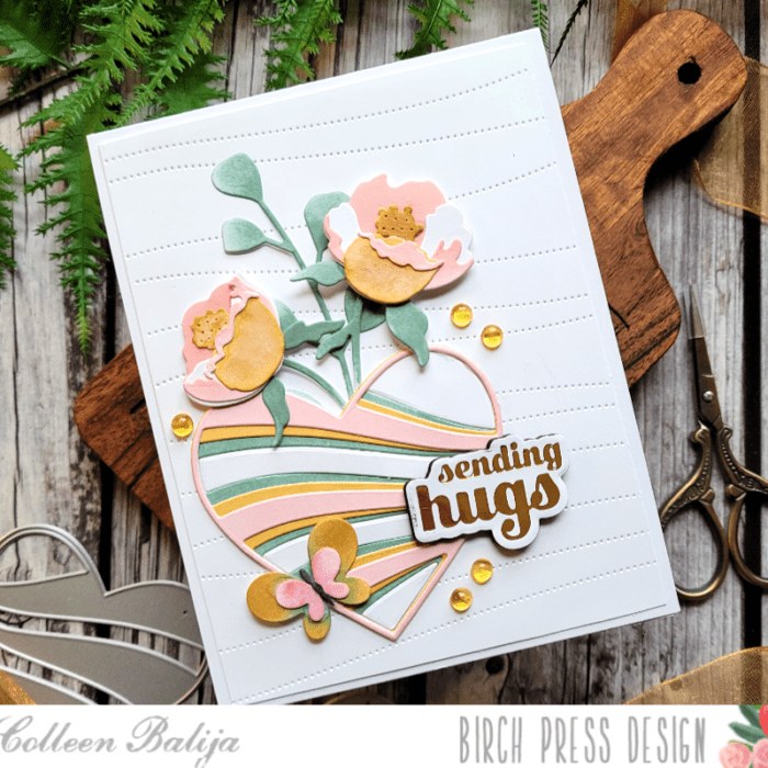
    Adding texture to white space is easy to do with a die cut! Die cuts add texture without adding color. For my card, I die cut the Pinpoint Contour Plate onto an 80 lb 5.5×4.25 white card panel. Then I trimmed the panel down and adhered it over a 5.5×4.25 white card base so that the white card base peeked out behind the die cut card panel. Already we’ve got texture and dimension!

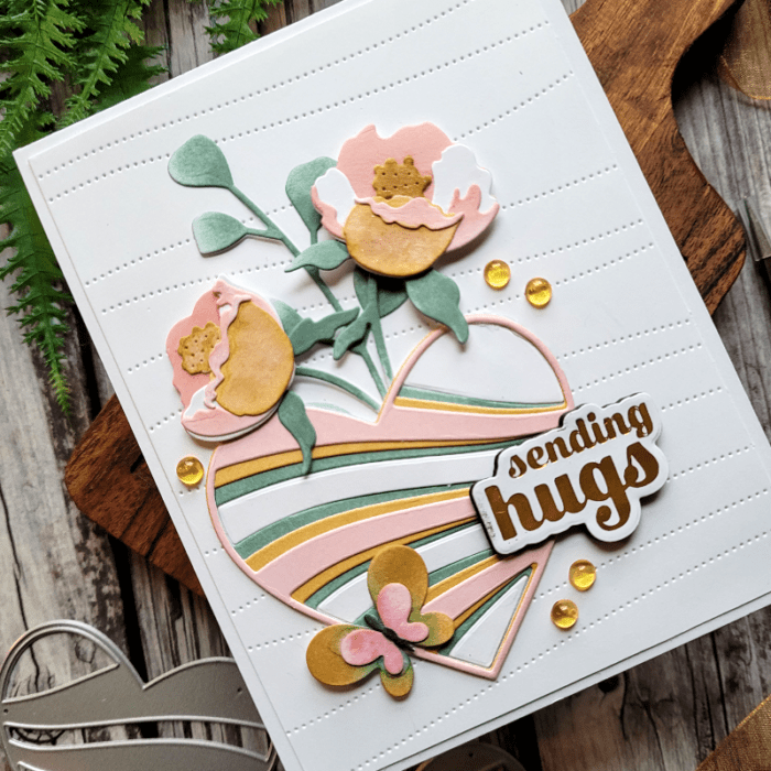
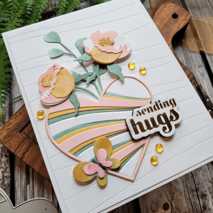
    Next, I added my focal point to the white space using Banner Hearts layering dies. I die cut all 3 layers and then ink blended each layer in soft shades of pink, golden yellow, and green. I kept the colors soft so they blended with the white background. I also die cut Plate C in white and set the inside pieces aside for later.

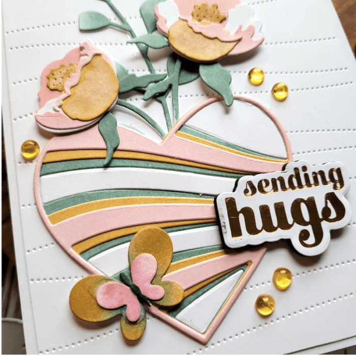
    I wanted to add some design elements around the heart to frame it. So, I die cut Prime Peony Duo Contour Layers, Eucalyptus Stem and Berries (just the leaves), and Simply butterfly Contour die and ink blended each layer using the same colors as the Banner Heart. I decided to place everything in the lower left corner of the card panel so that the white space would surround my focal point. I adhered the flowers first and then the heart next. I added the white pieces from Panel C in the heart so that the heart was a solid piece (I didn’t want the background card panel peeking through and competing with the heart). You can see the details in the photo below.

    The final step was to add the sentiment and a few gold sequins. My sentiment is the Sending Hugs hot foil plate and die cut. I foiled it in gold and die cut it 3 times so that it would pop off the page a bit for dimension. The flowers are popped up on foam tape as well to add dimension.

    Let’s take one final look at the card below and see how the white space works for it. This card has a lot of white space in it, but the texture from the Pinpoint die plate adds interest and texture without adding color. The colors in my focal point are soft enough that they don’t steal the show from that beautiful white space. And the positioning of the design elements allowed the white space to surround the focal point nicely. What do you think?

    I hope that you will play around with using white space to your advantage in your cards! The key thing is to know when to stop and allow enough of the white space to shine through! One thing that helps me is to pause a few times in the process to look at the card’s progress, and even take photos of it!

    Supplies

  • How to Use Color Mood Boards for Inspiration Part 2 | by Colleen Balija

    How to Use Color Mood Boards for Inspiration Part 2 | by Colleen Balija

    Hi friends,

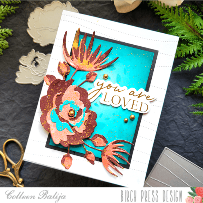
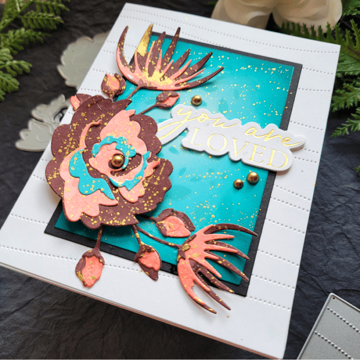
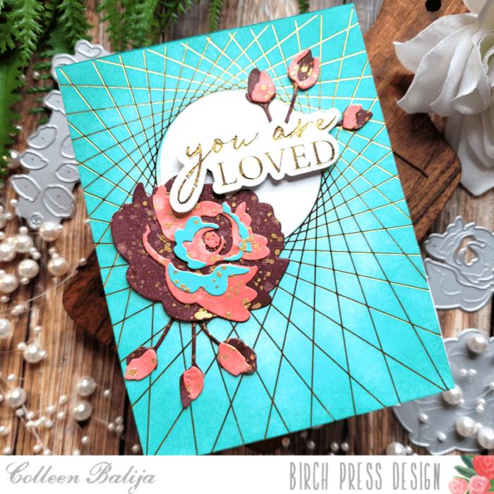
    I’m back with another post on how to use Color Mood Boards for inspiration!!! In my post earlier this month, I shared a mood board and card that was inspired by it. Today I’m going to share a completely different card using that same mood board! My hope is that you will see how inspiring it can be to create TONS of unique cards with just one color mood board! Here is my card below.

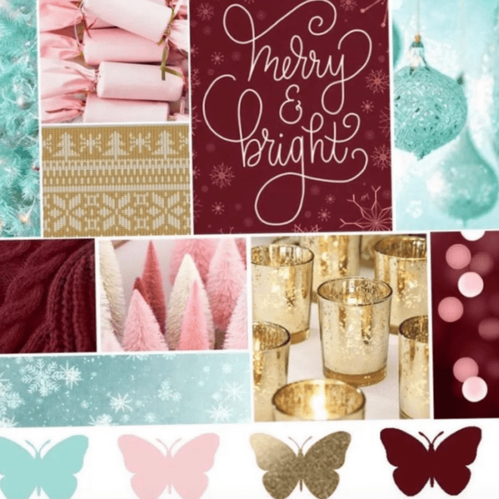
    And, here is that Color Mood Board in which I was inspired to create this card ealier this month! Again, I found this through DT Crystal Komara!

    The first step was to plan the layout of my card. I found a card on Instagram where I just fell in love with the layout and design elements, so I used that card as my starting point. Since I didn’t want to CASE the card, I used just the background design ideas from it.

    Next, I chose the Birch Press Designs dies I wanted to use for my card.

    Birch Press Designs just released a beautiful, layered floral called Morning Rose & Tripe Buds Contour Layers. In addition to this die, I used Wispy Blooms Contour Layers die to compliment the Morning Rose.

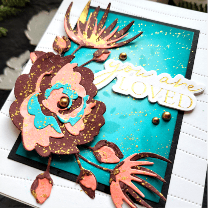
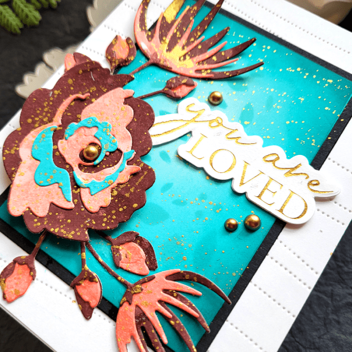
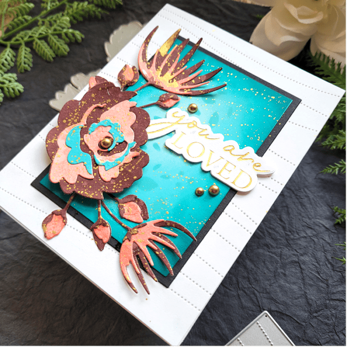
    Following the Color Mood Board, I used ink colors in similar shades and applied them directly to white cardstock. Then I splattered gold metallic ink and water over it to add interest. Once my card panel was fully dry, I die cut the layers of my flowers and buds and adhered it all together. All the flowers are coordinated with the same colors from the Color Mood Board for cohesiveness. I added more gold splatters to the flowers after they were die cut. You can see in the photo below how pretty the colors work together!

    The next step was to work on the background! I die cut the brand-new Pinpoint Contour die plate onto a 5.5×4.25 white card panel and adhered it to a white card base. This is a beautiful die that creates a design without die cutting it. It’s perfect for a background!

    Next, I trimmed 2 more card panels – one in white and a larger one in black. I inked up the white card panel using teal shades of ink, similar to the Color Mood Board. I went from lightest in the center to darkest on the outer part. To add interest, I used Layer A of Herbarium Layer Plates as a stencil and inked through it to create an abstract design over the teal ink! It was subtle enough to add interest without competing with the focal point! I also added gold splatters.

    I adhered the inked-up card panel to the larger black card panel, and then adhered both to the card base so that enough of the Pinpoint Contour die was peeking out from behind. You can see all that lovely detail in the photo above!

    Finally it was time to add my flowers over that beautiful card base! I “staged” everything exactly where I wanted it and then adhered it all down with liquid glue once I was satisfied with placement. The Morning Rose flower was popped up on foam tape. I finished with a gold foiled sentiment from You Are Loved.

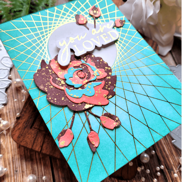
    As a refresher, here is the card that I made from my last blog post, so that you can see how different that card is from today’s card!

    The colors are similar of course, but the layout and design elements are different! Color Mood Boards are coordinated for you so that the colors will work together nicely. That’s really important, as too much color can take away from the beauty and cohesiveness of a card! So, you can feel free to use all the colors on the mood board with whatever design elements you choose!

    You can find Color Mood Boards by googling them, by searching for them on Instagram, or by creating your own! I also frequently refer to color mood boards designed by Sarah Renae Clark, whom you can find on Instagram. She creates a multitude of mood boards for every season and every reason!

    Thanks for stopping by today!

    Supplies

  • Using Color Mood Boards for Inspiration | by Colleen Balija

    Using Color Mood Boards for Inspiration | by Colleen Balija

    Hi friends! I hope your week is going well for you! Today I’m going to share how to find inspiration for your cards using a Color Mood Board!!! I have been using color mood boards for a few years now, and it never lets me down! It will take the most basic card and bring it to next level genius! Colors emit a powerful message, so I encourage you to use them whenever possible!

    Below is the color mood board that I used for my card in this blog post. This was inspired by my fellow design team member Crystal Komara, who shared it on her social media. I instantly fell in love with the colors and decided to use it for today’s card! The color combinations are glorious for this time of year!

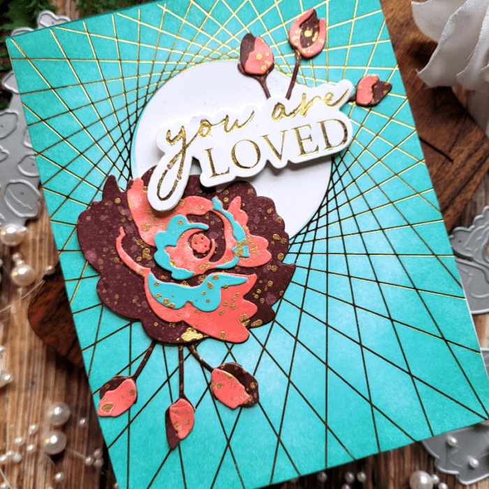
    I started with String Art Frame Hot Foil plate in gold, channeling the gold in the color mood board. Then I added teal shading over the hot foil, again inspired by the color mood board. Already we’ve got 2 colors used!

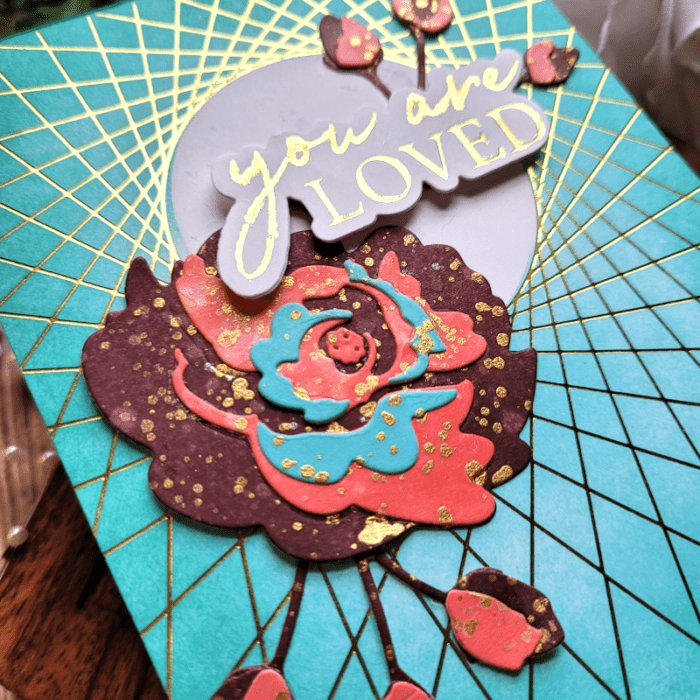
    Now it was time to work on the focal point! Using the NEW Morning Rose & Triple Buds Contour Layers die, I chose the burgundy, coral, and teal colors from the Color Mood Board to apply to my flowers and buds. This is a layered die set, so 3 colors were perfect!

    In the photo below, you can see the details in my flower and buds! Let me explain how I achieved this look.

    I swiped burgundy and coral inks directly onto white cardstock. Then I sprayed the ink to lift up some of the ink with water. Next, I added gold paint splatters over both colors and allowed it to all to dry. Once it was dry, I die cut my floral layers and buds. The darkest burgundy color would be the 1st layer (the one furthest away from the eye), coral the 2nd layer, and teal the top layer. Then I adhered my layers together. I added a bit more of the gold splatter once everything was adhered together.

    TIP: Birch Press Designs does an amazing job of helping you layer these contour dies! They emboss the image that needs to be layered next over the other image. All you have to do is line it up and adhere it! I love how easy it is to do!

    Next, it was time to put everything together on my card panel that I had created earlier.

    You can see in the photo above that I left the inner circle of the background panel white. This will help draw the eye to the focal point and it leaves just a hint of white space. There is something about white space that grounds everything!

    TIP: I “stage” everything before adhering it down, just to be sure that my design items are exactly where I want them! Once I have it where I want, then I begin to adhere everything using liquid glue. Liquid glue provides wiggle room to place the design item in the exact right spot!

    I adhered the flower and one of the buds to the lower left corner of the white circle, and then added the NEW You Are Loved Noted Script hot foil plate to the upper right of the circle, tucking the 2nd bud behind the sentiment. For the You Are Loved Noted Script sentiment, it comes with a coordinating die cut, so I die cut it 3 times and adhered it together to give the sentiment some pop!

    Here is one more look at the finished card. Notice how all the colors from the mood board were used? Color Mood Boards are made to work cohesively, so you won’t go wrong using one! You can find color mood boards just about anywhere – from social media (like Crystal’s) to googling it! One other source that shares a variety of mood boards is Sarah Renae Clark. You can find her on Instagram!

    I’m so glad you joined me today! I hope that you found inspiration and use a color mood board to bring your cards to life!!!

    Supplies

  • Bold Holiday Color Ideas / by Colleen Balija

    Bold Holiday Color Ideas / by Colleen Balija

    Hi friends,

    What colors do you generally resort to for your holiday cards? I like to venture out and try new colors and textures for my holiday cards, so today I want to share my idea on a bold and shimmery card that is unique for the holiday!!!

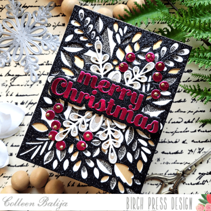
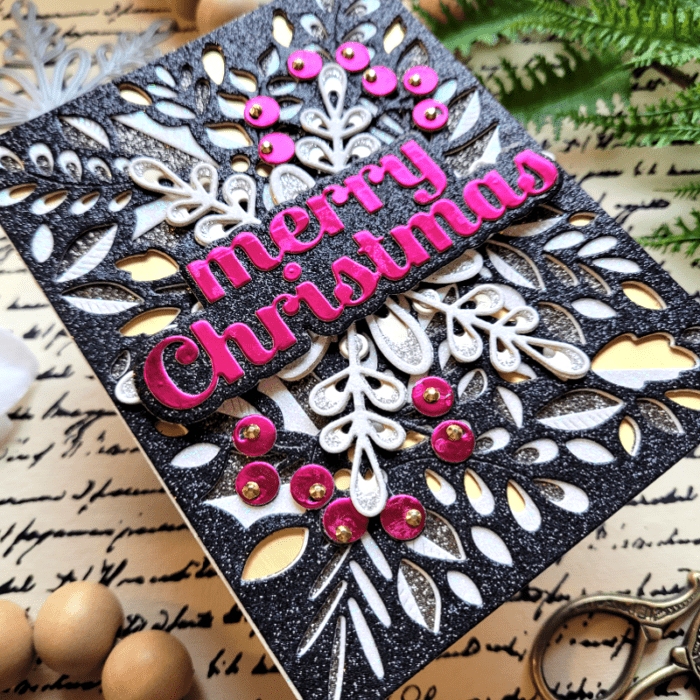
    For my card I’m using Birch Press Designs Herbarium Layering Plates, Merry Christmas Sugar Script & Outline die, Crochet Snowflake layering die, Eucalyptus Stem & Berries Contour Layering die, and Memory Box Majestic Hues and Rainbow Reflections paper pads.

    First step was to choose my color combinations. You can get inspired to find new colors by searching color mood boards or google popular colors, you can take inspiration from another card maker, or just choose your own colors! Try and limit your colors to no more than 3-4.

    Once my colors were decided upon, the next step was to choose the texture I wanted to add. Texture is a great detail to add to your card and it can come in many forms! I decided on a combination of mirrored paper and glitter paper. Glitter paper has a different texture than the smooth finish of mirrored cardstock, so I thought the combination of both was perfect!

    Next, I chose the design elements for my card (stamps, dies, embellishments). For me, it’s important to choose the color and texture first, as that makes it easier for me to choose the perfect stamps and dies!

    Once I had my plan in place and everything gathered around me, I was ready to put the card together. I started with the background using the Herbarium Layering Plates. This is a GORGEOUS and detailed layering die! Each layer was die cut in black glitter, white glitter, and mirrored gold paper from the Memory Box Majestic Hues and Rainbow Reflections 6×6 paper pads. The mirrored gold was actually the 5.5×4.25 card base as well so it served a dual purpose! I set my finished background aside and worked on the focal point – the sentiment.

    I die cut the Merry Christmas Sugar Script and Outline in magenta and glitter black cardstock. Since the sentiment is the focal point, I chose a color that would stand out from the background! After I finished the sentiment, I decided that I wanted more magenta on the card to even the colors out a bit more, so I die cut the Eucalyptus Stem & Berries Contour Layers in the same 2 colors as the sentiment.

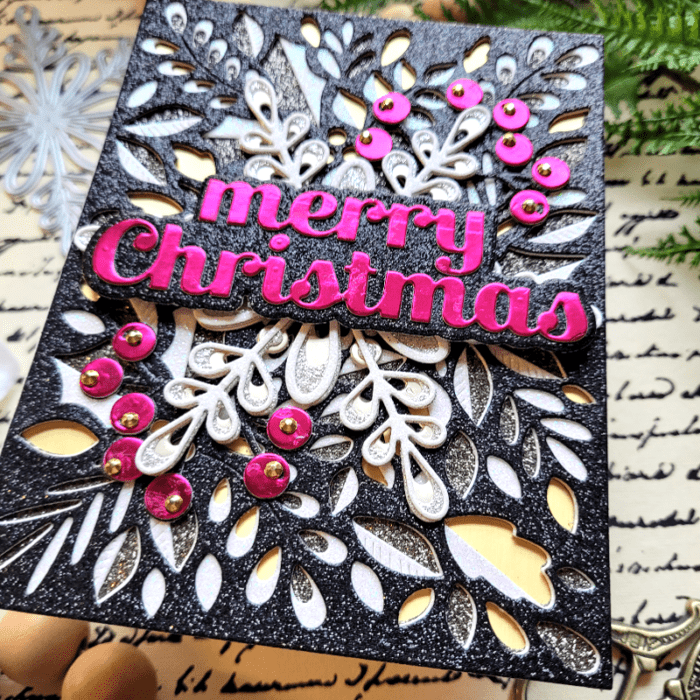
    I wanted another layer to be added between the background and the sentiment so that the sentiment would stand out from the busy background. I die cut the Crochet Snowflake layered die in shades of silver, gold and white glitter and mirrored cardstock and adhered it over the background. I stayed with the same color scheme for the snowflake with the exception of black.

    Next, I tucked the Eucalyptus Stem & Berries behind the Crochet Snowflake and then added the sentiment, which was popped up on foam tape to help it stand out even more. Every little bit helps! I finished with a few gold sequins over the berries!

    If you look at the finished card below, you can see a nice flow of color and texture! The eye is drawn right to the sentiment, and that’s what you want! You can get away with as much busyness as my card has when you limit your colors and textures!

    Next time you work on your holiday cards, no matter what the holiday you’re celebrating, search the Color Mood boards or google popular winter colors to get ideas on unique combos that you can use for your cards. You won’t regret it and your recipients will be delighted to get such a beautiful and unique holiday card from you! I’m so glad you joined me today!

    Supplies
  • Holiday Pop-Up Easel Cards / by Colleen Balija

    Holiday Pop-Up Easel Cards / by Colleen Balija

    Hi friends, I’m back on the blog today to share two Holiday Pop-up Easel cards using the new BPD Christmas Ornament Pop-Up Easel die!!!

    The Christmas Ornament Pop-Up Easel die is so easy to use and creates such a fun and interesting card design! I made 2 cards using Meridian Ornament and Flicker layering dies in two color combos to show you how unique each card looks just by changing a few design elements!
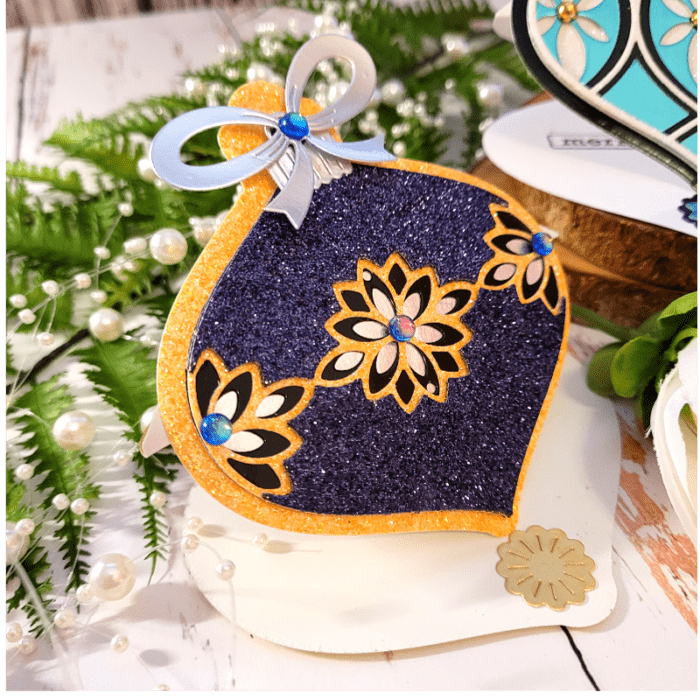
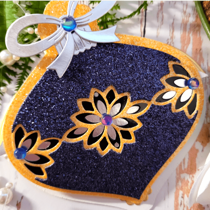
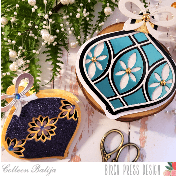
    The card featured in the photo above uses Flicker Ornament Layering dies. I started by choosing a color combo of deep blue, mirrored black, and yellow from my Memory Box Twinkling Jewel and Festive Glitter stash. Then I die cut each layer of the ornament using that paper and adhered the layers together according to the instructions. Then I placed the ornament over mirrored silver cardstock. I die cut the larger ornament-shaped die included in the Christmas Ornaments Pop Up Easel set using the yellow glitter paper and adhered the ornament over it. You can see in the photo below how the yellow peeks out from behind the finished ornament!

    Next, I die cut the Easel from the Christmas Ornament Pop-Up Easel set in mirrored white cardstock. The Easel die has 2 pre-made scoring lines, so all you need to do is fold at the scored lines and your easel will be ready to go! I folded the easel in half according to one of the scoring lines, and then folded the little lip facing upward according to the 2nd scoring line. I adhered the ornament to the little lip.

    Now all that was left was to support the ornament to stand upright with the help of the easel! To do this, I adhered one of the little snowflakes that was included in the Pop-Up Easel kit onto the card base at the very bottom. When I propped my ornament up onto that snowflake, it stood up quite easily! It also flattens nicely to fit into a standard A2 sized envelope! I finished with a sentiment on the inside of my card, the silver bow and ornament topper that comes with Easel set, and a few sequins!

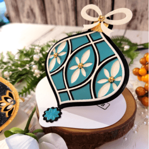
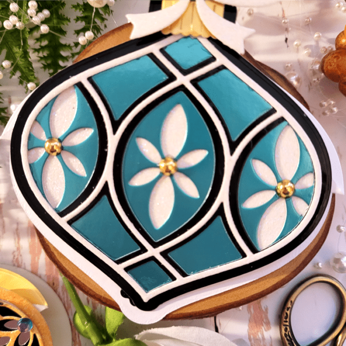
    My 2nd card uses the Meridian Ornament Layered die set! This time I chose colors in deep teal, black, and ivory. I followed the same instructions as with card #1! Only this time I used gold embellishments.

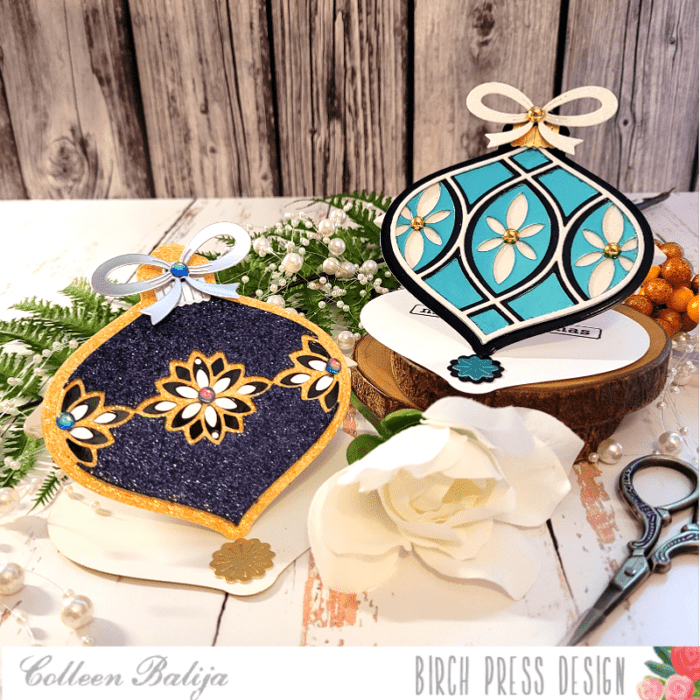
    Below is another photo of both cards together so you can get a side-by-side comparison of how unique each card is just by changing up a few design elements!

    You can create entire holiday card sets using the Christmas Ornament Pop-Up Easel die set and your choice of BPD layering ornaments! And won’t these look beautiful sitting on your recipient’s fireplace mantle? Or you could make some as decorations for your own home!

    Thanks for stopping by today!

    Supplies