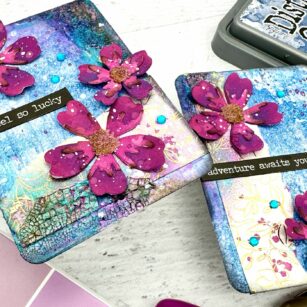
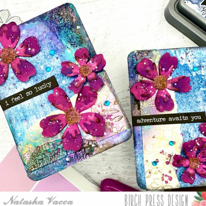
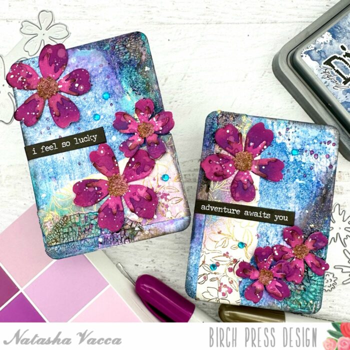
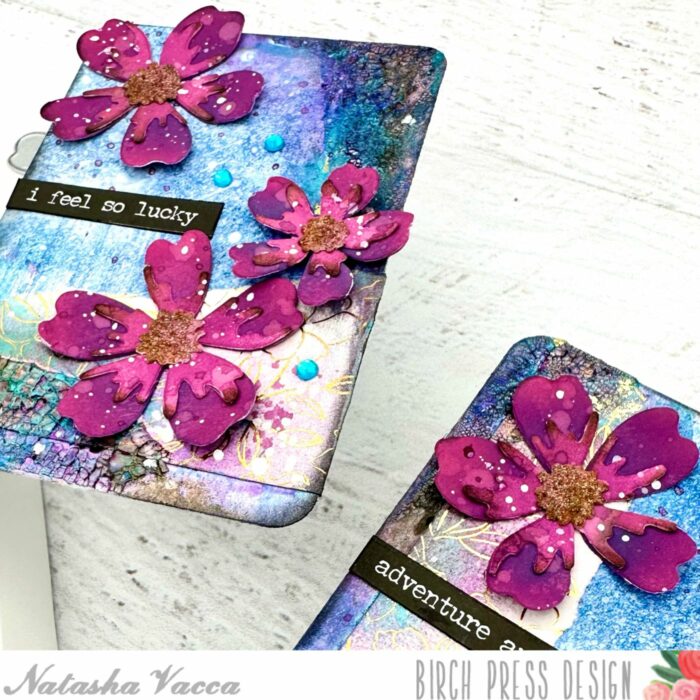
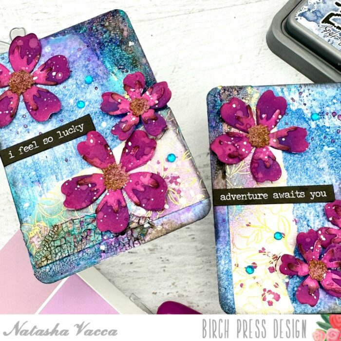
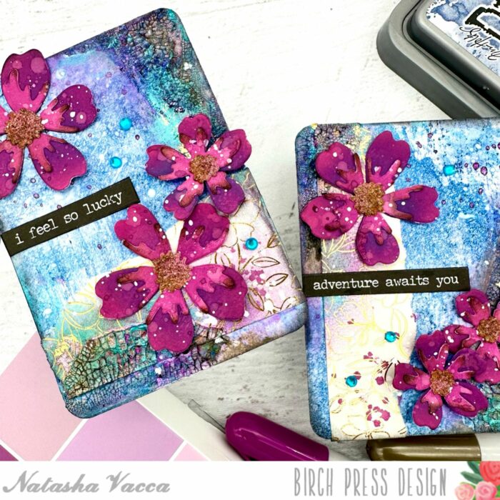
Hello Crafty friends! I am excited to be back on the blog today sharing a couple of mixed media ATC’s using the Phlox Blooms and Leaves Contour Layers die set. So let’s get started!
I started by die cut the floral images from the Phlox Blooms and Leaves Contour Layers die set. I cut enough for 3 florals per ATC. I die cut the flowers using the Vibrant Violet paper pad from Memory Box. I chose 2 shades of pink for the flowers and the center of the flower. Once everything was die cut, I used several shades of Distress Oxide ink to add more depth and texture to the flower images.
Once the flowers were all inked up I adhered the flowers together using liquid blue. Next I heat embossed the center of the flower using a gold embossing powder and then adhered the center to the flowers. I also added a few splatters to each flower. I then set the flowers aside to work on my backgrounds.
For the background I chose a blue panel from my stash of pre-made backgrounds. I trimmed the panel into 2 ATC’s (Artist Trading Cards). Next I chose a piece of pattern paper from the Magnolia Grove paper pad from Memory Box. I tore the paper and then adhered this to each ATC using liquid glue.
I then added a clear crackle paste to each ATC in a couple of places. I allowed the paste to dry and when it was completely dry I added a bit of distressing using distress crayons, as well as paper glaze for added shine and texture. Next I inked up the edges of each ATC using black distress ink.
I then added white and purple splatters to each of the backgrounds. Once the splatters were dry, I adhered the flowers using liquid glue and foam tape. I completed my ATC’s with a couple of sentiment strips and a few gems from the Fairy Jewels – Brights collection!
Thank you for stopping by today! I will be back soon!
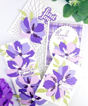
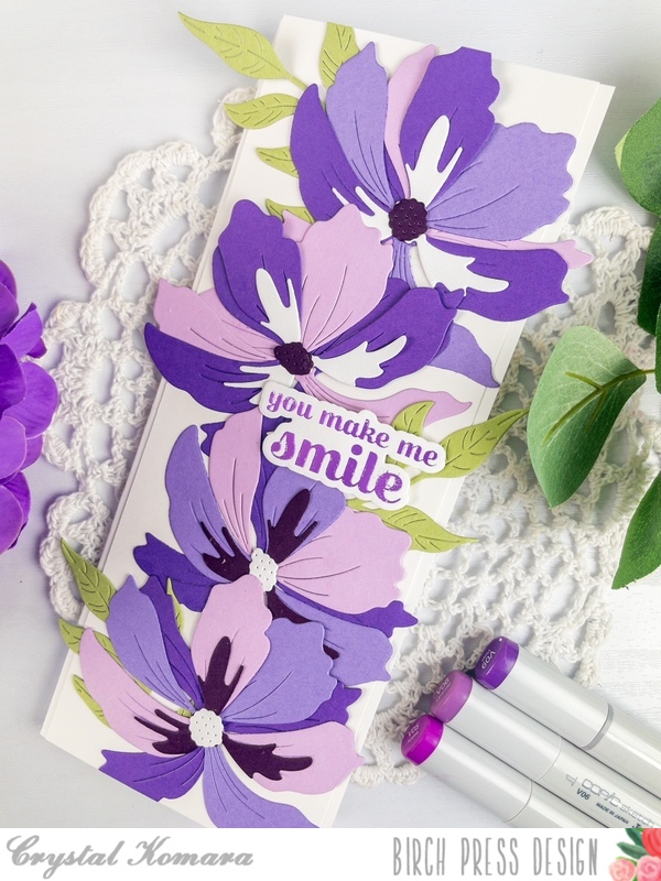
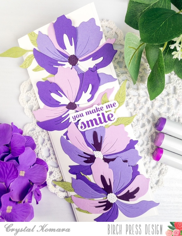
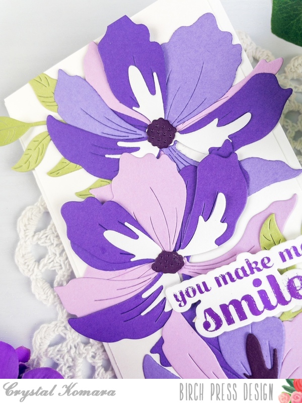
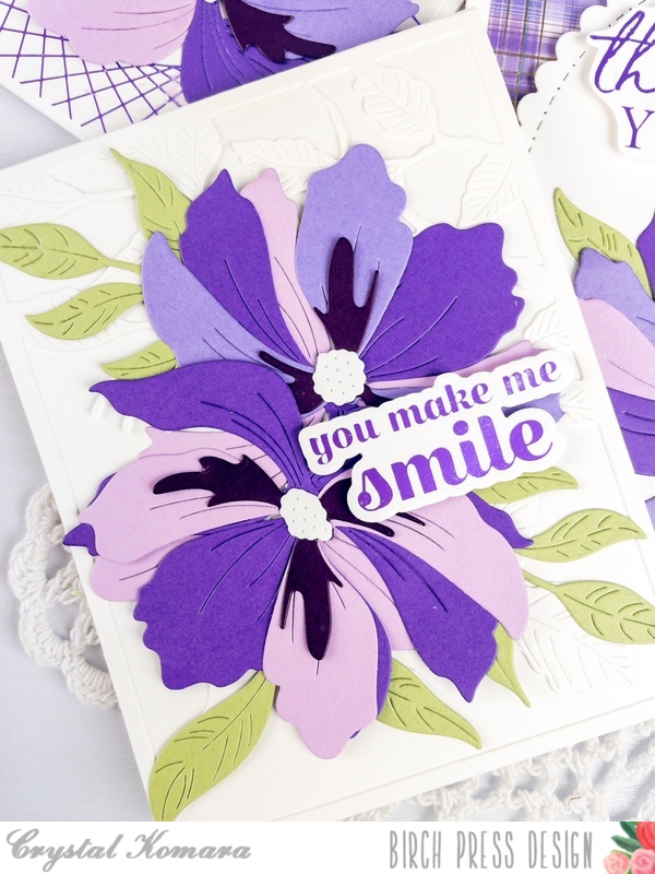
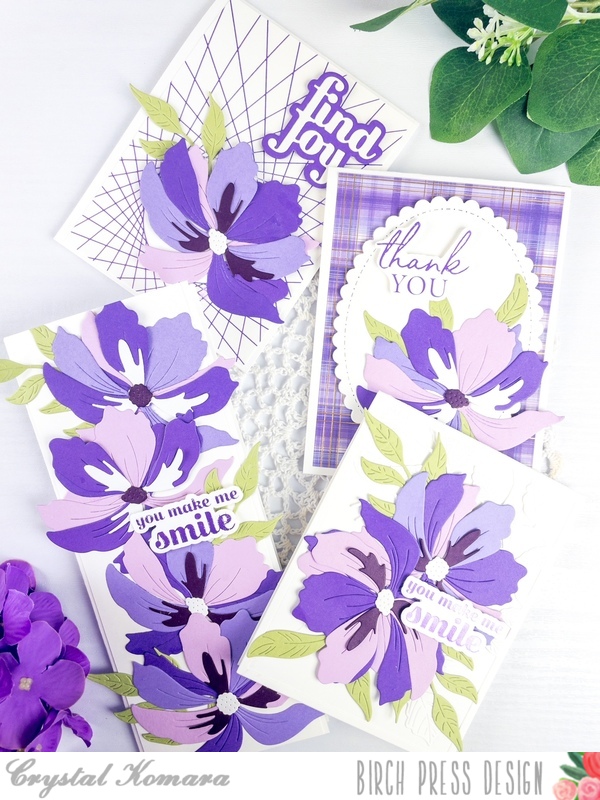
Hello Birch Press readers, this is Design Team member Crystal Komara here with you today showing your a whole variety of ways to use the beautiful new Large Cosmos Contour Layering dies! Initially, I had only one slimline card in mind, but I ended up die cutting soooooo many cosmo flowers that I made four cards to show you a variety of ways to use them. So, sit back and enjoy the inspiration!
The easiest way to begin making all of these cards, is to first create the large cosmos. For the flowers, I used a combination of purple colored cardstock. Then I just began assembling the flowers following the guided image. I ended up with almost 20 flowers by the time I was done. This truly was the hardest part of the entire process. Then I just took the flowers and designed multiple layouts.
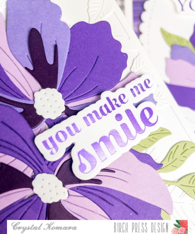
The first card is an 8 1/2 x 3 1/2″ slimline card. It is designed to fit inside a regular #10 business sized envelope. The white base is made from 80 lb. Neenah Smooth white cardstock. I adhered four of the large cosmo flowers down the center of the card. Behind a couple of the flowers, I tucked a few leaves, die cut from the Curved Leaf die from lush green cardstock.
I heat foiled the sentiment in purple foil on white cardstock. The sentiment is from the Sugar Script Sentiments Hot Foil plates. I added the sentiment to the card using 3M foam adhesive for added dimension.
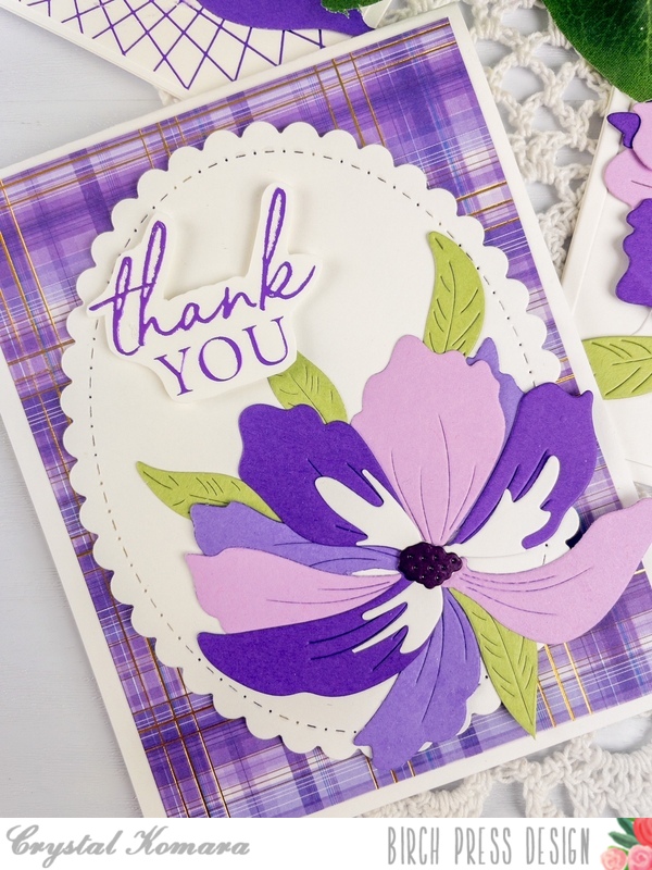
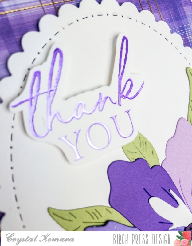
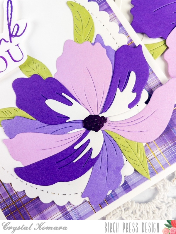
My next card is an A2 sized card made from the same 80 lb. Neenah Solar White Smooth cardstock. I matted the base with a piece of plaid foiled cardstock from sister company Memory Box. This plaid foiled paper is 5 1/4″ x 4″. Next, I die cut a large scalloped oval from white cardstock. I adhered this to the center of the card. I adhered one of the large cosmos to the lower right side of the oval. I also added a few leaves behind the flower. I heat foiled the sentiment in purple foil on white cardstock. Again, this sentiment is from the Sugar Script Sentiments hot foil plates.
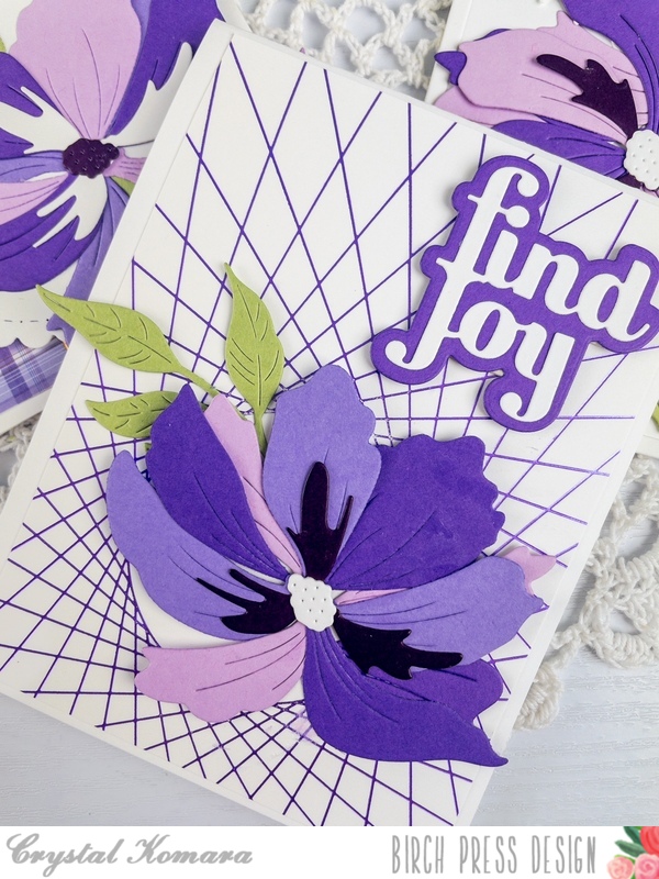
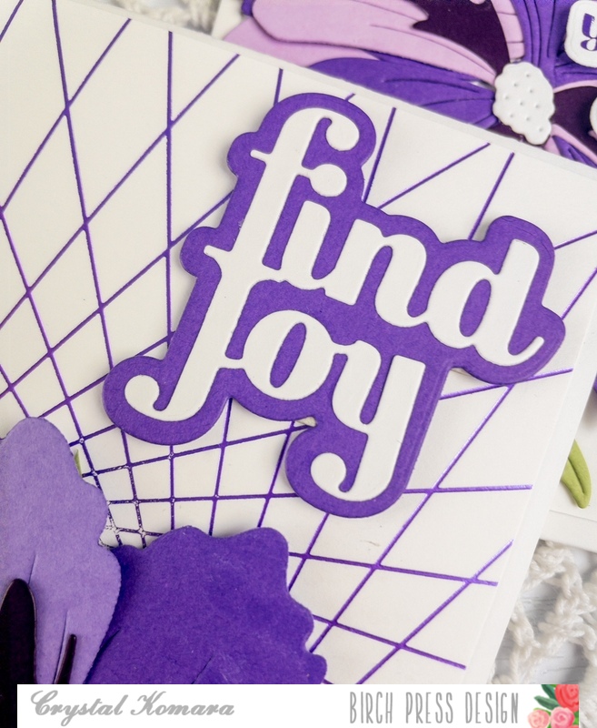
My third card for today is also an A2 sized card made from a base of 80 lb. Neenah Solar White Smooth cardstock. I heat foiled a piece of white cardstock with the String Art Frame Hot Foil Plate. Once this hot foiled background cooled, I adhered it directly to the card base as my first layer. I adhered one large cosmo to the lower right side of the card and tucked one leaf under the flower. Using the Find Joy and Outline die, I die cut the sentiment from purple and white cardstock, adhering the two layers together before adhering both to the card with 3M foam adhesive.
I hope you have enjoyed seeing a variety of cards all made in monochromatic purple and white with the new Large Cosmos die!
Thank you for visiting and have a wonderfully creative day!
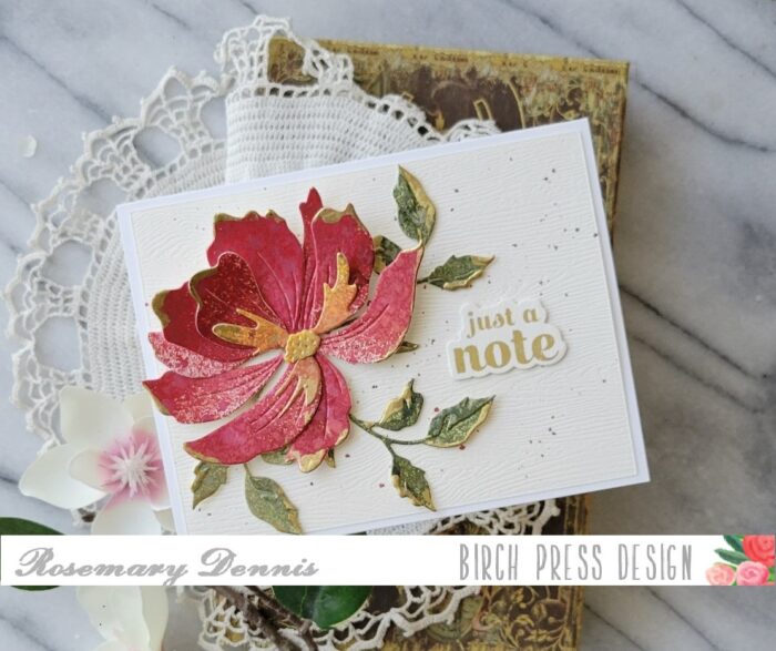
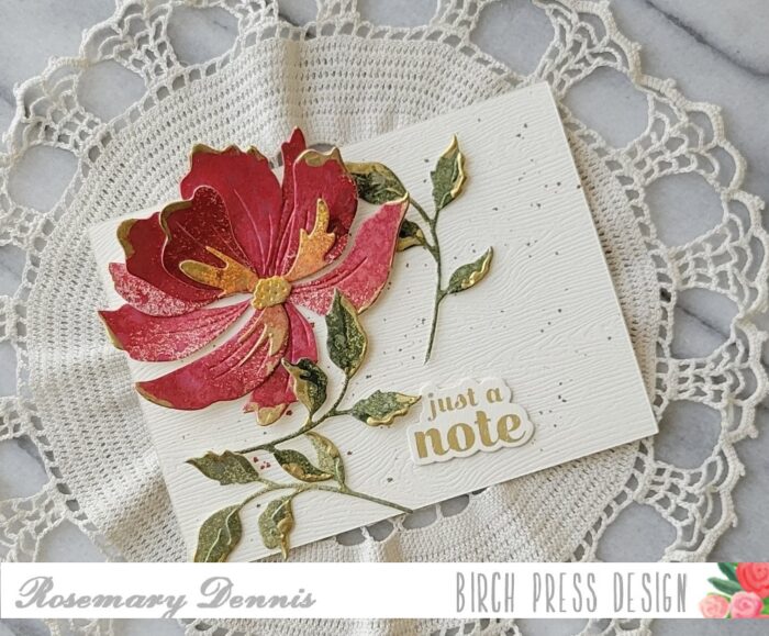
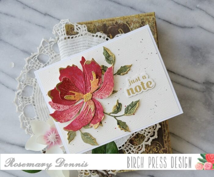
Hello! Rosemary here on the blog today sharing a mixed media type card that I created using the gorgeous new Large Cosmos Contour Layer die set, along with Fuddled Leaf Branches Contour Layer die set and a sentiment from the Sugar Script Sentiments 1 set. Let’s have a look.
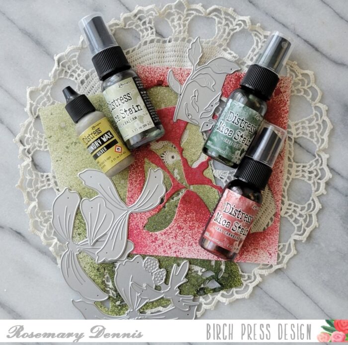
My teammate, Natasha, creates the most amazing mixed media projects using her Birch Press products. I was inspired by her to create my card combining by clean and simple with mixed media. I used Tim Holtz distress mica sprays and distress sprays and watercolor cardstock to create my panels.
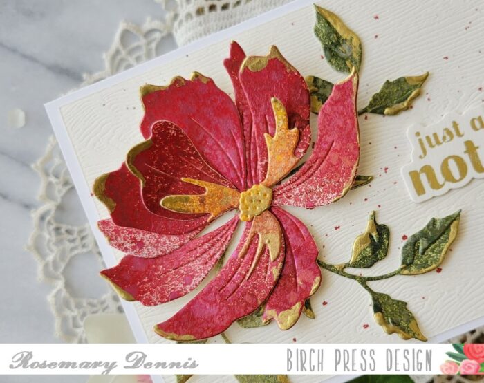
I die cut all the pieces and them assembled them using liquid adhesive. After the pieces were dry I added Gilded Distress Foundry Wax to the edges of the petals and the leaves. I used only smallest leaf cluster from the Fuddled Leaf Branches for my card. You have to work quickly when applying the foundry wax since it dries fast. I used my ring finger to apply the wax and then heat set it with my heat tool. Heat setting serves two purposes, it gives the wax the gilded look and it permanently sets it on your project. If you don’t heat set the was, it will simply chip off.
Once I had the gilding done, I created my background panel. I die cut cream Memory Box woodgrain cardstock and then splattered it with distress mica spray in Tart Cranberry. I had previously foiled the sentiment, so I simply had to die cut a few more blanks and then adhere them to the sentiment. I arranged the flower, leaves and sentiment to the panel with liquid adhesive. I then added my panel to an off-white cardstock base.
Here is a close up of the flower and leaves showing all that pretty gilding and some of the mica that provides alot of shine in real life.
I hope my card inspires you to try mixed media in a more clean and simple way. Thanks for stopping by and have a lovely day!
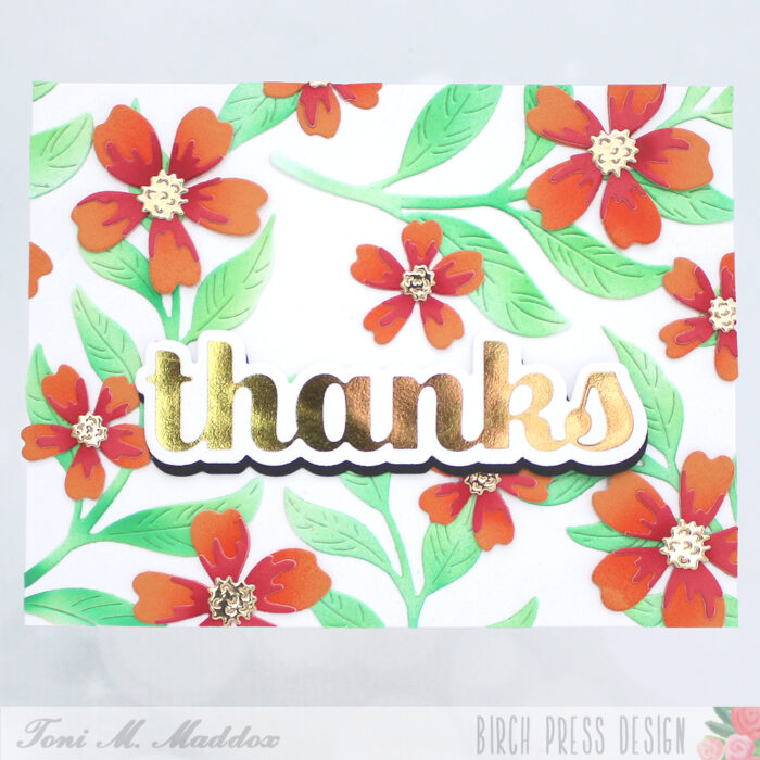
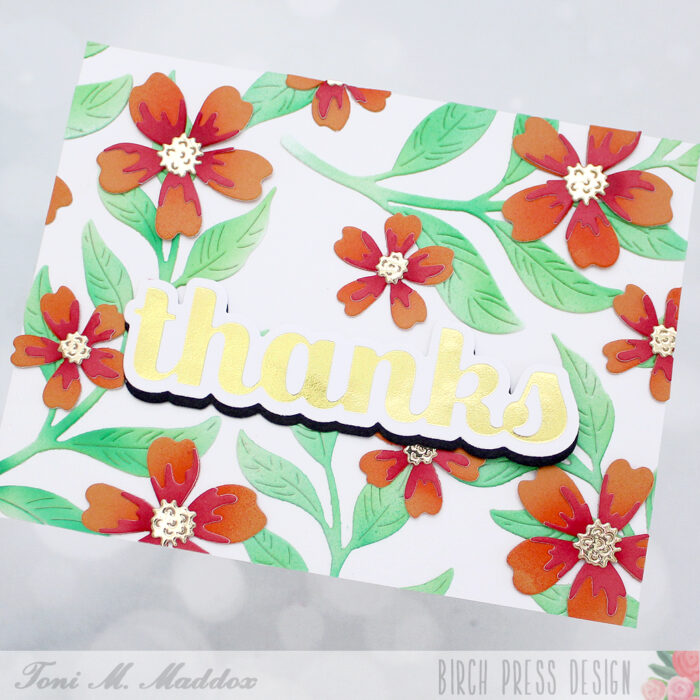
Hello, Birch Press fans! Toni here with you today sharing a tropical thank you card. I guess I’m feeling the summer weather big time!
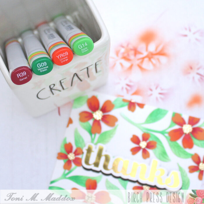
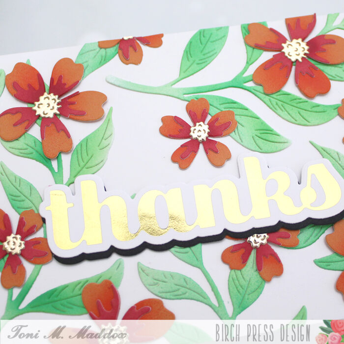
I started the card by cutting out some Phlox Blooms Contour Layers from Memory Box Berry Red and Sunny Orange 6×6 Paper. I added some Copic airbrushing (G09, G14, YR09, and R39) shading to the blooms.
I cut the Curved Leaf Branches from white and also airbrushed them.
For the sentiment I used gold with the Thanks Sugar Script Hot Foil Plate & Die, adding a black shadow diecut beneath. Notice how the bloom centers are gold too? Shiny and glam are being served today!
I hope you enjoyed today’s card and have a great rest of your week!
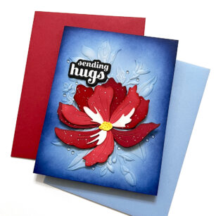
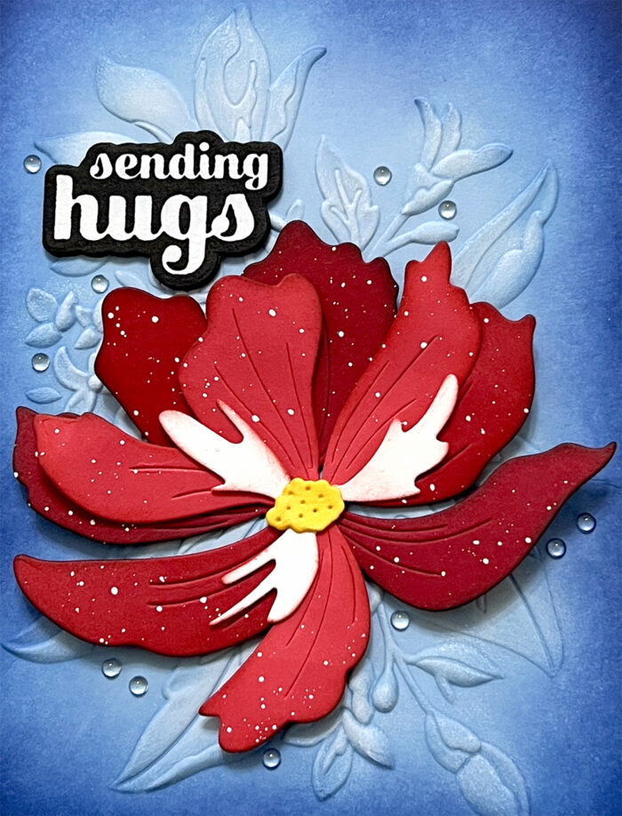
Hello, Birch Press friends. Today, I am sharing this vibrant card using the new Large Cosmos Contour Layers set. Since tomorrow is the 4th of July, I decided to use red, white and blue! I am also using the brand new Gracious Floral 3D embossing folder for the background.
I started out by embossing an A2 sized panel of light blue card stock with the Gracious Floral Embossing Folder. After taking the card stock out of the folder, I ran my white pigment ink pad over the embossed edges of the floral design. I then took a couple shades of darker blue ink and blended the edges of my card panel. This creates a glow effect in the middle.
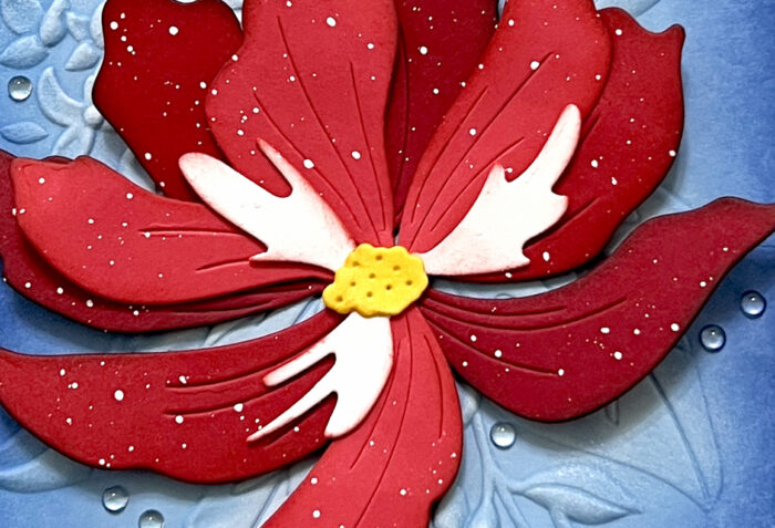
There is one die that cuts the larger petals for the Cosmos. I cut that from two different shades of red card stock and used one petal from each shade. So, one of those bottom layers is slightly darker than the other. I cut the smaller petals from a lighter shade of red. For all the petals, I inked up the edges with some dark red ink, and even a little bit of black ink for the darker petals. I cut the smallest die from white card stock – that cuts the two small pieces in the center. I ink blended the edges of the white piece with some red ink, and I ink blended the very center yellow. After glueing all the pieces together, I splattered it with white acrylic paint. I then adhered it to my panel over the large embossed flower from the Gracious Floral design.
I hot foiled my sentiment onto black card stock with white opaque foil. You can’t even tell that it’s foil – it just looks perfectly smooth. The sentiment comes from the Sugar Scripts Sentiment 1 Hot Foil Plate set. I finished my design by scattering my favorite embellishment – clear fairy drops.
I hope this card puts a smile on your face. Happy (early) 4th of July to those who celebrate! Thank you so much for joining us today.
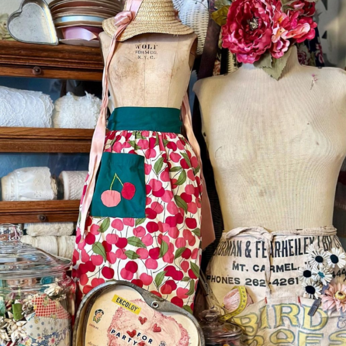
Hi friends! I’m back for Part 2 of How to Use Color Mood Boards for Inspiration! If you haven’t watched my previous post, be sure to visit that one as well for more inspiration! I love to use mood boards for color, texture, and design layout for my cards. Everything is done for you, so all that’s left is for you to choose what inspires you and make your card! Here is the mood board that inspired today’s card:
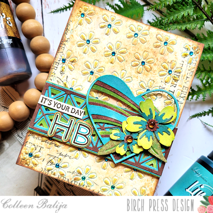
This mood board seemed old fashioned and rustic to me. I loved the hunter green from the apron, the yellow, brown, and blue from the words (lower right corner), the striking black words right above it, and the distressed shades beige from the manikin. The textures that I loved were from the manikin, the straw hat, and the large heart below the cherry apron. I wanted my card to be rustic and include a heart, flowers, and a mixed media touch with lots and lots of texture!
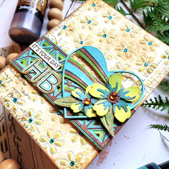
Step one was to create a textured background based on my observations of the mood board. You can see in the photo below all of the subtle, effective detail to my background. Let’s talk about how I achieved this look!
First, I duplicated the various shades of beige on the manikin using 3 shades of brown distress inks and then ink schmooshing onto watercolor cardstock. I placed the inks onto a glass media matt, sprayed with water, and then dipped the watercolor paper onto the ink. I kept repeating this process until I got the desired result. It helps to start with the lightest color of ink and heat each layer before adding the next layer. This creates a distressed look similar to the wood and manikin in the mood board.
Next, I applied a dark teal shade of ink onto Flora Die Plate Layer B and then placed my inked-up card panel over the die plate and embossed it with my die cut machine (embossing techniques vary by machine – see the instructions for your machine on how to emboss with dies). The emboss technique creates an impression of the die onto your card panel without cutting all the way through it. When I removed the die plate, I was left with an embossed image of flowers edged with the teal ink! Then I went back over the raised image with a bright yellow ink to give the flower petals a pop of color! I adhered the card panel to a white 5.5×4.25 card base and added blue Fairy Jewels over each flower for added interest.
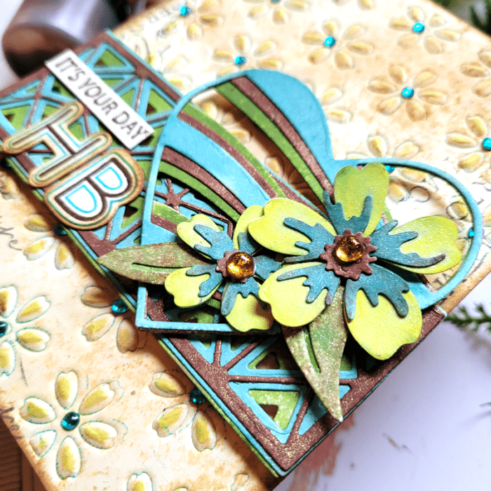
Next step was to work on the flowers and add even more texture! In the photo below, you can see the color and texture with the Banner Hearts die, Mini Splendor Bevel Plates, and Phlox Blooms & Leaves dies.
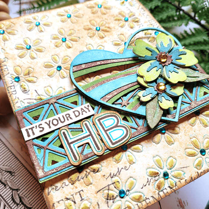
I die cut all of the above mentioned elements onto white cardstock. Then, I sprayed each of them using my Lindy’s sprays. Lindy’s sprays have subtle color variances and a bit of shine to them, so I knew they would be perfect for this mixed media project! After everything dried, I adhered the layers together. I placed the Mini Splendor Bevel Plates die over the card base about 2/3 of the way down. Then I placed the Banner Hearts die over it and to the right. I placed the 2 Phlox flowers and leaves over the lower part of the heart and finished with a “HB” (Happy Birthday) sentiment from Mod Alphabet stamp and die set. I chose that set because it reminded me of the bold yellow and blue words on the apron! Then I added “It’s Your Day” from Kind Hearts stamp to complete the sentiment.
I love to find unique elements from color mood boards to use on my cards, and I generally get lots of comments about it! I think that’s because the mood boards really inspire me to get playful! See if you can find some unique color mood boards that inspire you to jazz up your cards! You can even use mine! Be sure to let your creative juices flow on the layout and design of your card! Thanks for stopping by today!
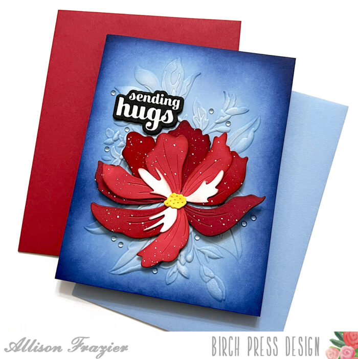
Hello Birch Press friends, it is Natasha here and I am back today sharing ideas on how to create a mixed media card using your dies! For today’s card I am using 2 new dies: Large Cosmos Contour Layers and Curved Leaf Branch Contour Layers. Let’s get started!
I started by die cutting the Large Cosmos Contour Layers die using the Vibrant Violet paper pad from Memory Box. I chose 2 shades of card stock from the paper pad. Once the floral was die cut, I added dye inks to the floral for added dimension. I then spritzed the floral layers with water droplets and picked up the color with a paper towel. I then adhered the floral together using liquid glue. For the center of the floral I chose a gold card stock from the Vintage Pastel Mirror Pad. I adhered this to the center of the floral and set this aside.
Next I started to die cut the Curved Leaf Branch Contour Layers die. I chose 2 shades of blue card stock from the Fresh Aqua paper pad from Memory Box. Once the leaf was die cut, I added 2 shades of dye ink to the leaf image. I added water droplets as well and picked up the color with paper towel. Once dry, I adhered the leaf layers together. I then added brown distress ink to the leaf edges for added texture.
Once the flower and leaf image was complete, I started to work on my background. I chose a gelli print from my stash with similar colors. I then dry embossed the background using the Ringadings 3D embossing folder. I added a bit more texture to the folder using dye ink in a dark grey on some areas of of the raised circles, as well as a blue glaze, and foundry wax. I allowed everything to dry, once the background was dry I added a few splatters to the background.
Next I added 2 pieces of pattern paper from the Magnolia Grove paper pack. I chose 2 colors to coordinate with my card design and tore the strips for a distressed look. I then adhered the card panel, strips of paper, leaf and floral to my A2 card base.
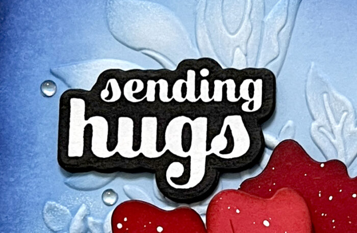
To complete my card I chose the Big Hugs Sugar Script die. I die cut the hugs sentimnent 3 times out of black card stock. I then adhered each layer together using liquid glue. I added a bit of foam tape behind the hugs sentiment for added dimension.
I hope today’s card inspires you to use your dies to create a mixed media style card!
Hello Birch Press friends, it is Natasha here today and I am excited to be up on the blog today! Today I am sharing a colorful card using the new Gracious Floral 3D embossing folder! This card was so much fun to create, using inks, stencils, and sprays, so let’s get started!
For today’s card I started with a piece of Canson Watercolor card stock. I started by adding Lindy’s sprays to the card panel background. When working with sprays, I add color to the paper, allow the panel to dry, spritz with water, then pick up the color with a paper towel. I continue this process for the background until I have the colors/textures I am looking for. Once the panel was completely dry, I ran the panel through my die cutting machine with the new Gracious Floral 3d Embossing folder by Memory Box. I love the detail in this folder. Next I added color to the floral and leaves using the coordinating stencil.
The stencil for this set is so amazing and truly so easy to use. The set comes with a coordinating guide telling you the stencil to use for each layer. I continued to add layers of color to my flower using the layering stencil using dye inks from my stash. Once the layers were complete, I spritzed the panel with water and picked up some more color using a paper towel. I love this step, as it adds more dimension to my images.
Next I added splatters to the card panel using my dye inks, as well as white splatters. I allowed the panel to completely dry, then I die cut the panel using my deckle edge trimmer. I then distressed the edges a bit more using my distress tool. Next I darkened the edges using distress ink and then adhered the panel to an A2 card base. I completed my card with a sentiment from the Gracious Floral stamp and die set.
Thank you so much for stopping by today! I love this collection and I hope I inspired you to get inky today! I will be back in a few days with more crafty inspiration using new dies from the latest Birch Press Designs release!
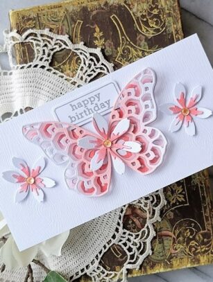
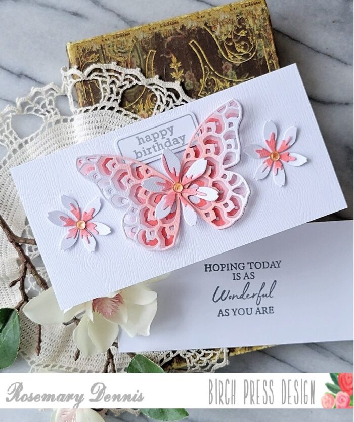
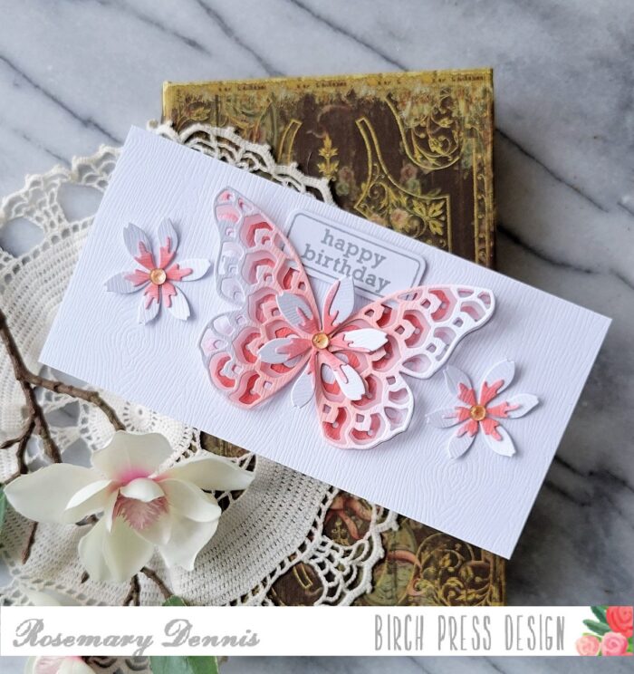
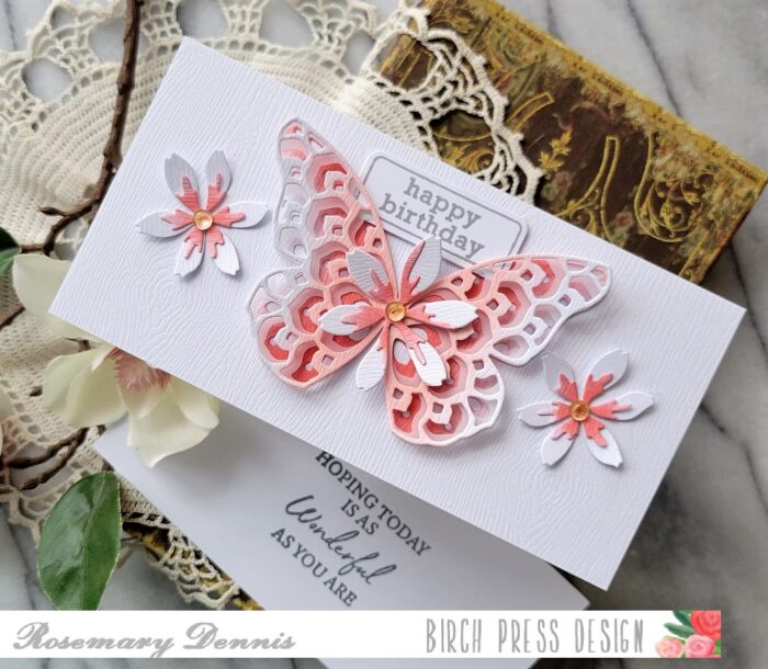
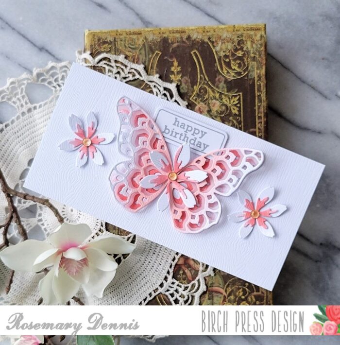
Hello! Today I have a clean and simple mini slimline birthday card to share. I used the Star Flowers Contour Layers dies along with the Glimmer Butterfly layers dies and sentiments from two different stamp sets.
For this card I decided to use the Memory Box white woodgrain cardstock. The only thing I didn’t use it for was the card base! I die cut the the A and C layers of the Glimmer Butterfly from the woodgrain cardstock. The middle (or B) layer was die cut from vellum. I then used to shades of coral ink to ink up the centers of the top and bottom layers. Darker coral on the bottom and light coral on the top. When I had the color to my liking I used liquid adhesive to adhere the butterfly only in the center.
I then created the flowers. All the layers were die cut from the woodgrain cardstock and then I added the darker coral to the second layer. There is a flower center die, but I decided to not use it this time. I layered the flowers and then added a fairy gem to the center of each flower that had a peachy tint to it. To make sure that the gems stayed in place I added a drop of liquid adhesive to the center of each flower.
A piece of the woodgrain cardstock was trimmed to fit the mini slimline cardbase and then adhered with double sided adhesive tape. The large flower was added to the center of the butterfly with a drop of liquid adhesive. Once everything was dry I adhered the elements to my card front using liquid adhesive. Now it was time to determine where to place the sentiment on the card front.
The sentiment on the card front comes from the Contempo Greetings stamp set. I decided to keep it soft my stamping it in a light gray. I then die cut it with the label die from the matching die set. I played around a little with where to place the sentiment and finally settled on the top. I added thin foam squares to the back and then nestled it into the wings of the butterfly. I don’t generally create a sentiment for the inside of the card, but for this card I did.
The reverse side of the woodgrain cardstock is smooth and perfect for stamping on. I trimmed down a piece to fit the inside of the card and then stamped the sentiment from the Kind Hearts stamp set using the light gray ink. This piece was then added with double sided adhesive.
I hope you enjoyed today’s project. Have a wonderful day!
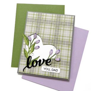
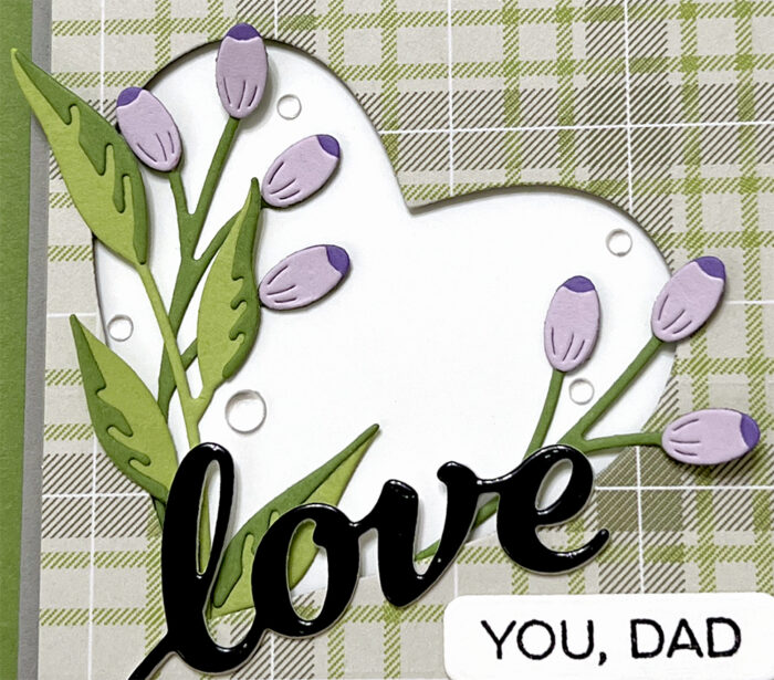
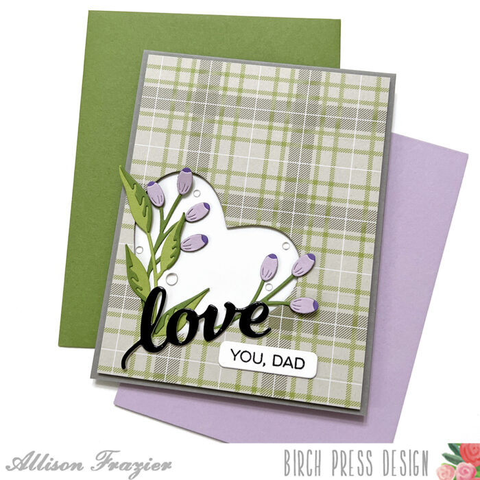
Hello, Birch Press friends! Today, I am sharing a Father’s Day card using the predictable plaid paper but adding in some unexpected floral elements. I admit that, when it comes to making masculine cards, I almost always reach for plaid paper. In my defense, I love plaid, too! Especially when it’s part of a plaid paper pad from Memory Box. I decided to add in some non-traditional elements to this card by adding florals and a heart. After all, men like flowers, too! My husband and his father are avid gardeners. Without him, my yard would be full of plastic plants because this girl does not have a green thumb!
I started my card by picking out my plaid paper. This particular piece is from the Woodsy Plaid paper pad, which I don’t think is available anymore. But, Memory Box always has some great plaid pads every season, so there is plenty to choose from. I trimmed that plaid paper down to 4″ x 5.25″, and then I used one of the dies from the Banner Heart Layer Set to cut the heart out. Any of the layers would work, since you’re just cutting the outline of the heart out. I then popped this plaid panel up on foam tape and attached it to a white panel before adhering it to my dark gray card base.
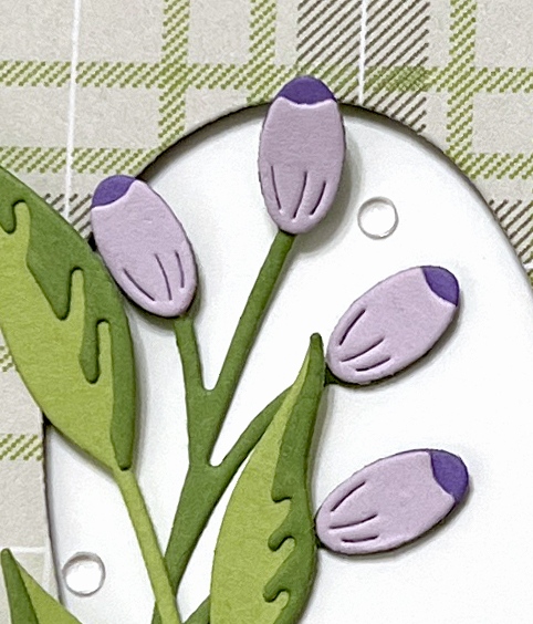
Next, I went through my stash of floral dies to find the perfect ones that would frame the heart opening. I chose the Sylvan Berries and Leaves Contour Layers set. I cut the berries out of two shades of purple card stock, and I cut the leaves/stems from two shades of green card stock. I assembled all of the pieces with liquid glue.
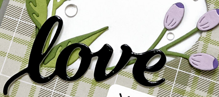
For my sentiment, I cut the Love Honey Script from black glossy card stock. I cut two additional layers out of white card stock to layer behind the black one in order to give it more dimension and stability. I left enough room between the outline of the heart and the foam tape so that I could tuck the ends of the stems behind the opening. I added liquid glue in some strategic spots so that I could also have some of the leaves and berries loose and dimensional. I added small pieces of foam behind various spots of the “love” sentiment and glued the rest of it to the plaid panel. I stamped the “you, dad” subsentiment from my stash and added that to the panel, as well. The original stamp says “I love you, dad” – I just masked off the beginning of it when I stamped it.
To finish the card, I added some clear fairy drops around the floral elements. I hope this card puts a smile on your face and inspires you to perhaps start adding florals to your masculine cards, too! Thank you so much for joining us today.