Category: Colleen Balija

  • Gracious Florals | by Colleen Balija

    Gracious Florals | by Colleen Balija

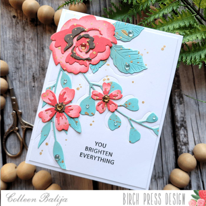
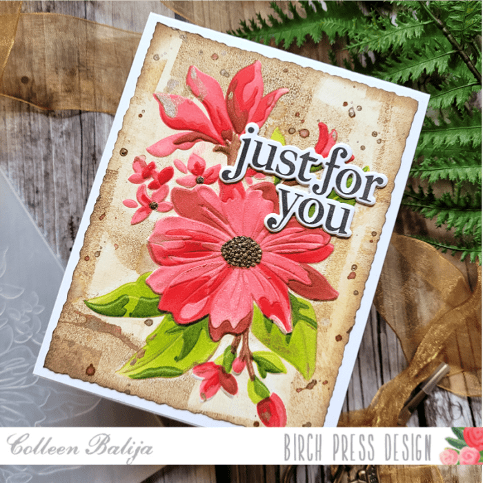
    HI friends! Today I’m going to share an easy way to add color to your embossed images using the new Gracious Floral Embossing Folder, Stencil, Stamp, and die set by Memory Box. This set coordinates together to help you create TONS of unique cards! I’ve linked the Supply List at the end of my post if you’d like to purchase any of the items (and I think you will want this set!!!)

    First step was to create a colorful background to the embossed Gracious Florals. I applied shades of brown ink directly onto the flat side of the Gracious Florals embossing folder using my mini brayer. The brayer creates a unique pattern, and I change directions with it to get an even more playful, mixed media look (see the photo below). If you don’t have a brayer, use your ink pads directly onto the embossing folder and change directions with the ink pad. You’ll get a similar look!
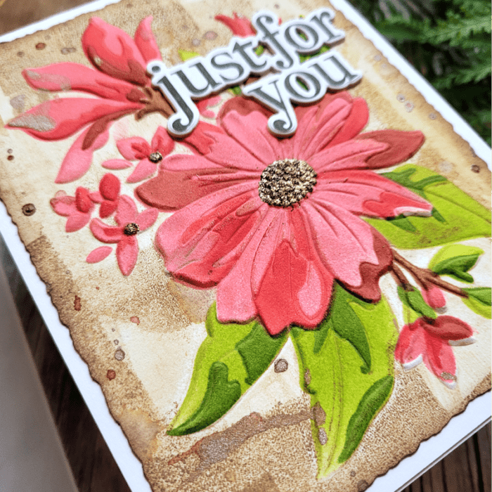
    Once I inked up the embossing folder, I added a white piece of heavy duty cardstock inside the embossing folder, closed it, and ran it through my die cut machine per the usual method of dry embossing. I was left with this awesome colorful background, but the flowers remained white!

    Next, I stenciled the flowers using the coordinating stencil set from Gracious Florals.
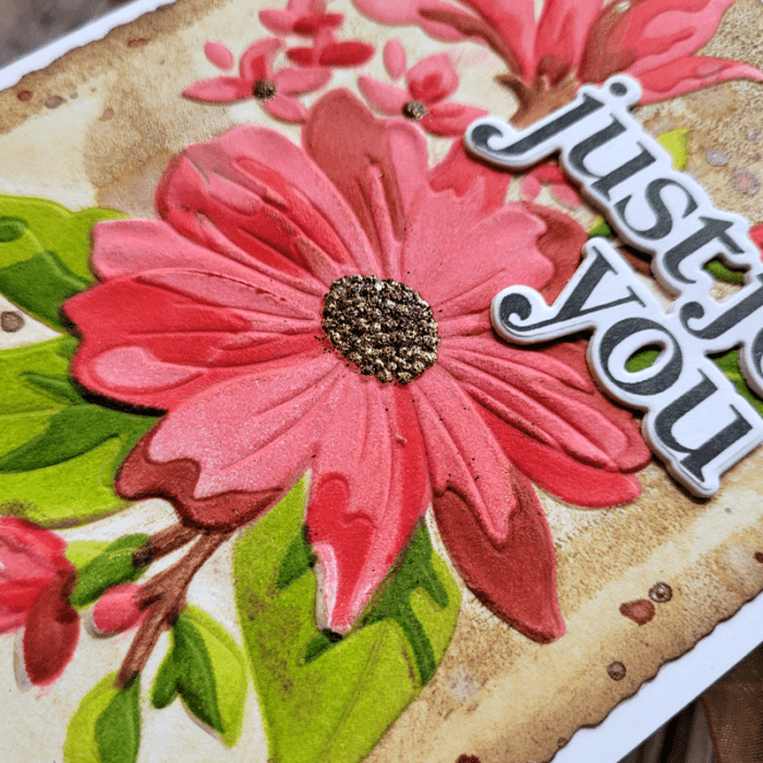
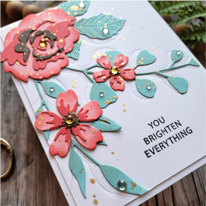
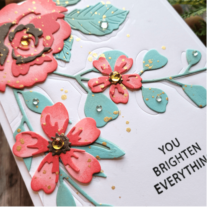
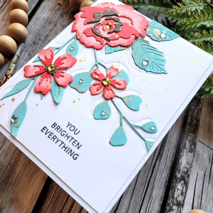
    The flowers are bold and absolutely BEAUTIFUL!!! The stamp set comes with the outline image of these flowers so you colorists will have a great time coloring the image! Getting back to my stenciling, I stenciled the layers using coral shades for the florals because they looked bold against the brown background. Then I stenciled the leaves in green and added gold embossing powder to the stamin for a touch of shine. I also added metallic gold splatters over the entire card panel for even more shine! Then I die cut the card panel using my deckled paper trimmer, added brown ink to the edges of the panel, and adhered it over a white 5.5×4.25 card base.
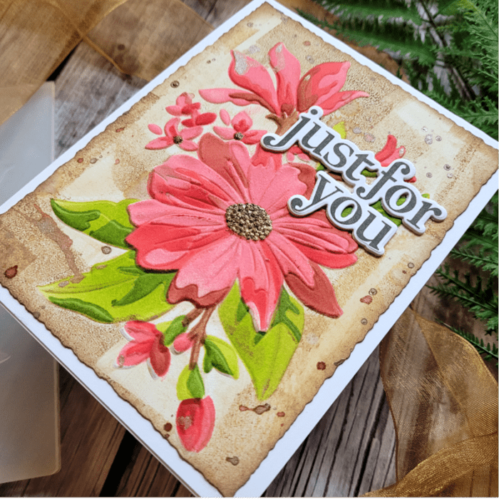
    The last step was to add the sentiment from the Gracious Floral stamp. The sentiments are bold and amazing, and I love how the die cuts right around the wording! I kept the sentiment simple in black and white so that the floral remained the focal point.

    I love how the brown background seemed to surround and embrace the florals! I hope you enjoyed today’s post and thank you for visiting me!

     

    Supplies
     

  • Using Color Mood Boards for Inspiration Part 2 | by Colleen Balija

    Using Color Mood Boards for Inspiration Part 2 | by Colleen Balija

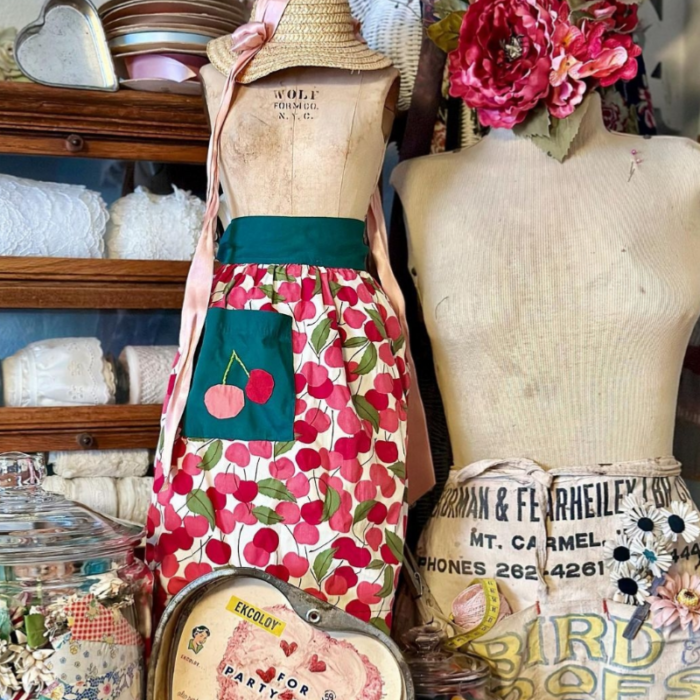
    Hi friends! I’m back for Part 2 of How to Use Color Mood Boards for Inspiration! If you haven’t watched my previous post, be sure to visit that one as well for more inspiration! I love to use mood boards for color, texture, and design layout for my cards. Everything is done for you, so all that’s left is for you to choose what inspires you and make your card! Here is the mood board that inspired today’s card:

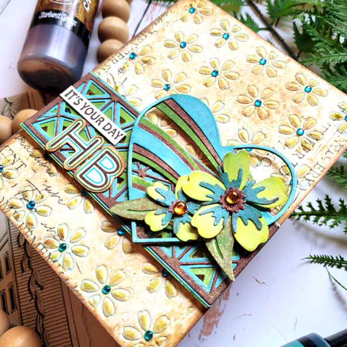
    This mood board seemed old fashioned and rustic to me. I loved the hunter green from the apron, the yellow, brown, and blue from the words (lower right corner), the striking black words right above it, and the distressed shades beige from the manikin. The textures that I loved were from the manikin, the straw hat, and the large heart below the cherry apron. I wanted my card to be rustic and include a heart, flowers, and a mixed media touch with lots and lots of texture!

    Step one was to create a textured background based on my observations of the mood board. You can see in the photo below all of the subtle, effective detail to my background. Let’s talk about how I achieved this look!

    First, I duplicated the various shades of beige on the manikin using 3 shades of brown distress inks and then ink schmooshing onto watercolor cardstock. I placed the inks onto a glass media matt, sprayed with water, and then dipped the watercolor paper onto the ink. I kept repeating this process until I got the desired result. It helps to start with the lightest color of ink and heat each layer before adding the next layer. This creates a distressed look similar to the wood and manikin in the mood board.

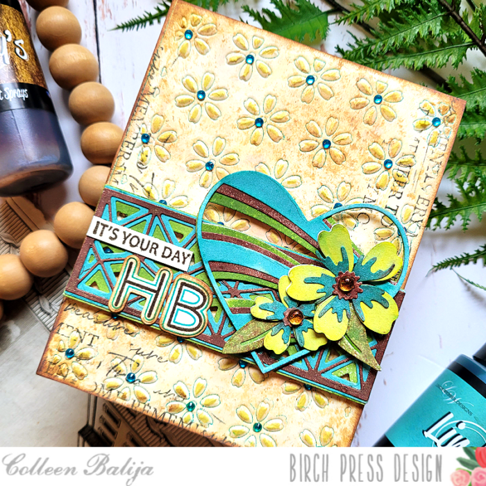
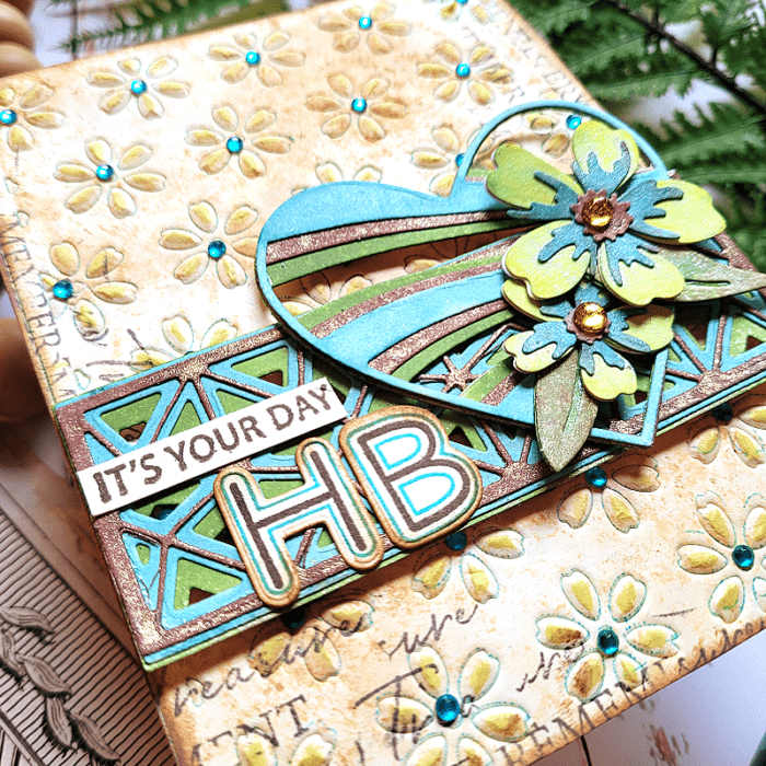
    Next, I applied a dark teal shade of ink onto Flora Die Plate Layer B and then placed my inked-up card panel over the die plate and embossed it with my die cut machine (embossing techniques vary by machine – see the instructions for your machine on how to emboss with dies). The emboss technique creates an impression of the die onto your card panel without cutting all the way through it. When I removed the die plate, I was left with an embossed image of flowers edged with the teal ink! Then I went back over the raised image with a bright yellow ink to give the flower petals a pop of color! I adhered the card panel to a white 5.5×4.25 card base and added blue Fairy Jewels over each flower for added interest.

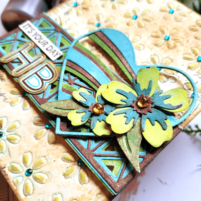
    Next step was to work on the flowers and add even more texture! In the photo below, you can see the color and texture with the Banner Hearts die, Mini Splendor Bevel Plates, and Phlox Blooms & Leaves dies.

    I die cut all of the above mentioned elements onto white cardstock. Then, I sprayed each of them using my Lindy’s sprays. Lindy’s sprays have subtle color variances and a bit of shine to them, so I knew they would be perfect for this mixed media project! After everything dried, I adhered the layers together. I placed the Mini Splendor Bevel Plates die over the card base about 2/3 of the way down. Then I placed the Banner Hearts die over it and to the right. I placed the 2 Phlox flowers and leaves over the lower part of the heart and finished with a “HB” (Happy Birthday) sentiment from Mod Alphabet stamp and die set. I chose that set because it reminded me of the bold yellow and blue words on the apron! Then I added “It’s Your Day” from Kind Hearts stamp to complete the sentiment.

    I love to find unique elements from color mood boards to use on my cards, and I generally get lots of comments about it! I think that’s because the mood boards really inspire me to get playful! See if you can find some unique color mood boards that inspire you to jazz up your cards! You can even use mine! Be sure to let your creative juices flow on the layout and design of your card! Thanks for stopping by today!

    Supplies
  • Using Mood Boards for Inspiration | by Colleen Balija

    Using Mood Boards for Inspiration | by Colleen Balija

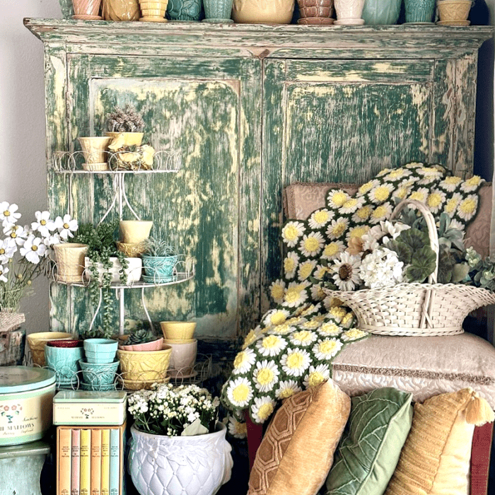
    Hi friends! I love to use mood boards for my card inspiration. Mood boards can provide a new and unique way to use color, texture, and design on your cards! Mood boards can be found easily, too, by googling them or by searching Instagram, which is how I found the one that I’m using for my card today!

    What inspired me with the mood board above are the colors of green, teal, yellow, and white, the texture from the vases and pillows, the flowers, and the beautiful throw rug with daisies on them! So, from this mood board I have color, texture, and a design layout for my card! Now, let’s apply all of this to the card, shall we? This is where your own imagination comes into play! How will you use the elements from the mood board?

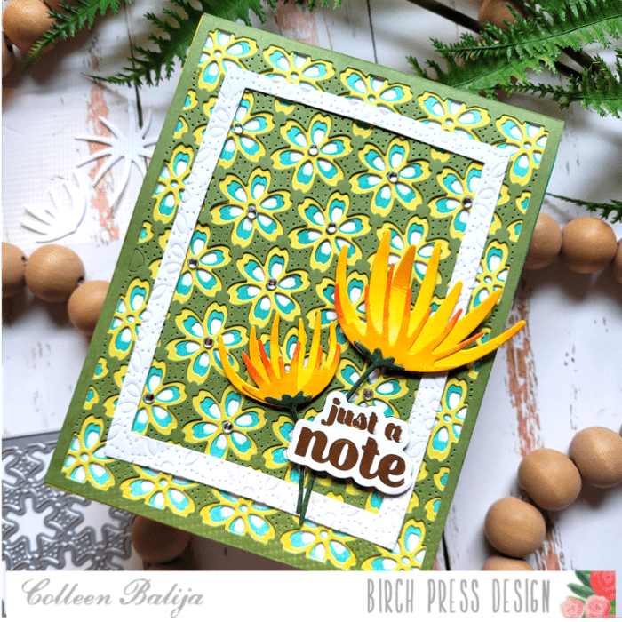
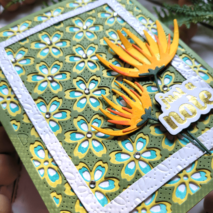
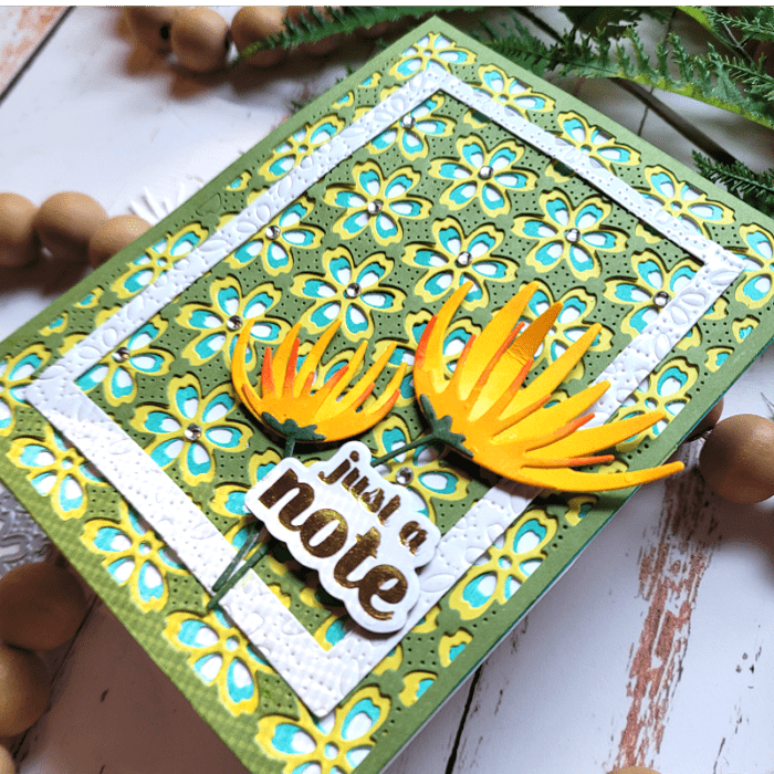
    For my card, I decided to use Flora Layering Plates to imitate the throw rug in the mood board, using shades of dark green, teal, and yellow. The throw rug didn’t have teal in it, but I loved the teal in the vases, so I decided to incorporate it into the Flora layers. I also love how the Flora Plates have texture in them, another feature I noticed in the mood board!

    Next, I wanted to add an element to my card that was similar to the white vase in the mood board, so I die cut a rectangle and then ran it through my die cut machine with one of the Flora Plates layers to add texture. I adhered it over the Flora background.

    Now it was time to add flowers, but the flowers in the mood board were mainly white and I wanted mine to have color to help them pop a bit from the busy background, so I used the colors from the pillows in the mood board for my flowers.

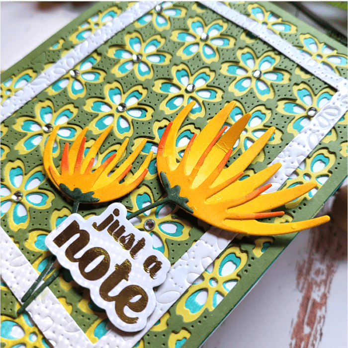
    Using Wispy Blooms Contour layers die, I die cut both flowers in white and then ink blended them in shades of yellow and coral. I used a dark green for the stem. Then I hot foiled the “Just a Note” Sugar Script Sentiment over white cardstock. I adhered the flowers in the corner over the white rectangle and applied the sentiment over the flowers to create a cluster in the lower corner.

    I finished with Fairy Jewels over the flowers just within the center of the white rectangle to bring the eyes to the center of the card.

    Here is one more look at the mood board so you can see how I used the elements on my card! Next, I want to create a background similar to that piece of furniture! I’ll share that with you at another time!

    I hope that you were inspired today to search for mood boards (you can search “mood boards” or “color mood boards”) and use them on your cards to bring them from average to WOW!!!


    Supplies


  • Use Your BPD Layered Dies as Stencils | by Colleen Balija

    Use Your BPD Layered Dies as Stencils | by Colleen Balija

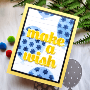
    Hi friends! Do you ever look for creative ways to use your BPD layered dies other than their original intention? Well, today I want to show you how to use them as stencils! We’ll be using Make a Splash Sugar Script die, Pinpoint Contour Plate, and Floral Balloon Layered dies, and I’ll include links to these supplies at the end of my post. Let’s get started!

    Creating stencils from your dies is easy! You’ll need the dies, of course, and masking paper. I use the Gina K Designs Masking Magic, but you can find masking paper just about anywhere! I recommend you buy 5×7 or 8×10 in size so you can die cut larger dies for this technique!

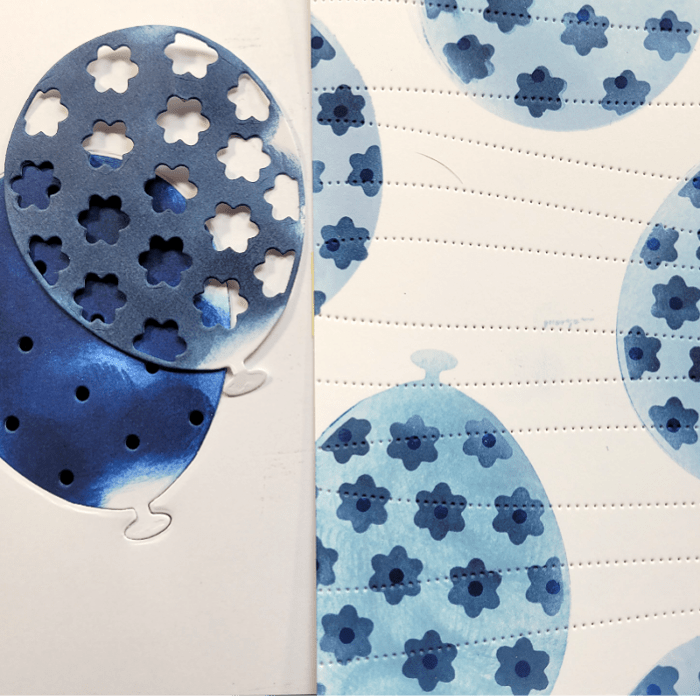
    First step is to create the mask by die cutting the layered dies using the masking paper.

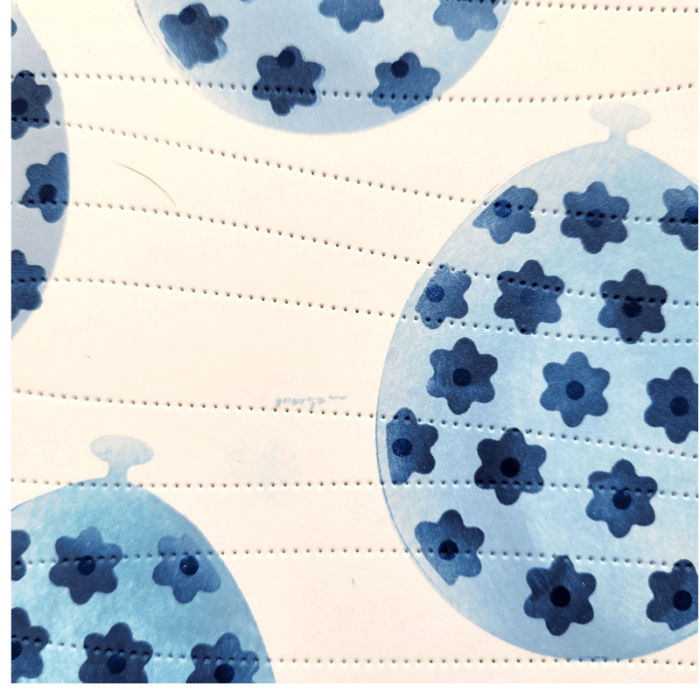
    Using both the positive (the image) and negative (the outline) pieces of the mask, I placed them over the white card panel to protect the panel from getting ink where I didn’t want it. Then I ink blended just like I would with a regular stencil! I used shades of blue and went from light to dark as I built the layers of the balloons with my handmade stencil. If you’re not sure how to build the layers, think about how the die would look if you adhered the layers of the die together and use it the same way as a stencil. You can see in the photo above how I created the stencil and then inked up the white card panel (stencil is on the left and inked up panel on the right)!

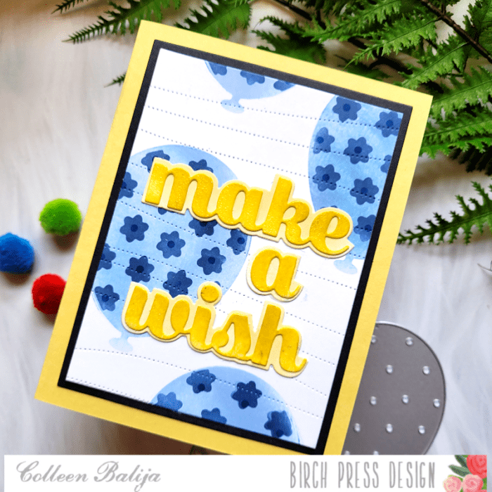
    Once the background was finished, I added another element of detail to it by die cutting the Pinpoint Contour Plate over the entire panel. I like this cover plate because it adds interest without stealing the show from the focal point!

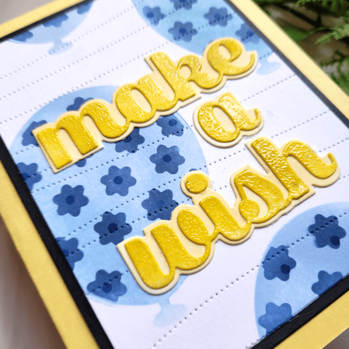
    Then, I trimmed down the panel with a rectangle nesting die, along with a black card panel that was slightly larger. I adhered them together and placed them over a yellow card base, sized 5.5×4.25

    Next up, the sentiment!

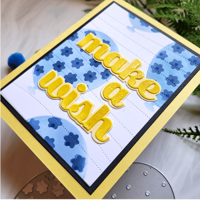
    I chose the Make A Wish Sugar Script sentiment, which is 2 layers. I die cut each layer and then inked them up using 2 shades of yellow. To help the top layer pop even more, I heat embossed over it with a clear embossing powder. That adds shine and makes the color even more bold! Then I adhered the sentiment over the balloon background!

    Below is a closer image of the entire card when finished!

    To summarize, grab any of your BPD layered dies and masking paper of choice, create a stencil by die cutting onto the masking paper, and then use it as a stencil! You can keep the stencil for future use by storing it with your dies, too!!!

    YThanks for stopping by!

    Supplies
  • Creative Use of White Space | by Colleen Balija

    Creative Use of White Space | by Colleen Balija

    Hi friends! Ya know, every once in awhile I love a good card with lots of white space and a small pop of color! But, I admit, it’s hard to know how to make white space not look boring! Well, I found a surefire way to add interest to white space!!! It works like a charm every single time for me! Let me share how it’s done!

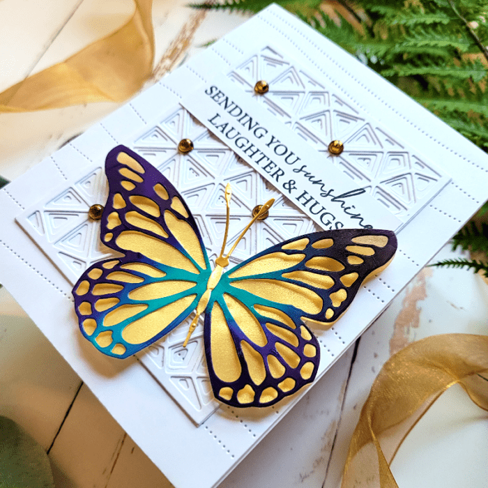
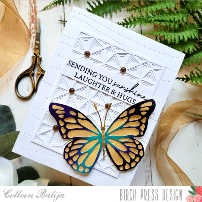
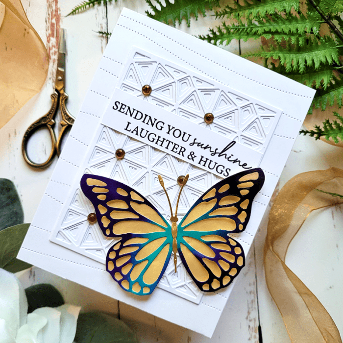
    For my card today, I’ll be using Butterfly Basics die, Pinpoint Contour Plate, Splendor Bevel Layered Plates, Kind Hearts stamp (sentiment only), and Memory Box Fairy Crystals.

    The first step is to create interest to a white background, and the best way to do this is by adding texture and layers with die cuts I die cut the Splendor Bevel Layered Plates, all on white cardstock, and adhered the layers together. These dies are made to be smaller than an A2 sized card, which is perfect for layering! Next, I die cut the Pinpoint Contour Plate onto a piece of 5.5×4.25 white cardstock. This added even more interest and texture to the background! I adhered the Splendor Bevel Layers over the Pinpoint Contour Plate and then adhered both onto a white 5.5×4.25 white card base. If you look at the photo above, you can see all the details in that background!

    TIP: Consider mixing vintage elements with modern geo elements! They work beautifully together!

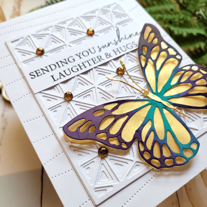
    Next step was to work on a colorful focal point – the Butterfly! Using the larger of the 2 butterflies that comes with this set, I die cut the base layer with gold vellum and the top layer with an alcohol card panel that I had on hand. I only glued the center of the top layer of the butterfly and fluffed the wings out a bit to give it some movement.

    The final step was to add a sentiment from Kind Hearts stamp and adhere the butterfly and sentiment to the white card panel. I kept the butterfly in the lower corner of the card panel so that you can still see lots of that luxurious white detail!

    TIP: You could also die cut the butterfly in white and have the entire card be white. It works beautifully! Consider embossing the butterfly with clear powder to add glossy shine!

    To summarize, create interest to a white background by:

    1. Adding texture with die cuts
    2. Adding layers with die cuts
    3. Use clear embossing powder to create a clear glossy shine onto one of the layers
    4. Limit the size of the focal point so the background is the star of the show!

    I’m so glad you stopped by today!


    Supplies:


  • Clean and Simple Spring Florals Part 2 | by Colleen Balija

    Clean and Simple Spring Florals Part 2 | by Colleen Balija

    Hi friends! I’m back for this month sharing another Clean and Simple card, similar to my blog post on April 10th! If you haven’t seen that post yet, head over there first to get the deets before reading this post, as this is a continuation!

    This month I’ve been focused on Clean and Simple lines in my cards. That’s a challenge for me, but I like a good challenge so decided to give this a try! I hope you like it! Clean and Simple cards can be very effective with just a few simple design ideas to add detail and interest to your card!

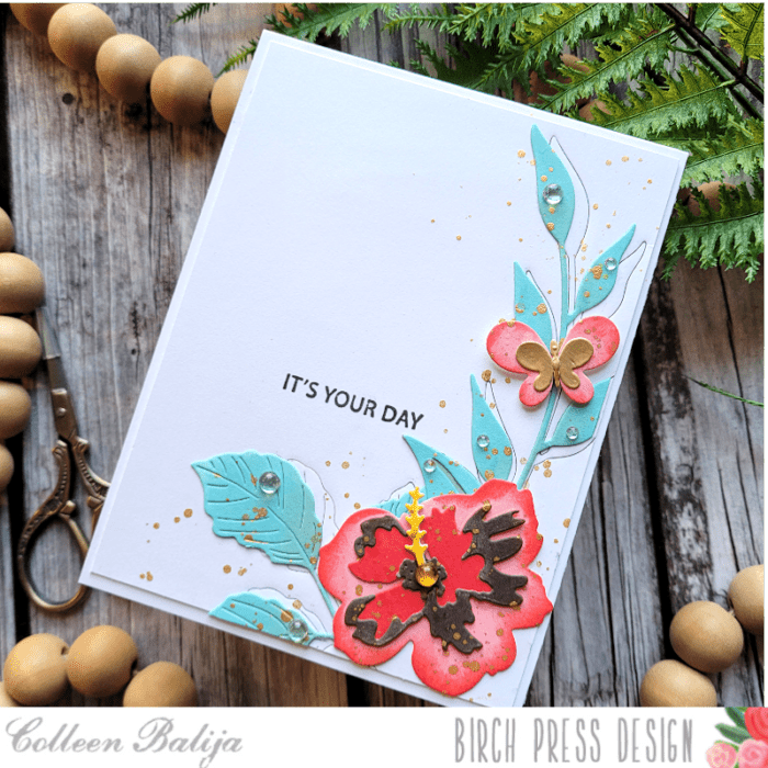
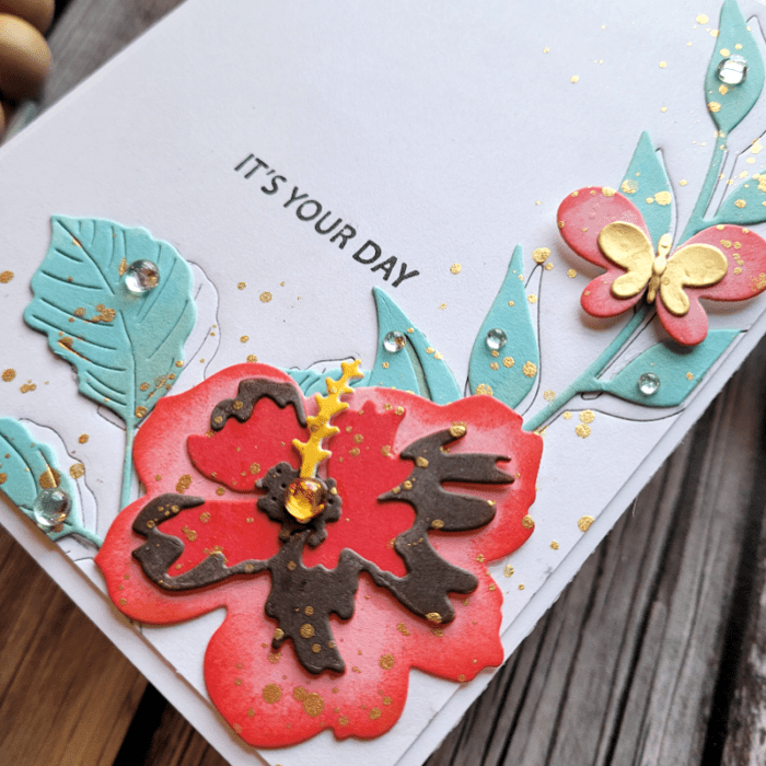
    The products I’m using for today’s card are Phlox Blooms & Leaves die, Sylvan Berries & Leaves die, Tropical Hibiscus Contour Layers die, Simple Butterfly die, and Rainbow Days stamp. All of these items will be linked at the bottom of my post!

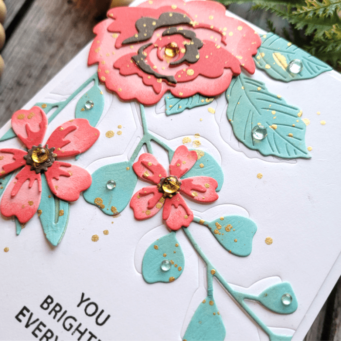
    Similar to my other Clean and Simple card of April 10th, the first step was to decide on the arrangement of my flowers on the white card panel. Once that was decided upon, I die cut my flowers and leaves and then ink blended each in shades of coral and mint green. I explained in my first blog post why I die cut first and ink blend second. Basically, it allows me to get more depth of color with the flowers and leaves. You can see that in the photo above!

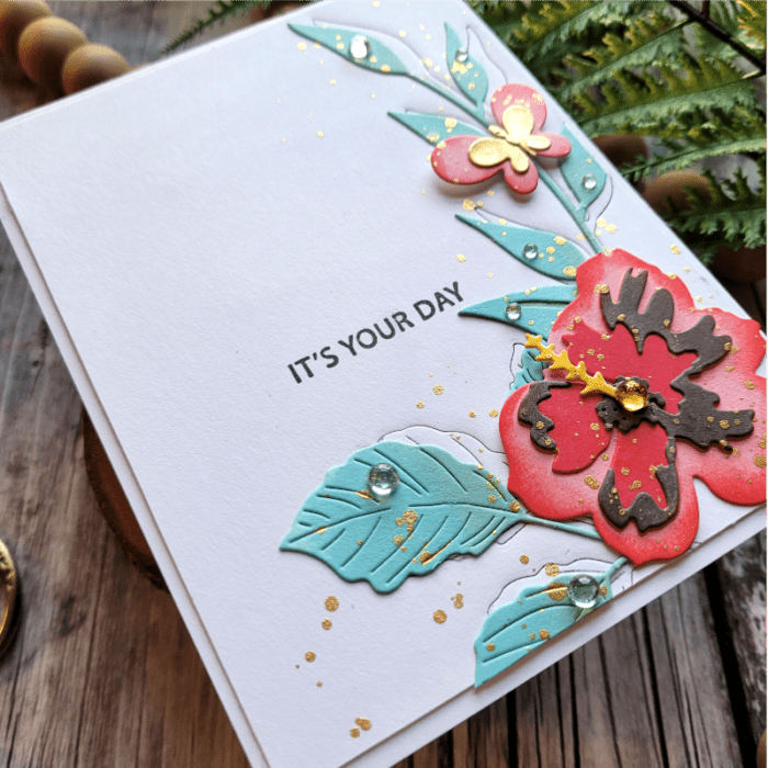
    Next, I wanted to add subtle detail to the white space, so I used a few of the die cuts from earlier as embossing tools. And unlike my first card, this time I inked up the die with black ink! To do this, I inked up just the tips of the dies, placed them carefully where I wanted them (once they are in place, don’t move them or you’ll get black ink all over your nice white card panel), taped them down to the card panel so they wouldn’t move, and ran them through my die cutting machine using an embossing pad. The embossing pad allows the die cut to embed an image without cutting all the way through (Each die cut machine is different in how it works, so refer to your brand of die cut machine for details.) The black ink adds another element of interest! You can see in the photo above and below the level of detail that this technique adds! The black ink is subtle, but effective! You could use any color of ink, too!

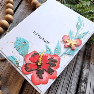
    Last step was to adhere the flowers and leaves to the card panel, placing the leaves offset from the embossed image so just a bit peeked out from behind! Then I added gold metallic splatters just around the flowers, being careful to leave most of the white card panel untouched. I placed the “It’s your day” sentiment next to the flowers and then finished with sequins over the leaves and flowers.

    Clean and Simple cards are really fun, and if you keep these helpful tips in mind, you just can’t go wrong!

    1. Emboss the white card panel with embossing folders or dies
    2. Use splatters sparingly to add interest without overwhelming the card panel
    3. Add detail to the focal point by ink blending to create depth and life to your florals
    4. Keep the sentiment simple and small
    5. Add sequins or a Nuvo Shimmer pen to add shine and shimmer to your focal point
    6. Keep one half to one quarter of the card panel white and untouched

    Thanks for stopping by!


    Supplies


  • Clean and Simple Spring Florals Part 1 | by Colleen Balija

    Clean and Simple Spring Florals Part 1 | by Colleen Balija

    Hi friends! Today I want to share a Clean and Simple Spring Floral card!

    A good Clean and Simple card utilizes white space creatively. And it’s hard to add detail and interest without over-doing it!!! I tend to create cards that are filled from top to bottom with details, but I fall in love with designers like Dee Nacar and her expert use of white space, so I’m giving it a try today, and I hope you like it!

    Today I’ll be using Morning Rose & Triple Buds die, Eucalyptus Stem & Berries die, Phlox Blooms & Leaves die, Sylvan Berries & Leaves die, and Rainbow Days stamp. All of these items will be linked at the bottom of my post!

    First step was to decide on the layout for my card panel. Once that was decided upon, I die cut my floral pieces and ink blended each piece with shades of coral and mint green. While it’s easier to ink blend a card panel first and then die cut second, I like to do the opposite because I can add more depth this way. I create an ombre effect with color that brings my flowers to life. And that’s one of the details you’ll need in a Clean and Simple card! Take a look at the photo above to see what I mean about adding depth.

    Next, I added more detail to my white background card panel by using the same die cuts from earlier as an embossing tool. To do this, I placed the die cuts where I wanted them on the card panel, taped them into place so they wouldn’t move, and then ran them through my die cut machine with an embossing pad that comes with my machine (each machine is different, so look for an embossing pad that goes with your die cut machine). The embossing pad allows the image to be embedded into the card panel without cutting all the way through. This is another fun and creative way to use your die cuts! Look at the photo above and below to see the embossed images peeking out from behind the flowers and leaves!

    Another option to add detail to a white card panel is embossing with embossing folders. You’re adding detail without losing the white space. It’s a great technique!

    The final step was to place the flowers and leaves where I wanted them, along with the sentiment. I wanted to keep the sentiment simple, so I went with a stamped one rather than die cut one. The leaves are placed off-center from the embossed image so that a tiny bit of the embossed image peeks out from behind them. Then I added gold metallic splatters and sequins to add shine! You can see the splatters and sequins in the photo below. Some of the sequins are clear to look like rain drops on the leaves. The splatters and sequins are another subtle way to add detail without busying up the card panel! I was careful only to splatter around the flowers and leaves, leaving a good part of the white card panel alone.

    I’m pleased with how this Clean and Simple card turned out! To summarize, here are a few pointers to keep in mind when creating Clean and Simple designs:

    1. Emboss the white card panel with embossing folders or dies
    2. Use splatters sparingly to add interest without overwhelming the card panel
    3. Add detail to the focal point by ink blending to create depth and life to your florals
    4. Keep the sentiment simple and small
    5. Add sequins or a Nuvo Shimmer pen to add shine and shimmer to your focal point
    6. Keep one half to one quarter of the card panel white and untouched

    Thanks for stopping by today!

    Supplies
  • Blue Willow Floral Thank You | by Colleen Balija

    Blue Willow Floral Thank You | by Colleen Balija

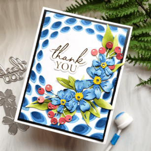
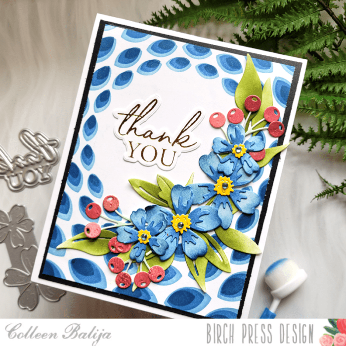
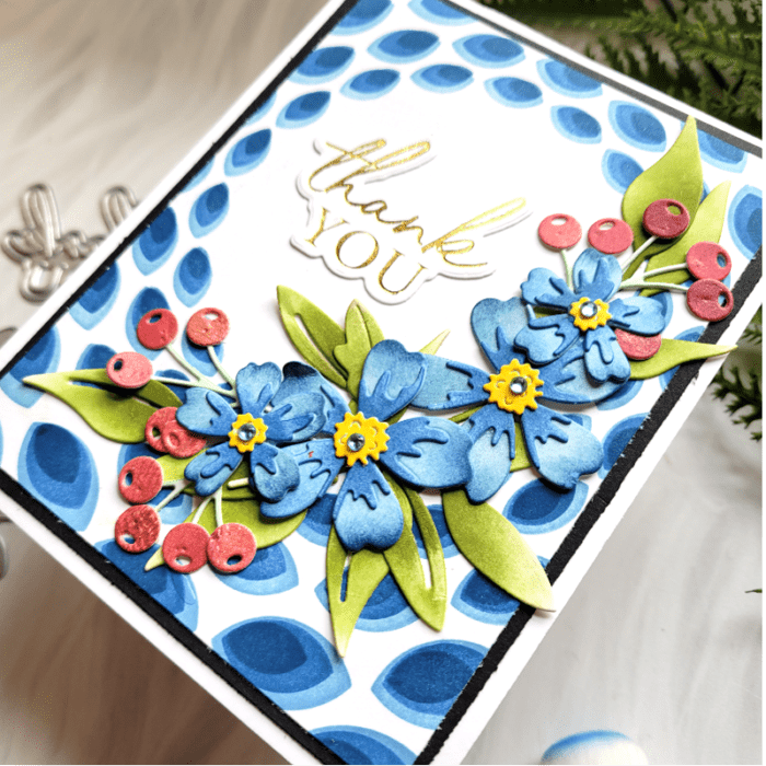
    Hi friends! Today I want to share a card that reminds me of my Mom’s Blue Willow dishes! I loved those dishes, and I’ve been seeing this color frequently and just fell in love with it all over again! Let me show you how I achieved the look!

    Since I already had my color palette chosen, I picked my design elements for the card. I’m using Sylvan Berries & Leaves, Mixed Berry Contour, Phlox Blooms & Leaves, Thank You hot foil plate, and Gilded Petal Point stencil (which also comes with the hot foil plate). All the links to the products here will be at the end of my post for you!

    First step was to create my background to look like Blue Willow dishes (if you don’t know what these are, go look them up and you’ll love them!) Using the Gilded Petal Point 3-layer stencil and inks in light, medium, and dark blue, I ink blended my background onto white cardstock. Then I trimmed the card panel and placed it over a slightly larger black card panel. Both layers went onto a 5.5×4.25 white card base. Already I’m in love with these colors and designs!

    Next up, the flowers!

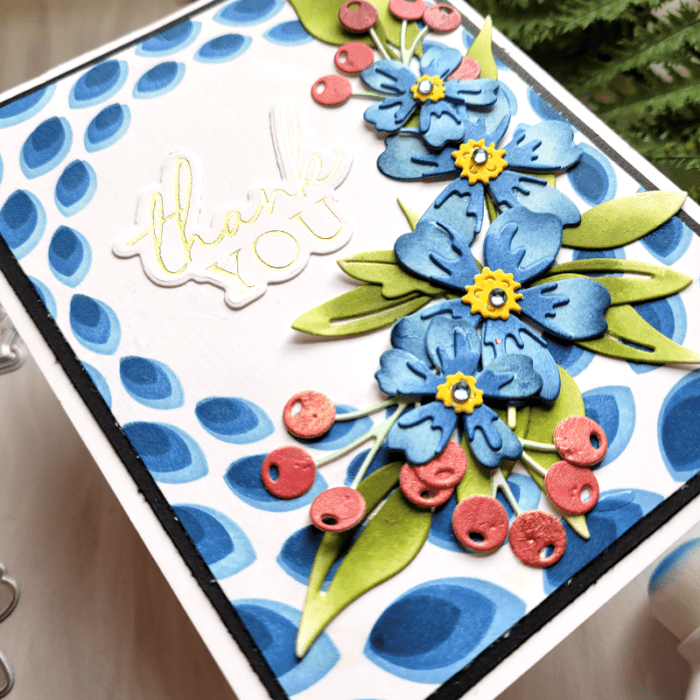
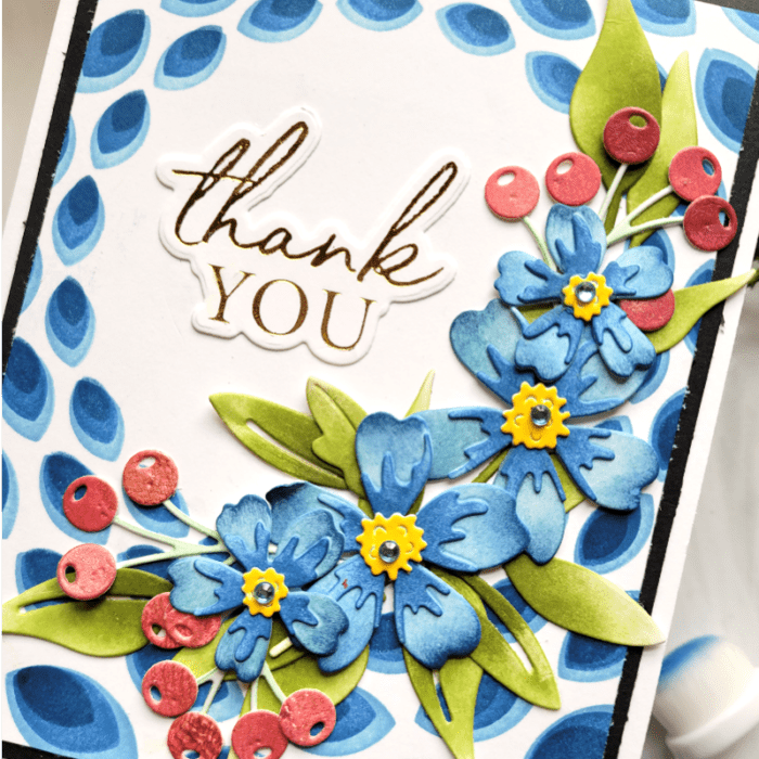
    I die cut the Phlox onto white cardstock and ink blended them using the same inks as I did on the background. You can see in the photo above how I played with the variation of light to dark with my ink blending. Don’t be shy about adding contrast of color to them! It adds so much detail and depth to your flowers!

    I wanted just a pop of a different color to add some variety, so I die cut the berries using a colored card panel that I had on hand in shades of red. For the leaves, I ink blended in shades of green in a similar way that I did with the Phlox. Then I adhered all the layers together. Birch Press Design layered flowers are really easy to put together!

    Now I was ready to place everything onto the card base! Before adhering everything down, I staged the foliage where I wanted them around the hot foil Thank You sentiment. Then I slowly glued everything into place using liquid glue. Liquid glue gives you a little more time to get the exact placement before it dries, so I always use it with my flowers. I finished with a few sequins from Memory Box over the flowers and the Thank You sentiment.

    Blue is such a fun and bold color to use on cards, and the color can be used from Sympathy to Happy Birthday greetings! Thanks for stopping by!

    Supplies


  • Colorful Spring Hugs | by Colleen Balija

    Colorful Spring Hugs | by Colleen Balija

    Hi friends! With spring in full swing, I want to share a colorful and simple floral card to celebrate the bounty of beautiful color that’s about to descend upon us! I can’t wait!

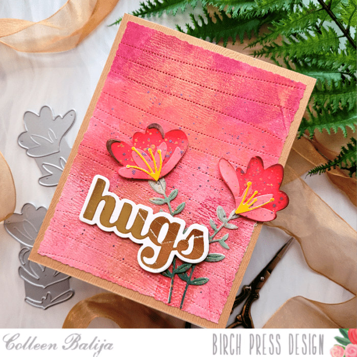
    I will be using Jovial Blooms & Leaves, Pinpoint Contour Plate, and the Hugs Sugar Script die. Oh yes, and LOTS of bold color! All the supply links will be provided to you below at the end of my post.

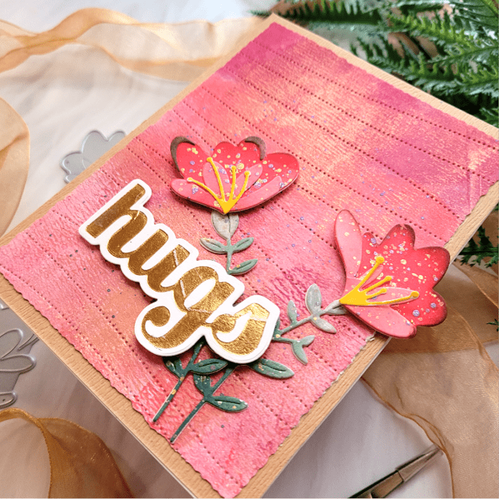
    First step for me is always to choose the colors for my card. Choosing the colors helps my creative process! I had a gelli plate card panel set aside that was in shades of coral, pink, and gold, so I decided to use that color palette and build my card from there. I took the colored card panel and die cut it with the Pinpoint Contour Plate to add texture and interest to the background. Then I trimmed it down using my deckled paper trimmer and placed it over kraft cardstock. Background finished! Now it was time to focus on the flowers and sentiment!

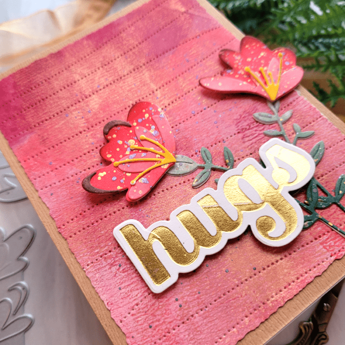
    I decided to go with a monochromatic look, meaning that the flowers would be the same color as my background. I die cut Jovial Blooms & Leaves onto white cardstock, and then ink blended each layer in shades of coral and the leaves in shades of green. I created an ombre effect by going from lighter to darker with my ink blending tool. I added brown ink to the tips of the flowers to help them stand out from the background color. Then I adhered the layers together and finished with gold and purple splatter using metallic paint, a paintbrush, and water. The splatter adds another level of detail and interest to the flowers. I added splatters to the background as well for a cohesive look. You can see the detailed ink blending and splatters in the photo below! These little extra details can take your flowers from average to outstanding!

    Once the flowers were dry, I placed them over the background card panel where I wanted them, and then adhered everything down. I finished with a Hugs Sugar Script die that was hot foiled with gold. The sentiment and flowers were popped up using foam tape. And the gold from the sentiment brought balance to the gold in the background and in the flowers! Can you see what I mean in the photo below?

    You could use any color palette to create a similar monochromatic look to your card. Just remember to add those little details to your flowers to help them stand out from the background! Thanks for stopping by!

    Supplies


  • Miss You Spring Bouquet | by Colleen Balija

    Miss You Spring Bouquet | by Colleen Balija

    Hi everyone! I’m back today sharing a Miss You Spring Bouquet featuring products from the February new release!

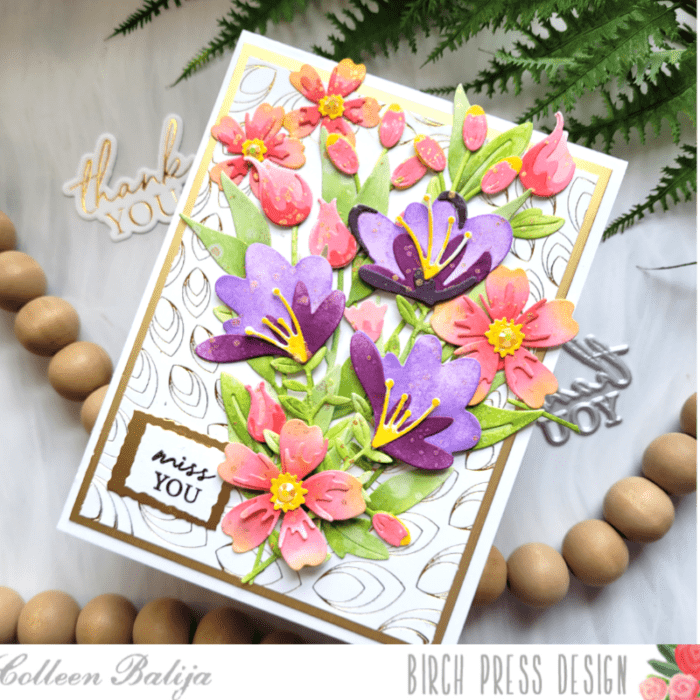
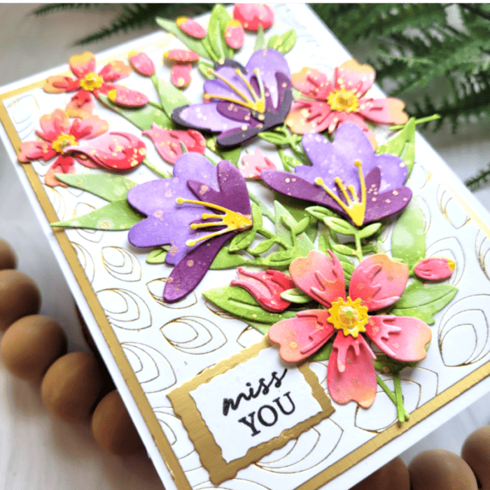
    First step, as usual, is to create the background that my focal point will sit upon. I hot foiled in gold the Gilded Petalpoint plate, trimmed it down and placed it over a piece of gold cardstock just slightly larger. Then I adhered both layers onto a 5.5×4.25 white card base. I love the gold and white combination!

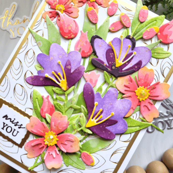
    Next, it was time to play with my spring floral bouquet using Phlox Blooms and Leaves Contour Layers, Sylvan Berries and Leaves Contour Layers, Delicate Floral Buds Contour Layers, and Jovial Blooms and Leaves Contour Layers (featured in purple).
    With my previous card that I shared with you on the 16th, I mentioned that I had die cut a bunch of flowers and leaves, and ink blended all of them using shades of coral – pink and purple. Then I sprayed them all with water to get a blotchy look and finished with gold metallic splatters. I just love how that simple step takes your ink blending to the next level!

    I created a bouquet with all the lovely flowers from this release over my hot foiled background card panel. Keep in mind, I haven’t adhered the flowers down yet. I’m just staging them for now! When I was happy with the placement of my bouquet, I picked up the entire bouquet using Press n Seal. Press n Seal has a sticky side on it that acts like adhesive, allowing me to “pick up” the entire bouquet in one piece! Then, flipped the bouquet over carefully with the Press n Seal, added my adhesive to the back of the bouquet, and then flipped it over again and adhered it over the background panel. This is an AMAZING trick to use for larger bouquets like this one! It keeps everything in one place and saves you time! If you don’t have Press n Seal, you can use washi tape strips.

    My final step was to create a sentiment to go along with this springtime delight! I chose the Miss You one from an older stamp set called Classic Sentiment Wreath. I thought that sentiment actually fit my feelings about missing spring weather. I used my deckled edge paper trimmer to trim the sentiment along with a larger piece of gold behind it.

    That was it for this card! The hardest work was in the design of the flowers and leaves, but it was relaxing to do this, and then I had them ready to go for this card! Thanks for stopping by today!

    Supplies